An apartment renovated by Camille Bernard of LalaHome
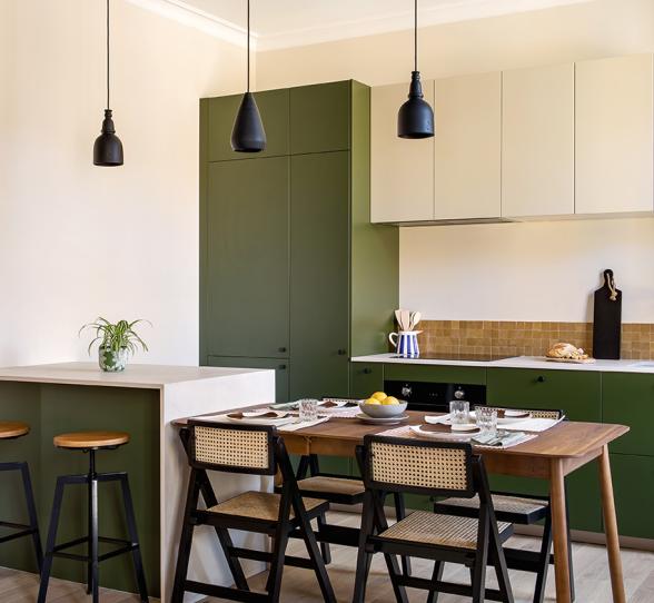
Time to head to the centre of Besançon, to an 18th century building housing a 70m2 apartment. Its last renovation? During the 1950s...For this investment property, architect Camille Bernard was able to let loose with colours! The result is a cool and chic flat, contemporary yet with a unique look. The open plan kitchen is a deep green, the pretty period details such as original mouldings and fireplaces are highlighted with a lick of pain and door frames act as punctation throughout the flat. A balance of shades, subtle details and more : discover it all with the founder of LalaHome. Follow us!


Olive allure
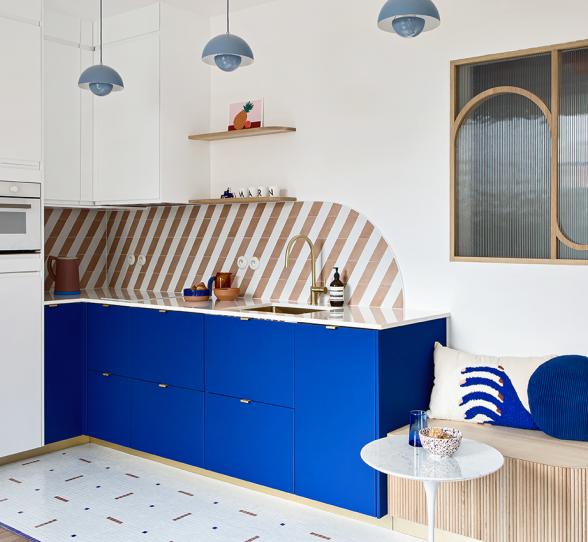
Goodbye partition walls and run-down kitchen and bathroom. To give a total makeover to this apartment, Camille reorganised the layout of the rooms, opening new perspectives and choosing a bold colour to dress up the open-plan kitchen. "I wanted a colour that was simultaneously strong, rich and timeless. Created by Plum Living, these matte lacquered fronts in their Olive shade, were the starting point for a tonal palette for the whole flat".


A perfect recipe
A second shade takes pride of place in this apartment: our Moka paint, used by Camille to colour plinths, window frames and wooden detailing. "A milky coffee shade with a touch of pink, this colour calms the intensity of Olive, whilst also warming it up. Used mostly in the living room, you can also find touches of this shade in the kitchen, to continue the theme". Ocre tiling, a walnut table and touches of black: it's these design-driven details that really bring a creative touch to the kitchen and pull everything together!

Totally optimised

A touch of Moka

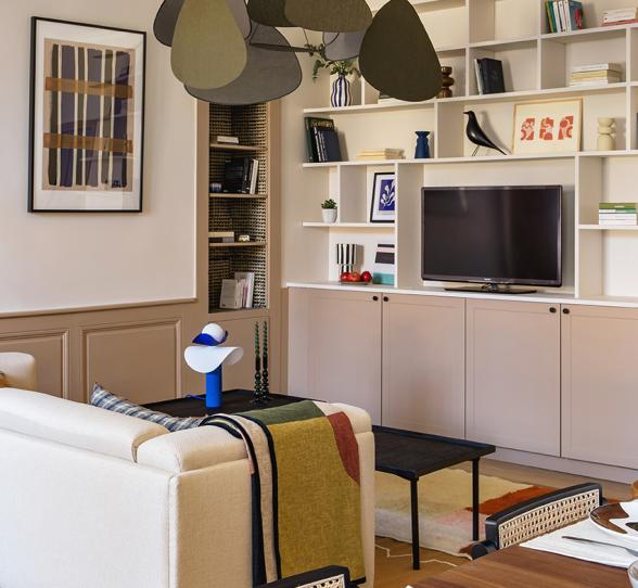
With just a tiny hint visible in the kitchen, our Moka shade comes into its own in the living room. "Neutral, but still with a bit of personality, I found this the perfect shade. It tones down the intensity of Olive in the kitchen, but still creates a cosy, warming environment." On the curves of the custom claustra, to the wooden detailing and the alcove, this colour adds some depth and rhythm to the apartment and links original features with modern elements.


That custom-made feeling
Say hello to colour

The secret of balancing a palette of different colours? "Use a common basis, here a creamy off-white, and then consider how each colour you add to that works together with the rest. That way, you will avoid any last minute faux pas." But don't forget a few flicks of personality! In the master bedroom, a Glacier blue adorns the wooden detailing and ceiling mouldings, bringing depth and perspective to the room. Khaki green, ocre and electric blue, the kids' bedroom echos the main room, whilst still being child-friendly.


Antique love
A full renovation doesn't always mean eliminating everything original! "In the master bedroom, I decided to highlight the period elements, giving them a new personality or purpose". Slightly lightened, the original pine parquet floorboard reminds us of Scandi floors. Painted in a bold blue and highlighted by Bejmat tiles, the fireplace gets a whole new look! The cupboard has been removed, replaced by a niche and a small desk, all in the same shade as the original wood.


Play with space


Powdery backdrop


Technical elements, made beautiful
In this compact bathroom, the curved shower cabin is a real feature! For this room, Camille chose to play with organic shapes, hiding for example the washing machine behind a tiled partition. Practical and pretty! The architect even turned her attention to the glass screen, having it cut to order as well as the little step, designed to facilitate the shower Plum Livingbing.
Ideas which inspire us
- Transforming the open-plan kitchen into a livable space thanks to a simple island and a dining table
- Creating a little desk in an old cupboard and painting it the same colour as the wall
- Highlighting door frames, wooden detailing and alcoves with timeless colours and contrasts
- Daring to paint fireplace surrounds to give them a total makeover.