The details that make a difference in the kitchen!
Metod, Utrusta, Behjälplig... After several weeks working on your kitchen project, you're almost fluent in Swedish! The product code of the Maximera 60x37cm drawer rails is engraved in your memory alongside your first home-phone number. Not to mention your new-found knowledge on sinks and countertops - it's basically a full time job! But get too lost in the Ikea Kitchen Planner world and you'll forget the little details. And we all know it's the little details that make all the difference. From handles to plinths to cover panels, each piece plays a part. Here's the proof!
Shelves made from cover panels
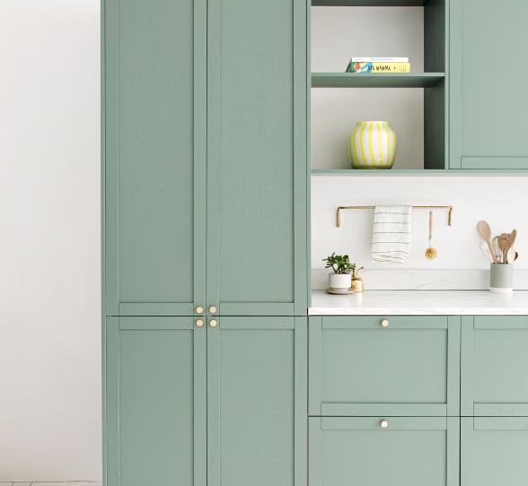
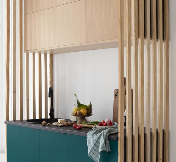
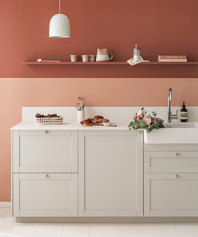
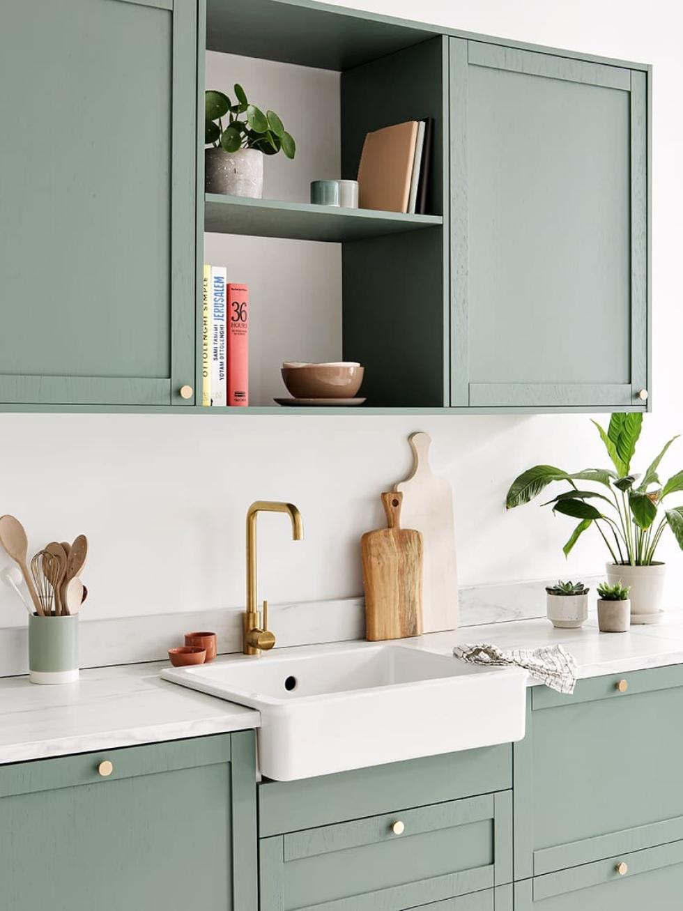
Diverting, creating, making and remaking... As you can tell, this is our great passion! Our favourite playground being the multitalented cover panel. Originally designed to hide the sides of cabinet frames and fill the gap between a column and a wall, they do have a way of sparking our creativity. The most recent experiment was using offcuts to create open shelves. Simply screwed in from the inside of the cabinets, they blend in with the decor and add a little lightness to this Green 03 - Vert de gris layout.
Well-placed handles
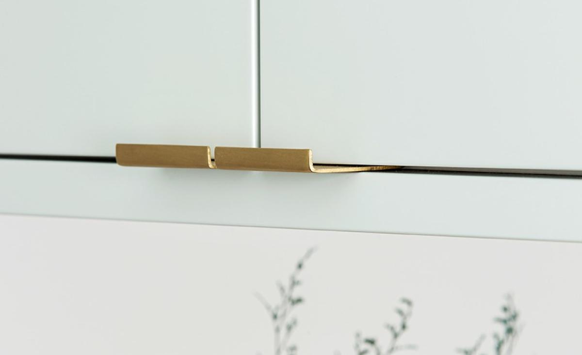
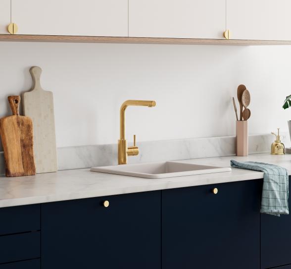
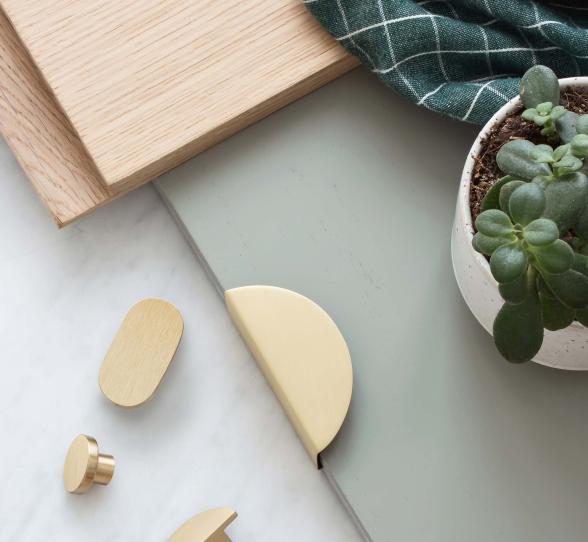
You only had to lay your eyes on them once to know: for your handles, it'll be brass Liseret or nothing! As for their location, that's another story... Simply placed on the edge of your fronts, our Liserets will fulfil all your interior fantasies. Marie Froideval understood this, playing around with them to give rhythm to Marina's (founder of La Seinographe) kitchen. Up, down, sideways... One word of advice: have fun!
An unexpected listel
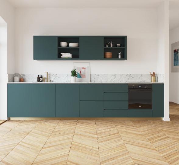
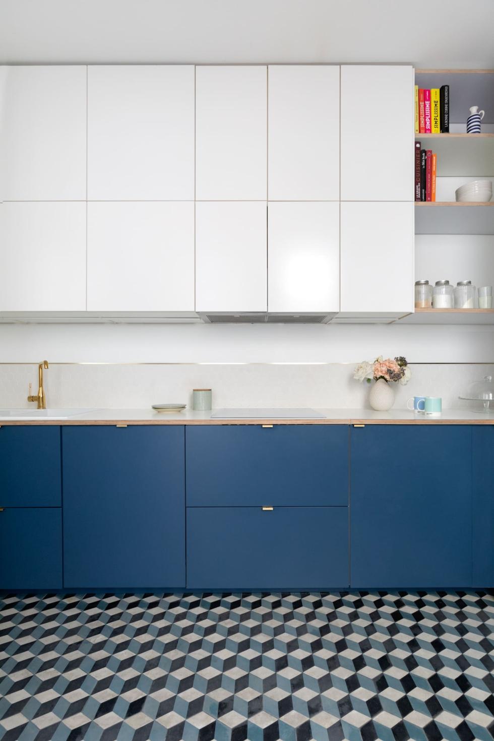
"Cover panel", you have. "Farmhouse sink" too. Ready to level up? On the agenda for today, the "listel". Chosen from your favourite materials - such as brass, this little strip can change everything... Place it on the floor to emphasise contrast between a parquet floor and cement tiles, or on the wall to define your splashback. Here, the interior designers at Mon Plan d'Appart have used this trick to make the transition between the overhead and lower cabinets. Brilliant!

Brass: worth its weight in gold
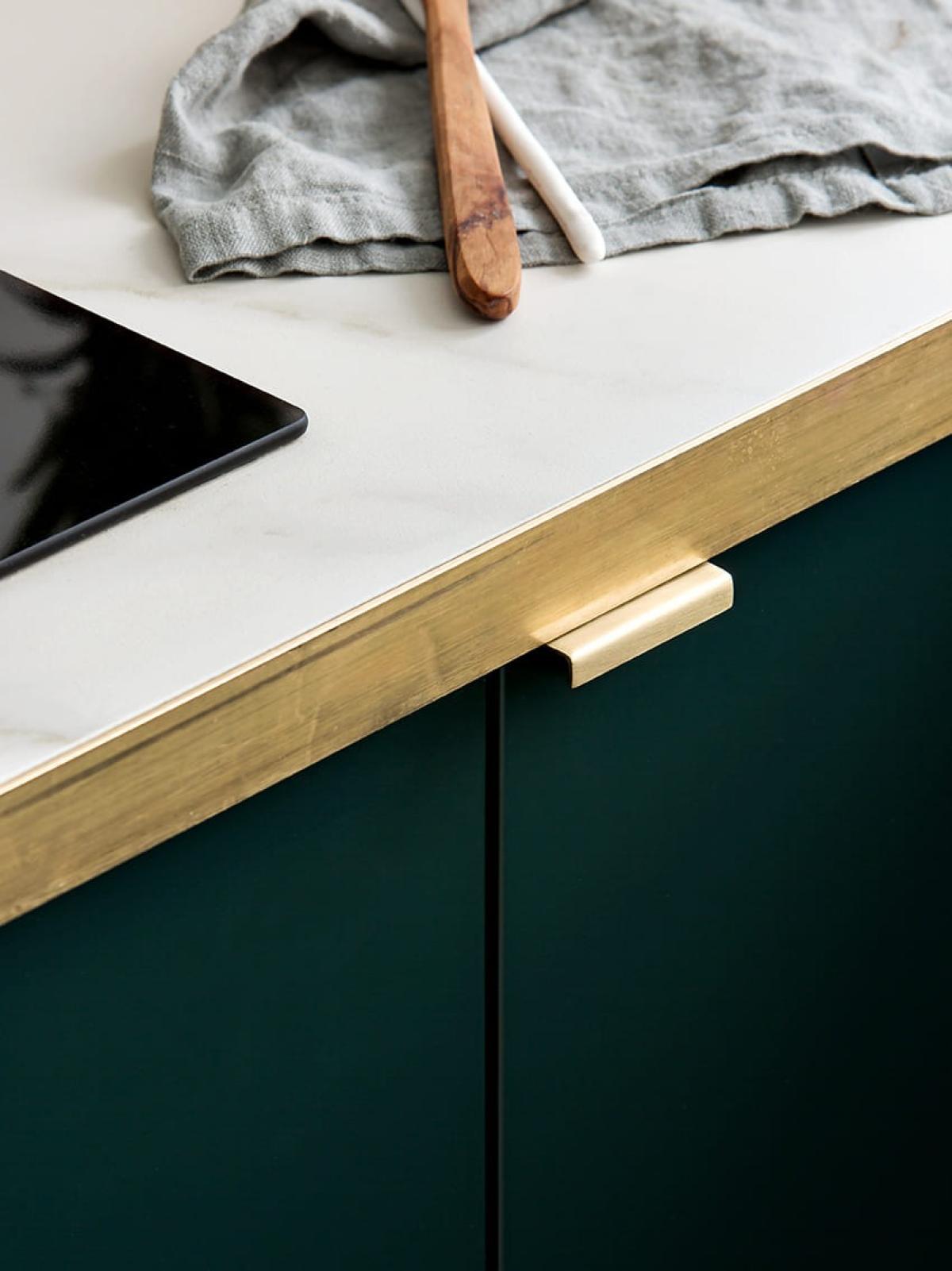
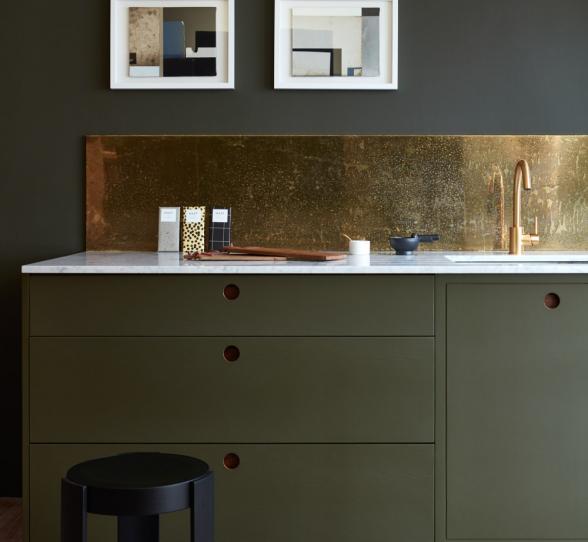
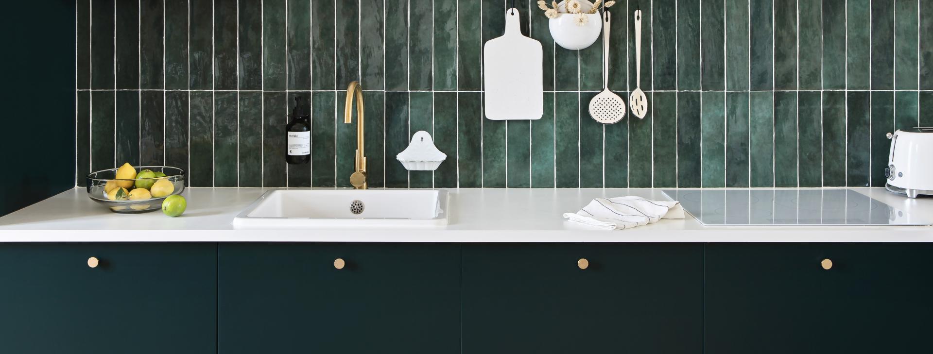
It can single-handedly change the look of your kitchen. Whether you opt for natural stone or laminate, dark granite or white marble, quartz, terrazzo or wood; the countertop sets the tone. The only downer is the price... which can quickly skyrocket depending on the surface to be covered and the material chosen. The founder of Studio Mariekke has turned this budgetary constraint into a stylistic signature by pairing porcelain stoneware with a brass edge. A unique and economical alternative reminiscent of a charming Parisian bistro, it adds a touch of zest to this Green 02 - Sombre forest and Green 01 - Amandier grisé kitchen.
Contrasting finishes
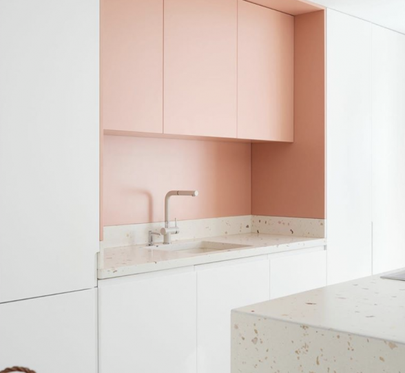
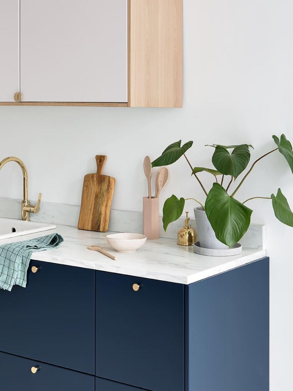
Four cabinets high, four cabinets low... At first glance, your kitchen looks quite simple. Switch up your Ikea plan! The 15 colours of our range all contain a touch of grey, perfect to mix and match. Natural woods are also a great choice to spruce up your layout, like this kitchen created at Studio Plum Living. With its slight pink tinge, our natural Oak adds a little colour to our Beige 01 - Beige rosé!
Unique dividers
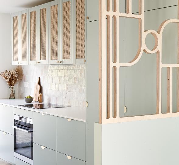
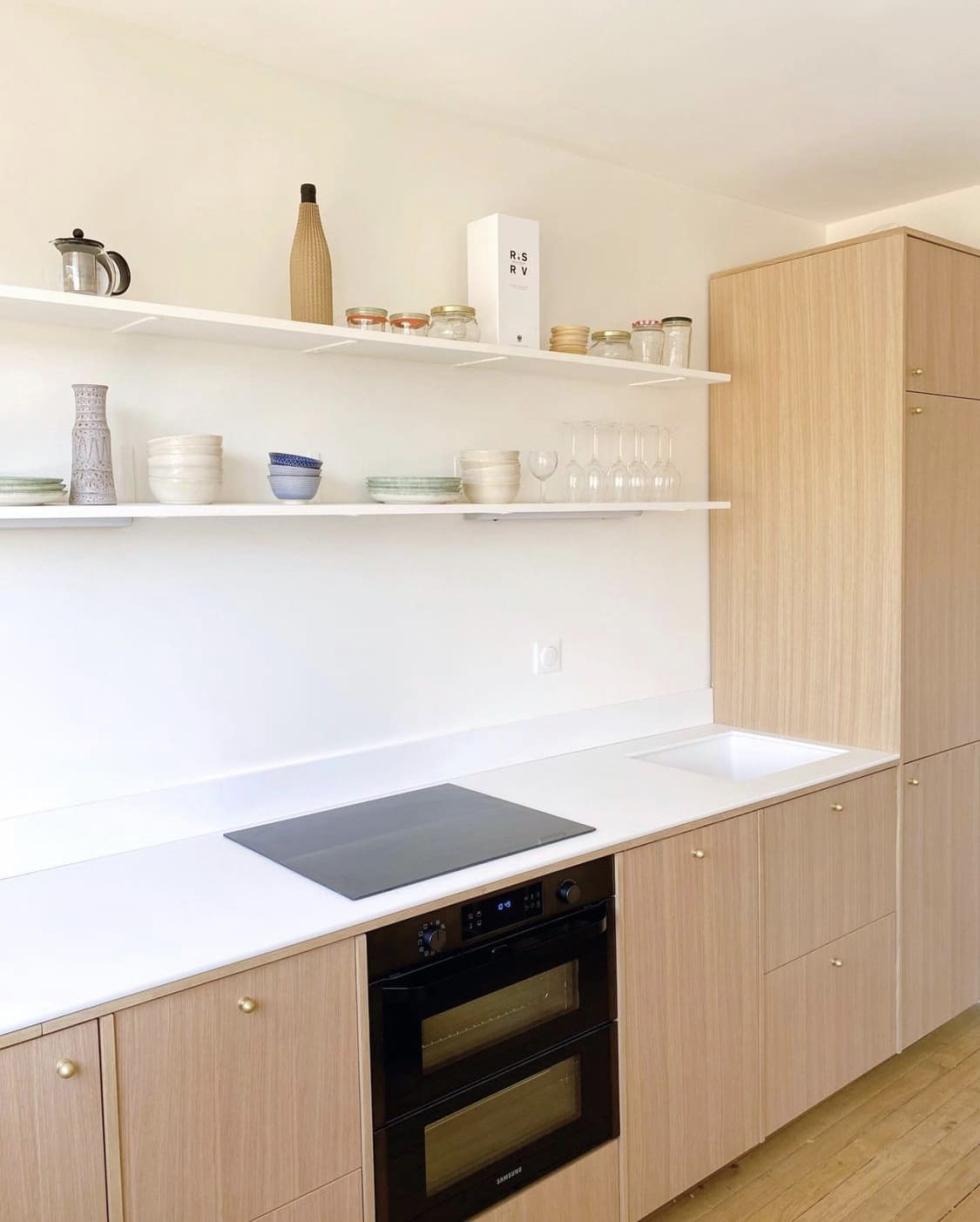
"Has anyone seen a PF Amandier in 39?" "What's the SKU of a 40-60 in smooth Blue 05 - Bleu paon?" "The Delta? You have to put it on the edge!" Faced with the blank stares of onlookers, we have come to terms with the fact that Plum Living is a dialect in its own right. The most recent addition to our vocabulary: the divider. Don't take your binders out just yet! These are actually just the cover panels inserted between each Metod cabinet (once the kitchen is assembled) to create a frame effect around your fronts. We particularly like them in natural wood, as shown in this project by the Bo Renov agency. Here, the fitter slipped a cover panel horizontally under the countertop for a play on lines.

A plinth in disguise
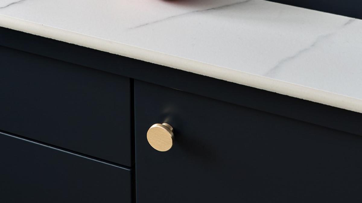
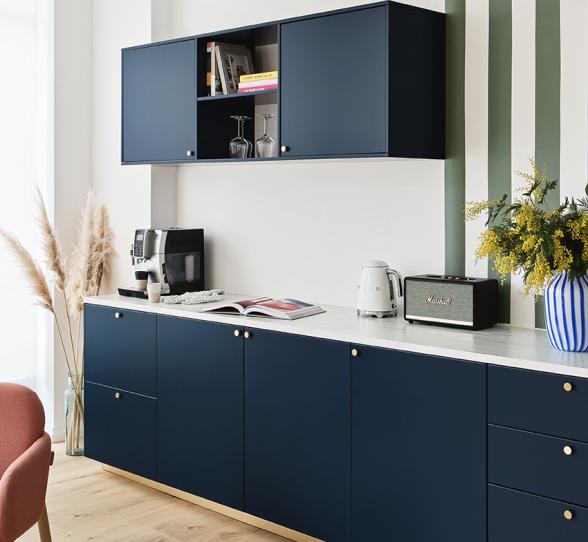
You take your large marble-effect porcelain stoneware tiles. You cut them to size and stick them to a waterproof medium countertop, making sure to create the finest possible joints of course... The illusion is *almost* perfect. On closer inspection, there is still one small elephant in the room. Yes, we're talking about the edge, which is anything but aesthetic. We've got tricks! Alexandra (Content Manager @ Plum Living), had the genius idea to cut a plinth across its width to match her Blue 02 - Bleu nuit fronts. Voila!
