What colour to pair with white in your kitchen?
It could have been worse, right...? It could be bright red, outdated or light years away from your style. Sure, it lacks a little personality, but with white, your kitchen has the merit of being neutral. Make it your playground! All you need to do is change a few fronts to give it a new life, but which colour to match with white? From our Blue 01 - Lagon to Green 03 - Vert de gris, or our Green 02 - Sombre forest and Blue 02 - Bleu nuit, all combinations are possible! The results do the talking.
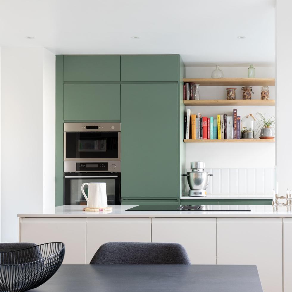
Green 03 - Vert de gris and white, to define your spaces
In the kitchen, Green 03 - Vert de gris fronts. In the living room, an island we can only dream of. Mon Plan d'Appart has struck again! The agency's interior designers have played with white fronts, subtly separating the living room from the kitchen. The immaculate splashback and countertop accentuate the two-tone aspect of this layout.

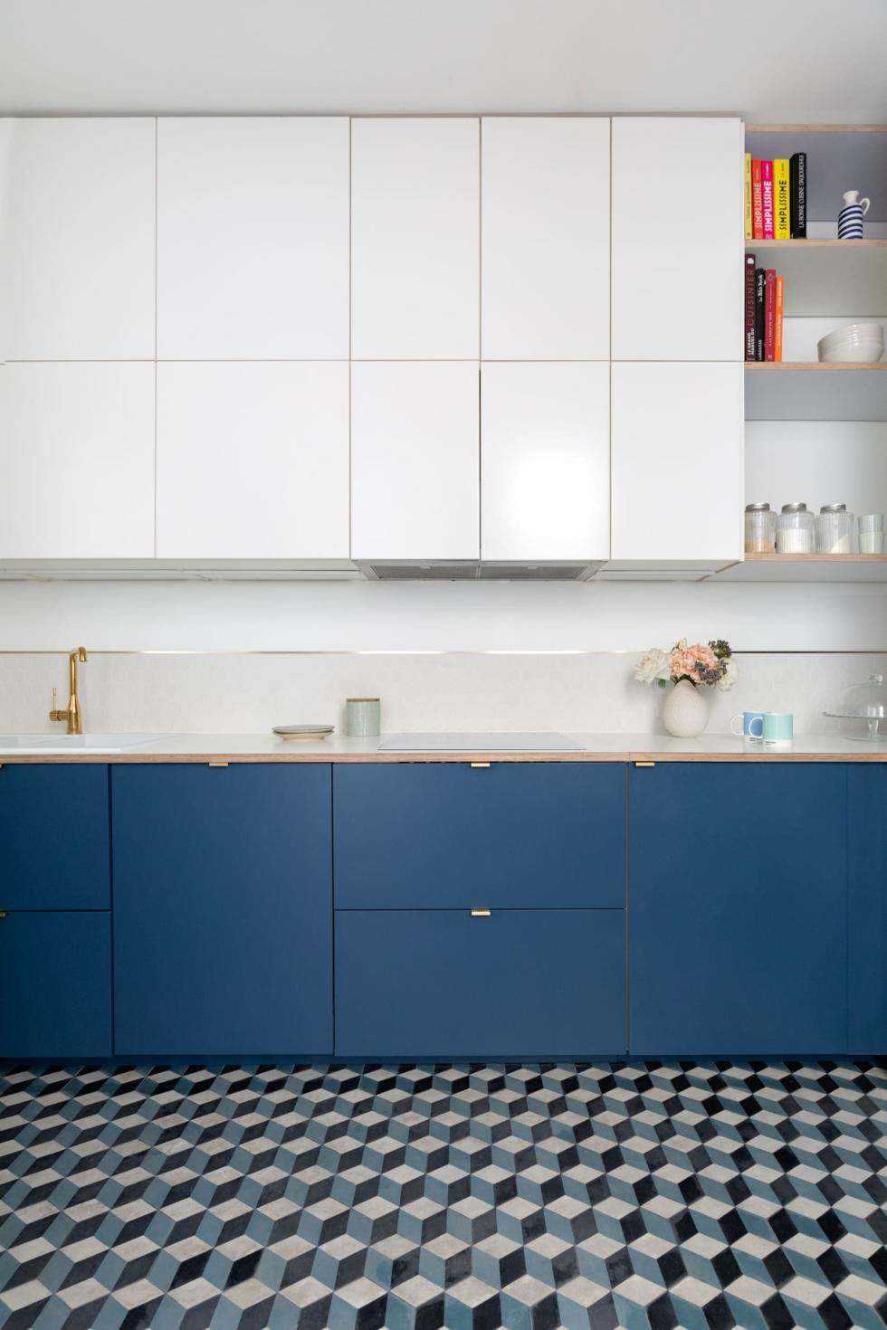
Blue 03 - Bleu gris and white, for a guaranteed optical effect
With a ceiling at 3 metres high, your kitchen is not short of space. The risk? By increasing high storage compartments, you risk feeling squashed, even more so if you opt for a strong colour. The interior designers at Mon Plan d'Appart have avoided this problem by choosing white fronts to cover the wall cabinets. Lighter visually, they highlight the volume of the room without giving up storage space. Installed below, our Blue 03 - Bleu gris fronts echo the cement tiles and balance the room with an optical effect.
Green 01 - Amandier grisé and white, a celebration of softness

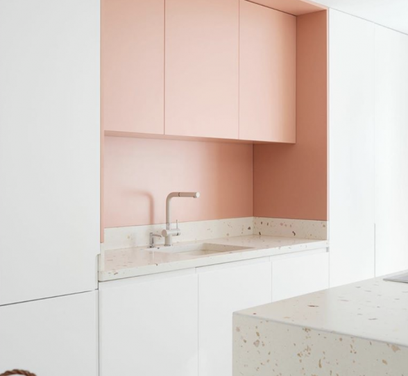
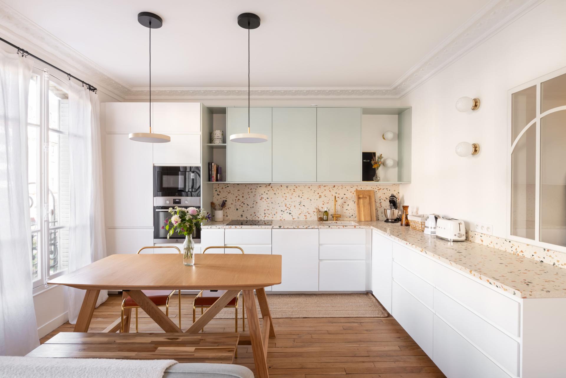
Between your Pinterest board and your renovation project, budget often plays a role. But don't give up on your dream interior! White fronts make it possible to lighten the look, leaving room in your budget for what matters to you most. Add three doors in smooth Green 01 - Amandier grisé matte lacquer, highlighted with matching cover panels creating open shelves, and you've got yourself an original layout at a reasonable price, further enhanced with a terrazzo countertop.
Blue 01 - Lagon and white
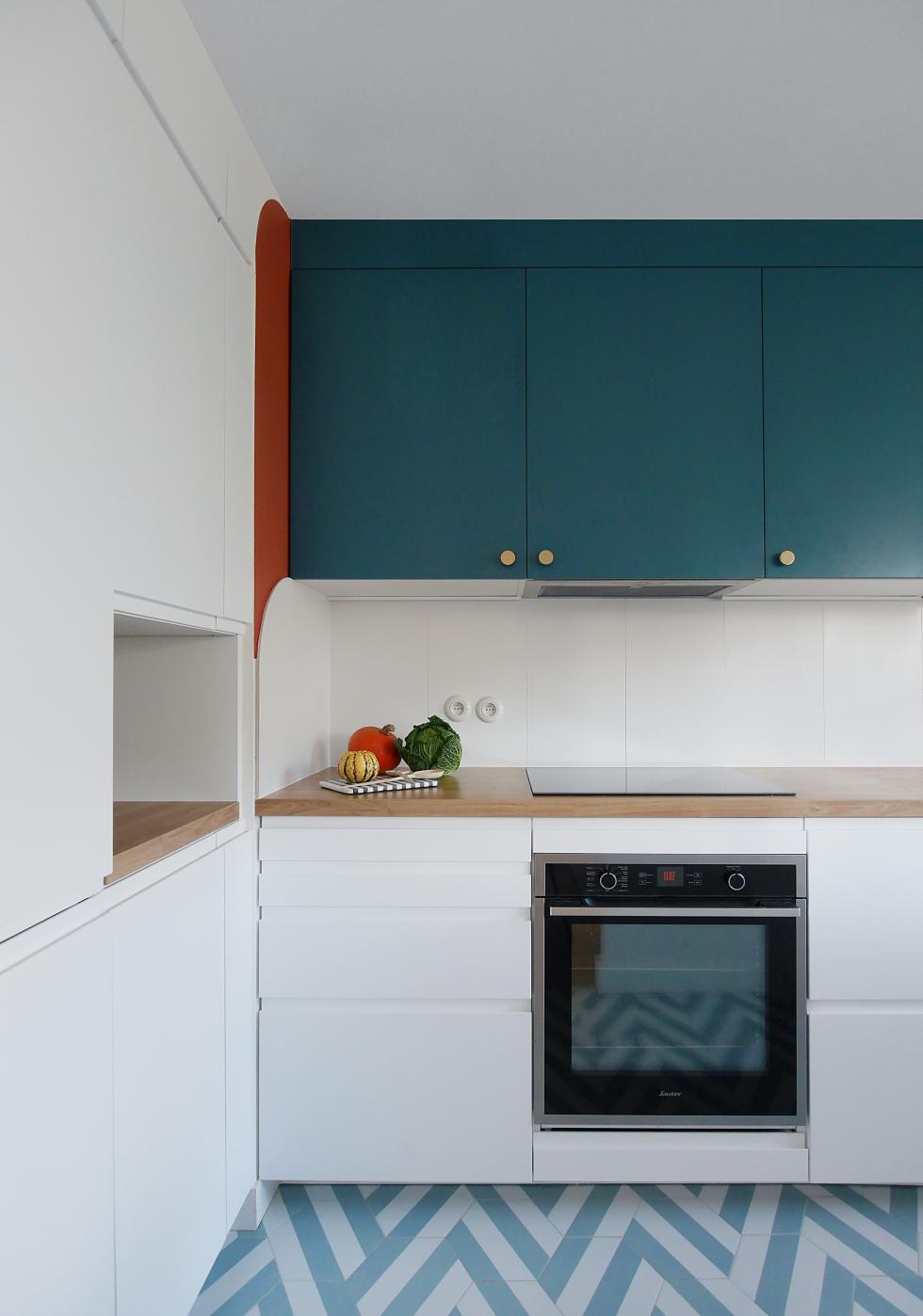
We keep writing about it: it's the little details that make our favourite projects so special! This project by Marn Deco is no exception. Interior designer Nicolas Payet is a lover of colour and has succeeded in making us forget that he started with a white base. Chosen in a shade reminiscent of the floor, our fronts in Blue 01 - Lagon extend to the ceiling thanks to a finishing panel that gives the illusion of a full height kitchen. Simply painted on the adjoining wall, the carmine red arch reinforces the personality of the room.

Blue 02 - Bleu nuit and white, strong yet subtle
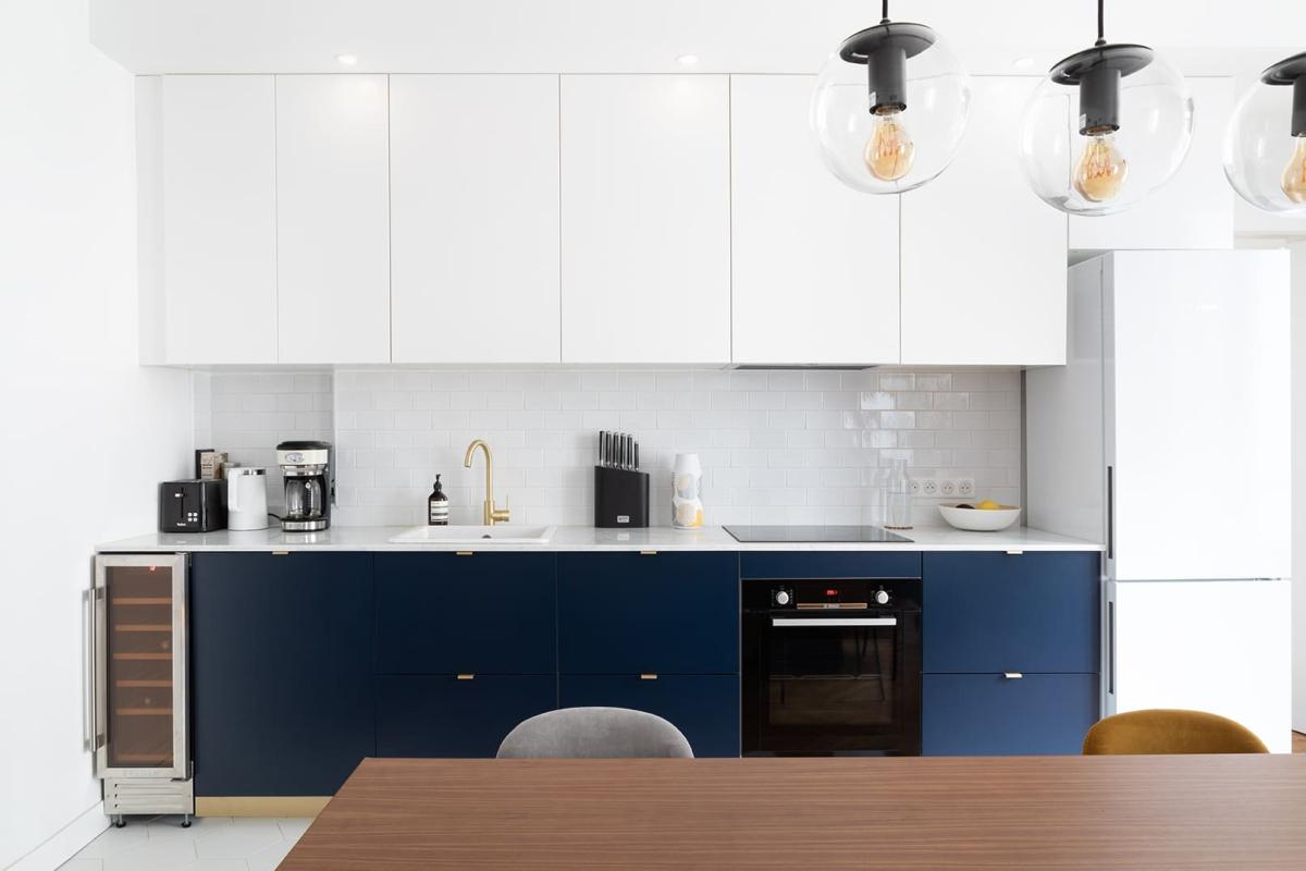
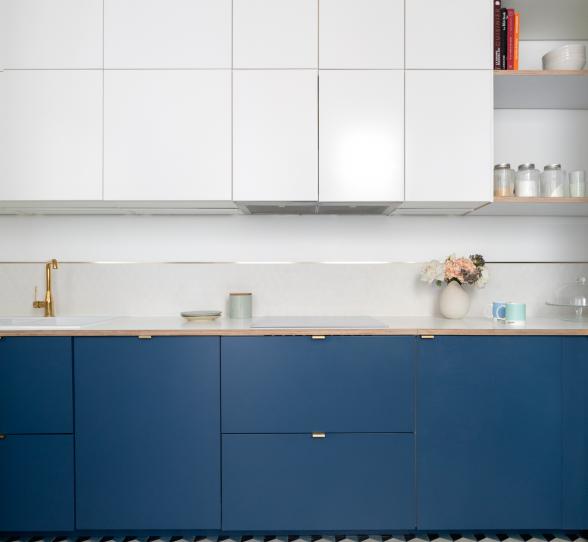
It's the headache of open kitchens: how to create a space with personality without taking over the whole room? Interior designer Déborah Bettan designed this kitchen like a stylish piece of furniture, combining white with our smooth Blue 02 - Bleu nuit matte lacquered fronts. Neutral and discreet, the high fronts leave the spotlight to the low cabinets. The immaculate splashback and fridge emphasise this feeling, while the brass details draw the eye to the colour. Clever!
Red 01 - Terra and white, for a boost at little cost
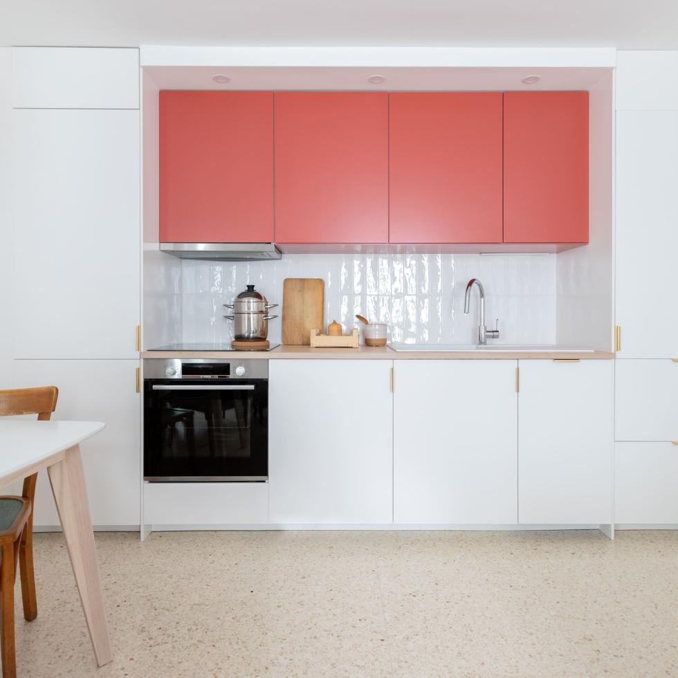
Although loved for its vibrancy and depth, and never failing to make an impression...our Red 01 - Terra can be difficult task to take on! Forget a full look: combine it with white to lighten its punch. Like a hyphen, it forms the link between the two columns of this immaculate kitchen. Less deep, the statement piece cabinets create the unexpected illusion of a mini-layout.
Beige 02 - Sable and white, for a touch of warmth
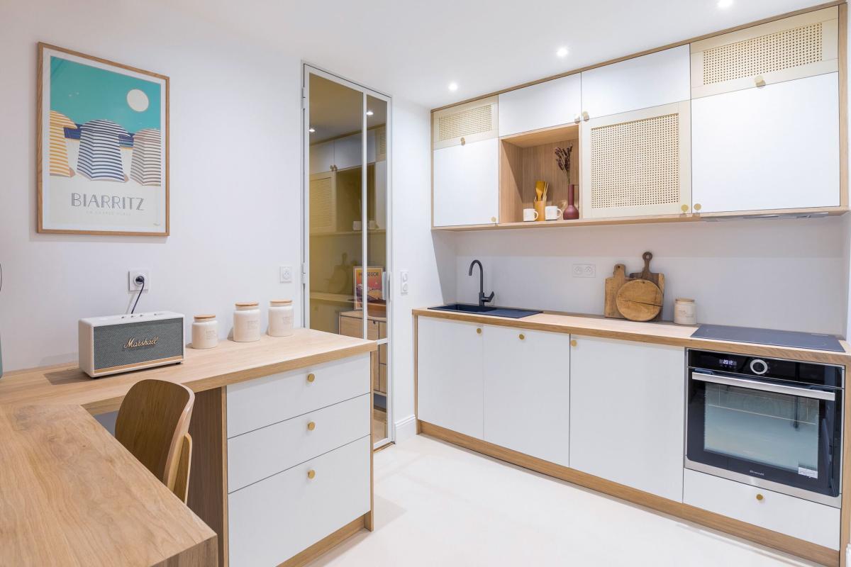
It's no coincidence that landlords are happy with them: inexpensive, crowd-pleasing and easy to replace, the white fronts sold by Ikea are ready to face a long life of renting. Good news if you're the tenant in question, they can be changed in a flash. Or you can choose to replace only part of them, as decorator Alex Movrel did with this white kitchen, adding a touch of warmth with three Beige 02 - Sable fronts. Tying in perfectly with the natural oak countertop and plinth, this is a low-budget trick that works!
