Home of Marina, founder of La Seinographe
Welcome to your journey through time in the heart of Paris. Even before entering Marina and Nicolas' home, the building makes it clear: we're in the groovy 70s. Here, terraces are a given, windows are open onto the city and the aesthetics are undeniable. An iconic style recognisable among them all, which the founder of La Seinographe concept store and her husband have chosen to utilise throughout their ultra-bright duplex. Shall we take you on a tour?
Time travel
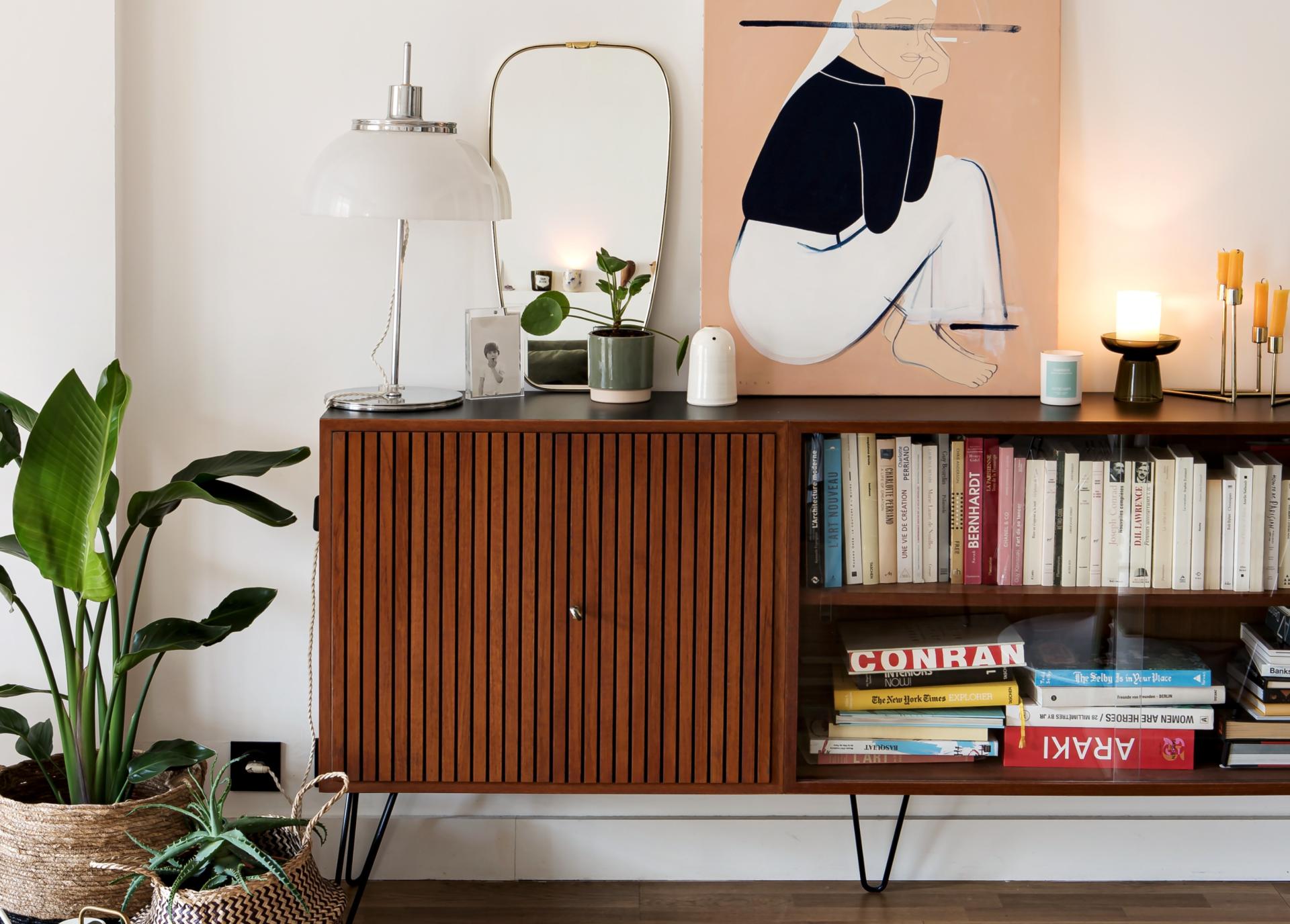
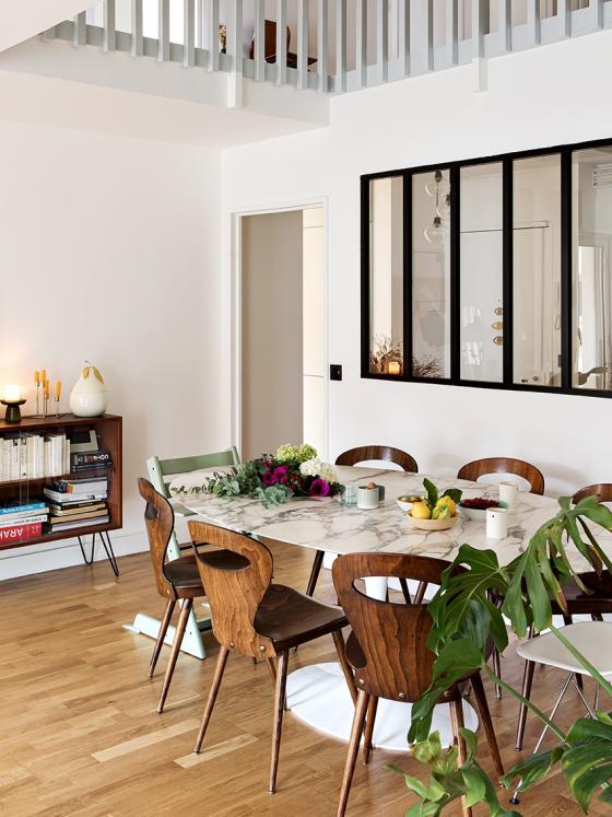
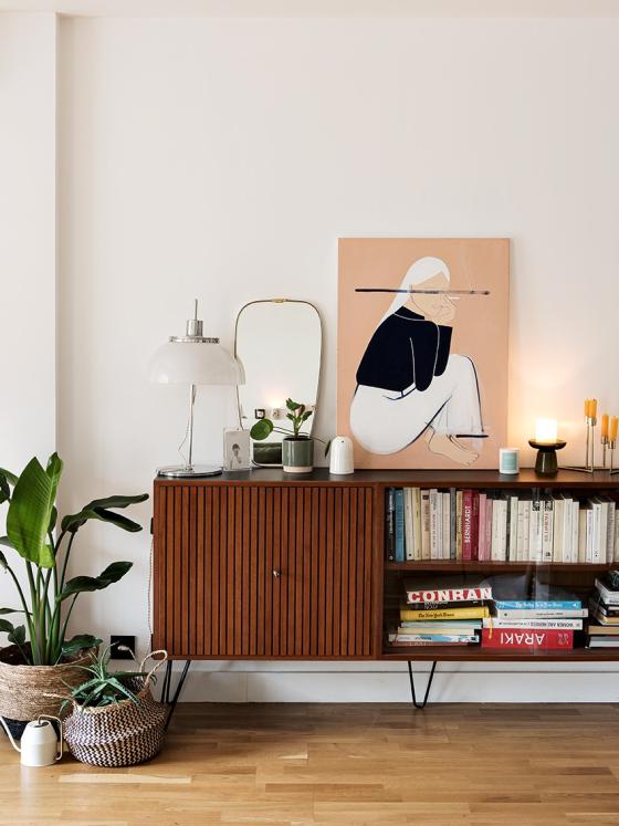
Combining contemporary comfort and 70s style is quite a task! Already renovated by the previous owners, Marina and Nicolas' flat lacked personality, especially in the bathrooms. An easy fix when the founder of la Seinographe let her passion for vintage furniture take over, calling on Studio Mariekke to make her kitchen and bathroom visions a reality. The dining room, with its capturing high ceiling, features a Knoll marble table and vintage chairs sourced by Marina. The Scandinavian sideboard found at a local antique shop only adds more charm to the room!
Play on vintage materials
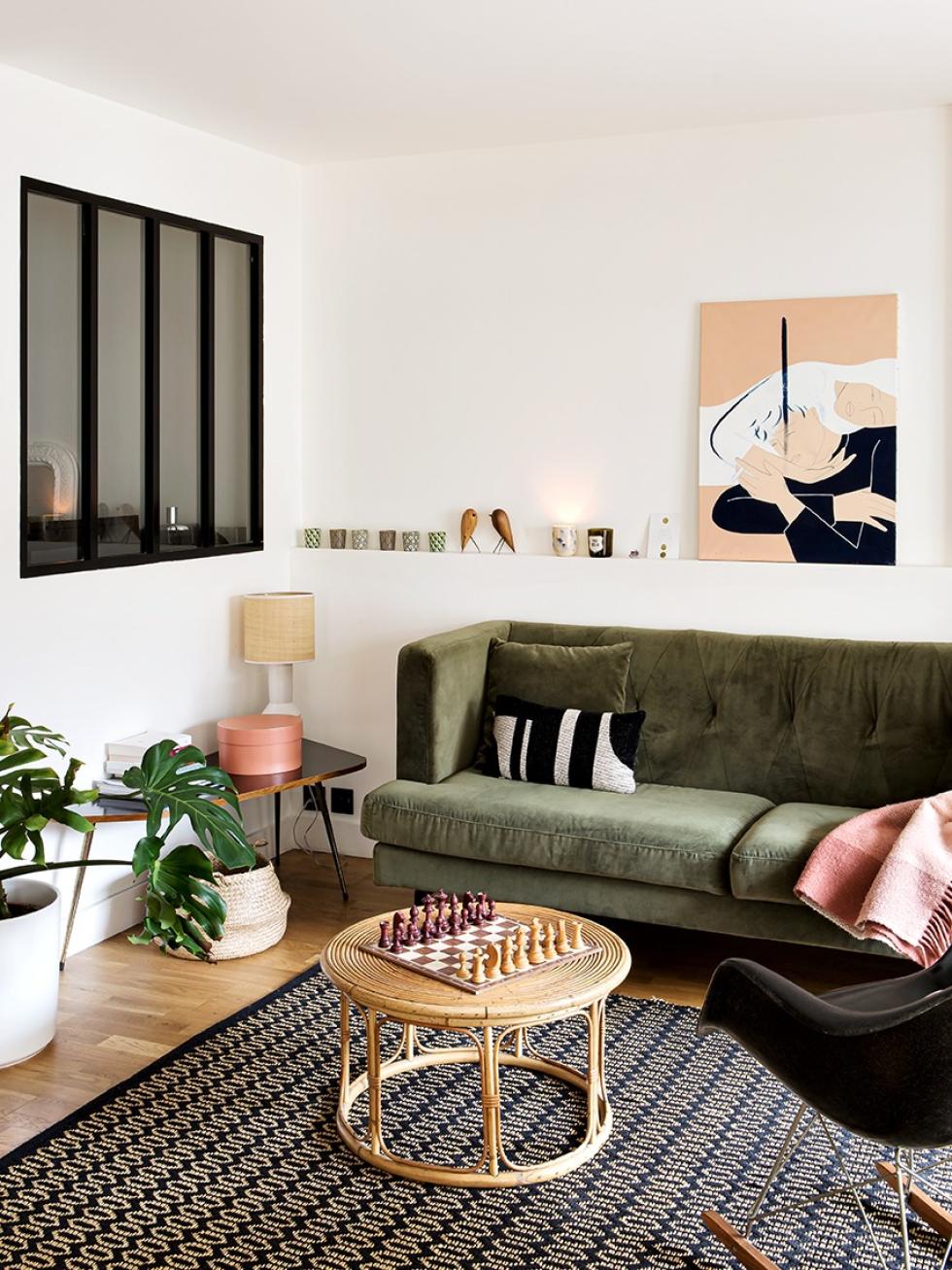
In the living room, the sofa by NV Gallery is an invitation to put your feet up and relax. Marina opted for a velvet model, the leading material of both 2021 and 1970! The side table legs, rattan coffee table and iconic armchair by Ray and Charles Eames further enhance the retro spirit of the room.

Two-tone kitchen with hidden storage
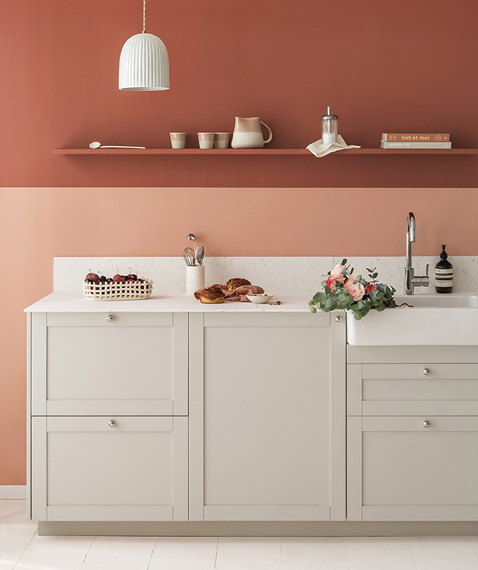
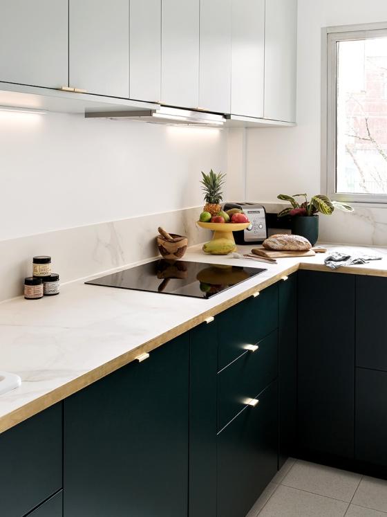
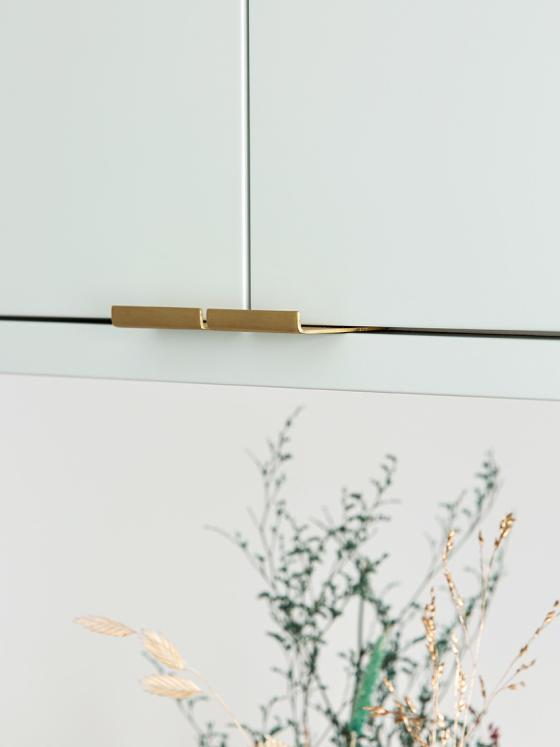
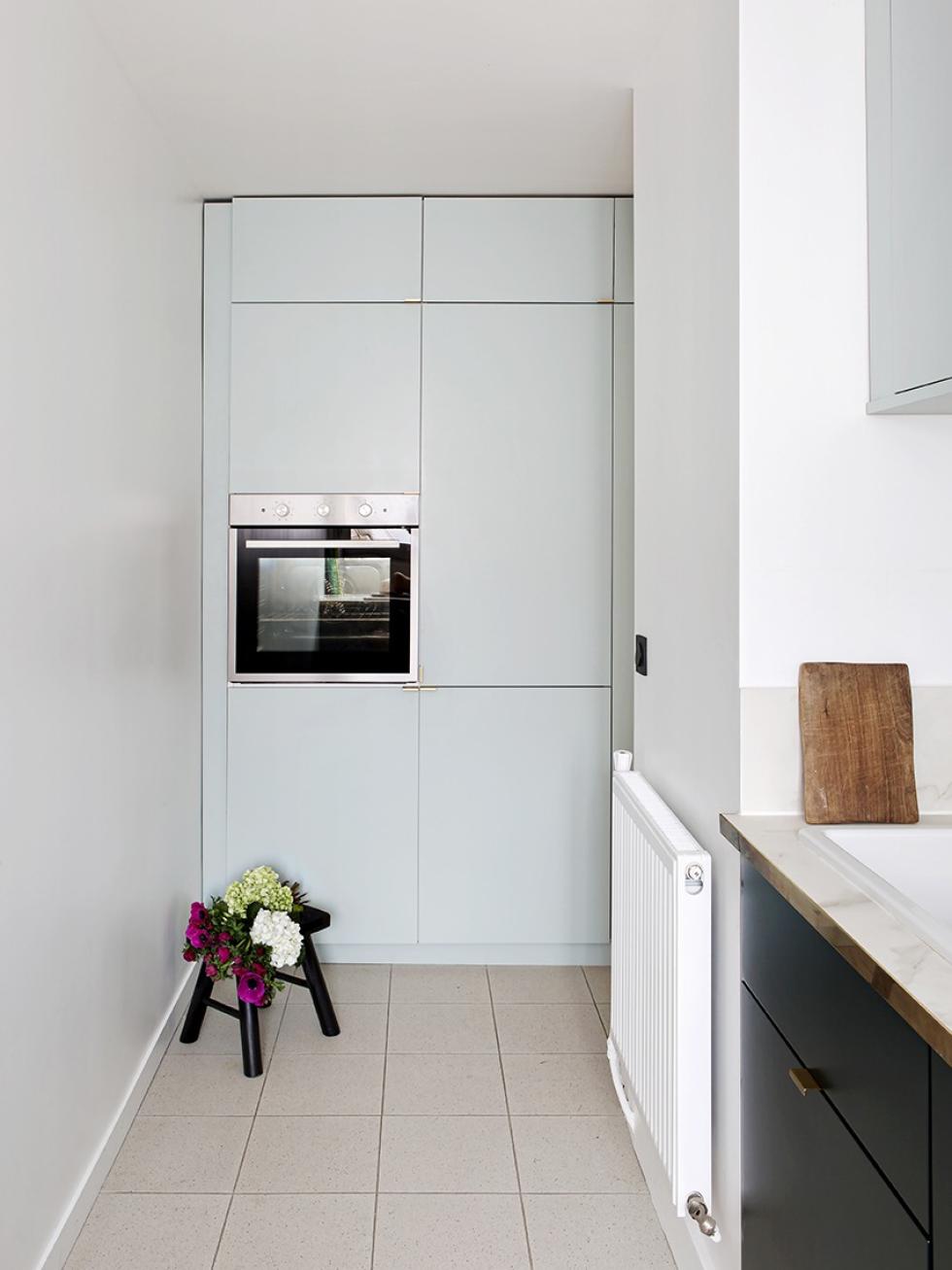
Aesthetic yet functional, visually light but full of storage, tastefully designed but on a limited budget... Marina and Nicolas had very specific ideas for their kitchen. Interior designerMarie Froideval took their wishes as the starting point for a unique two-tone Plum Living layout. The open shelves were soon replaced by closed overhead cabinets dressed up in our smooth Green 01 - Amandier grisé matte lacquer fronts, which contrast nicely against the Green 02 - Sombre forest lower units.
The charm of brass
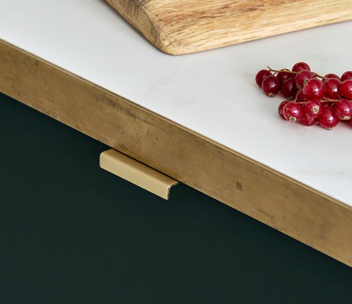
Too expensive and impractical for everyday use, natural stone didn't tick all the boxes for this project, despite Marina's wish for marble. The solution? Porcelain stoneware. The interior designer opted for large 3mx1m marble-effect slabs, cut to size on site and simply glued to a water-resistant medium sheet to cover the countertop. Reminiscent of a Parisian bistro, the brass profile from Tartaix hides the visible edge while pairing perfectly with our Liseret handles. "I tried to focus on the details to make a decorative and refined piece that breaks the codes of the classic kitchen" says Marie.
Metod + Pax
2 Metod columns... We're off to a good start. Marie added a little complexity to the kitchen by adding a Pax wardrobe (of different dimensions) to the modules that open onto the entrance, as well as additional units to create full-height storage. The Pax cabinet was cut to size on site to blend in with the decor, while the Plum Living doors were cut by a carpenter for a custom look. "We faced the bare edge towards the ceiling so it wouldn't be visible," explains the interior designer.
Graphic bathroom
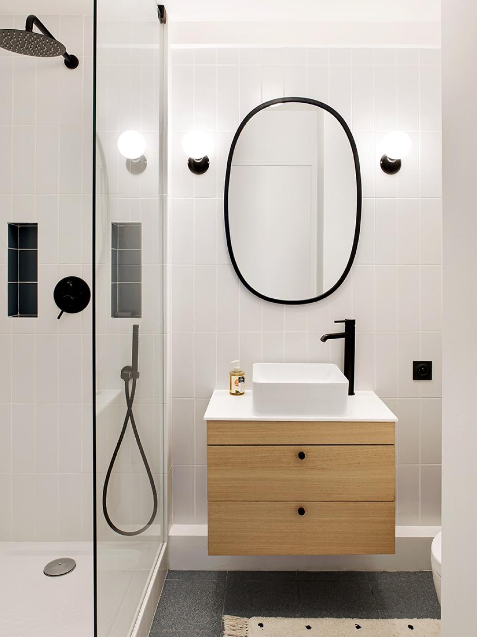
Marina and Nicolas' flat features two bathrooms totally redesigned by Studio Mariekke. On the ground floor, Marie Froideval has created a common theme of black touches with the door handles and Bakelite switches found throughout the flat. The custom-made vanity unit and Berber-inspired carpet bring a little warmth, while the earthenware ties the look together. Upstairs, Marie has taken full advantage of her carpenter's know-how to create a vanity unit home to a washing machine that is "out of sight, out of mind."

Work in progress
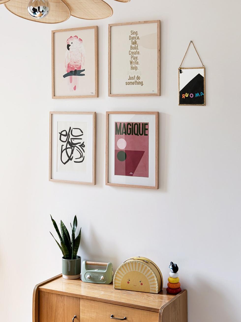
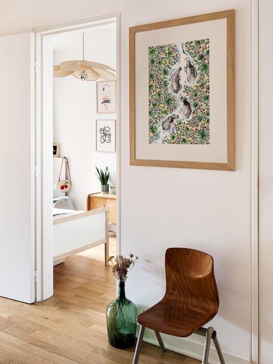
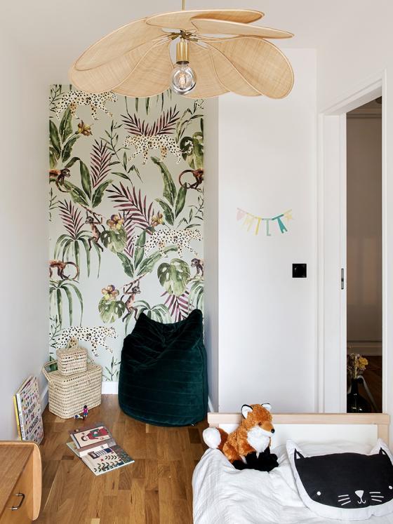
A love for vintage knows no age! Marina didn't hesitate mixing antique pieces with modern ones in her daughter Mila's bedroom. The Georges rattan pendant light showcases the natural material popular in the 70s. The poster by Emilie Bouguereau set above the vintage chair and demijohn (both found on Le Bon Coin) adds a creative touch to this light-filled landing.
Cloud of softness
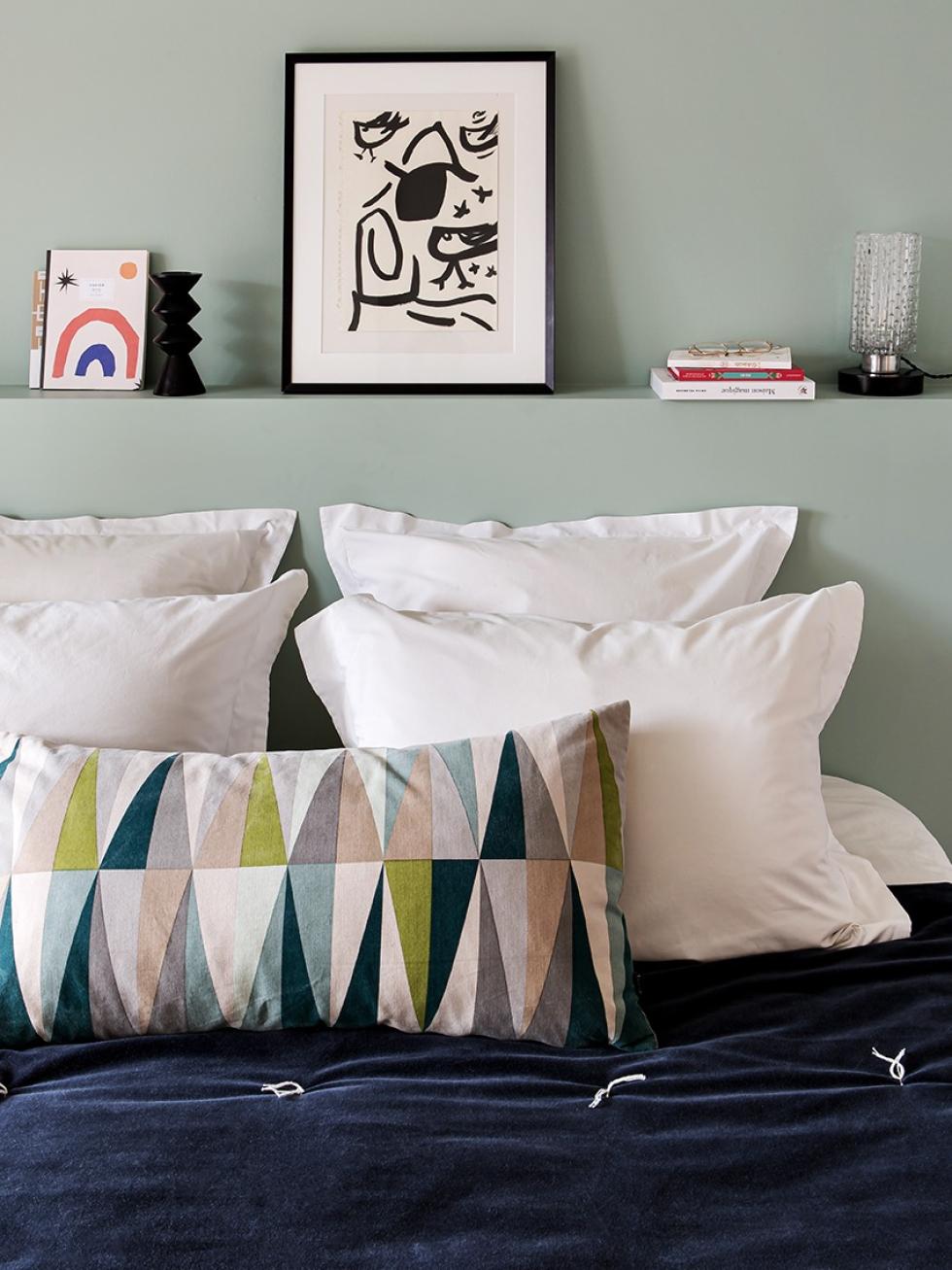
Take a pastel wall with a matching headboard. Add a few colourful cushions, personal pieces, and a velvet quilt that you can already imagine curling up in whatever the season, and you're left with a cloud of softness. Designed by Marina, the black & white poster recalls the style of the flat and gives personality to the room.

Ideas that inspire us
- The porcelain stoneware countertop with brass edging, more budget-friendly than natural stone!
- The clever combination of Pax and Metod columns
- The inherently retro-style found in every room of this flat.
