A duplex renovated by Cyrielle Wattinne
One renovation approach: knock everything down, then build it all again from scratch. Cyrielle Wattinne did exactly that: from floor to ceiling and over 5 months of construction, she oversaw the total rebirth of an outdated 130 m2 duplex apartment. The first step was to create a layout that made sense for the lifestyle of Marylaure, Antoine and their two daughters. The next step involved reinterpreting design codes of the past and present through carefully chosen details. With each door in light wood, along with balanced tones and clever touches on each floor, the interior designer reveals the behind-the-scenes of this timeless, heart-warming project.
Let's take you along for the ride!
A blank canvas

Trompe l'oeil
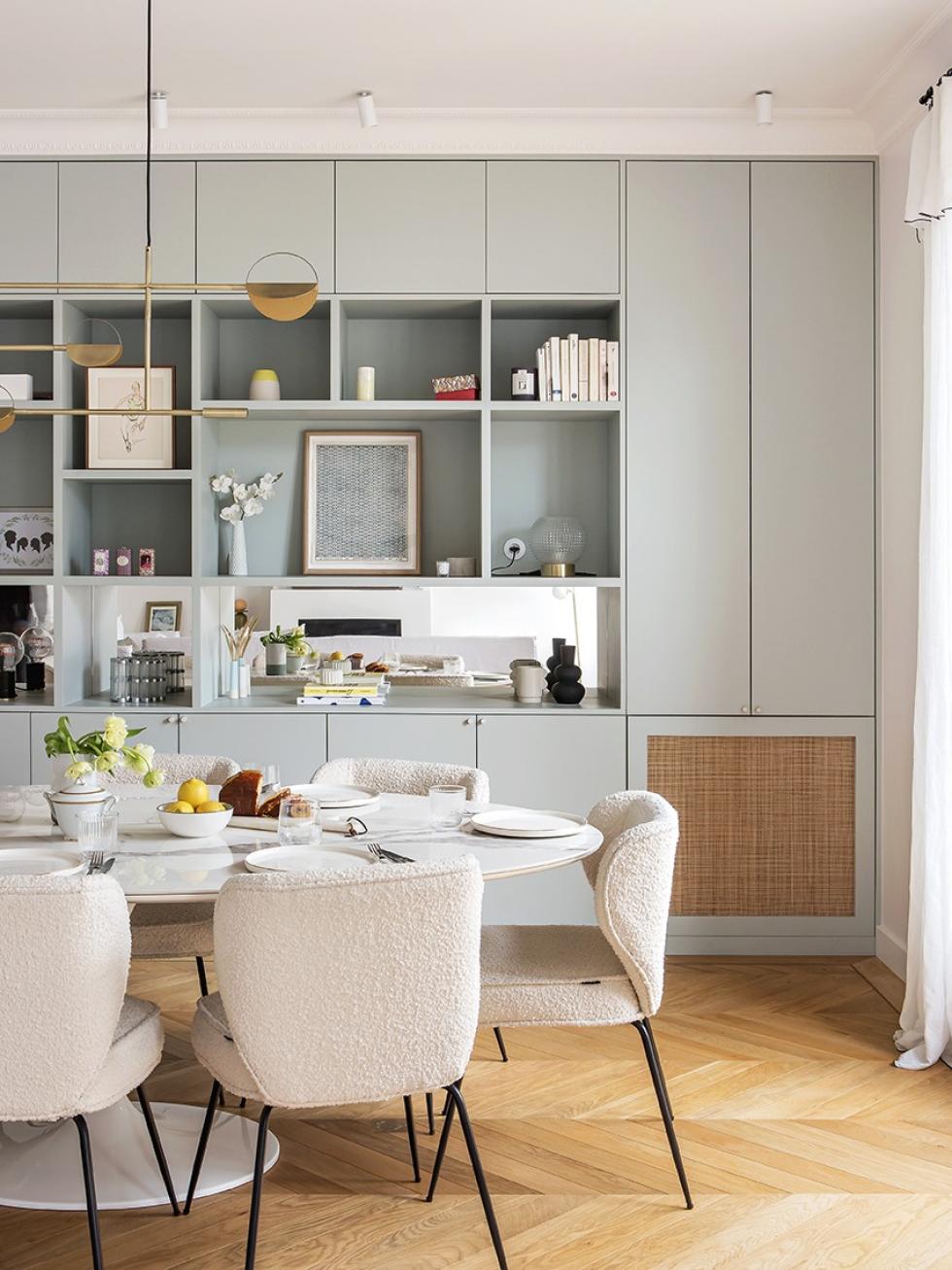
A luminous bubble
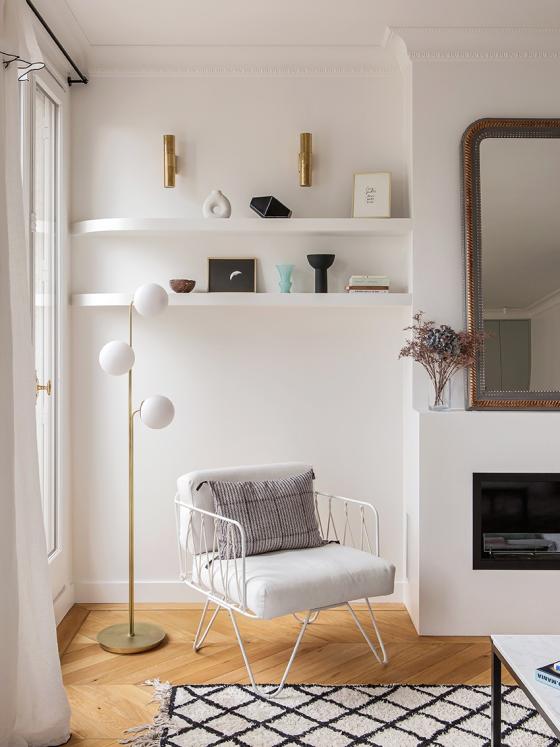
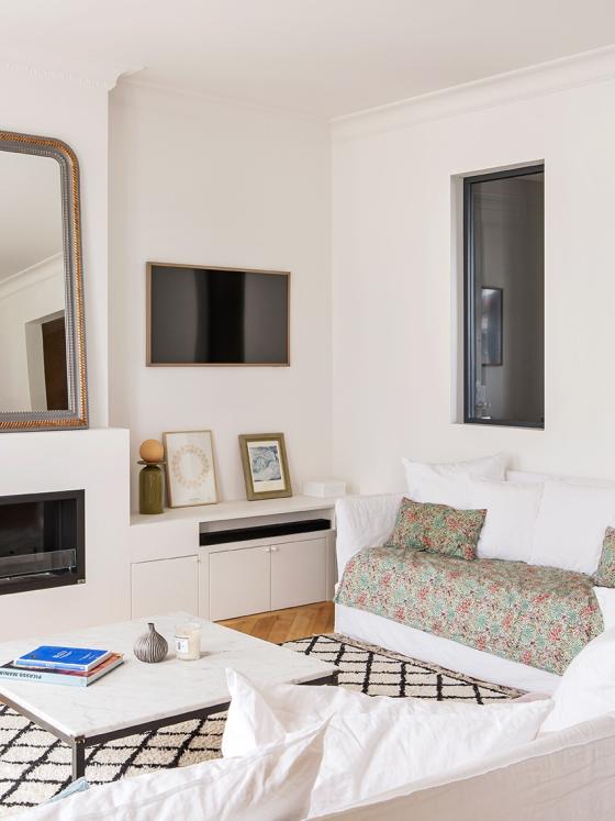
Now over to the living room, where two sofas inherited from Antoine and Marylaure's old apartment set the tone. "It's going to be all white, and that’s that!” Once the basis was set, Cyrielle added her touch: an open space here, and some warmth there. The bio-ethanol fireplace is hidden discreetly inside a box frame, on top of which rests a vintage mirror. Near the window, high shelves leave room below for an armchair and an assortment of decorative objects. Sleek (but still cosy).
The only way is wood
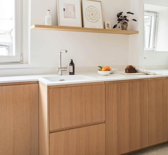
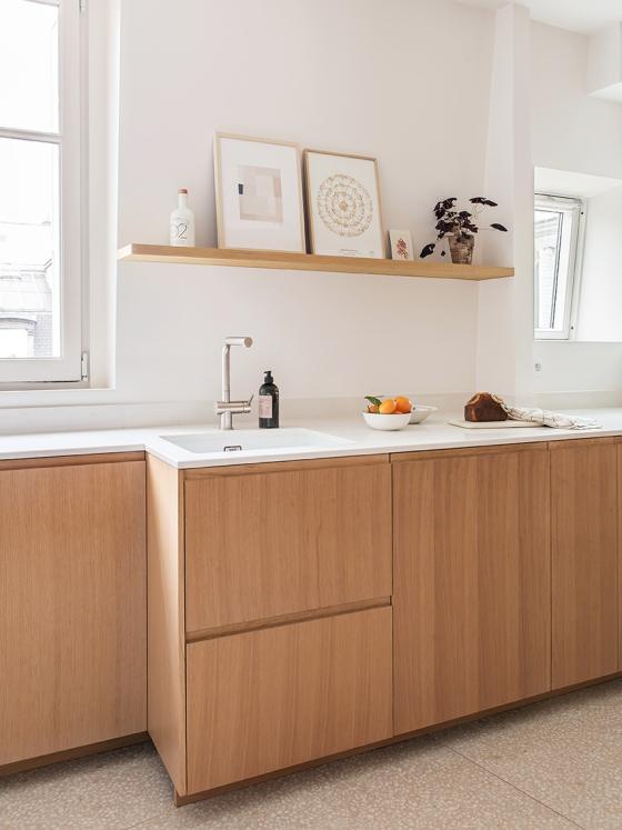
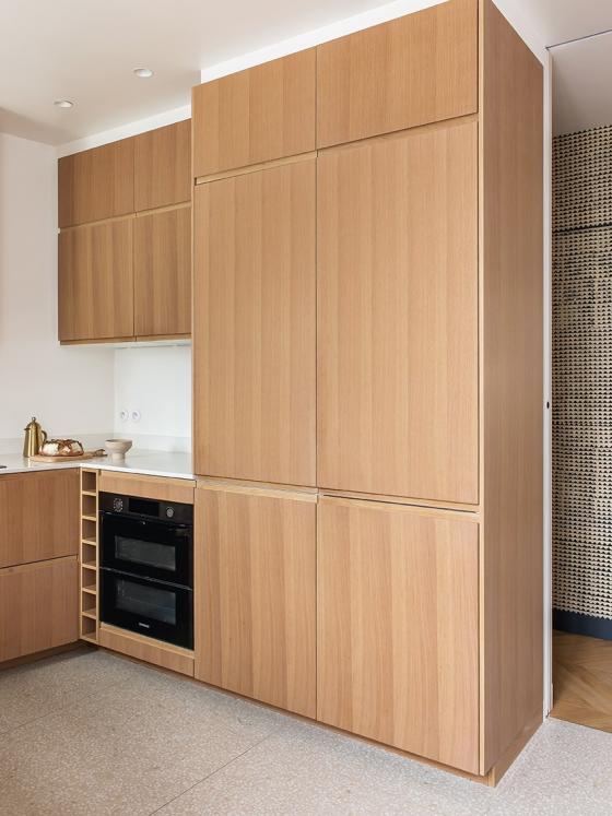
Although the kitchen layout underwent a couple of changes, the overall ‘look’ is clear. "Marylaure and Antoine wanted it to be minimalist and warm.” So naturally, Cyrielle opted for our U-Shape design in natural oak, rather than choosing cold handles and materials. And whilst the kitchen’s technical appliances are hidden behind high columns, the lower module reflects the daylight, thanks to its clean-finish worktop. A simple custom-made shelf is also integrated into the wall at an angle, another clean line added to the overall unit.
Rounding off the corners
Creating a bedroom cocoon

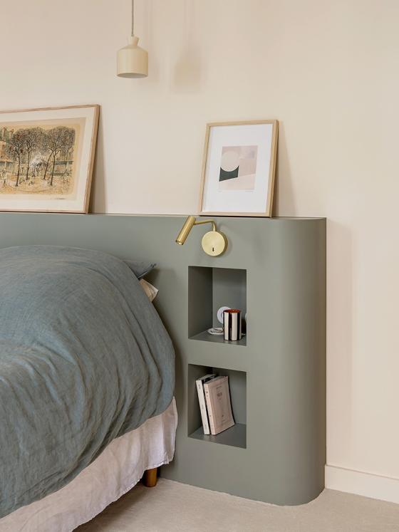
Decorative objects
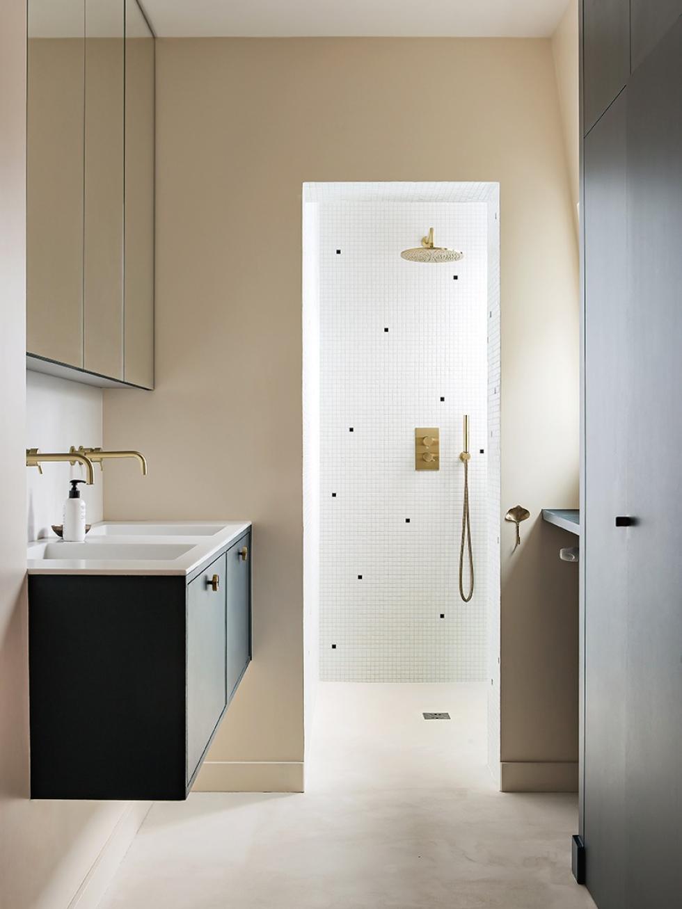
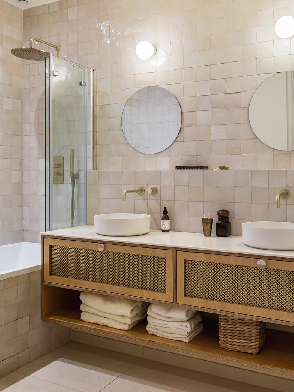
Powder puff

The magic of carpentry
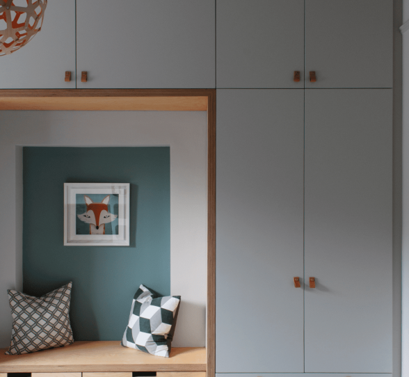
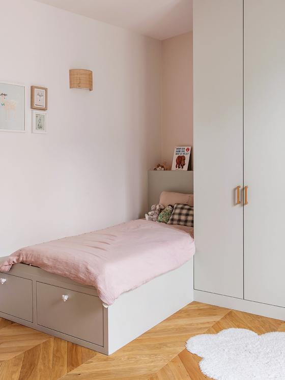
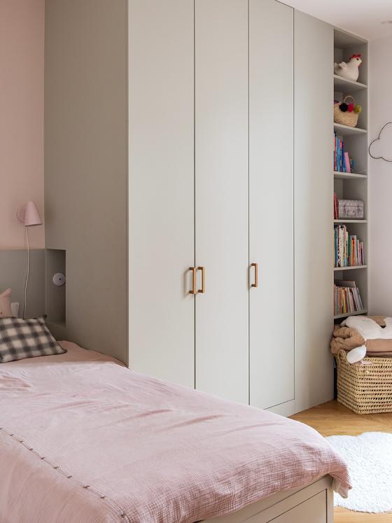
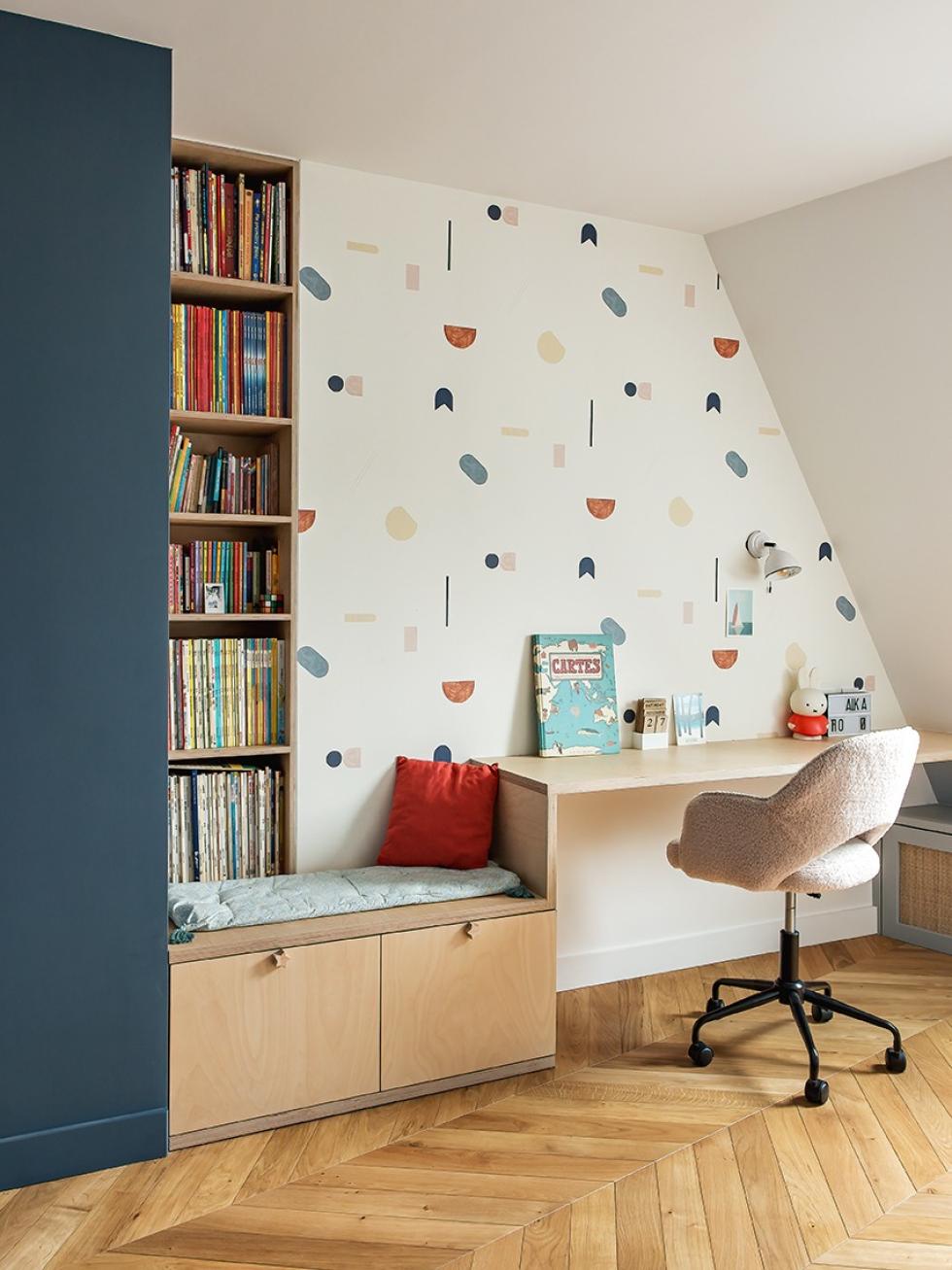
The brief was clear: this little girl's room had to be - and remain - organised! No problem for Cyrielle. She used made-to-measure carpentry to realign the walls, which also created a lot of storage space. In the corner, the bed rests on a base, with drawers below which are within easy reach. Extending from the headboard, several cupboards create a wardrobe, and on the end sits a bookshelf built from the open modules. Painted in subtle pastel colours, with sweet wooden handles as details, this room echoes the harmony found throughout the home.
Mission: optimisation

Trait(s) d'esprit
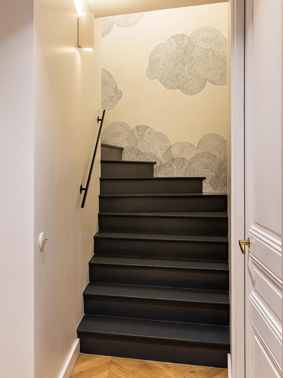
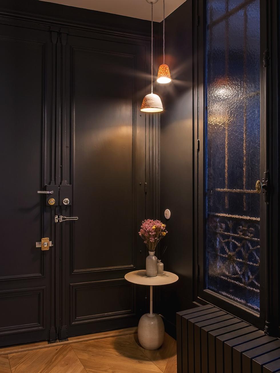
Often neglected, the corridor and the staircase can be seen as ‘dead space’. Not here, where Cyrielle has given them real personality. From the entrance, the black paint sets the tone, stretching from the door to the walls, creating a cosy box effect. The long corridor, serving all the rooms on the first floor, is covered in bold wallpaper to bring some movement to the space. Along the staircase, the cloud detailing invites you to climb the steps, which are painted black. Cyrielle’s final tip here: "both in pairs and placed off-centre, adding light spots can sculpt the space even more".

We’re inspired by…
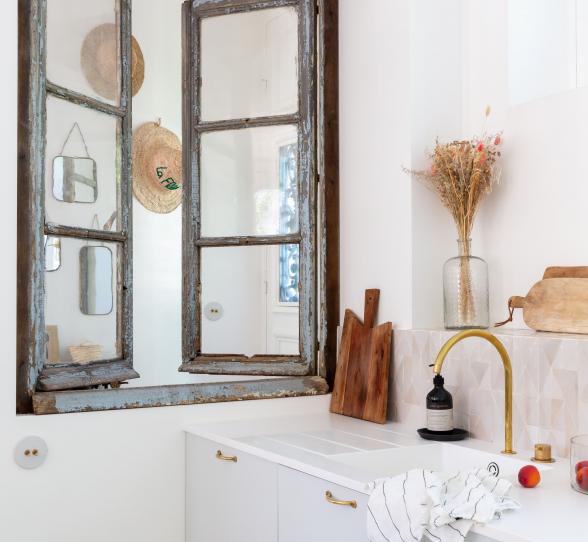
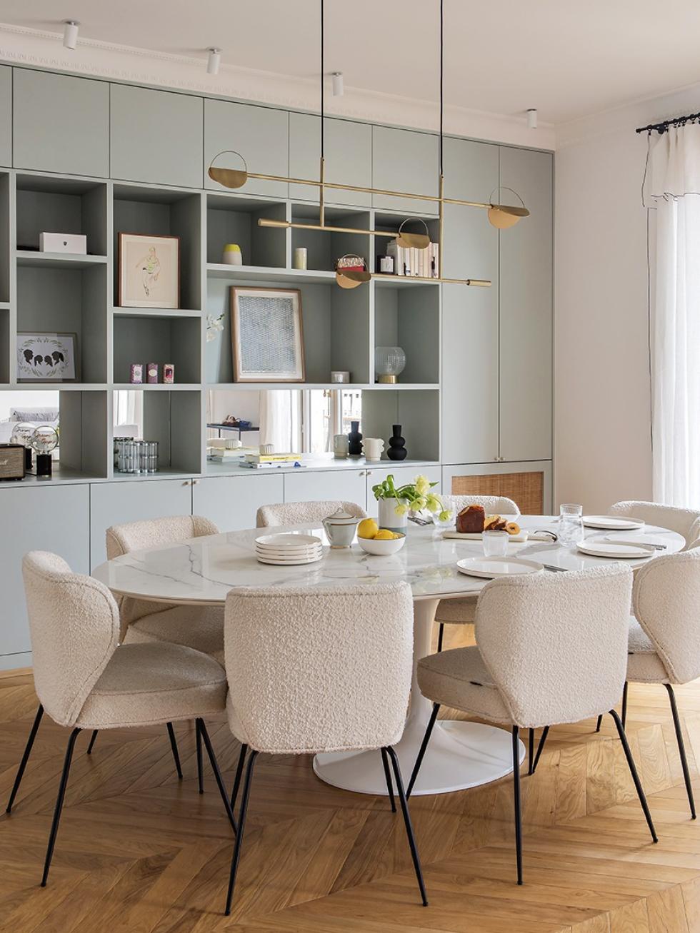
- Using oak and brass from room to room, creating a timeless theme. Mirrors that cover the lower modules of a bookcase to make the room feel more spacious.
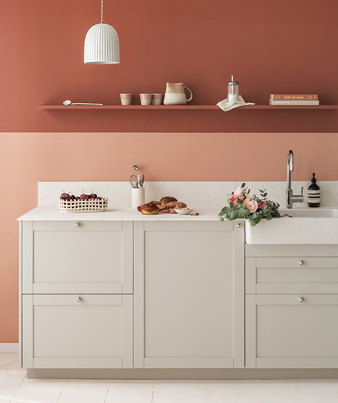
- Nude, peach or pastel paints: the use of pink in all shades.
- Black paint and bold use of wallpaper to enhance the hallway, entrance and staircase.
