At Elise Chalmin's
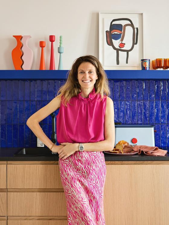
Parquet flooring, wall mouldings and light woodwork... On paper, Élise Chalmin's flat seems totally classic. But this Parisian designer has imagined an interior truly as colourful as her clothing line. Once you step inside, you see what we mean right away: here, the natural oak kitchen is highlighted by a Klein blue splashback, the alcoves are treated as decorative objects and the door frames as colourful ties between each room. Bright and fun-loving Élise has offered to inspire us as a guide for a Home Tour. Shall we show you around?
The big blue
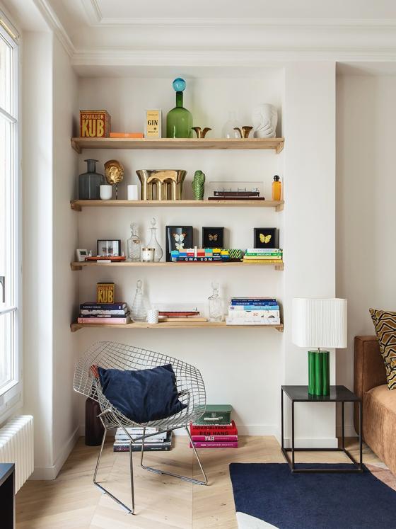
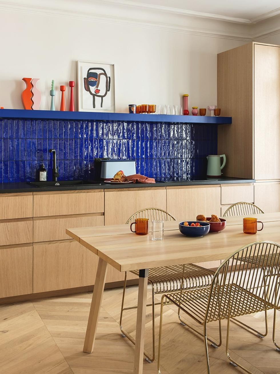
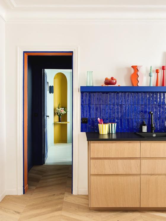
On one side, the walls remain white and paintings are kept on the floor. "It's all so spotless, I don't dare to start here!” On the shelves, objects collected over years have each found their own place. Placed on the other side of the room, this really stands out: bold and colourful. The kitchen instantly becomes the obvious centrepiece of the flat with its Klein blue splashback and natural oak fronts.
An open kitchen, or none at all
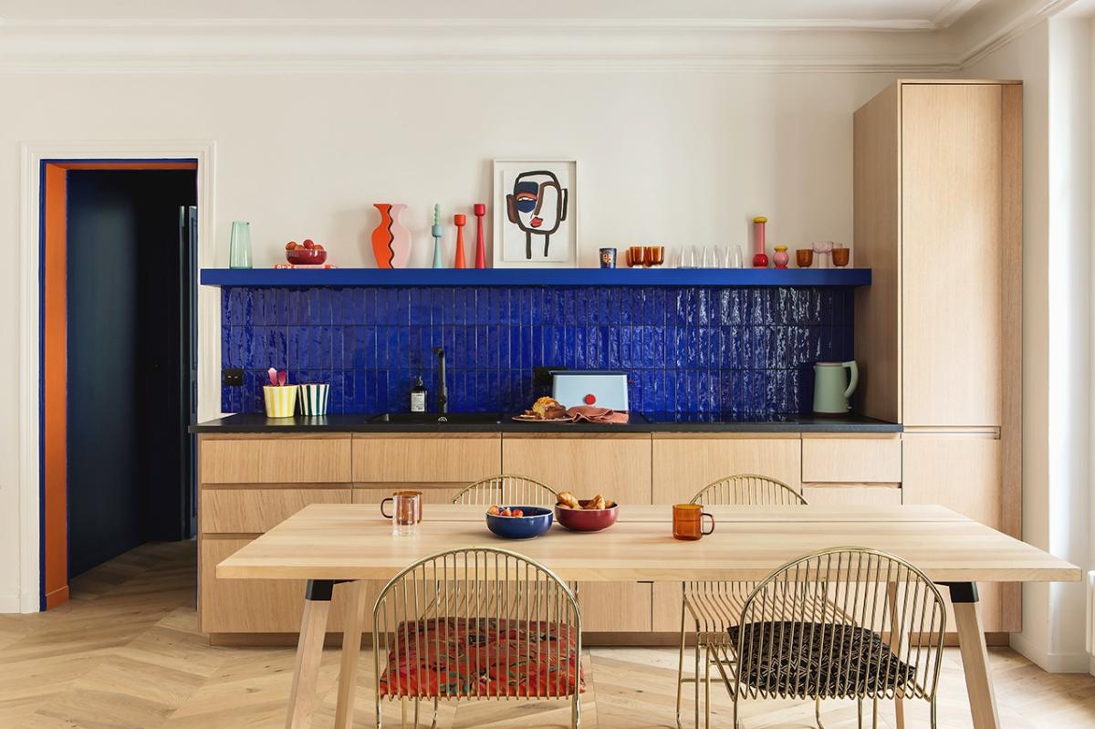
TThat was the condition before moving into space. Elise and Rodrigue’s kitchen had to be open. "The one in our old flat was separate, we found it so frustrating! We didn't want to feel detached when entertaining guests.” So, a bit of imagination and a good dose of efficiency later… The double living room was transformed, incorporating a kitchen that runs the length of the back wall.
A truly decorative object
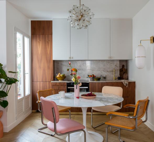
Don’t expect to see the extractor fan, the oven, or even wall units in this kitchen. Aside from our Line single-handle tap, which stands out against the zinc by Surface, Elise’s kitchen layout feels much more like a beautiful piece of furniture, than an actual kitchen. “I just wanted it to totally blend into the room.” No handles to be seen. The designer also opted for modern, chic U-Shape fronts in natural oak, which extend from the parquet floor.
The power of colour
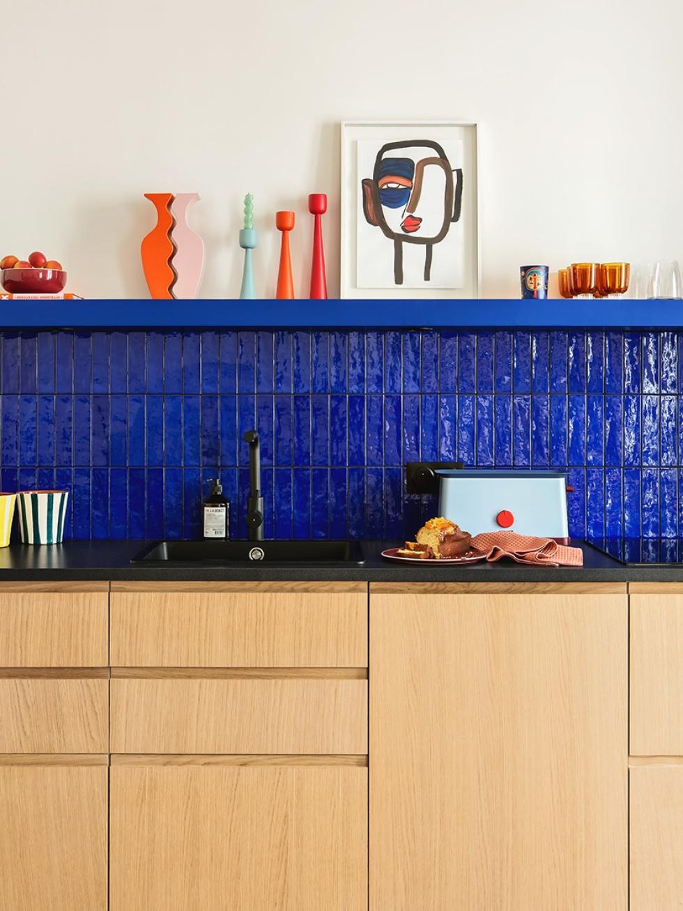
What really catches the eye as soon as you enter the room is the Klein blue splashback. Highlighted by a custom-made, one-piece floating shelf that showcases colourful objects and burnt tableware, it reflects the light and adds to the character of the kitchen."At first, we wanted a blue wall from floor to ceiling. In the end, we felt that would be too much, but we're delighted with what we’ve gone for here!" At the same time, the black sealing joints match the shade of the laminate worktop purchased from Ikea. "We dreamed of granite, but we had to make some tough budget decisions. This part was actually supposed to be temporary, but it will stay this way!"

A secret weapon
Creating a box effect
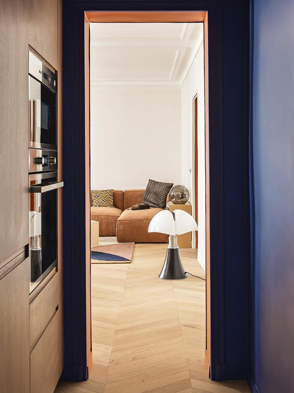
The designer's architect experimented by matching the natural oak finishing panels with the fronts to give the illusion of custom-made arrangements, which fill the space from floor to ceiling. The ceiling was also painted the same colour as the walls to create a boxy effect that distracts from the dark, narrow corridor. "This is the kind of detail that gives the high-quality effect I'm so keen on!"

A question of perspective
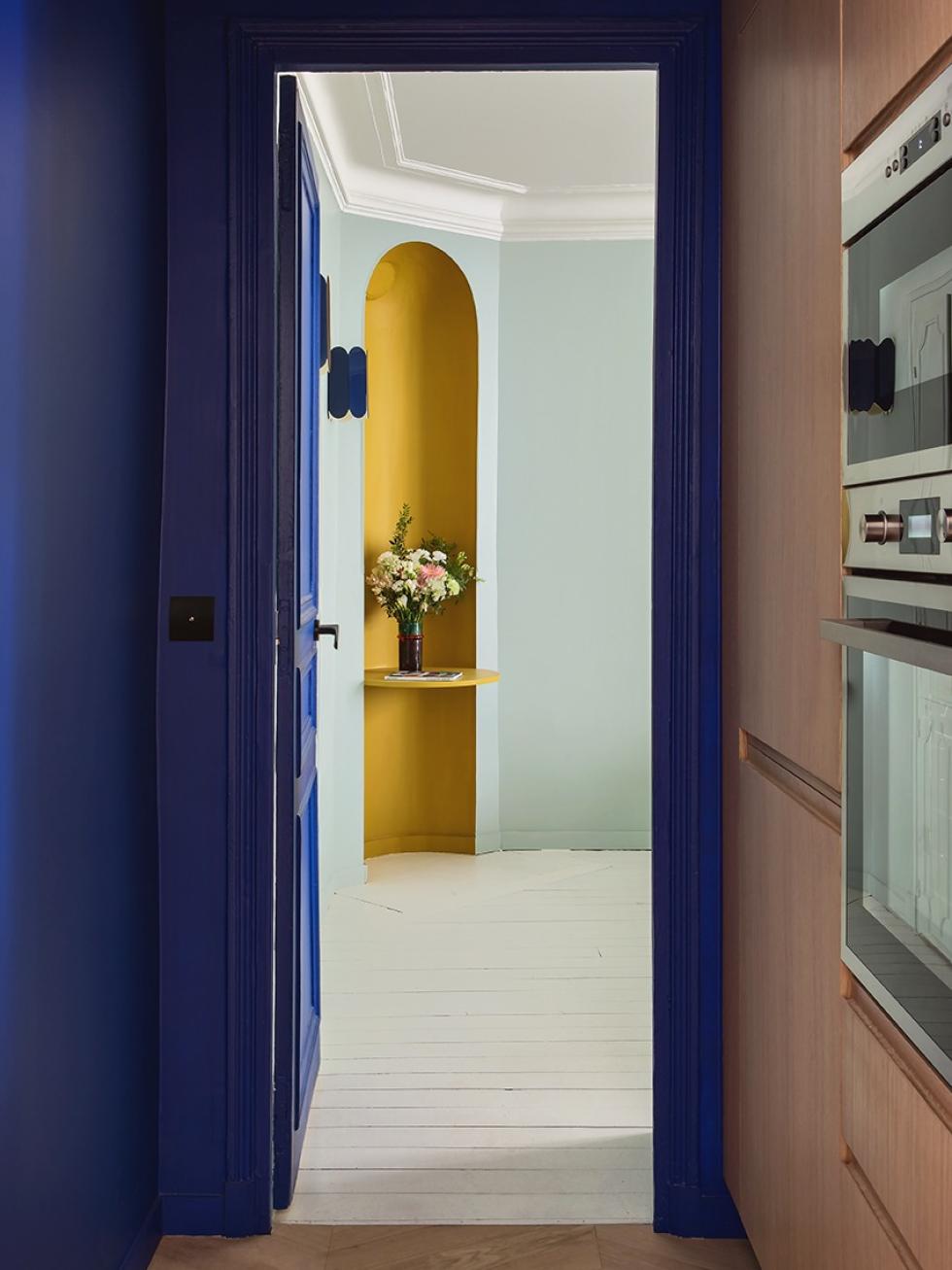
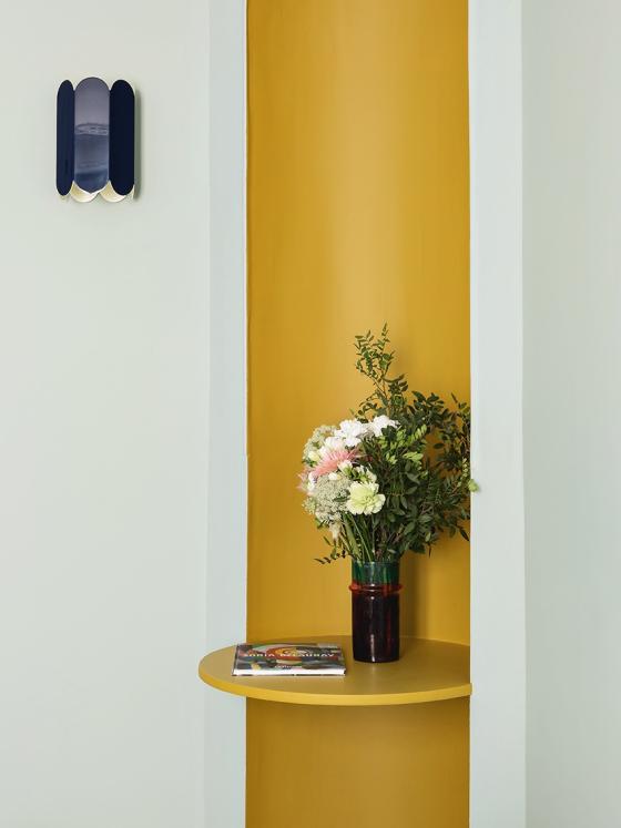
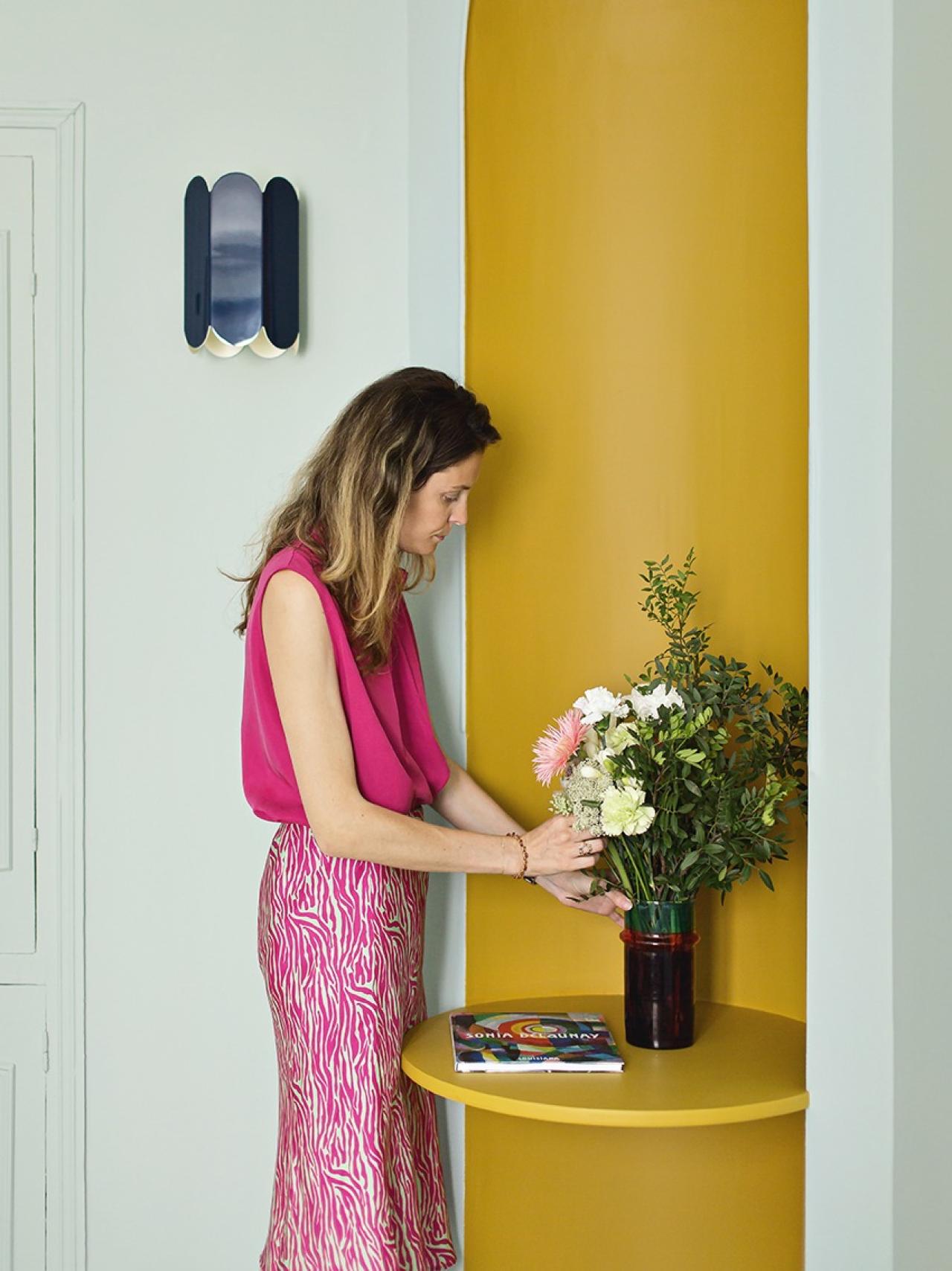
This can be seen from the living room, like a halo of bright colours that stand out against the pastel wall. Nestled in a space created by the room layout, this mustard alcove draws in the eye and adds depth to the room. Once again, Élise played with colours to distinguish one space from another, adding character to her space whilst keeping costs affordable. "I had so much fun with this rainbow effect!" Inserted simply into the wall, the rounded shelf creates a small side desk, a perfect spot to get inspired.
Mix & match
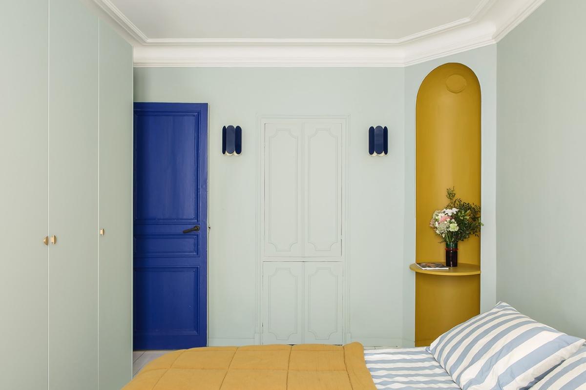
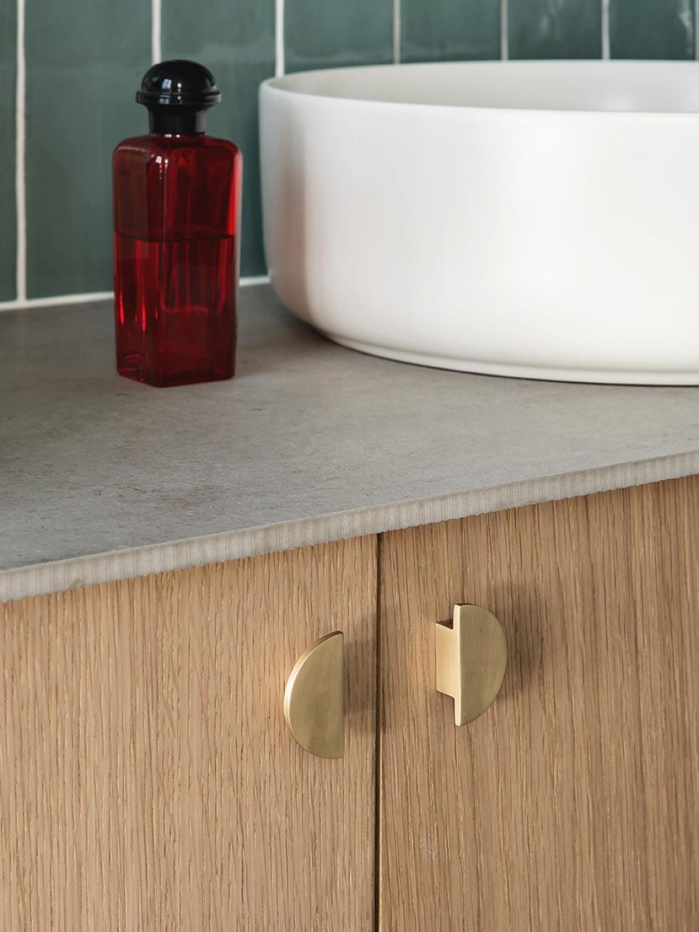
"When I told the architect how many shades I wanted to use in the flat, I thought he was going to choke! From Klein blue + mustard + to Amandier gris, it would have been a shame if I’d had to choose just one!” Accustomed to creating bold, ready-to-wear combinations, Élise has come up with unexpected colour mixes that enhance the original wall mouldings of the building. From the Hay light fixtures that match the back of the door, to the brass Mini-Lune handles that echo the mustard alcove, each shade contributes to the spirit of this space.
Amandier grisé forever
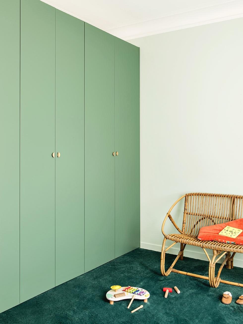
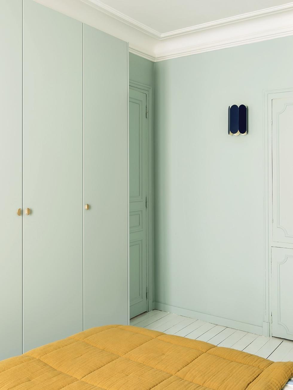
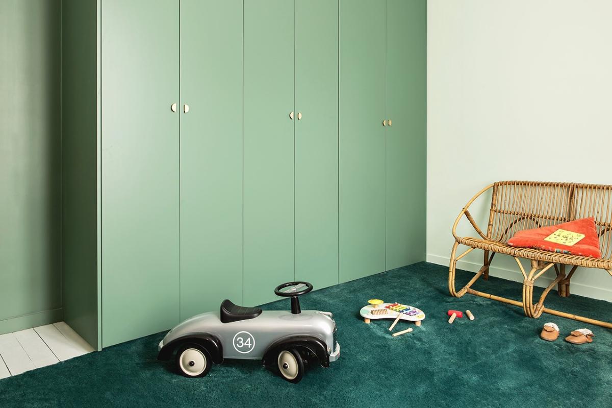
Half a dozen fashion collections every year, along with a lifetime of carefully-curated pieces: that’s what needed to fit into Elise’s wardrobe! But despite this, she wanted to avoid taking over the room with this piece of furniture. “We chose 35 cm-deep Pax cabinet frames to avoid the room feeling overcrowded, and we painted all the walls in Amandier gris so that the doors would blend in with the decor". The finishing panels that mask the sides of the wardrobe were integrated simply onto the walls, thanks to a small silicone seal. This adds to the overall high-quality look.

Goodbye kitchen, hello bathroom

The winning team
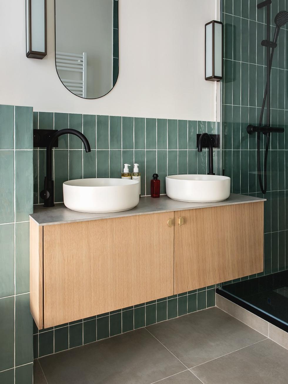
Take a closer look at the handles, taps, fronts… From the kitchen to the bathroom and the bedroom, there are lots of common features, which was totally intentional! "It was important to me that everything fit together. This also made sourcing throughout the project a lot more manageable.” Élise certainly wasn’t afraid to change certain elements to adapt them to her overall vision. The dressing table is made from Metod cabinet frames, while the single-handle taps have been taken from the kitchen to fit the countertop basins. The worktop was made from scraps of the floor, to keep a sense of continuity, and to keep adding to the illusion of customisation.
For today, and for tomorrow
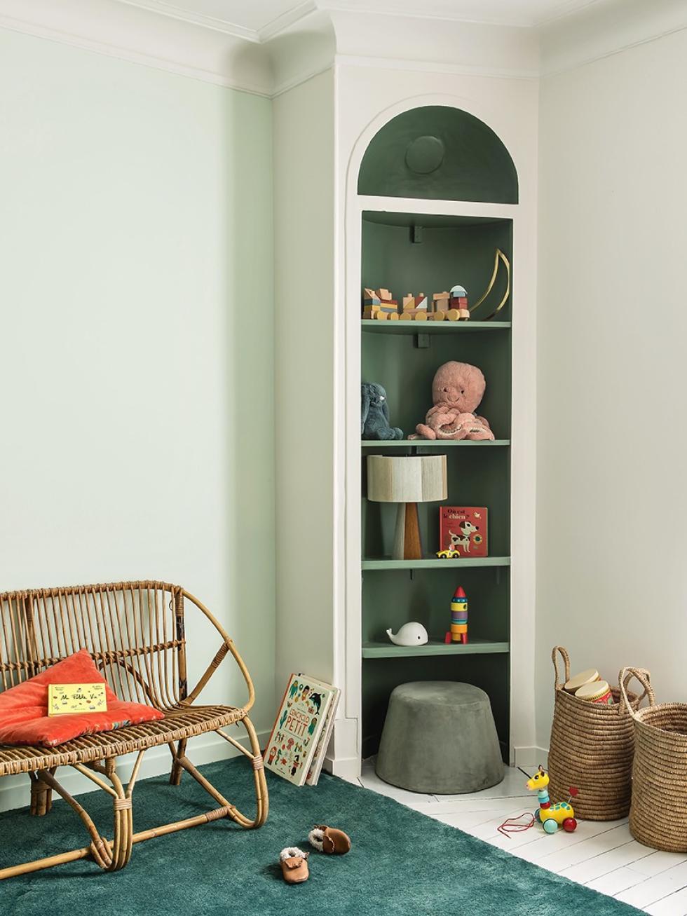
This is truly the challenge for young parents who start renovation projects: how do you design a child's room that fits their age without risking having to start all over again in a few months? Élise decided to create a timeless space, and to experiment with one and a half year old Léonard's favourite objects to personalise it. As we saw in the parents’ bedroom, the Vert de gris wardrobe blends into the wall, while the alcove stands out and highlights his books and toys.

We’re inspired by…
- Door frames painted in a bold, contrasting colour to instantly catch the eye
- Alcoves enhanced by colour
- Floating shelves that match the splashback, transforming the kitchen into a statement piece
- Kitchen tap fittings used in the bathroom, adding to a free-standing basin
