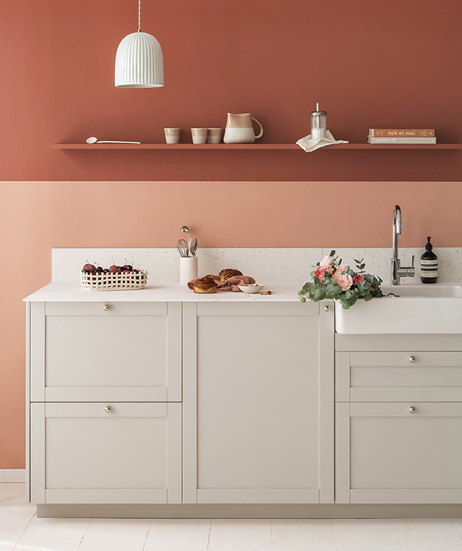
Chez Lucie Socrate, interior designer
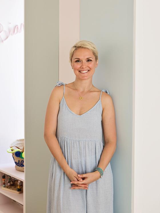
Now a thousand miles from the finance world (leaving Excel spreadsheets and business plans behind her), Lucie Socrate has reinvented herself as an interior designer. She started to pursue this new career path when working on the house she now calls home, with her husband and two little girls. Three floors and six months of work later, Lucie had transformed an early twentieth-century building into a bright, colourful place to live. Through working with the original floors (which bring a vintage element to the space) and making some bold choices for the walls and ceilings, she’s been able to deal with the demands of the space, making it only more beautiful.
Shall we show you around?
Colour palette
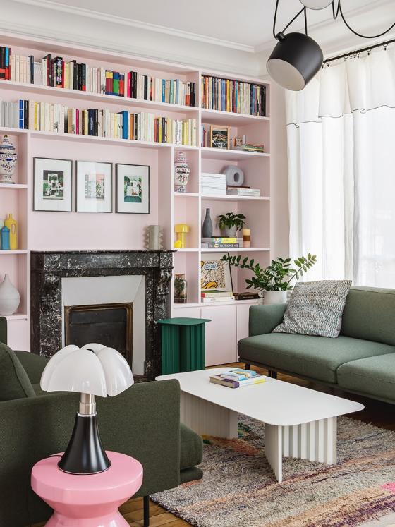
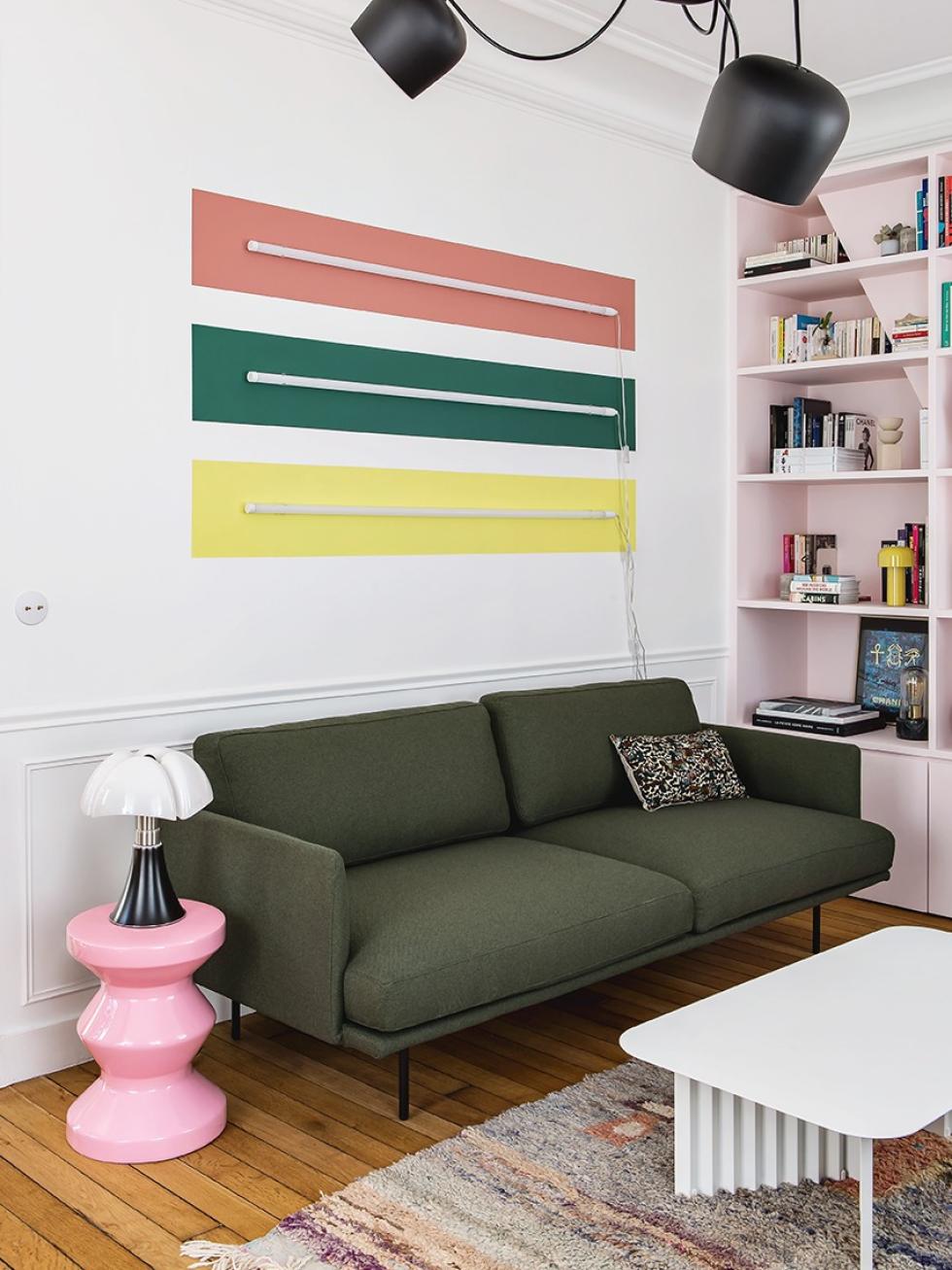
PFrom the bold pink bookcase, the furniture in several shades of green, to the rug… You only need to take one look at the living room to get it: it’s really all about colour! “It’s a constant theme in our home, but also in our family’s lives” Lucie inherited this passion for colour from her father, but it was her husband who suggested having pink as the colour for the bookcase, designed to be the centrepiece of this room.
Library in rose
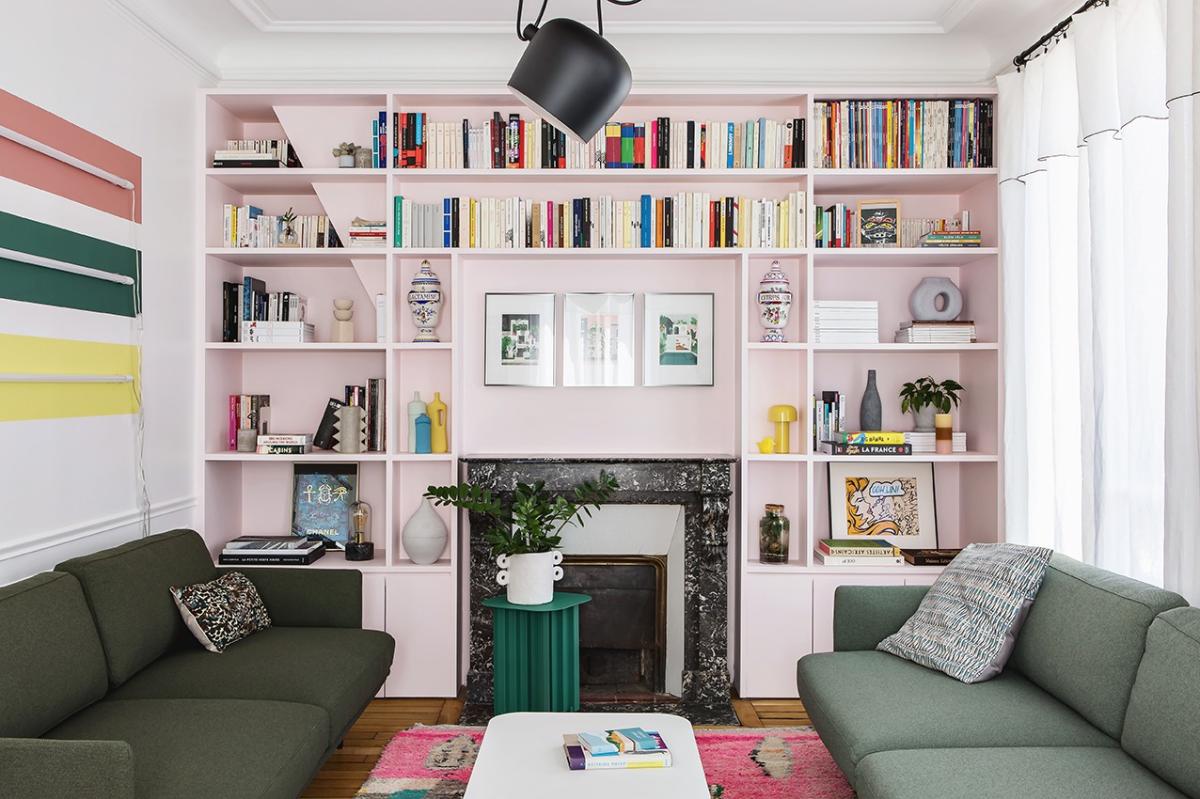
It’s quite a challenge to rethink the traditional trio of parquet flooring, wall moulding and fireplace, and highlight the possibilities of the living space - all at once. Lucie decided to simply break the rules by experimenting with the horizontal lines of the bookcase. No mirror, too predictable. The centred trio of illustrations really catch the eye, and the lights (designed by the Bourroulec brothers) add to the character of the space.
Bright ideas
The paradox of having white in your home: on the one hand, it’s easy to adapt to, it’s timeless, and on the other… Well, it’s tricky to know where to start with a blank, white wall. To get over the blank page phase, Lucie got out the paintbrushes. Her result: three bands of colour, accentuated with neon fluorescent lights, that look wonderful at night. These colours are intentionally chosen, as each can be found in another room. "I wanted to give a personality to each room, while maintaining some coherence through the continuity of the colours and floors.”

A recipe for mixing and matching
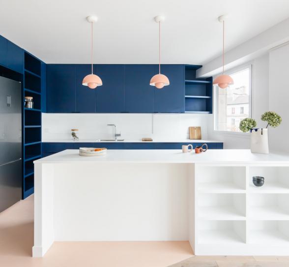
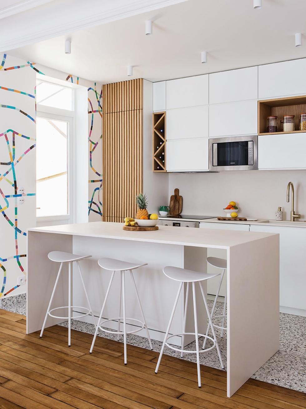
One thing was clear: the kitchen was really in need of a makeover. Situated opposite the living room, separated by the entrance hallway, Lucie removed a partition to open it onto the dining room and make it a large family room. Here, fresh white shades run from the cupboards to the central island, enhancing the natural light. Oak parquet and ceramic tiles coexist in harmony on the floor, and on the wall, bold wallpaper reminds us that a burst of colour is never far away in this home.
Redefining the past

Pastel tetris
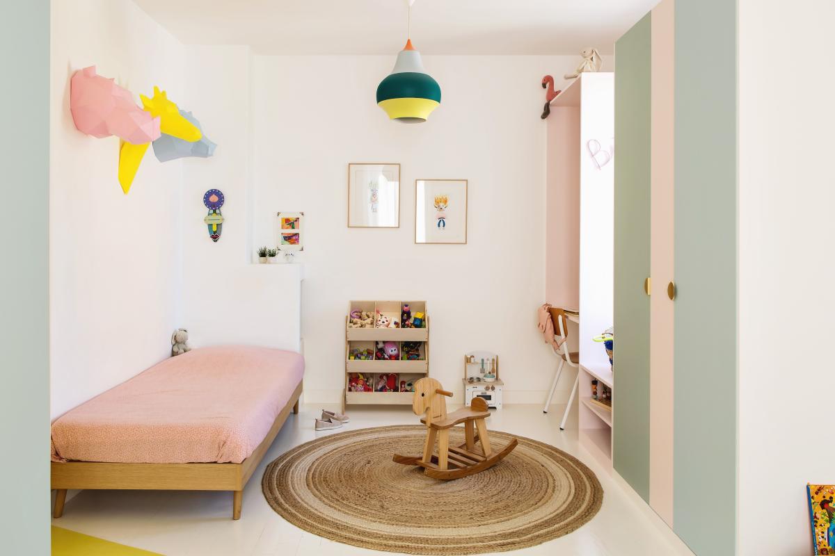
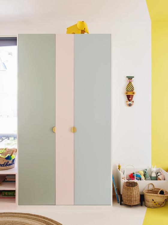
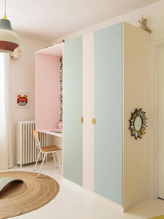
Nestled on the first floor, Bianca and Léonie's room reflects the themes that play an ever-central role throughout this home: colour and shape! The interior designer combined Pax pedestals sold by Ikea and custom-made frames to create a wardrobe that matches the pink of the bookcase in the living room. The wardrobe doors are painted in a trio of pastel shades (Green 01 - Amandier grisé, Beige 01 - Beige rosé et Blue 04 - Ciel voilé) contrast with the walls and the parquet is repainted in white.
Lasting touches
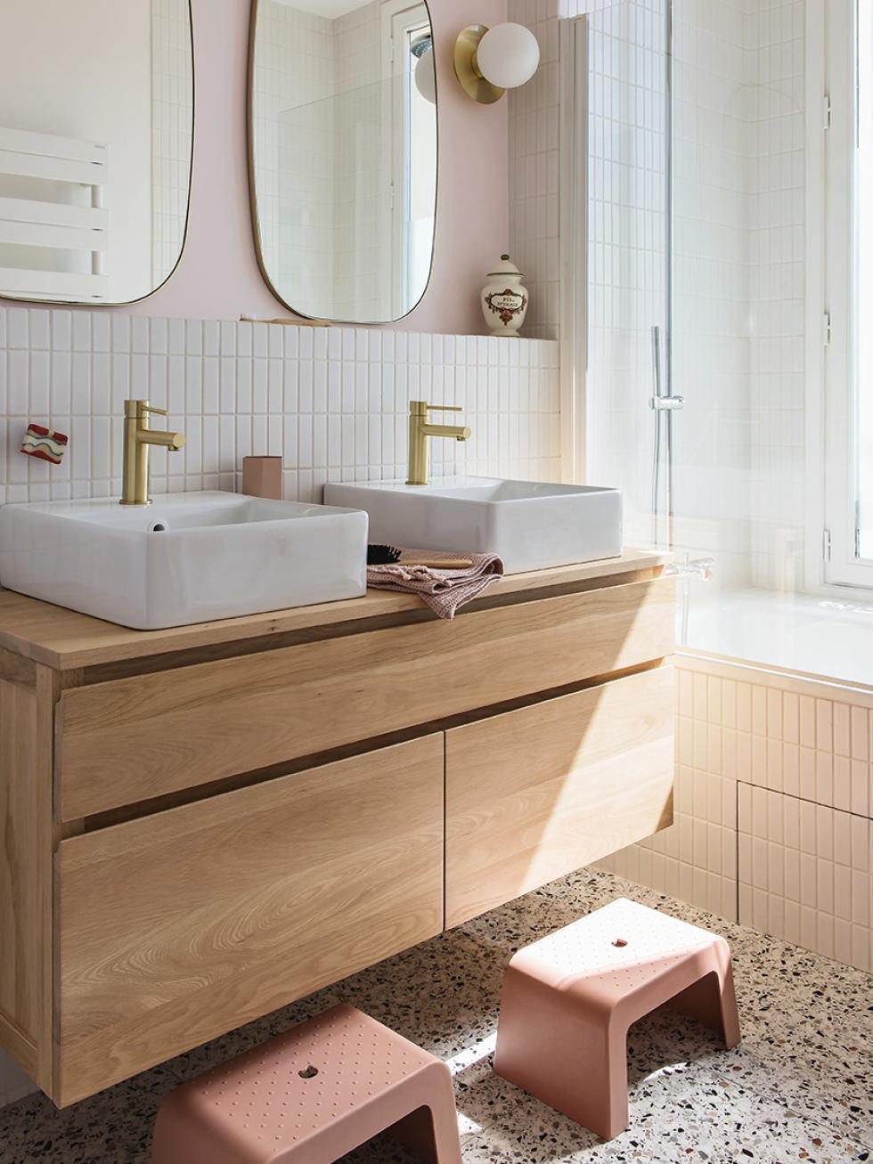
"I prefer to keep the colour scheme to a minimum in the kitchen and bathroom, as these are more technical rooms and therefore more difficult to renovate.” Here we find shades of pink, as well as the ceramic tiles we saw in the kitchen. The timeless white tiles have been placed to experiment with lines, whilst the brass accessories complete the look, adding some light to the scene.
A screen - nothing more, nothing less
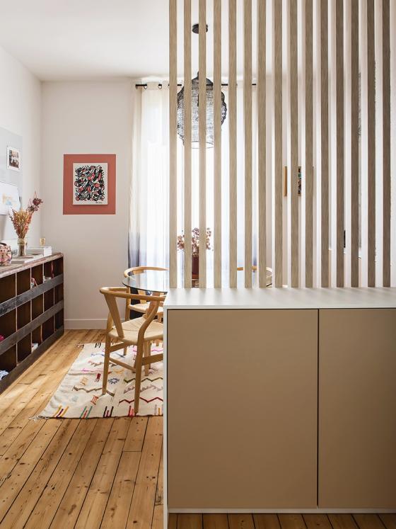
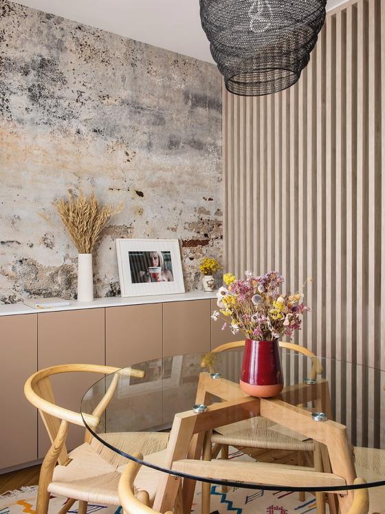
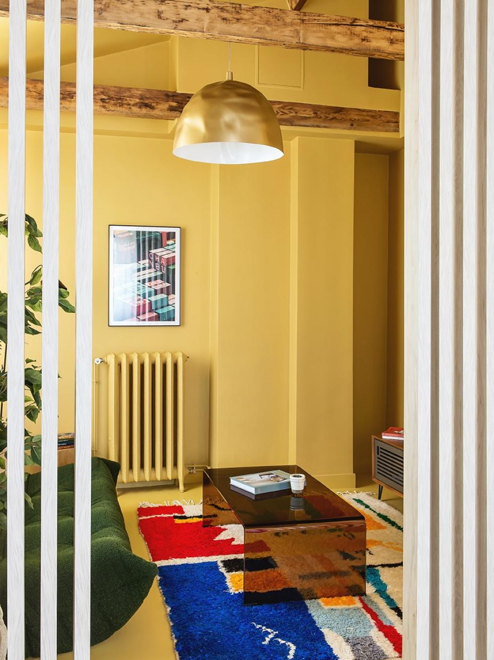
Many of us know the headache of large rooms with multiple functions. To separate, or to not separate? One solution is to use a screen and a few wooden strips. Here we see one integrated into Moka doors to separate the guest room from the small living room. An original - and affordable - way to divide a room without closing off space, and to add structure without it feeling overbearing.
3D painting
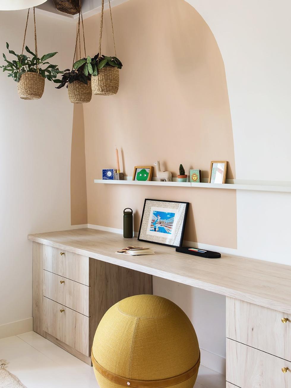
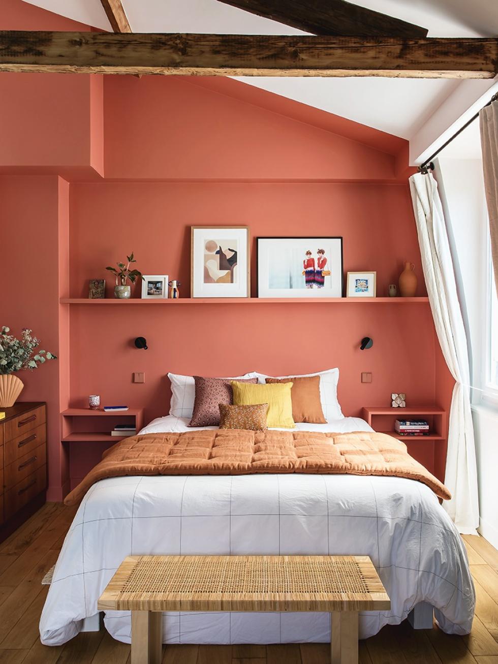
When Lucie first opened the door to her rooftop room, she discovered low ceilings that really didn’t do justice to the architecture of the house. Not an issue for Lucie! "We opened up all the ceilings on the top floor and took the opportunity to redo the insulation. Created to hide all technical pieces, the new form became a playground for experimentation for the interior designer. With its slight overhang on the ceiling, the terracotta wall creates a box effect while highlighting the new elements.

Dressing up the wardrobe
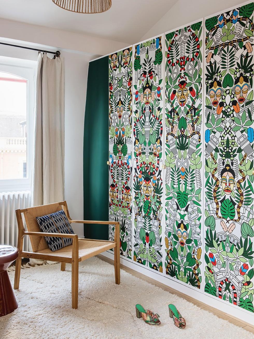
Visible from the bed, the wardrobe quickly became the masterpiece of the bedroom. Rather than restricting it to merely its function, Lucie has instead chosen to turn it into a bold design statement, thanks to a few strips of wallpaper placed on the middle doors. This colourful pattern is paired with brass Mini-Lune handles which highlight the piece, and attract the light and the eye. And the interior designer certainly doesn’t regret this daring choice. "I've realised that the boldest decisions I make are the ones I get the least tired of!"

In the box
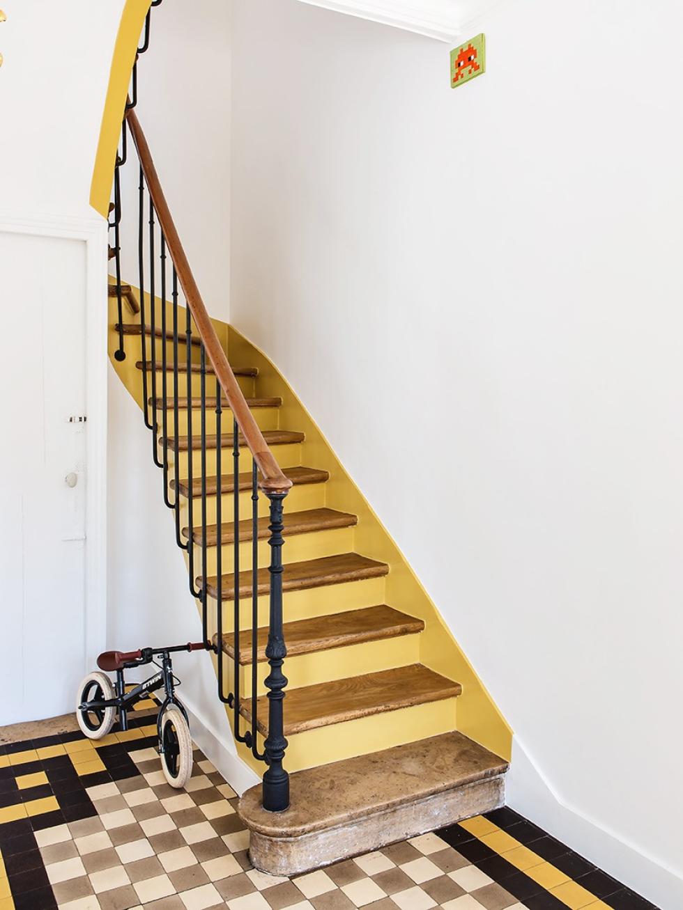
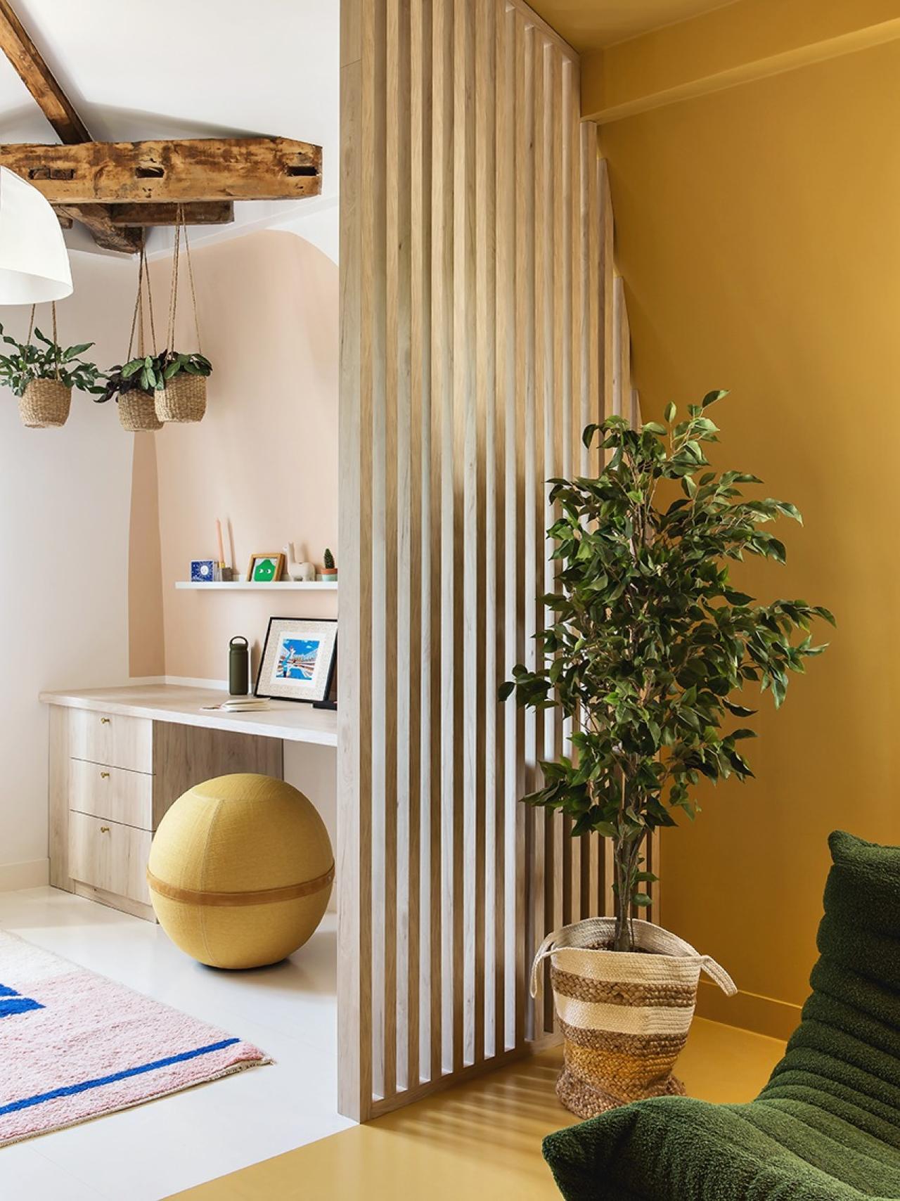
Recognise this? Seen on the tiles in the entrance way and extending up the staircase, this luminous yellow is also found in the TV room. Applied on the walls from the floor to the ceiling, this creates a box-effect that makes the room feel all the more cosy and cocoon-like.

We’re inspired by…
- Using bold colour to structure and enhance space. Upcycling original floors to reduce costs and ecological impact. Experimenting with wallpaper to transform a wall or a piece of furniture.
-
- Using brass handles to attract light and highlight a particular design.
