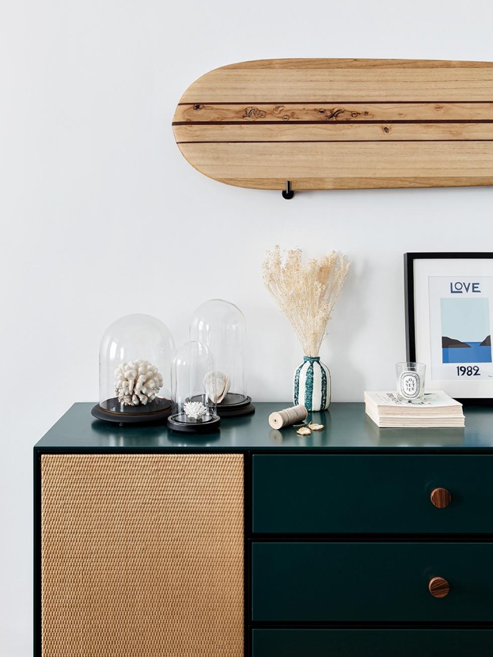
Home of Alexandra, Plum Living's Content Manager
Once upon an Instagram post… Plum Living was only a few weeks old, and the Plum Scanner still seemed a distant dream for Amandine and Marion who were calculating quotes in their living room. As for Alexandra, she was spending more time scouring social media in search of inspiration for her newly signed 80m2 home than she was writing articles. What happened next is one of our favourite stories. As if by fate, an order mishap led Alexandra to join our adventure as a Plum Living writer before becoming responsible for all content creation. She is the mysterious author behind most of the articles you read here! Therefore, it comes as no surprise that the centre piece of her homely cocoon in Versailles is in fact the kitchen. Want to explore?

Playground
Measuring tape in one hand, sketches in the other, you’d think she’s been doing this her whole life, and yet no. “Interior design is a profession, but it’s not mine!” asserts Alexandra. A keen decorator, Alexandra had to improvise as site manager during the renovation of her apartment in the heart of the historic town of Versailles. “I dreamed of finding a place in its original form that I could totally redesign. And that’s exactly what I got!” The design process has been a delight for Alexandra. Choosing the colours, the kitchen layout, the lights and the small accessories, she’s been like a kid in a playground. “The structural work has been a different story! It’s best to seek professional support and not to underestimate the amount of time you’ll need to spend on site.”
Rethinking spaces
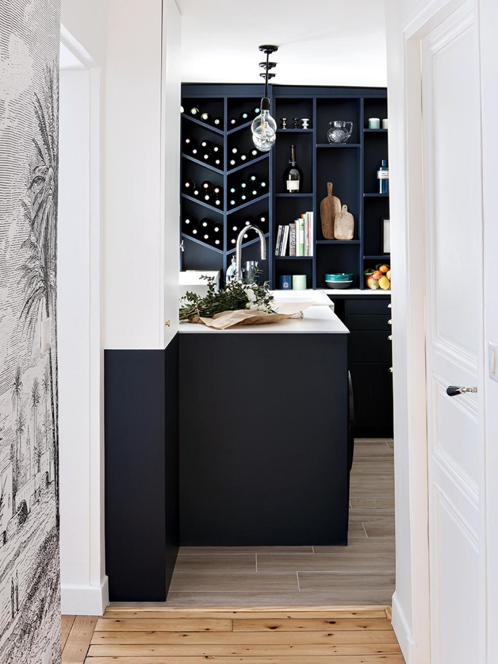
This journalist did a lot more than just give the walls a fresh lick of paint. “We created a corridor connecting the two adjoining bedrooms and played around with the layout, swapping the 1960’s kitchen with the cramped bathroom.” Semi-open to the living room, the kitchen has been designed to be a communal space allowing people to come and go, where Alexandra can pass down her love of baking to her two sons. “I guess there’s no need to explain why we chose parquet effect tiles for the floor!”
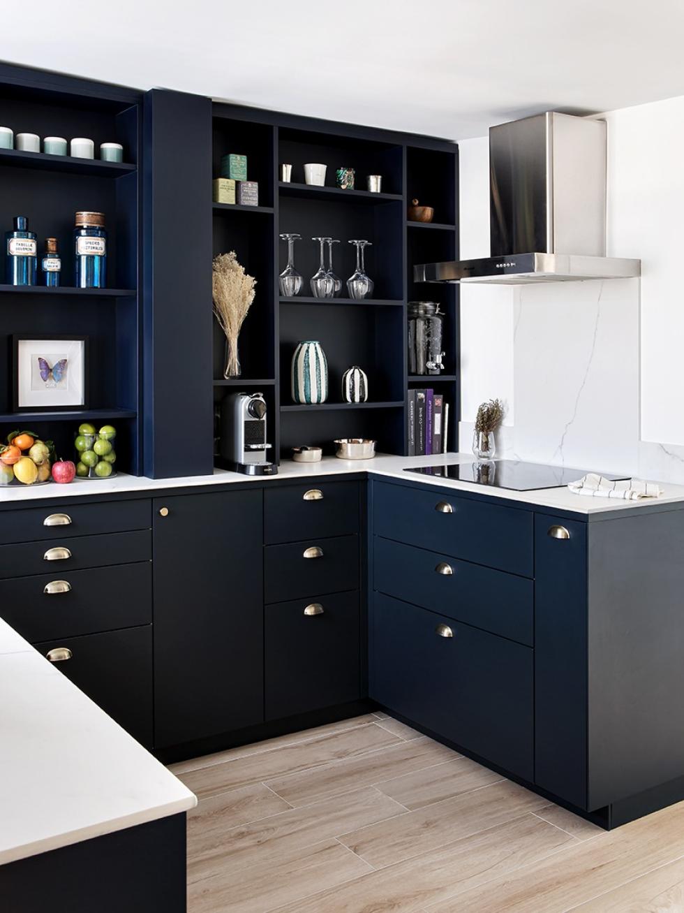
Kitchen or bookcase?
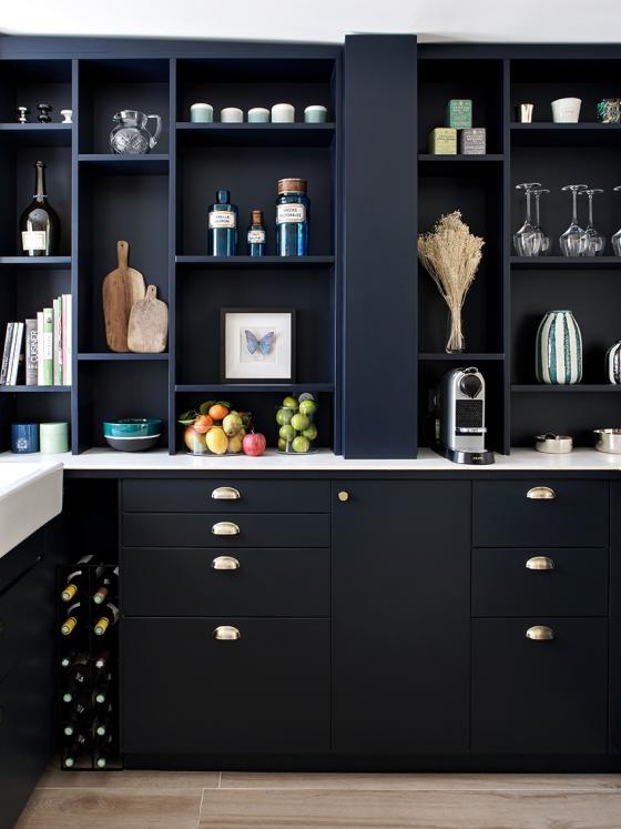
Designed to resemble a bookcase, the kitchen is lined with Metod cabinets paired with our Blue 02 - Bleu nuit matte lacquer fronts. Painted in this same colour by a professional carpenter, the kitchen shelves elegantly displaying crockery and bottles of wine are an accumulation of Alexandra’s imagination and design skills. However, not every vision was achievable. Due to financial constraints, her dream of a natural stone countertop had to be set aside and a new solution found: marble-effect porcelain stoneware. “These 120cm slabs were cut to size before our contractor then glued them to the countertop,” explains Alexandra. “The edge of the countertop is concealed by a Plum Living plinth cut to the exact width.”

The great diversion
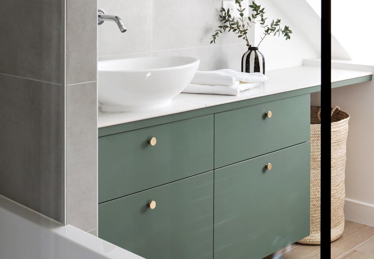
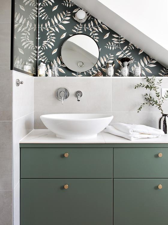
Separated from the kitchen by a sliding door, light streams freely into the bathroom where the same carefully curated style continues. But no need to count the Carrez square metres in this room because: “There aren’t any! The contractor calculated the gaps to the exact millimetre for the bath and vanity unit.” The secret weapon? A low wall along one side of the room ensures the pipes and drains are tucked out of sight, avoiding an eyesore while also creating a practical shelf. Placed directly above the bathtub, the two black-edged partitions bring a contemporary touch while serving as a shower.
Cloudy skies
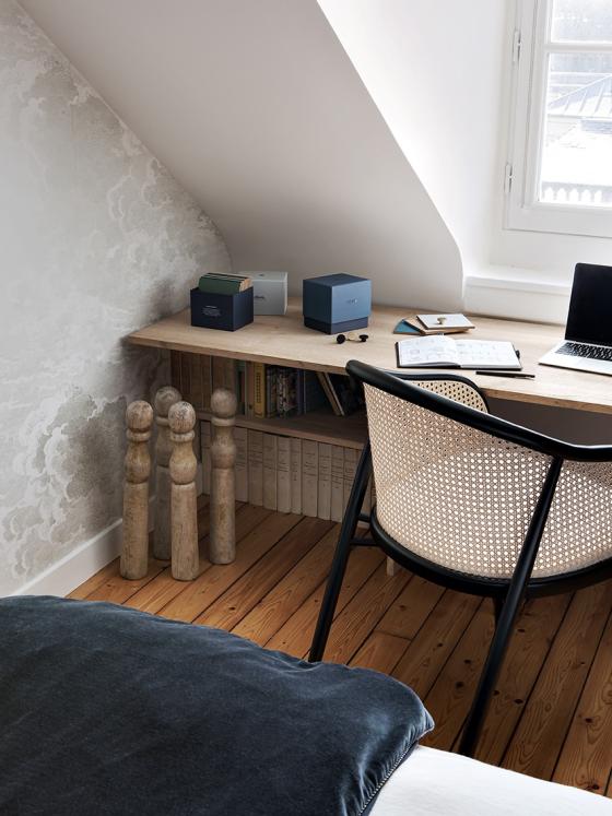
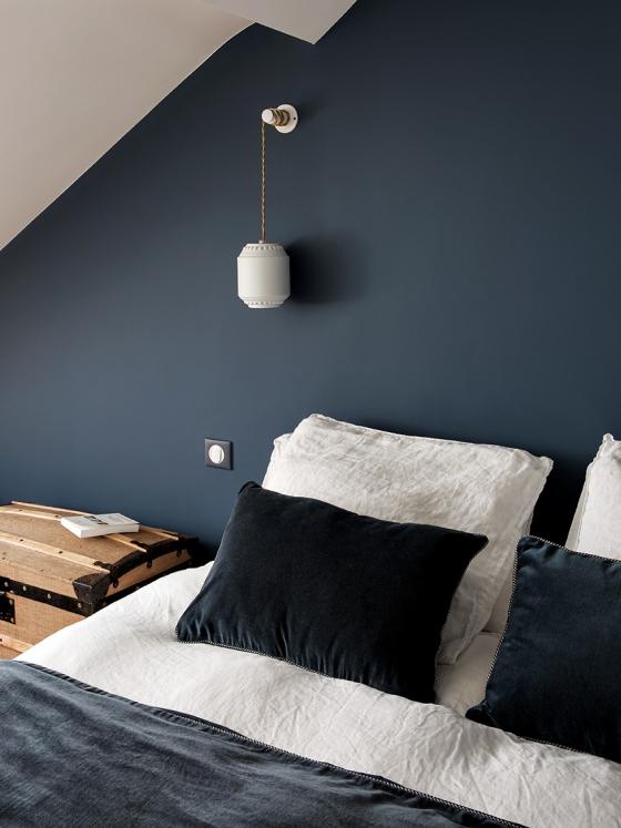
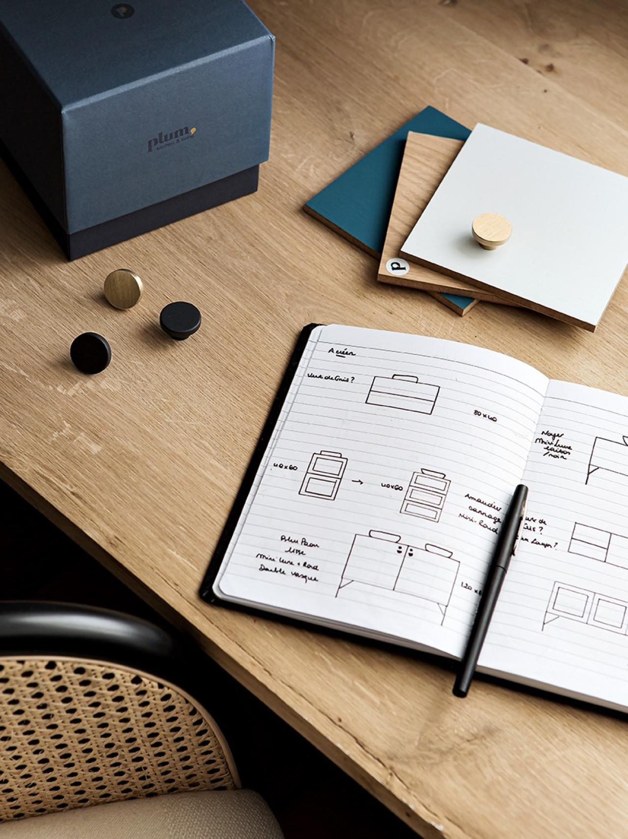
We retrace our steps. The new corridor, dominated by the XXL reproduction of a 19th century engraving published by Les Dominotiers, connects the two bedrooms. The use of natural materials (washed linen, cane, raw wood) is one of the main features of Alexandra and Romain’s bedroom. Farrow & Ball’s Stiffkey Blue covers the bedside wall, directing attention towards the Alix D. Reynis hanging lights and antique trunk serving as a bedside table. The Cole & Son’s Nuvolette wallpaper adorns the adjacent wall with dreamy clouds. In the corner sits an oak desk, hand-made by Alexandra herself. "The walls aren't straight, neither are the floors, so we had to opt for plan B!" A sneak peek at where she writes all her witty posts you love so much!
In green and against all odds
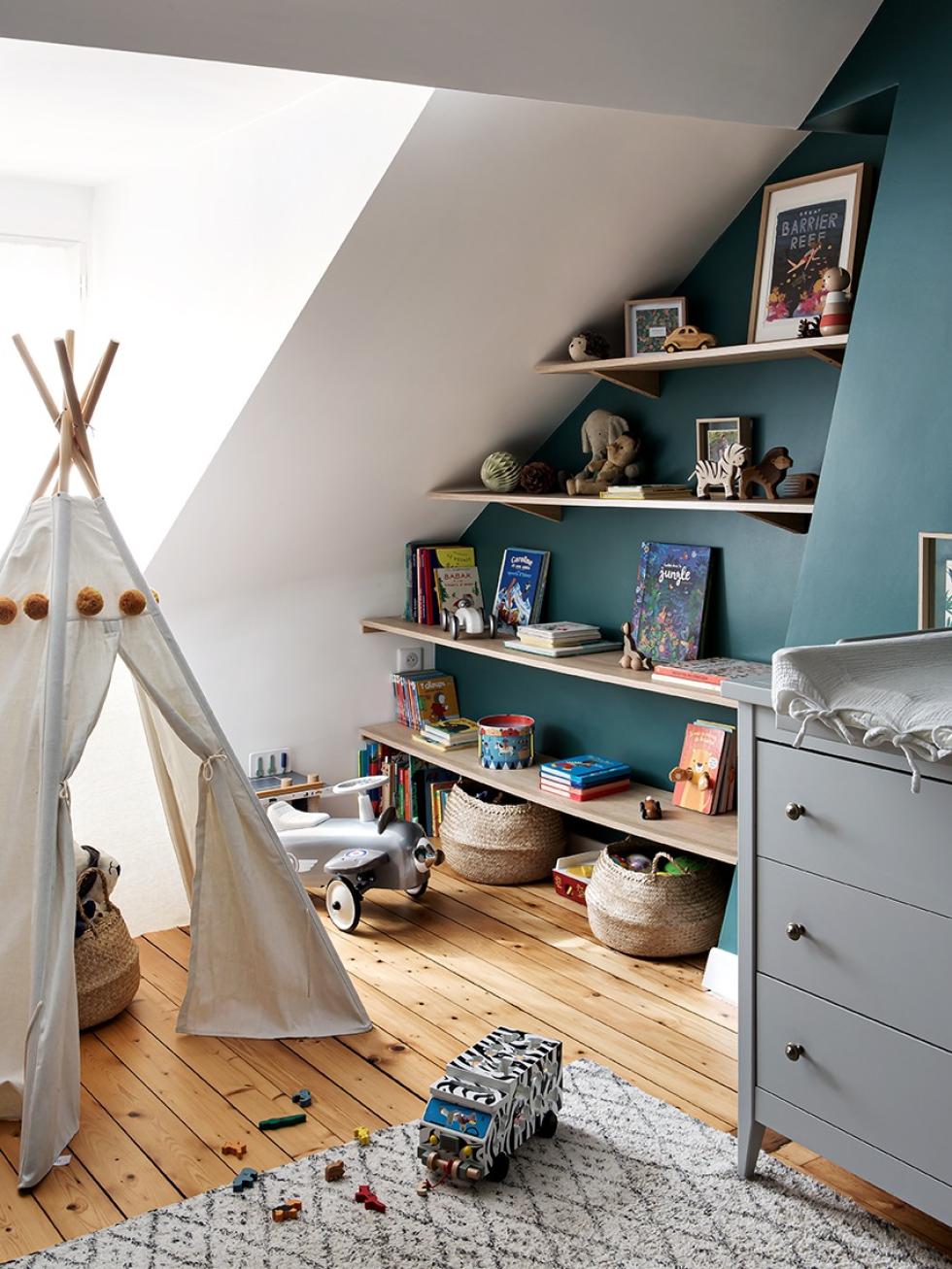
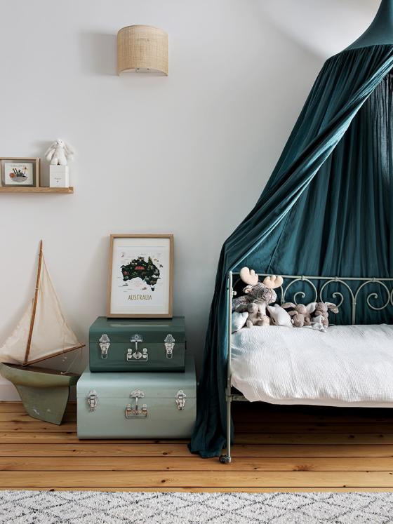
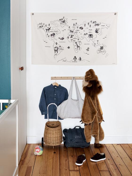
Welcome to the kid’s kingdom! The couple’s two young boys share this attic room in which no square metre is left unused. The sloping ceiling is accommodated by a self-made bookcase while the unoccupied space created by a recess has been cleverly filled with a made-to-measure wardrobe. The green walls and accessories create a cocoon effect, highlighting the natural wood and souvenirs collected during their travels. “It’s a joyful mashup of their passions and memories!”

Souvenirs, souvenirs
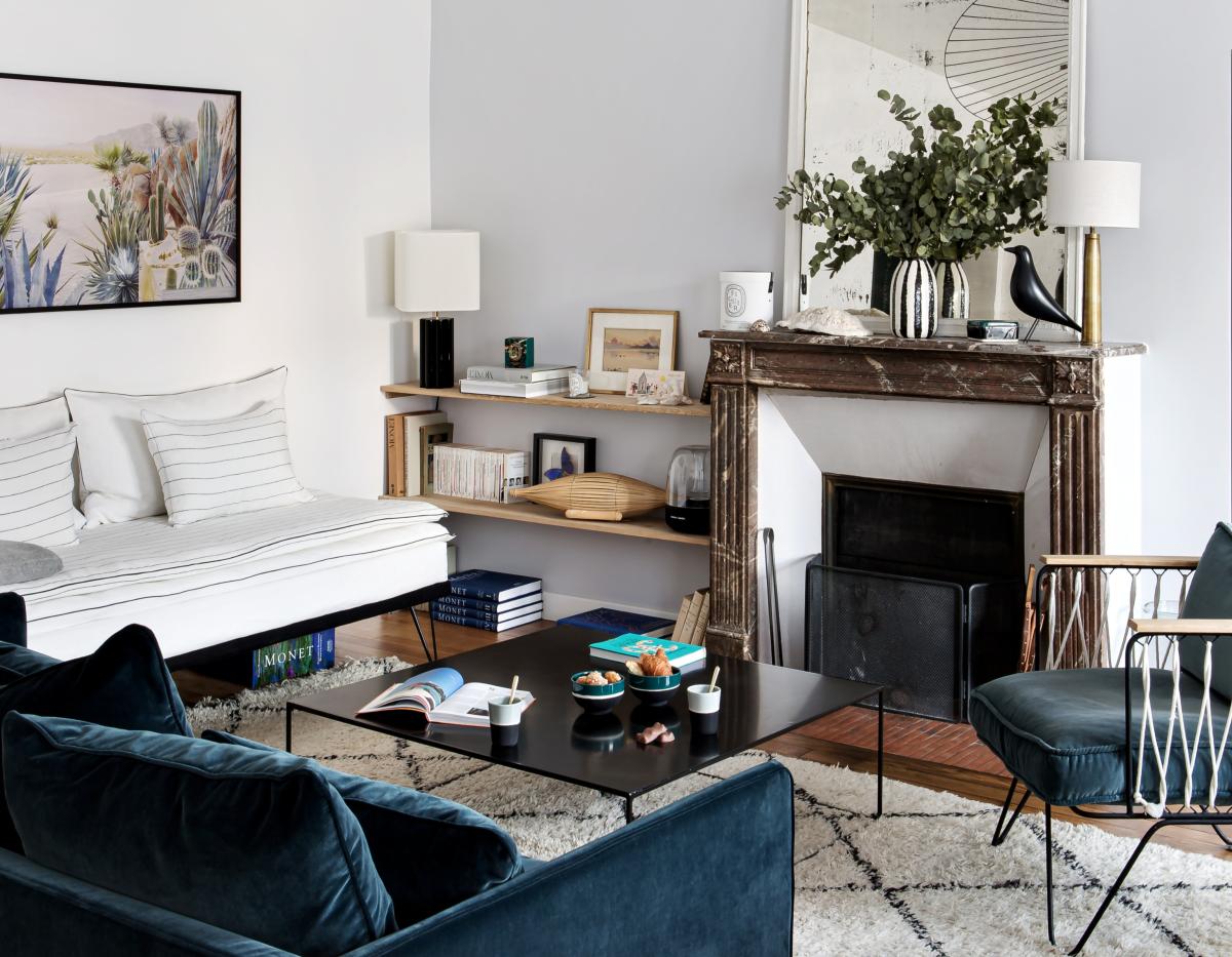
Alexandra jokingly admits her biggest struggle was keeping the joyful mess out of the living room. “I wasn’t successful every day!” Her collection of treasures gathered from around the world as well as from her grandmother’s attic give the room a special charm. “She lived in Tahiti and in Africa. Every shell and book has its own story!” Not wanting the living room to resemble a bric brac shop, Alexandra has found the perfect balance between new and old. The lights, designed by Constance Guisset for Petite Friture, the Socialite Family and Sarah Lavoine, keep the room anchored in modern time.
Black-to-black
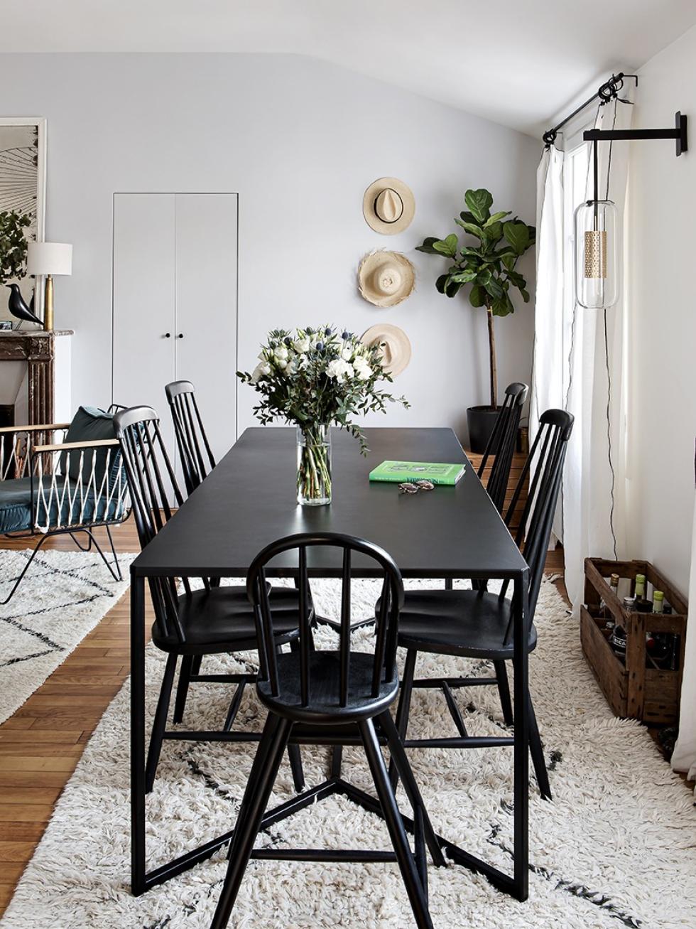
Black is a recurring theme throughout the home, from the Tapiovaara chairs "found at the Lyon flea market and repainted" to the Honoré armchair, door frames and handles, these eye-catching touches create a sense of harmony. Meanwhile, the white linen and duck blue velvet bring a touch of colour to this room, bathed in sunlight from morning to night. The mercury mirror, taken from the former corridor connecting the bathroom and the kitchen, has found a new home above the crackling fireplace. “Our idea of happiness!”

Ideas that inspire us
- The plinth used to hide the edge of the countertop
- The colour of our fronts extended across the whole kitchen
- The Metod cabinet frames used as a vanity unit
- The deep, bold colours from the kitchen to the kids' room
