6 ideas to enhance your projects with wallpaper
Just mentioning it is enough to take you back in time. Flowery in your childhood room or Japanese in your grandparents' living room, highlighted by a border or applied from floor to ceiling... Wallpaper has imprinted itself on your retina, but not always for the right reasons! Dusted off and updated, it can bring gorgeous personality to your interior, especially when it is associated with furniture. The question remains how to use it. Shall we show you?
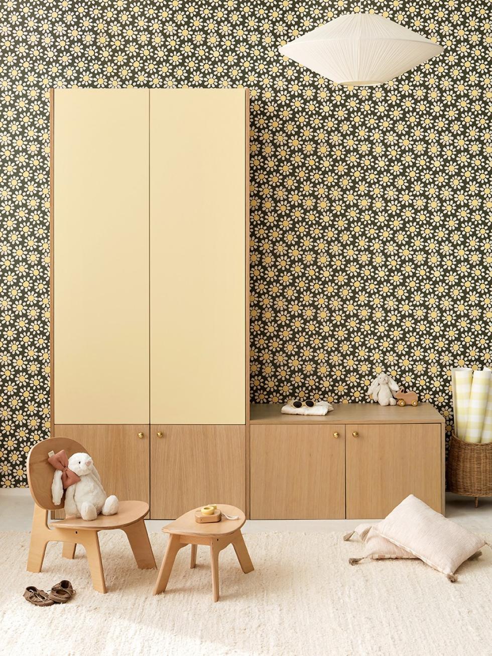
To personalise a baby's bedroom
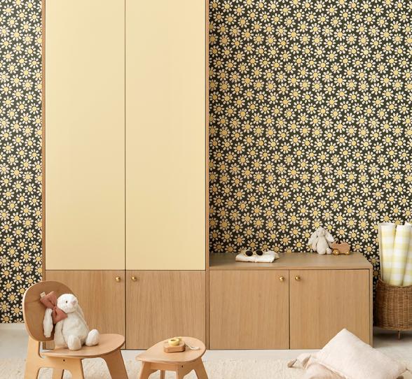
Sweetness, delicacy, and colour: that's all it took for us to fall under the spell of Papermint's Jolies Marguerites. Reinvented for Plum Living in two two-tone versions, Olive + Lemonade and Ciel voilé + Jungle, they are particularly well suited for personalising children's rooms. Here's the proof, with this Lemonade and Natural Oak arrangement composed of Metod cabinets, enhanced with matching wallpaper. Poetic!

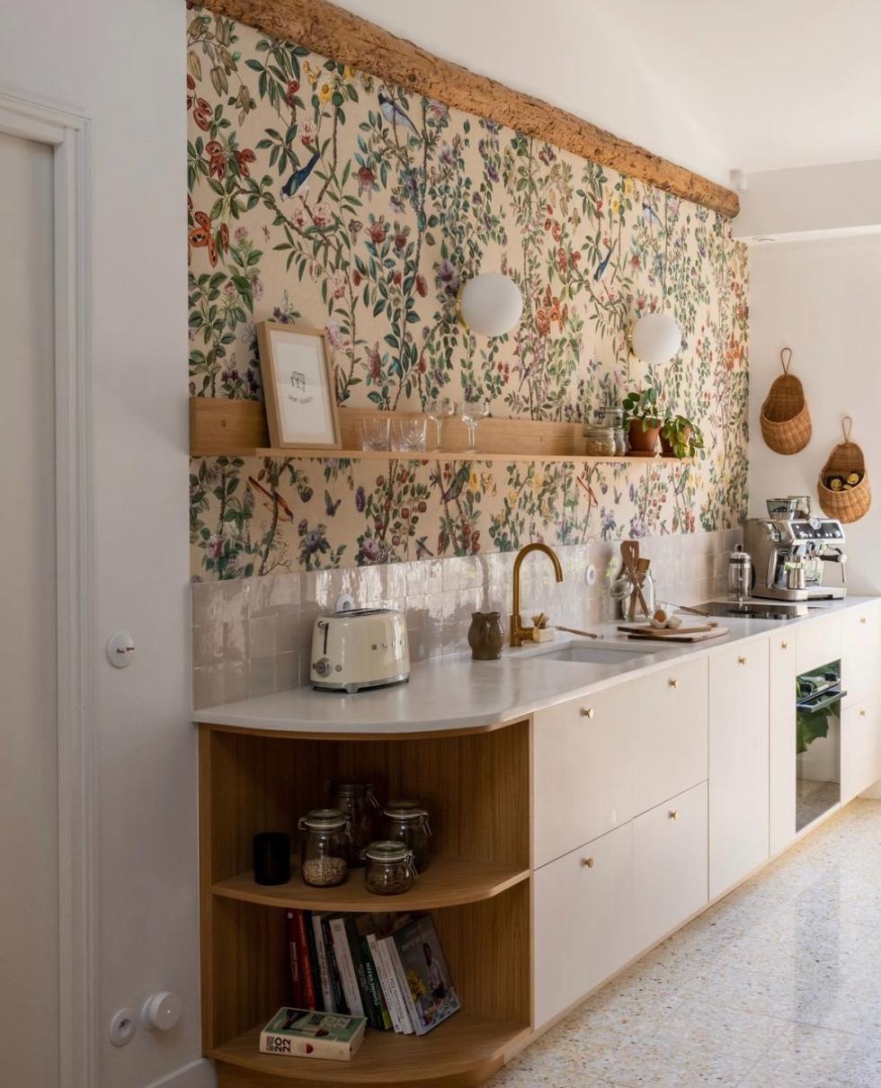
Twist traditional kitchen codes
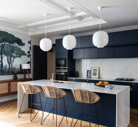
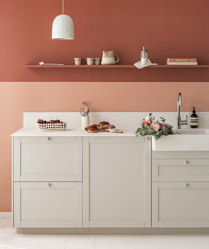
It may be the last place you would have imagined it, and yet: placed in a kitchen, wallpaper can reveal another facet to your layout. Take this custom-made creation by Amélie Colombet, composed of neutral fronts similar to our Beige rosé, a zellige backsplash and natural oak elements. The interior designer has twisted it all with a floral and colourful wallpaper that catches the eye and makes the kitchen a decorative object that blends into the living room. Inspired and inspiring!
To dress up a headboard
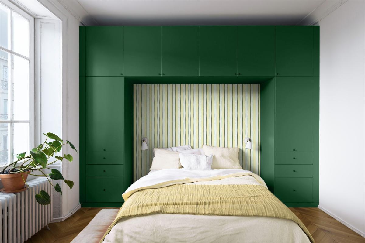
Securely installed above your head, this headboard arch made of Metod wall units and Jungle fronts from Plum Living in straight design, matte lacquer finally gives your room that cosy feel you've been dreaming of. All that's left is to jazz up the background! Inspired by English cottages, the unique lines of our British Stripes wallpaper get a fresh twist by mixing Olive and Lemonade, or Ciel voilé and Jungle. Two vibrant combinations to apply on the back of a niche or on an entire wall.
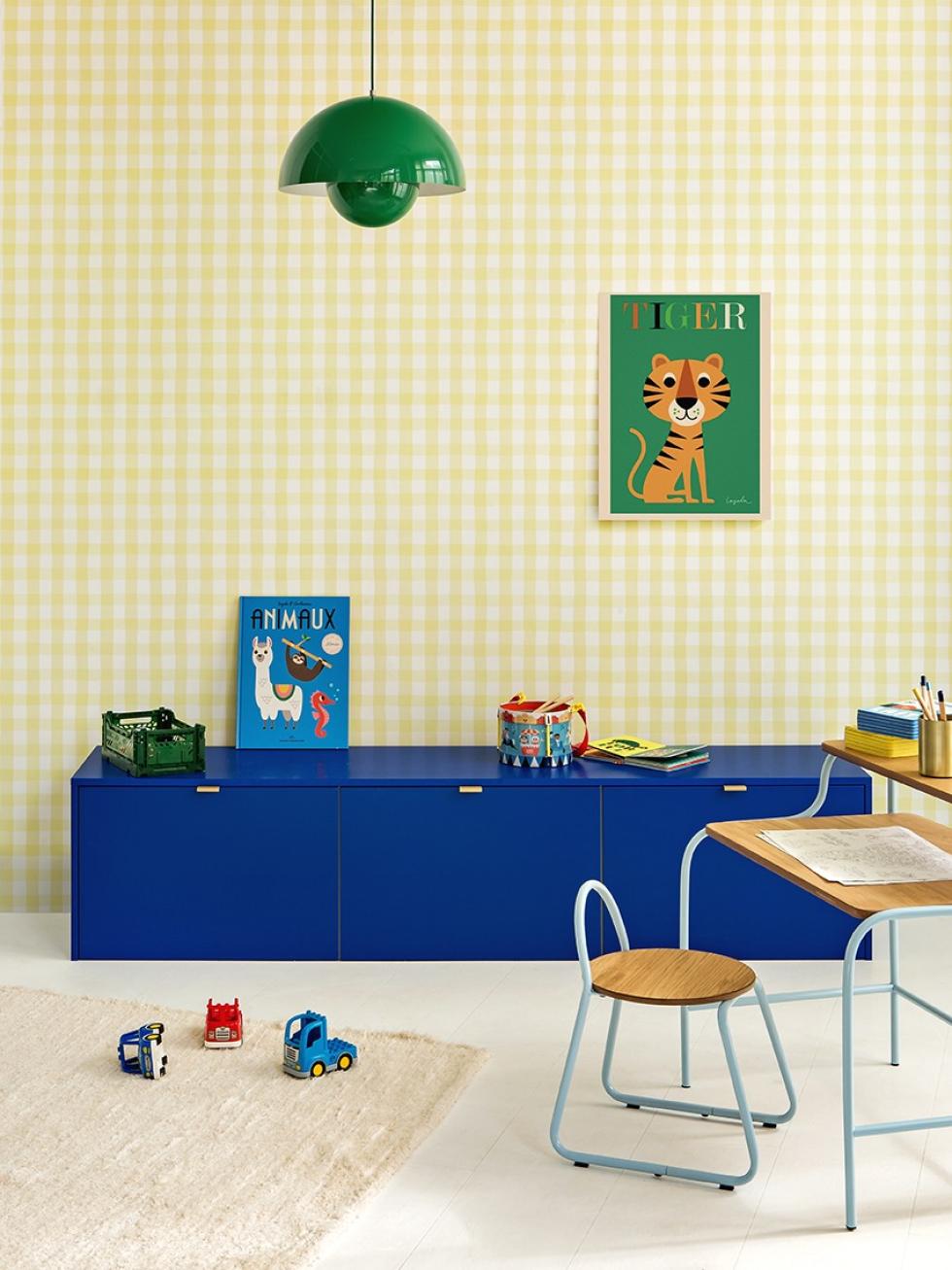
To bring some interest to yours kids' room
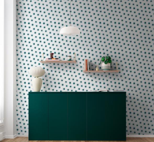
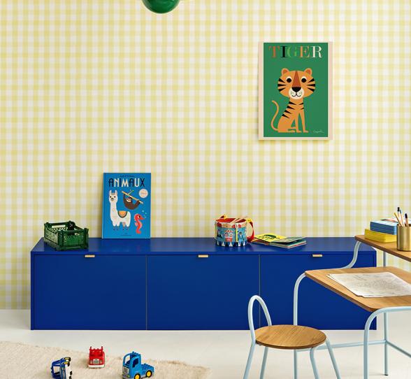
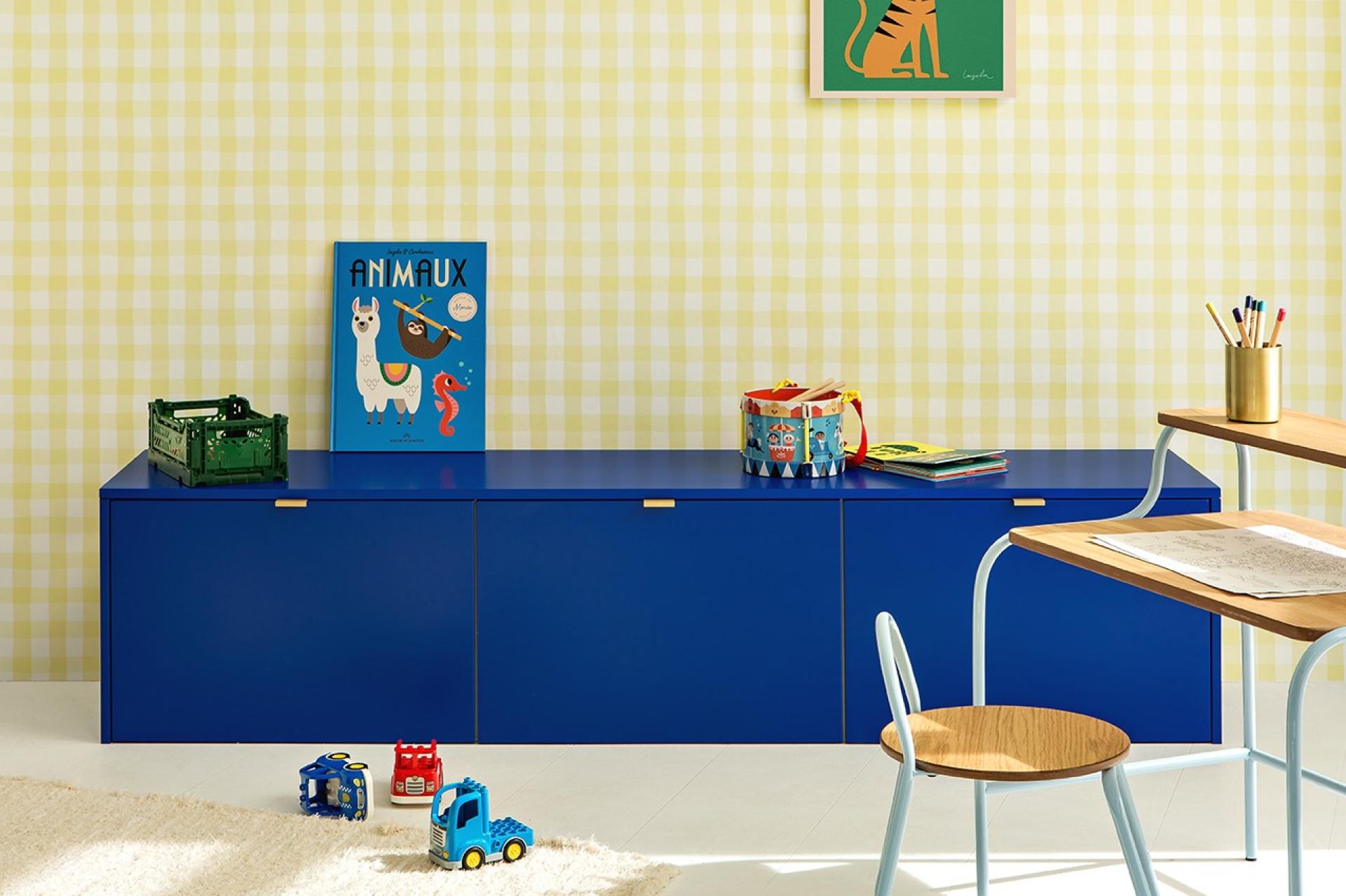
An Electric banquette, a bold pendant light and a poster that sets the tone: in a few hours, your kids' room has got a whole new look. Goodbye plain white wall. Edgier than paint, more playful than a collection of frames, the Le Petit Vichy Lemonade wallpaper from our collaboration with Papermint gives it another dimension. A flagship print of the Parisian brand, it has been reimagined here in a miniature version, which we think would look just as fab in the kids' room as a kitchen.
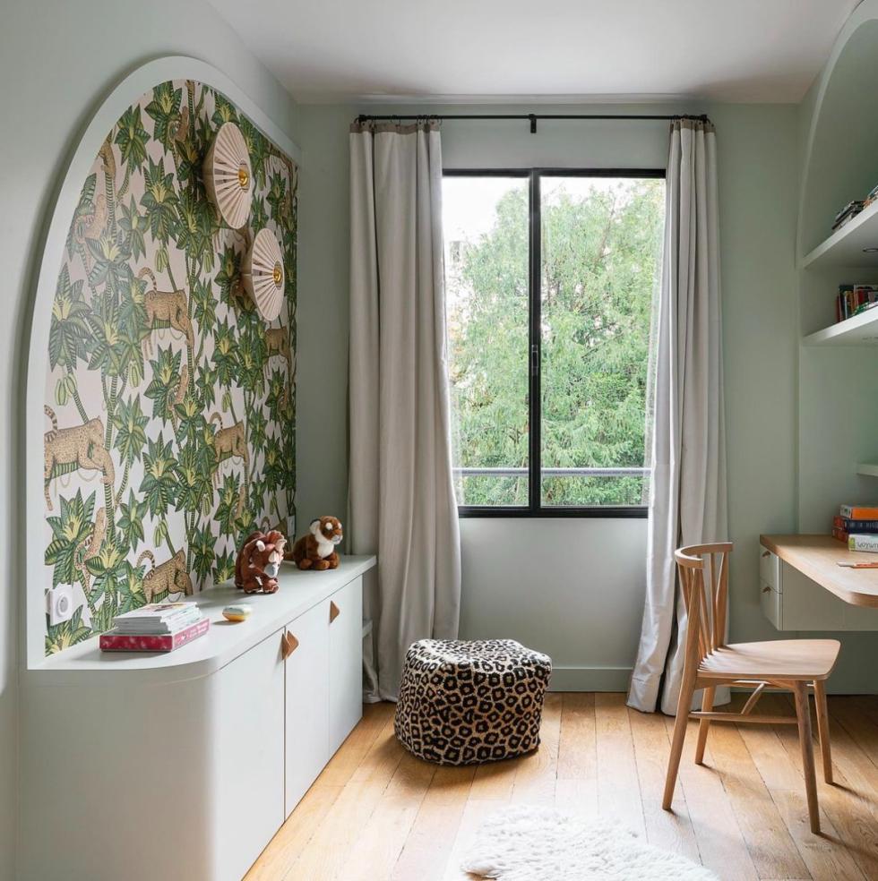
To section off spaces
Forget about wallpaper applied all-over in a room. Like paint, patterns can also be added in small touches to section up spaces. Mastering the art of playing with textures, interior designer Vanessa Faivre used it here to enhance a sea green sideboard installed in a child's room. Topped with a wallpaper arch, it structures the room and gives rhythm to this long wall. The detail that we love? The moulding that frames the arch, to hide the edges of the wallpaper and accentuate the picture effect.

To highlight a vanity unit
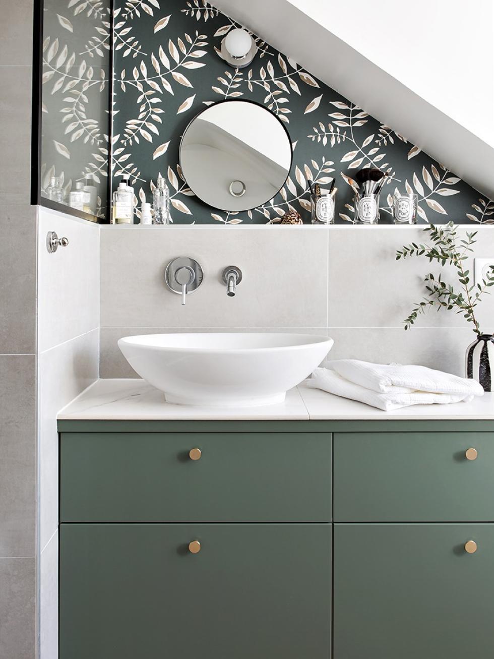
How to add personality to a practical room, to erase its technical functions without making them disappear? It's a tough call. With their taps, their almost compulsory tiling and their not always aesthetic sinks, bathrooms often struggle to show off your style. Good news, it only takes one detail to change their look. Applied on the sloping wall, the wallpaper by Mues Design allows here to divert attention while giving a nod to the shade of the Plum Living Vert de gris facades. Enough to give a youthful boost at a low cost.
