Paint + layout: the right mix to dress up your entry
A coat hook, spare bowl for your keys, and three pairs of discarded shoes... Your entrance has the essentials, sure. On one hand, you don't want to waste your renovation budget on it: after all you only spend a few of minutes a day there. But this area creates the first impression and sets the tone for your home when someone pushes open the door. Give some TLC to your entrance! All it takes is a few Ikea cabinets and a pot of paint to give it a new life at little cost. Take a look at some inspiring projects.
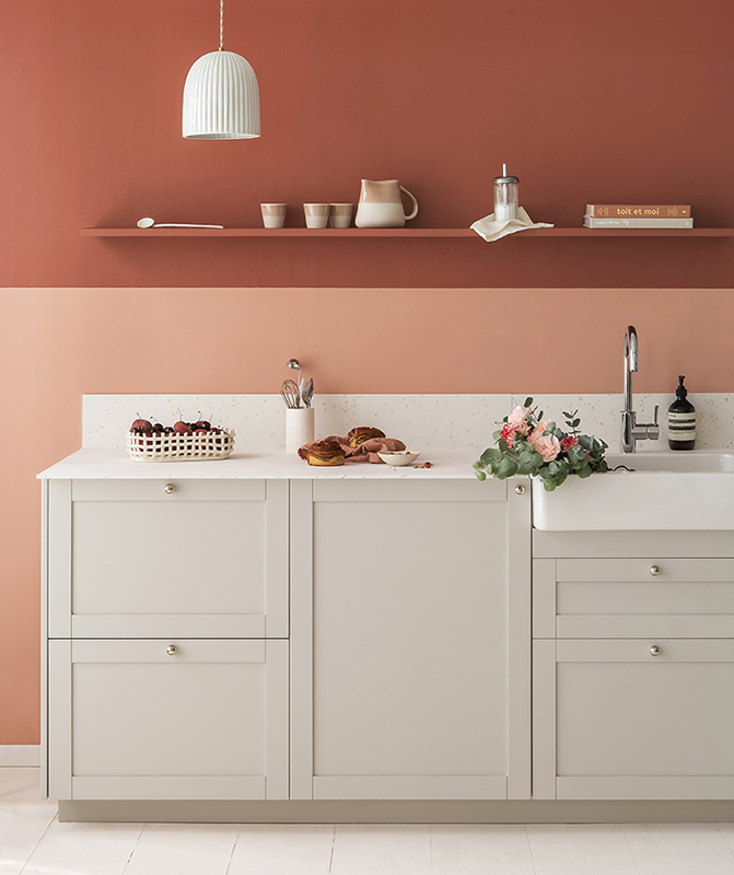
Take on two-tone
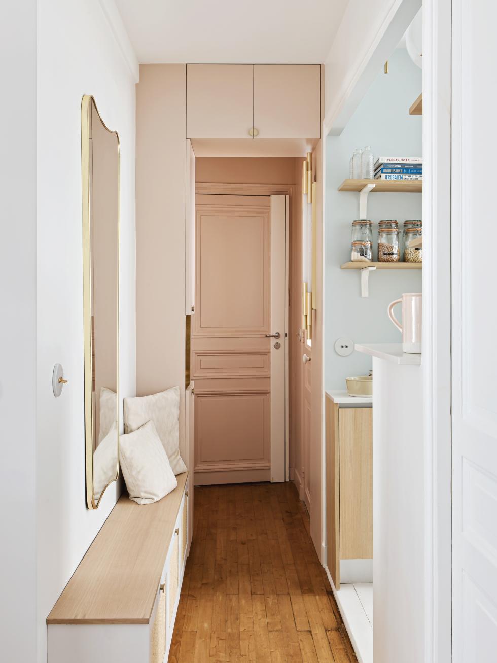
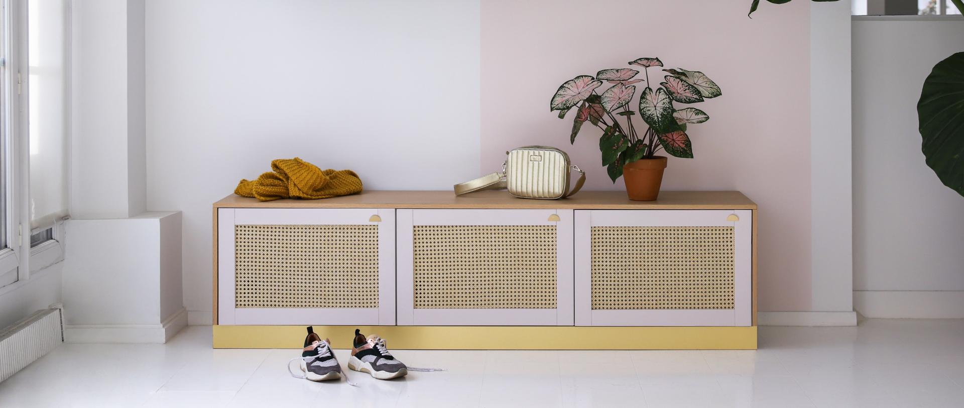
Bubble of softness

In green and against all odds
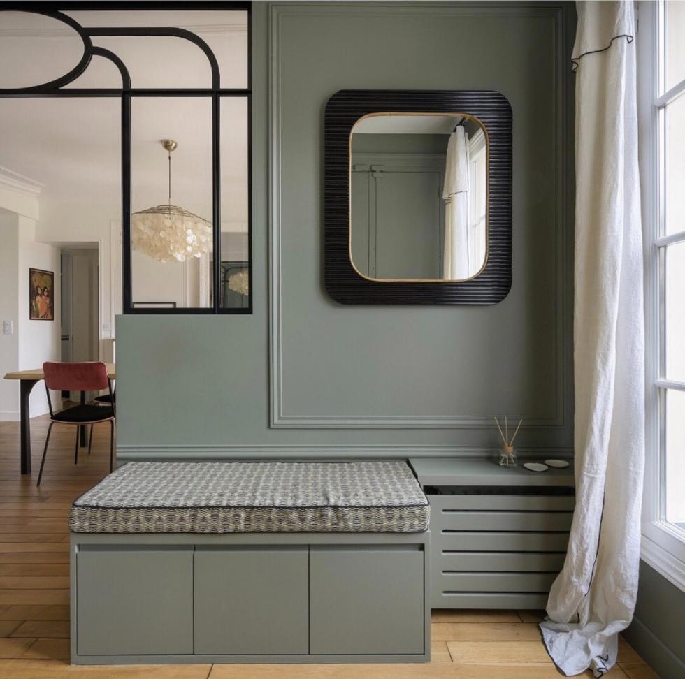
Call it the headache of renovations... How do you open up your entrance without removing it all together? One word, glass! Interior designer Caroline Debono added a touch of Art Deco spirit into this flat with a model that separates the entry from the living room while allowing light to flow through. Painted in the same shade as the walls, door, and woodwork, the lower cabinets act as both a bench and a spot to hide discarded shoes. Clever and creative!

It's all about perspective
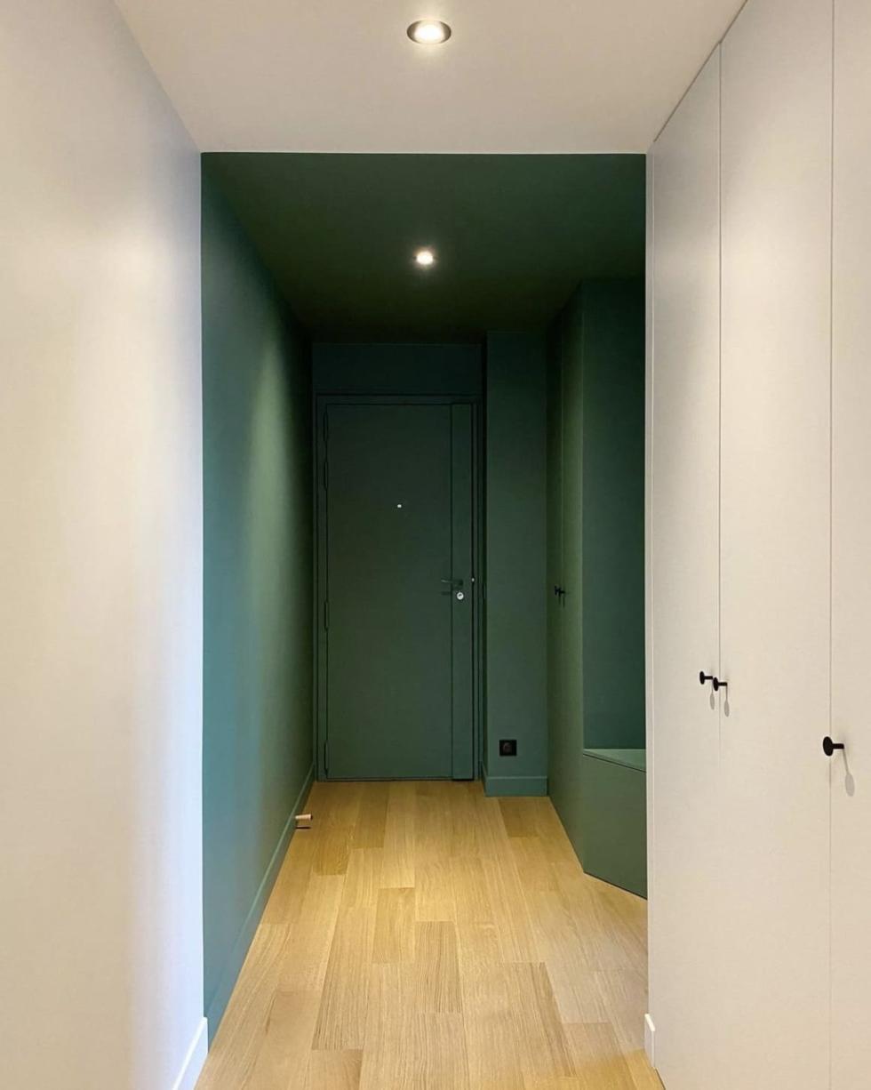
Two doors and six metres: that's the distance between this entrance and the living room. Interior designer Olivia de Revel has decided: out with white, in with colour. Here, the deep green extends from the door to the ceiling, visually reducing the length of the hallway while giving it character. The matching bench and wardrobe are in camouflage-mode, reinforcing the box effect.
