What colour to pair with a wooden kitchen?
It could be the Scandinavian spirit, the cosy warmth, or the connection with nature (which we have all been trying to bring to our interiors for the past few months), whether oak or walnut: natural wood is taking over the kitchen. But colour is hard to forget... opt for two-tone! While lighter shades will soften your space, darker shades will emphasise its character. All that's left to do is decide! Discover which colours will pair best with your wooden kitchen.
Natural Oak and Blue 02 - Bleu nuit, an electric match
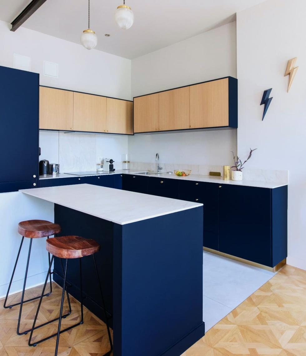
When it comes to designing an open kitchen, there are two schools of thought: on one hand, those who like to play it safe. On the other, the risk takers. No need to tell you which side Lisa Perez is on! The interior designer from Marseille combined our natural Oak and Blue 02 - Bleu nuit matte lacquered fronts for an electric result. We are particularly loving the cover panels framing the light wood cabinets, both emphasising them and creating unity with the cabinets below.
Natural oak and Green 01 - Amandier grisé, a celebration of softness
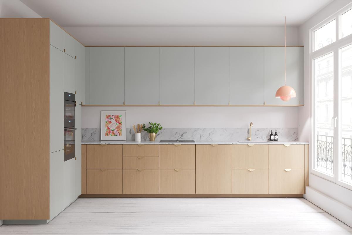
From the front, it looks like a natural oak kitchen with a touch of Green 01 - Amandier grisé. From the side, it's the Green 01 - Amandier grisé that dominates, highlighted with touches of light wood. A captivating layout, no matter the point of view! Here we played with matte lacquer and oak veneer to create a singular kitchen in which the materials help create structuring lines. The marble and brass handles naturally enhance this soft and timeless look.
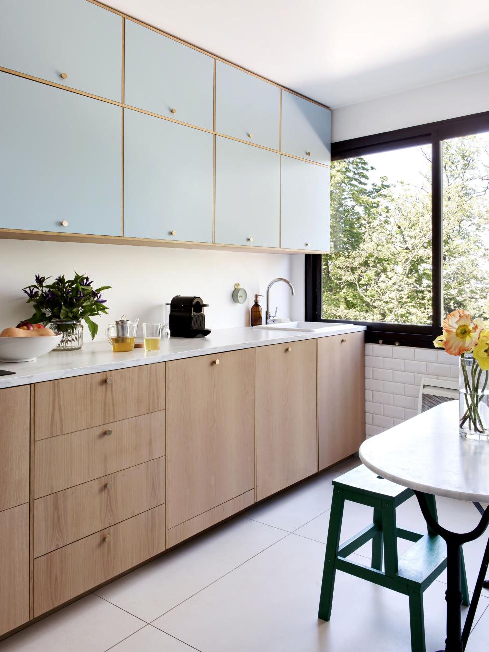
Natural oak and Blue 04 - Ciel voilé, Scandinavian style
How to combine two materials as different as lacquer and natural wood, without sacrificing a harmonious kitchen? Plum Living's co-founder has discovered the answer by placing natural oak cover panels between each cabinet in Blue 04 - Ciel voilé, creating dividers. The brass handles add the finishing touch to this Scandinavian mix and match look.

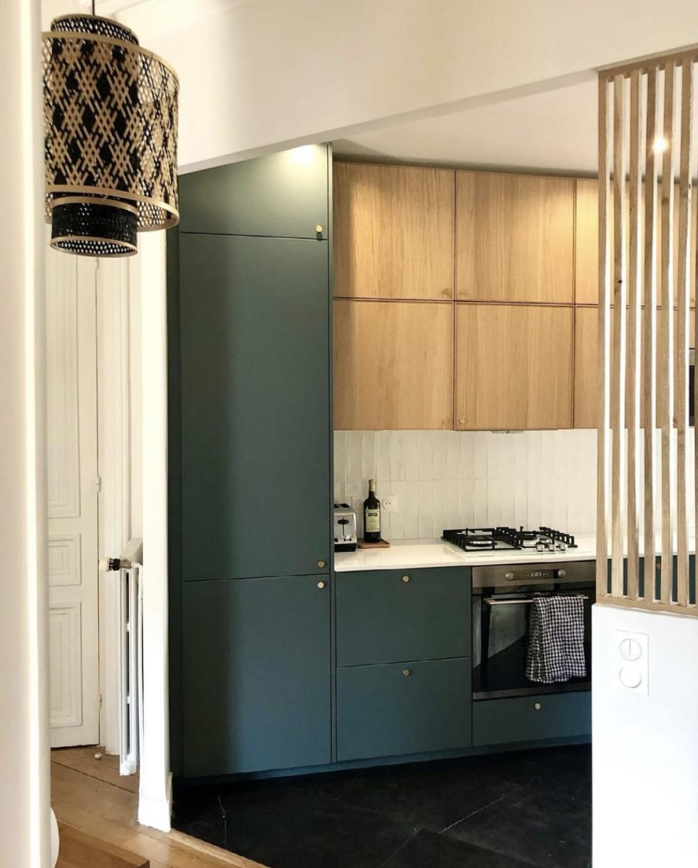
Natural oak and Green 02 - Sombre forest, in touch with nature
It's in their DNA! Whether oak or walnut, natural woods go particularly well with our shades of green. The proof is in the pudding with this design by Olivia de Revel, which combines a light wood - here the Ekestad model from Ikea - with our Green 02 - Sombre forest in matte lacquer. The interior designer chose this colour to dress the lower cabinets and the side columns, while the light wood of the wall cabinets pairs perfectly with the slats used to separate the kitchen from the entrance.
Walnut and pale grey, for a vintage look
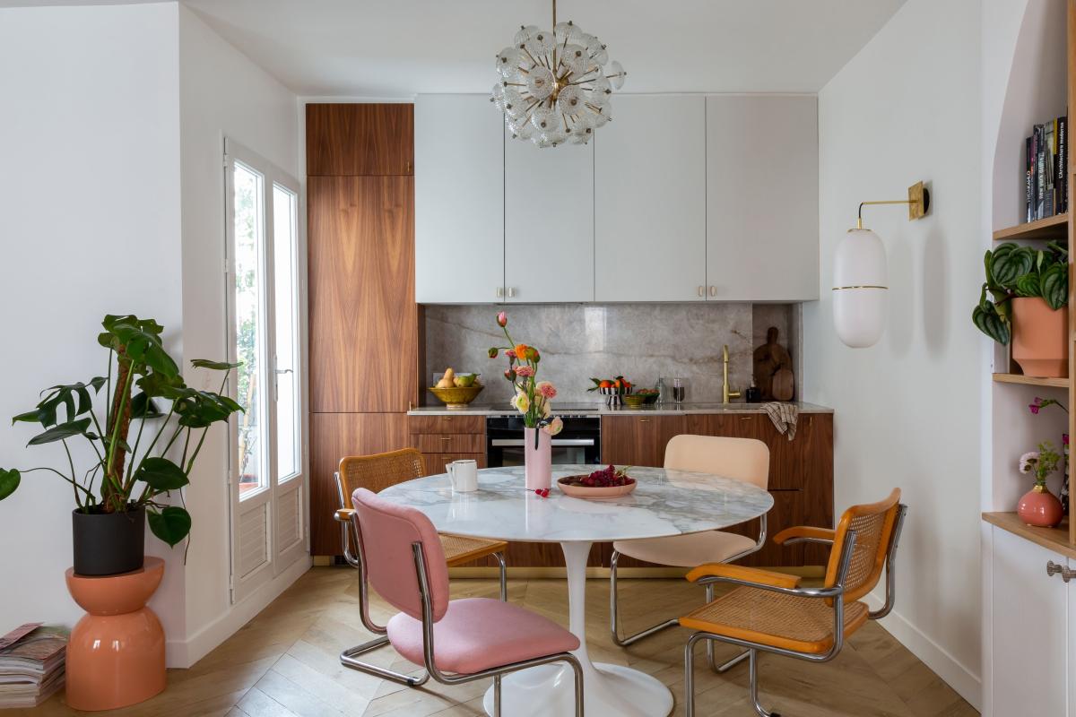
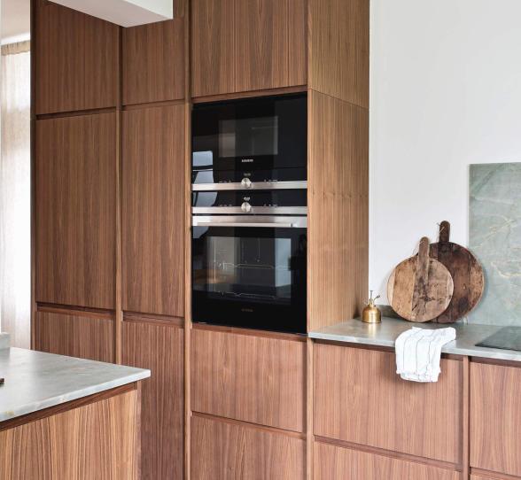
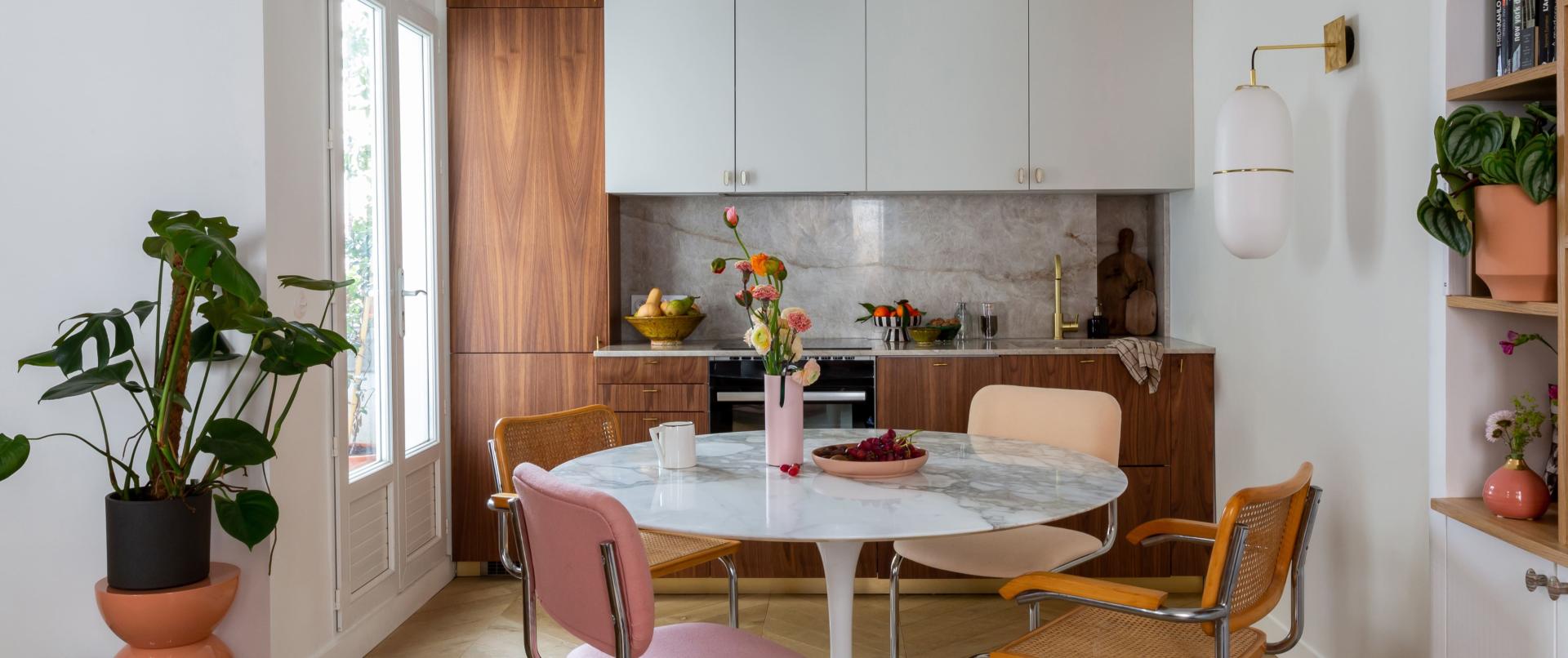
Natural Walnut fronts, mother-of-pearl and brass handles, and a pink granite countertop: interior designer Margaux Meza's kitchen proudly shows off its vintage influences. The co-founder of the Transition Id agency optimised the limitations of her space, choosing to visually lighten the dark wood by pairing it with a pale grey very similar to our Grey 01 - Gris nuage. The result is this stunning kitchen that sticks to the aesthetic codes of the rest of the flat, while blending perfectly into the living room.

Natural oak and black, the power of contrast!
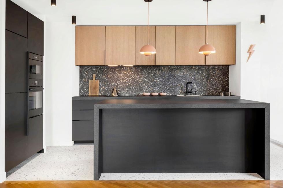
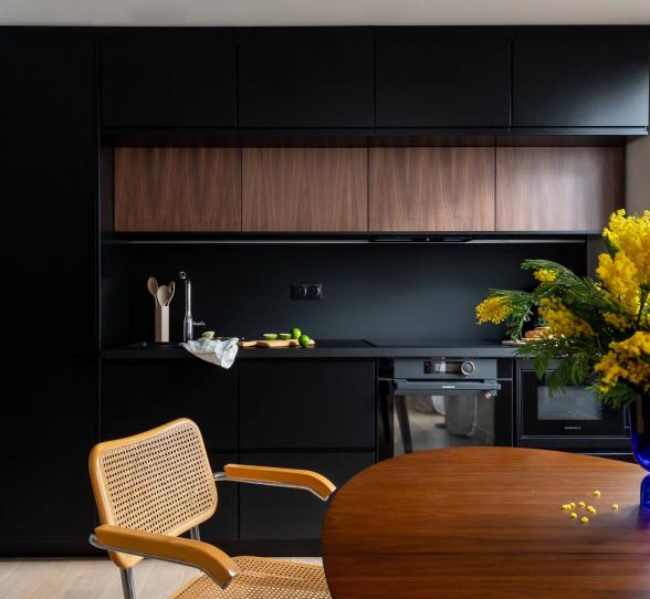
It's what catches your eye when you walk through the door to this kitchen: installed on the high cabinets, the natural oak doors steal the show from the black fronts below. With their light veining and subtle pinkish hue, they are a perfect pair for the terrazzo splashback and FlowerPot hanging lamps. Without over imposing, the black elements add a touch of contrast to the light wood.
