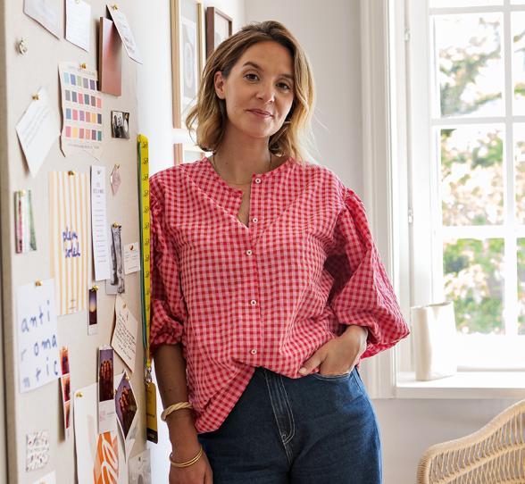
At Caroline Debono's, founder of Atelier CVD
Don’t look for a white wall: there isn’t one. Eight years after the first renovation of her apartment, Caroline Debono has reimagined it, boldly bringing in color and adapting it to family life. 125 square meters of ultra-optimized space, where shades enhance and echo one another, highlighting the creative ideas and design choices of the interior architect. A masterclass in layout and a life-sized color palette — come along for the Home Tour.


Life in colour
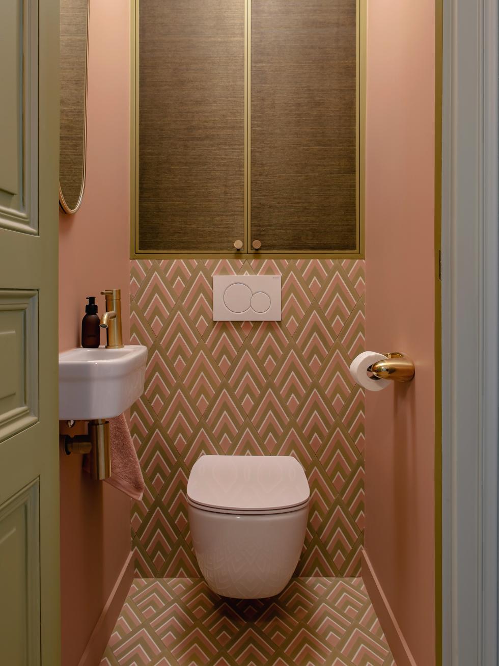
Pierre Frey wallpaper framed by a burnt-earth mirror, celadon walls, and teal-blue glass partitions — the entryway sets the tone without ambiguity. With their bronze door and blush tiles, even the hidden powder room doesn’t shy away from color. It was, in fact, this little space that sparked the idea to give the apartment a second life. “I had just renovated my upstairs neighbors’ place, and realized we could also create a second bathroom — a must when you’re living with three teenagers!” A perfect excuse for Caroline to dive headfirst into her craving for change. Gone are the pristine walls, pure white woodwork, and black-and-white sofas. “I realized that color makes me feel good.”


Starting point
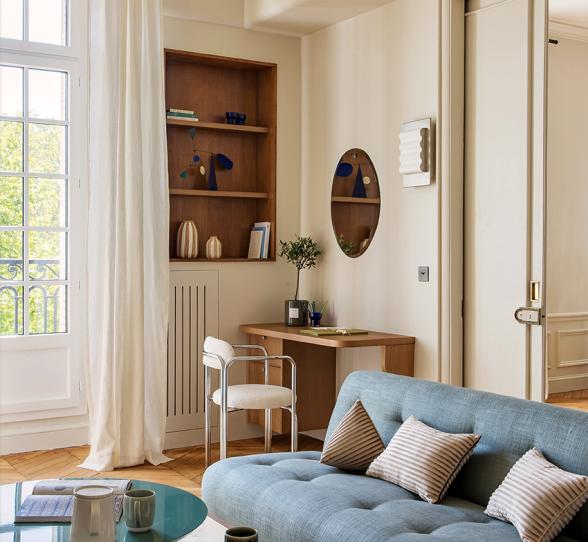
Color doesn’t have to mean monochrome. “That’s actually what flattens a space and makes it boring — unlike layered shades,” Caroline explains. The living room’s centerpiece, an Ananbô panoramic wallpaper framed between two windows, served as the starting point for the home’s entire color palette. From it, the interior designer drew the freedom to mix hues within the same room — like the bronze and celadon bookcase facing the olive-green kitchen, all tied together by teal-blue windows. “I wouldn’t necessarily have dared to use such a deep pink at first — but the wallpaper gave me permission to!”
Singing accents

If white is merely anecdotal for Caroline, so is black! A curtain rod here, a wall light or a console there — a few remnants from the apartment’s first version, and that’s it. The founder of Atelier CVD prefers deep tones like teal blue or wine red, which she uses as accents — sometimes to give character to a window, sometimes to add a playful twist to a glass partition. Her only rule: every shade must come from the living room’s wallpaper palette, to ensure a perfect harmony between all the colors.
Colour power
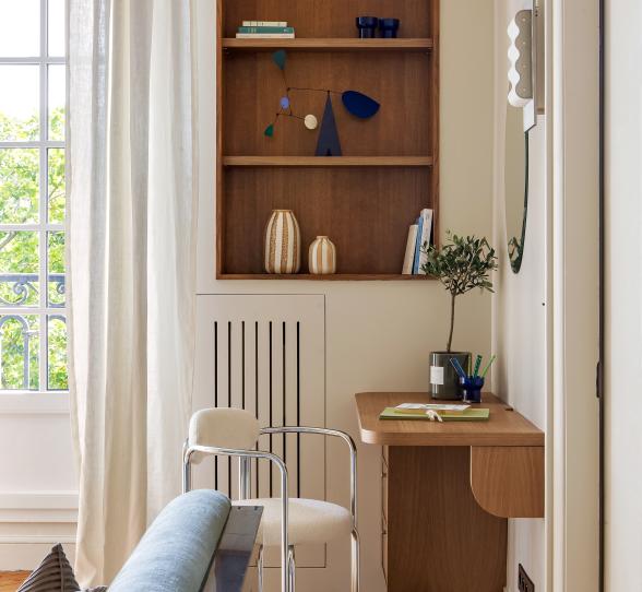
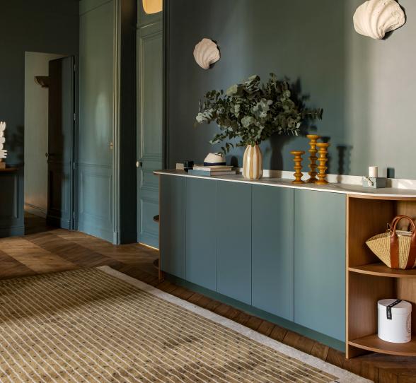
From the entrance to the living room, celadon is treated as a neutral colour. The interior designer has played with this pastel shade to highlight her arrangements, with the bookcase taking centre stage. "I kept the original structure, just adding a shelf and covering the doors of the lower unit with sisal. The colour does the rest!" The celadon then creates a structure that allows Caroline's beautiful books and cherished objects to stand out, giving the illusion of a full-height piece of furniture. The different gaps between the shelves and the open niche create rhythm, whilst the cable management and the cuts made in the shelves to preserve the picture rails give the whole ensemble a high-end appearance.


A decorative touch
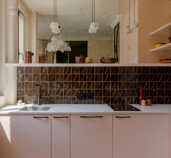
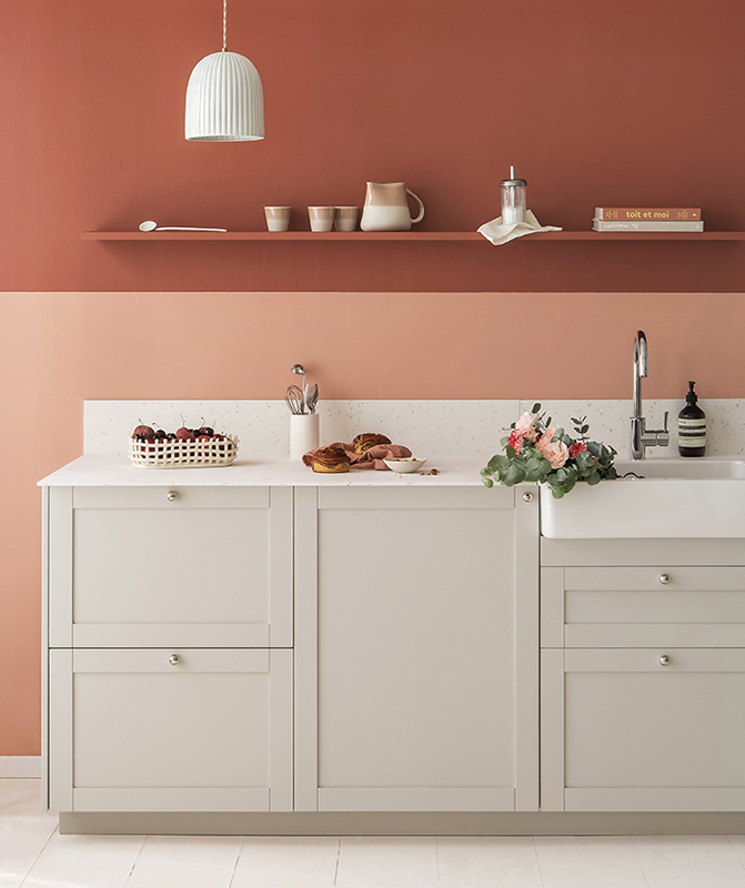
Caroline applied the same principle in the kitchen. Once white, it is now simply dressed in colors to gain character and depth. The centerpiece of the layout, the green quartzite countertop extending into the sink, enhances the aesthetic dimension of the open-plan space, while the dining table completes the composition. “I hesitated for a long time about adding an island; I even made 3D plans, but it would have overcrowded the space.” Add a contemporary rug and a pendant light echoing the brass details, and you get a kitchen designed as a decorative touch.


Hide the things I’d rather not see
A clever design idea that owes much to the creativity of Atelier CVD’s founder, who loves finding ways to conceal unsightly technical elements. First introduced during the initial renovation, the partition hides the oven column while creating a recessed nook for small appliances. Caroline also took advantage of this layout to integrate a corner cabinet into her kitchen — a smart way to maximize storage. And to keep everything tidy in a large family? “Discipline!”
Hotel-style
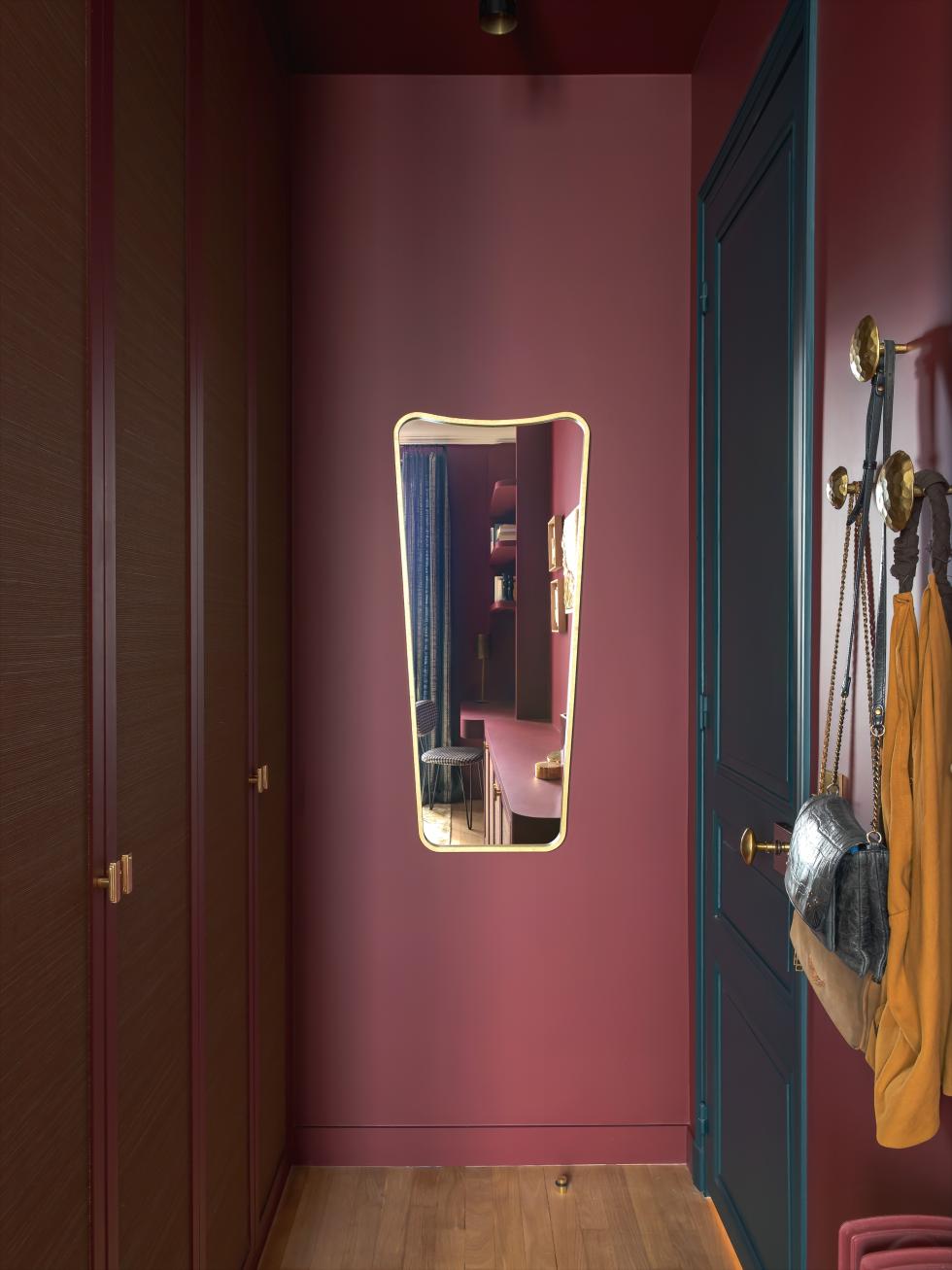
Why stop halfway? The interior designer extended the use of color into the sleeping areas, with the master suite as the perfect example. Nestled just off the entrance, it combines a dressing area, a home office, and a bathroom within a few square meters. Paint acts as a unifying thread between the different elements, creating a cozy, theatrical atmosphere. The burgundy walls extend from the joinery to the bathroom ceiling, energized by touches of khaki and brass. Materials play a central role in these color games, with zelliges leading the way — on walls and floors, they capture the light and enhance the tonal harmony.


Out of sight, out of mind
As in the kitchen, Caroline's bedroom prioritises aesthetics. Her husband needed a screen for work? No problem! She integrated it into the dressing table that extends her sideboard, concealing it behind fluted casing. There was no question of neglecting the details. In this recess, you'll find brass sockets and switches, just like in all the rooms of the flat.
Framing the scene
Take a closer look. From the living room to the master suite and even in 16-year-old Juliette’s bedroom, the wallpaper takes on a theatrical flair. “I like to offset it to give it a more contemporary feel.” In the living area, it becomes a painting, simply placed within the existing moldings. For the headboard, the interior designer envisioned it framed with a 5 cm strip painted in teal. “It happened instinctively. I felt it contrasted too sharply with the white ceiling, and simply juxtaposing it against the burgundy wall would have been too easy.” In Juliette’s room, the paneled vanity frame delineates the Ananbô panoramic wallpaper, while the painted wainscoting and adjacent wall add complementary depth.


Colourful repertoire
Bronze, wine lees, glacier blue, peacock blue… each bedroom has its own colourful repertoire. A bold design choice that doesn't prevent continuity, thanks to a well-established grammar found throughout all the bedrooms. The joinery doors upholstered with sisal wallpaper by Élitis are the perfect example. Available in dedicated shades, they create a link between the bedrooms. You can even find them in both toilets! Special mention goes to the fine frame that surrounds them and gives them a contemporary dimension, as well as the 4cm skirting board that elegantly elevates them.


Rounding the corners
Curves are another detail dear to Caroline. While here they are an integral part of her custom carpentry, she doesn’t hesitate to attach them to a standard IKEA unit on her projects, before painting them in the same shade as her Plum doors. They also appear in Juliette’s bedroom in the form of an arch. Here, the edge of the shelves has been painted in a contrasting color to create a playful mix of tones and add character to the layout.
Two-tone hallway
Throughout her renovation, the founder of Atelier CVD has mastered the art of combining colors. Just take a look down the hallway from one of the teenagers’ rooms to see for yourself! By playing with the door frames and doors, Caroline lets the shades interact, adding depth to the passage spaces—like pairing two different pink tones in the corridor.


Giant moodboard
It's ultimately in her office that she remained most reserved. Entirely painted in teal, it stands out as a calmer space, where she brings to life the moodboards she envisions for her clients. By moving the glass partition a few dozen centimeters, she created room for a work table paired with a bench, perfect for free-flowing discussions with her collaborator and for experimenting with colors and materials. Don’t even think about asking her for white!
The ideas that inspire us
- The wallpaper that serves as the starting point for a palette of bold colours
- The beading, mouldings and paintwork used to give a theatrical dimension to the wallpaper
- The joinery covered in sisal and available in several shades throughout the flat
- The colour used as structure in the bookcase
- The tonal colour schemes on the doors and door frames
- The bold colours used as accents on the windows and glazed partitions
- The technical elements hidden in the kitchen
- The painted ceiling and zellige tiles on the floor in the bathroom