Home of Morgane Chaplain, architect
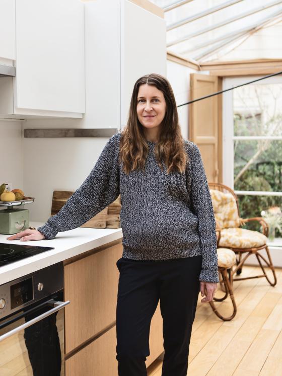
In a small street, nestled between the boulevards of the 16th arrondissement of Paris, lies the home of Morgane Chaplain. Here, the old workers' homes built on either side of the street give the area a London-feel. But once you walk through the door, it's all Scandinavia. The architect has been living in her childhood home for the past four years, which she made her own by playing with natural wood to create a warm cocoon for her family. Take a guided tour.
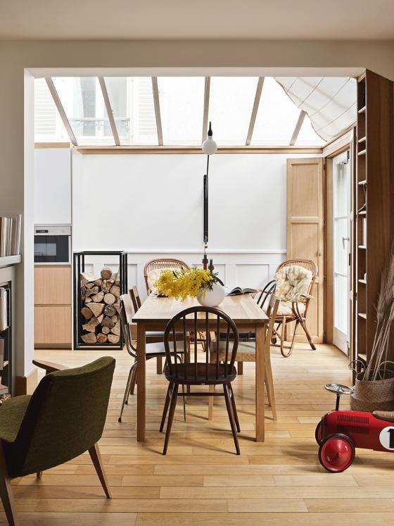
Blank canvas
The headache of all tenants: how to personalise your interior and feel at home in a space created by others? "When my parents suggested we move in, the living room was much darker and furnished to suit their taste," says Morgane. The architect chose to start from scratch, painting the whole house. The woodwork and glass roof created by her dad (also an architect), served as a starting point for developing her own style.
Home sweet home
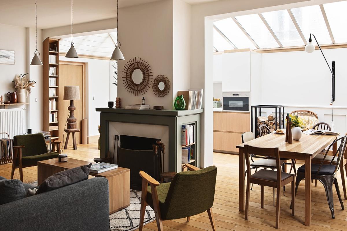
"I prefer to start with a neutral base, then liven it up with natural materials, wood, and decorative pieces" explains the woman who now devotes herself to interior design. Over the months, Morgane's interior has also evolved. The black fireplace, a centrepiece in the living room, was repainted green to soften the look. She also mixed antique furniture with contemporary elements to bring character to the space. "We took our time to buy furniture that would fit the space, and to create a home that suits us perfectly."
Big change, little cost
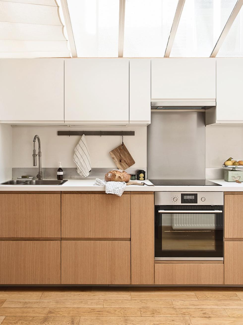
The kitchen was a surprise for Morgane when she returned to the family home. "It was only installed by my parents when they redesigned the space as a rental. They took advantage of the glass roof, making it a very bright and pleasant space." While the discreet yet functional layout worked well for the architect, the glossy beige Ikea fronts were not quite what she had in mind. "The kitchen is visible from the entrance. It had to blend in with the decor and fit the aesthetic-codes of the house."
Scandi spirit
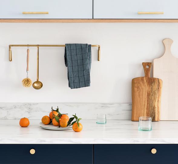
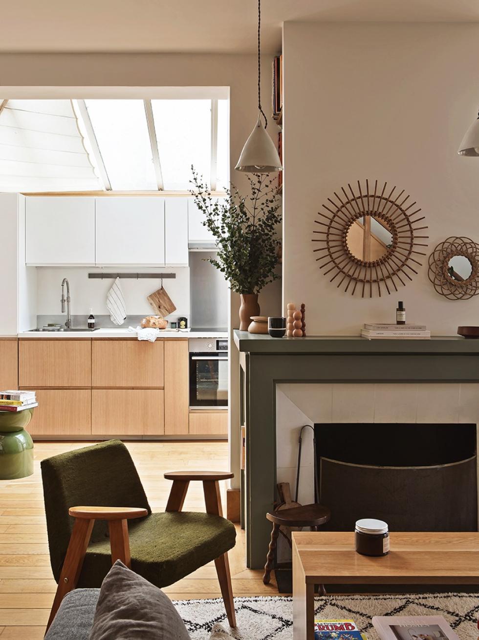
A few natural oak Plum Living fronts, white Ikea doors and a laminate countertop were all it took to give the kitchen a new look. "The idea was to change (and spend) as little as possible" admits Morgane. Handles are out: she deliberately chose our U-Shape design to keep the Scandinavian simplicity found throughout the house. The dark countertop was replaced with white, for a discreet look that didn't break the budget.

Do It Yourself
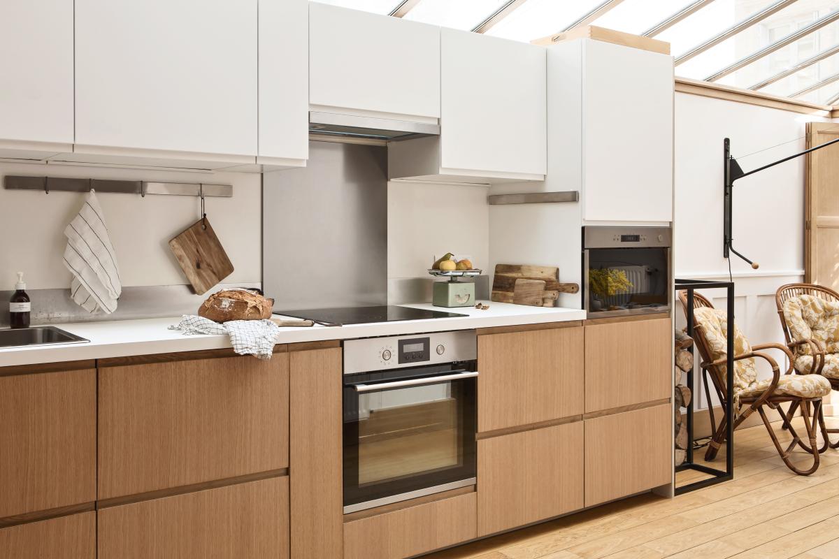
By keeping the existing structure, Morgane was also able to avoid the extensive work that comes with renovating. All that was needed was to remove and replace the existing fronts. "My husband did all the fitting!" The couple played with finishes to give the kitchen a little rhythm. On the lower cabinets, natural oak echoes the light wood floor and shutters. Take a closer look: the columns on either side of the countertop are also two-tone, for a totally-uniform aesthetic.
Rethinking spaces
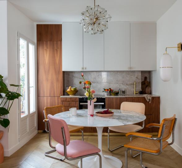
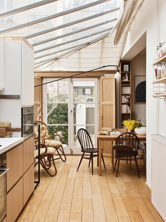
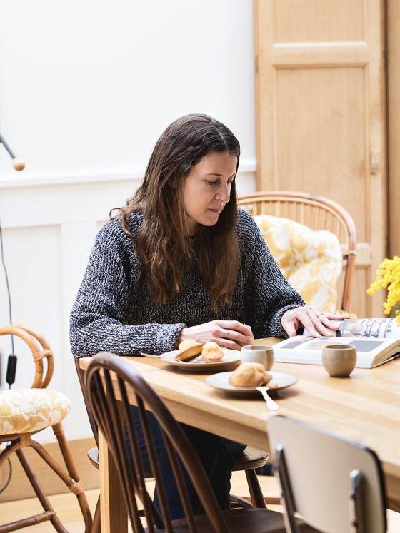
Morgane's parents lived in the adjoining house and had used the ground floor as a large living area with no specific purpose. The kitchen helped structure the space, while the dining area was a natural extension of it, taking full advantage of the natural light flowing in from the glass roof. The Muji light wood table blends perfectly with the Ercol chairs and antique crockery. The black metal bracket adds a contemporary touch, as does the Bourroulec brothers' creation hanging on the wall.
White with a splash of colour
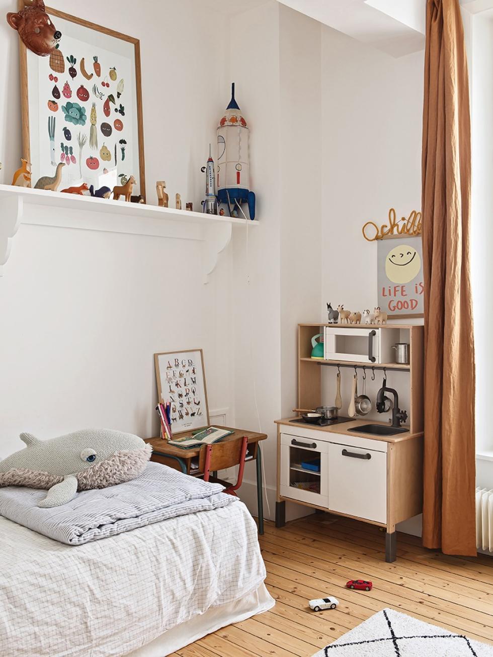
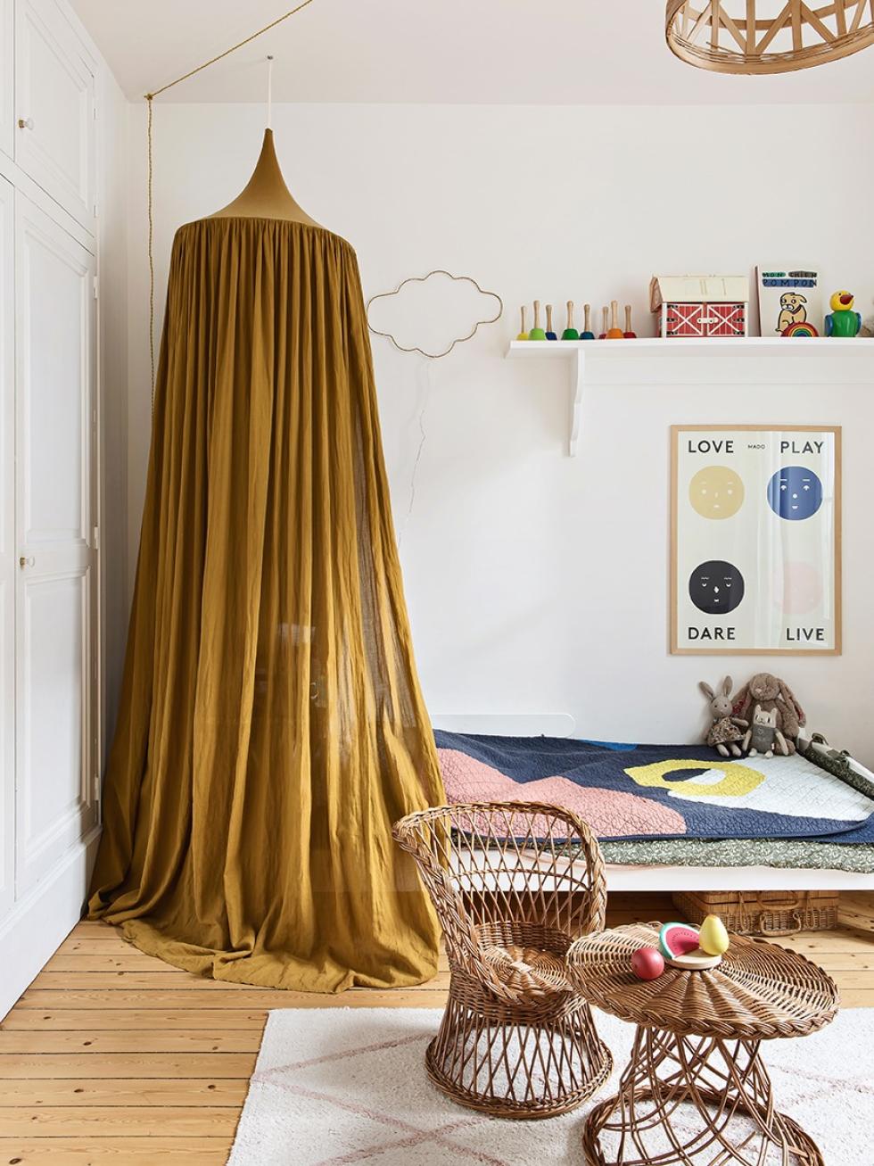
Upstairs, the kid's rooms don't escape untouched! "When we first arrived, mine and my sister's bedrooms were just as we left them all those years ago when we left the nest. A coat of white paint was inevitable!" Morgane added a twist to the blank canvas with antique furniture and splashes of colour. In Madeleine's room, it's a mustard canopy and vintage toy collection, while in Achilles', it's the ochre curtains that give a warm & cosy light to the room. Little effort, big impact details that change the look of the room without any major work!

Ideas that inspire us
- The natural oak fronts that instantly give the kitchen a new look
- The combination of natural materials and white for a warm Scandinavian style
- The fireplace and coloured accessories that bring the living room alive
- Antique objects that give soul to the home
