Tiphaine and Ronald's home in Lyon
Next stop, Lyon! You'll need a bit of height before pushing open the door to Tiphaine & Ronald's family home. Lockdown got the better of them, and after a few months of searching, they settled down in this 1920s home located at the gates of the Presqu'île that they renovated from top to bottom. Goodbye small partitioned rooms: the couple have created an open and luminous living space, where light oak is the common theme. Take a guided tour with us!
Shaker spirit
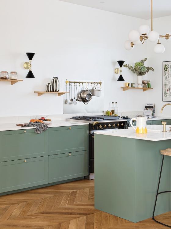
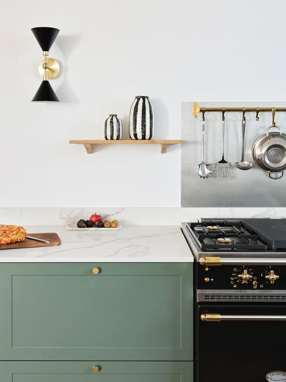
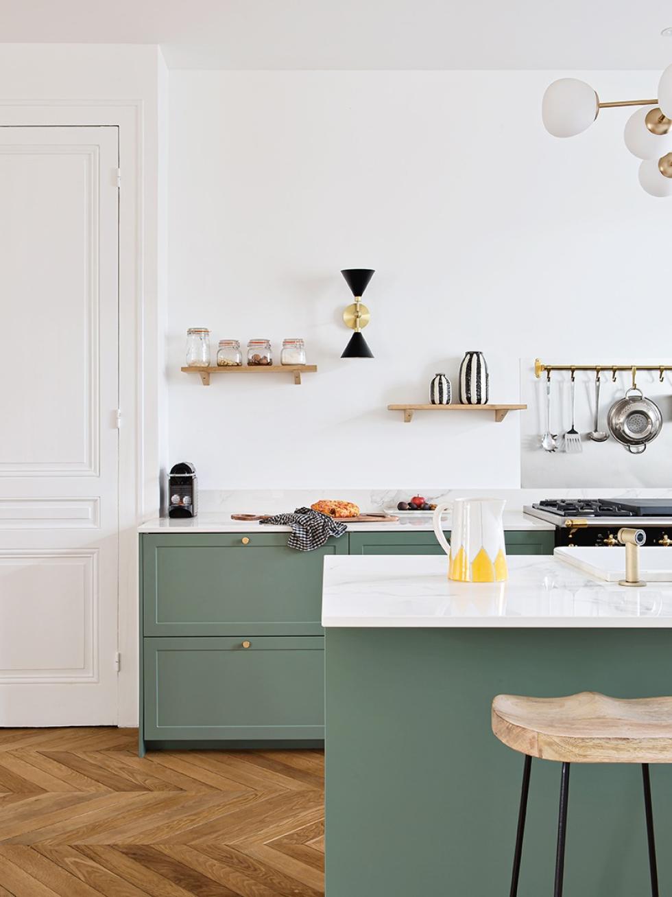
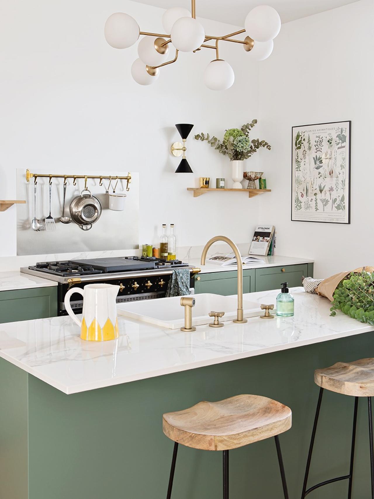
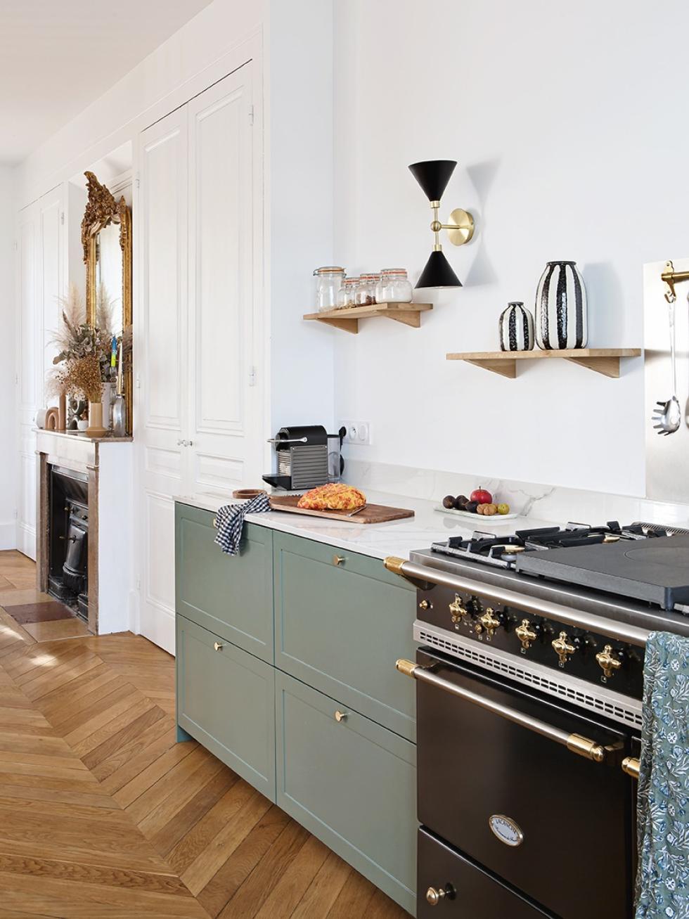
All eyes on the kitchen! With its Green 03 - Vert de gris framed fronts, marble-effect Dekton countertop and brass touches, this kitchen looks as though it's straight out of an English cottage. Tiphaine and Ronald made it the central room of their home. "It's the room we designed first. We both love to cook and entertain, so it was important to us that it was warm and friendly." No tall furniture here: the cupboards in the dining room make it possible to go without wall units in favour of floating shelves in a light wood. A perfect spot for decor we think?

Possibility for an island
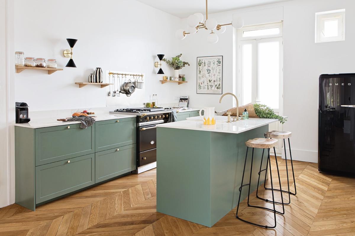
Isolate herself from her guests? Unthinkable! A central island was therefore the obvious choice for Tiphaine. "It's super user-friendly! You can walk around it, and it gives the impression of space." The farmhouse kitchen sink further reinforces the shaker-style of this kitchen, highlighted with a brushed brass mixer tap.
Blank canvas
Installed as an extension of the kitchen, the dining room was actually a bedroom until a few months ago. "Everything was very compartmentalised on the ground floor. We broke everything up, to start from scratch and rebuild as we went". With its high ceilings, moulded cupboards and period fireplaces, the house ticked all the boxes of an old home with character, which is exactly what Tiphaine and Ronald wanted. "It really was in its original state. We wanted to bring out the existing character".
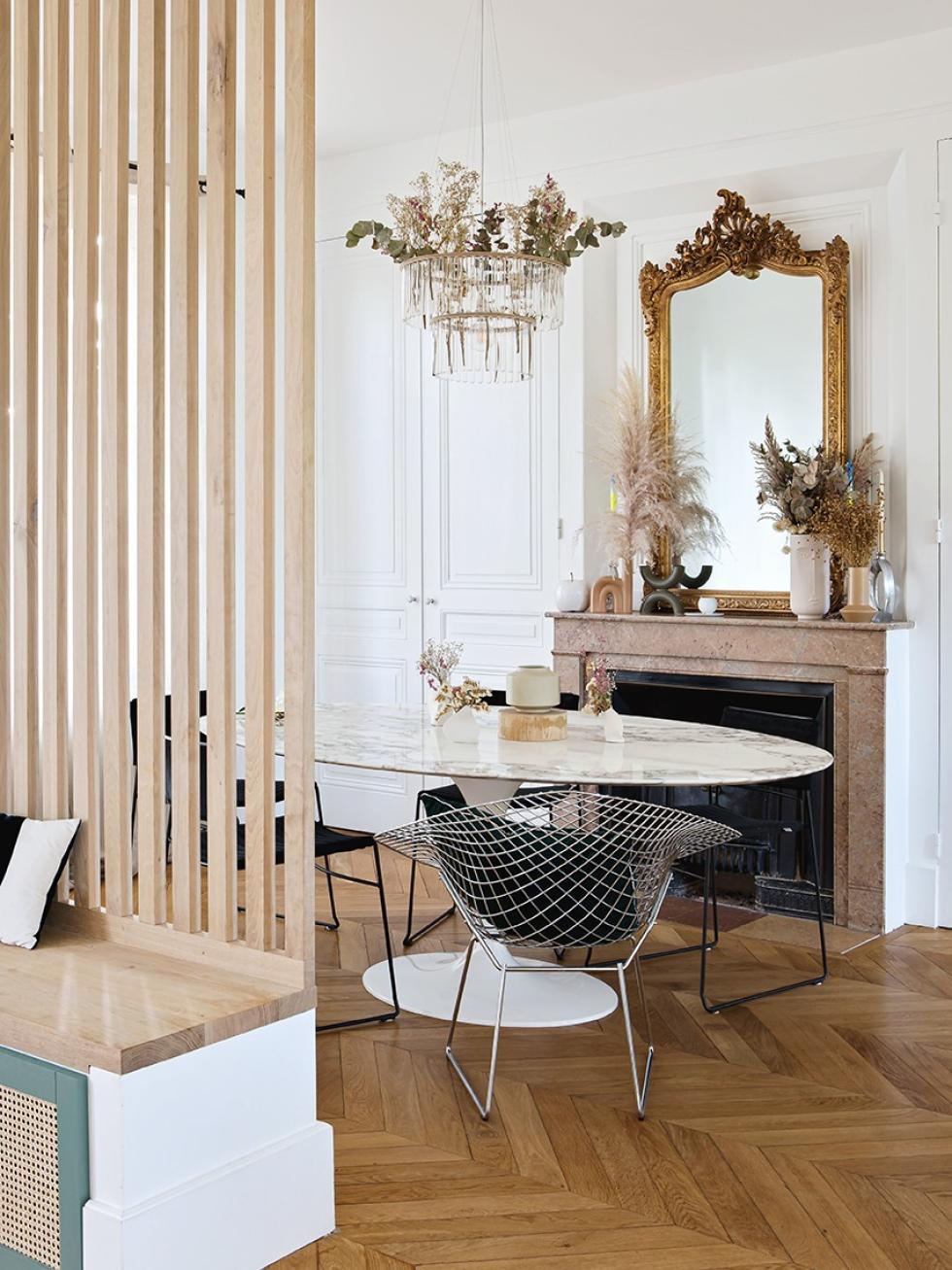
The claustra charm
Open up space, yes. But remove the walls all together? Not quite. "We wanted space without feeling like we were having dinner in the hallway." Claustra quickly came to the rescue! Made of light wood reminiscent of the parquet flooring, natural materials make up this cosy spot. The Knoll table in marble pairs perfectly with the kitchen countertop.

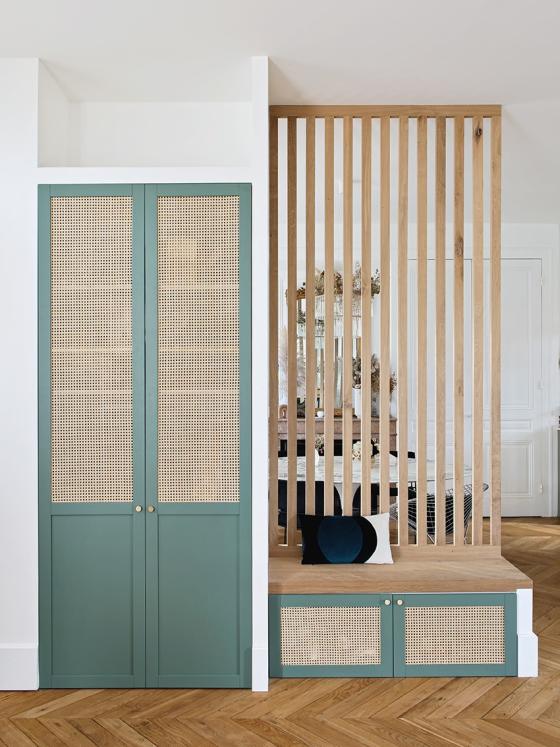
Custom-made effect
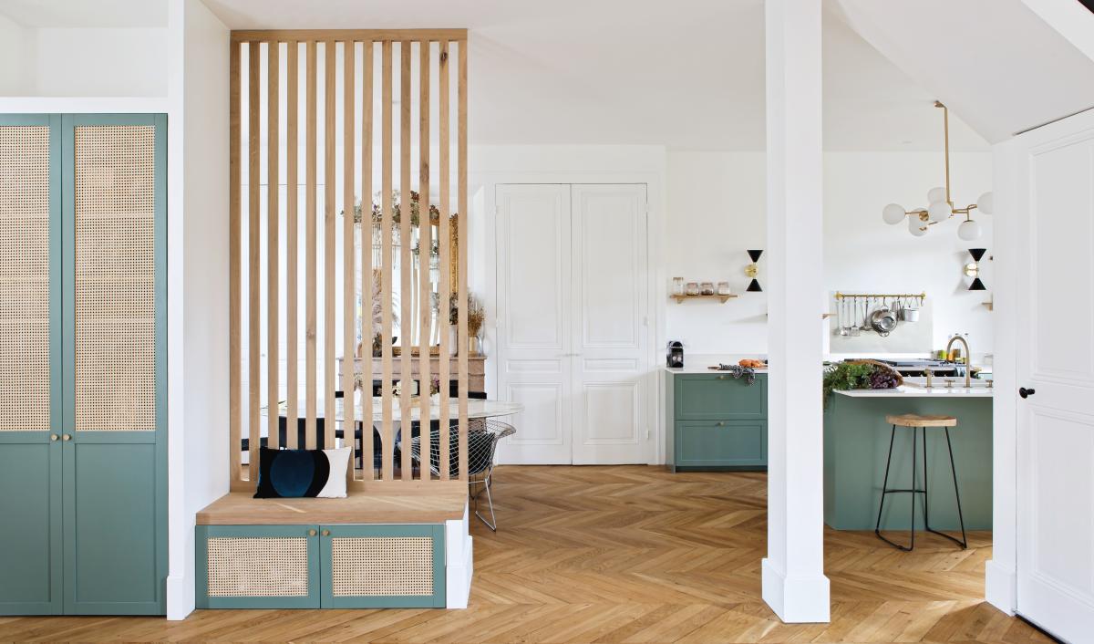
On the other side, claustra was used as the starting point for an ultra-practical entrance. The perfect spot for storing jackets, coats, and tying the kid's shoes! Tiphaine and Ronald went for a custom-made look by having two plasterboard partitions fitted, where they installed Pax and Metod cabinet frames to create a wardrobe and bench. Chosen in the same shades as the kitchen, the Plum Living doors in cane Green 03 - Vert de gris keep a common theme throughout the rooms. "It adds so much charm to the house!"
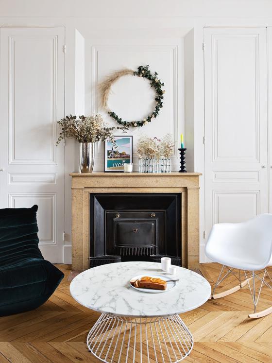
A floor story
The living room on the other hand, has barely been touched. Aside from the floor, which needed a few touch-ups once the partition walls were removed. The couple set the cement tiles from the old bedroom aside for a future project, and the parquet flooring, which was previously laid in straight strips, was completely removed. "We found strips of the same size in an old castle and bevelled them to create a herringbone pattern. A long story that took us some time to perfect: there was always something missing!"
Work in progress
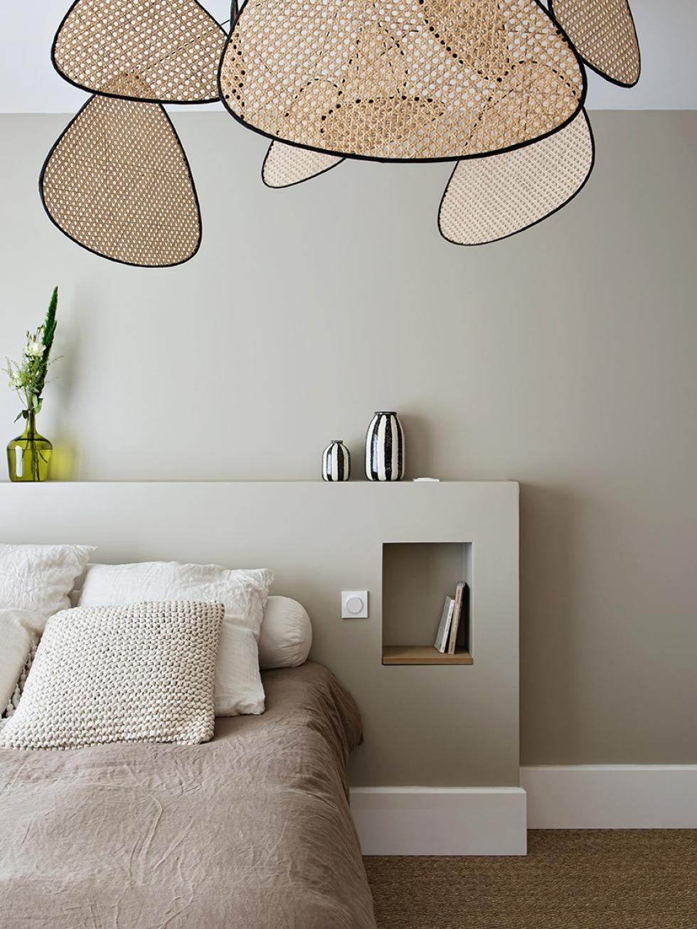
With two renovation projects under their belt already, Tiphaine and Ronald weren't afraid of an extension project. The result is a 35m2 extension to the house, home to their bedroom, wardrobe, bathroom and laundry. "Ronald was so busy with the project that he left his job in finance to start his own project management business!
Practice makes perfect
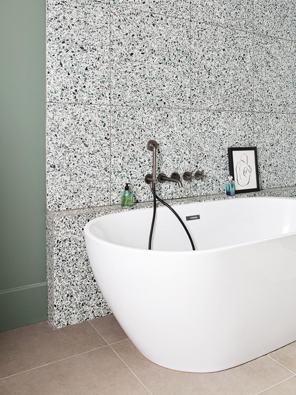
The bathroom definitely required the most thought. "We were disappointed with our two previous bathrooms. We had to work with what we had, and the result never lived up to our expectations. This time, we used terrazzo as a starting point to create a spacious bathroom, which still fits in with the rest of the house. We didn't miss this time!"

On the wall
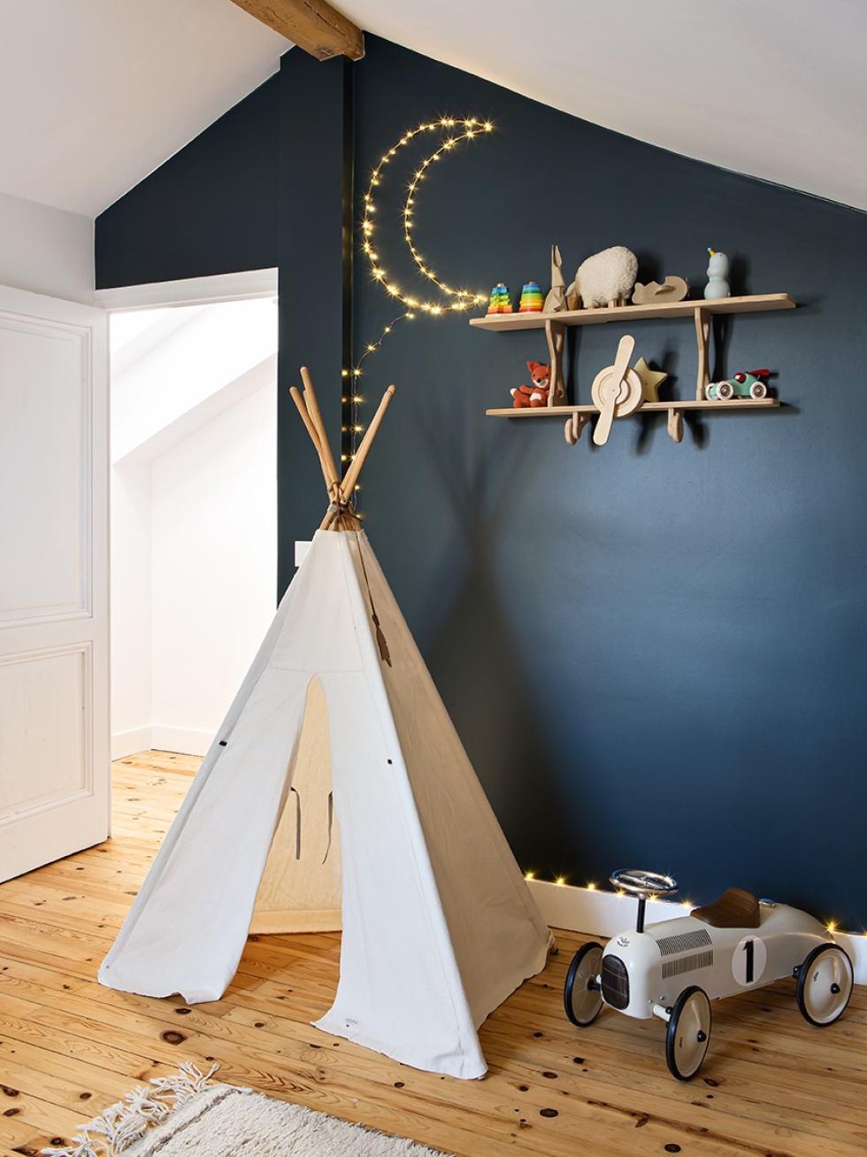
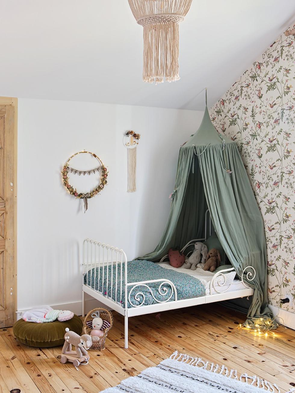
Madeleine aged 3, and Gaspard aged 4 and a half, share the first floor. "We wanted to keep the volumes but enhance the existing space." The sanded wood floors and exposed beams blend in perfectly with the kid's bedrooms, which haven't been spared in terms of decor! Tiphaine chose to highlight one wall in each room, opting for a poetic wallpaper by Cole & Son in one and a Blue 02 - Bleu nuit wall in the other. Nonetheless, both designs complement the wood and light that bathes the bedrooms. "They feel good there, and that's the most important thing for us!"

Ideas that inspire us
- The cabinets built-in to the partitions that give a custom-made look
- The kitchen without wall units, designed as a decorative space in its own right
- The claustra, which allows spaces to be defined without partitioning
- The natural wood used as a common theme throughout the home, giving it harmony
