Interior designer Margaux Meza's place
Take your favourite vintage furniture. Add a few decorative pieces collected from around the world, and sprinkle it with colour and wallpaper full of character. Nestled in the heart of Batignolles, interior designer Margaux Meza's cocoon is an invitation to travel through time. From the bathroom to the kitchen and master bedroom, every nook and cranny of this 52 m2 apartment has been thought out and optimised to welcome the Transition Id agency co-founder and her family. A colourful project, which she agreed to reveal to us to help you in imagining yours!
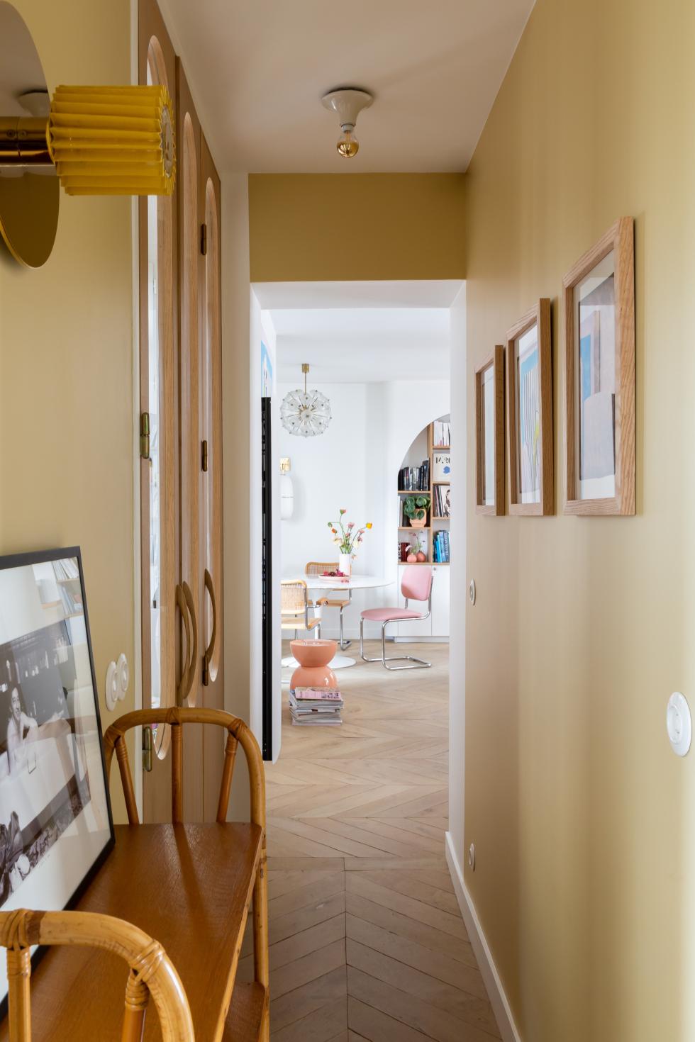
The entrance sets the tone
Colourful cocoon
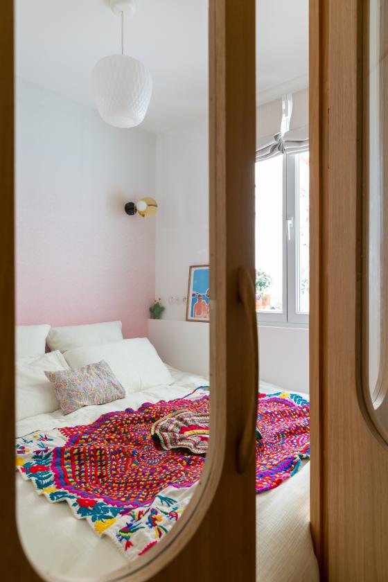
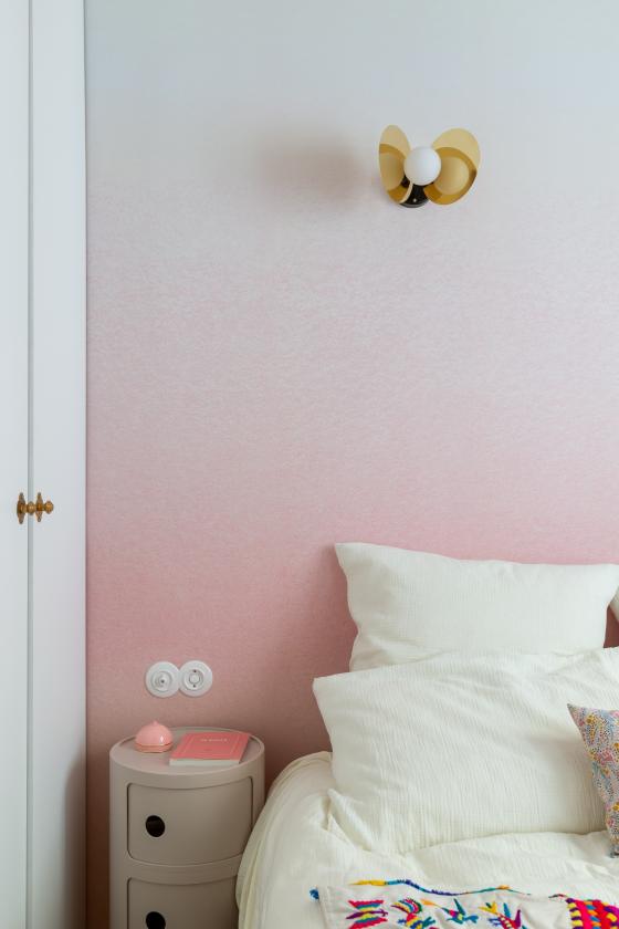
It's impossible not to be drawn to the master bedroom as you walk by. Hidden behind a custom-made glass partition with rounded shapes, it's as compact as it is colourful. A bed, wardrobe, and Componibili bedside table all nestled into 6m2. "It's a little cocoon that's just enough for us," explains Margaux, who preferred to leave the main bedroom to the kids. The pink gradient wallpaper, highlighted with Areti wall lamps, is a reminder of the sunrise that the couple can see from their window. The bedspread, a souvenir from a trip overseas, gives a personal touch to the room.
Retro lines & modern materials
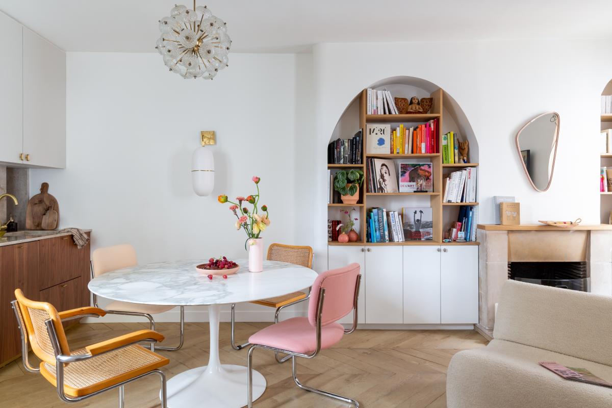
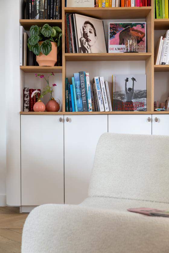
A mix of styles and eras, the living room clearly reflects Margaux and her partner Carla Lopez's taste for china and vintage. The arches of the bookcase and round furniture by The Socialite Family give it a resolutely retro feel. The solid wood herringbone flooring combines this passion for old charm with the comfort of the new. With its patina, you'd swear it was decades old — however, found at Parqueterie Nouvelle, the couple had it installed when they first moved in! The switches follow the same concept. "The ceramic models are fragile and costly. So we opted for switches made of Duroplast, a composite plastic that gives the perfect illusion!"
Two-tone kitchen with a vintage table
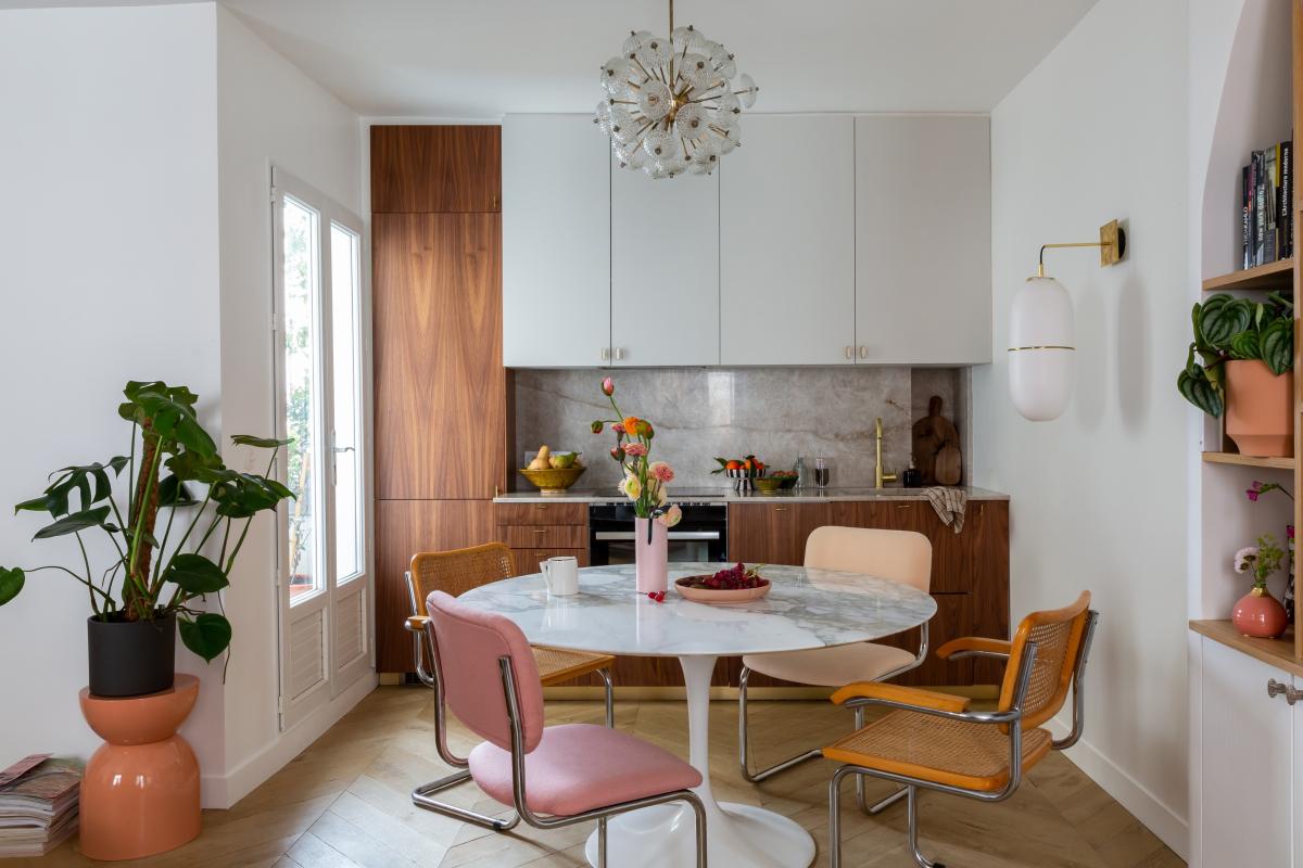
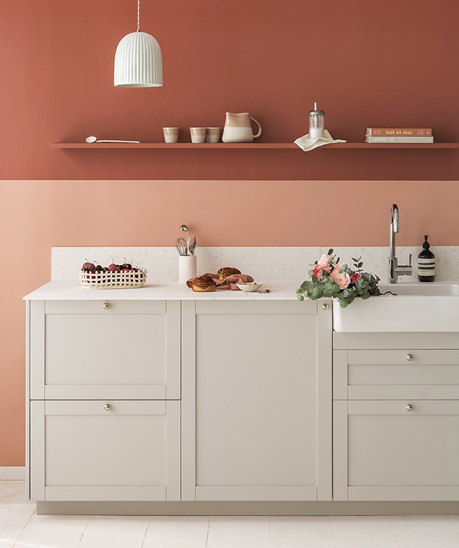
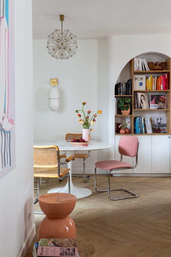
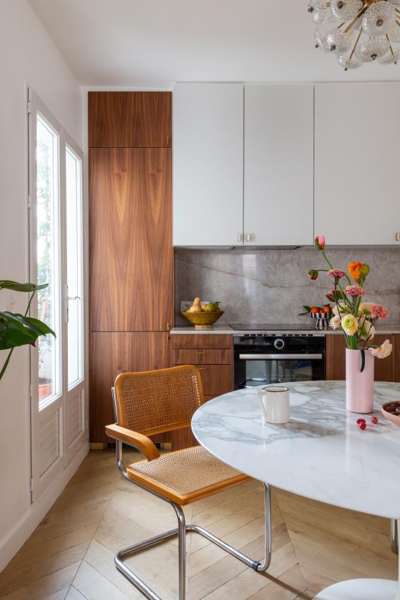
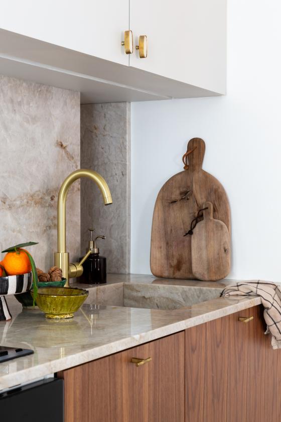
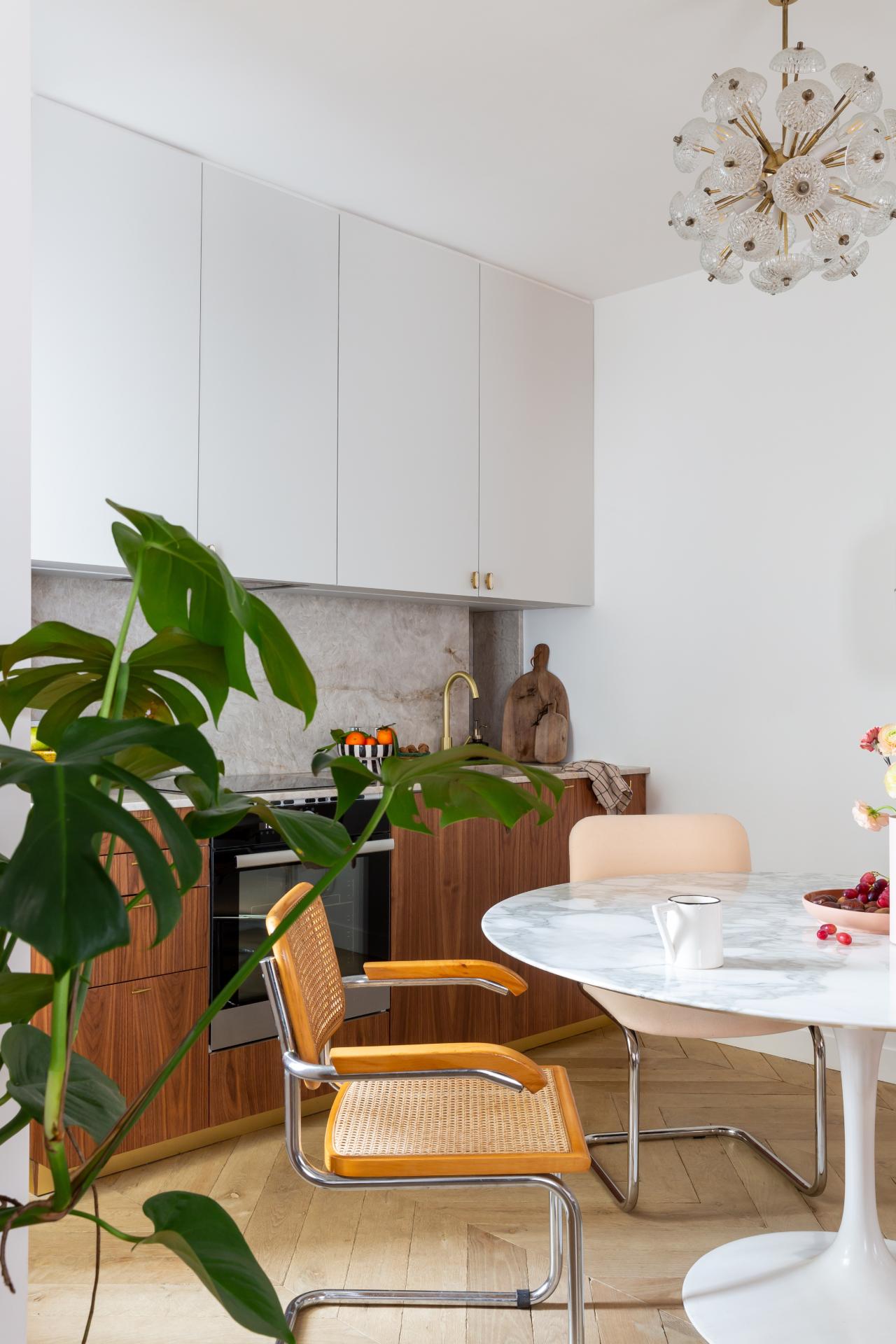
Nestled at the back of the room, the kitchen is open to the living room, much to the couple's delight: "We love to cook! It's one of the main rooms in the house, so we absolutely wanted it as part of the living room, and the fact that it's a little set back allows us to hide the mess". Margaux created a layout that mixes Plum Living Walnut fronts and custom-made overhead doors painted in a pale grey, which lighten up the look. "The grey helps to break up the rather bold effect that walnut has as a full look". The brass handles enhance it again, while the marble granite worktop - "Texta parla Santy", by Easy Plan - is anything but ordinary. The table designed by Eero Saarinen for Knoll is the link between the kitchen and the living room and acts as a second countertop for everyday use. Passionate about vintage, the co-founder of the Transition Id agency and her partner Carla Lopez, decided to mix Marcel Breuer and The Socialite Family chairs to add to the layouts' dynamic feel.
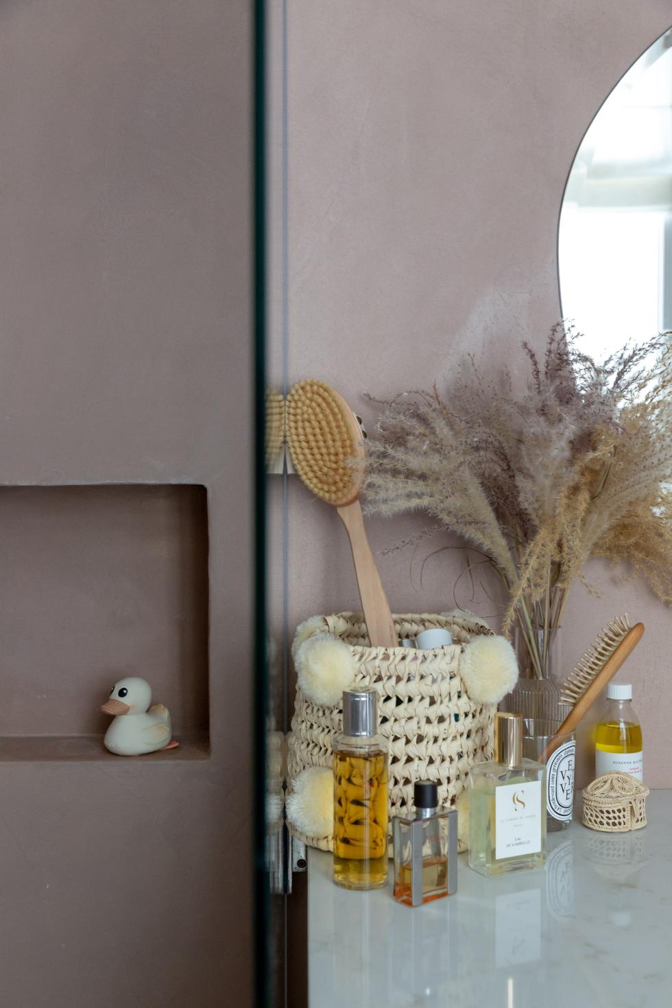
Concrete but make it pink
Still think pink is cliché? Not when played down with polished concrete! Applied to the walls and surrounding the bathtub, it gives a raw look to the bathroom. Margaux has combined it with a natural oak vanity unit with an Italiana Ambra quartz stone countertop, found at Easy Plan.

Let there be light
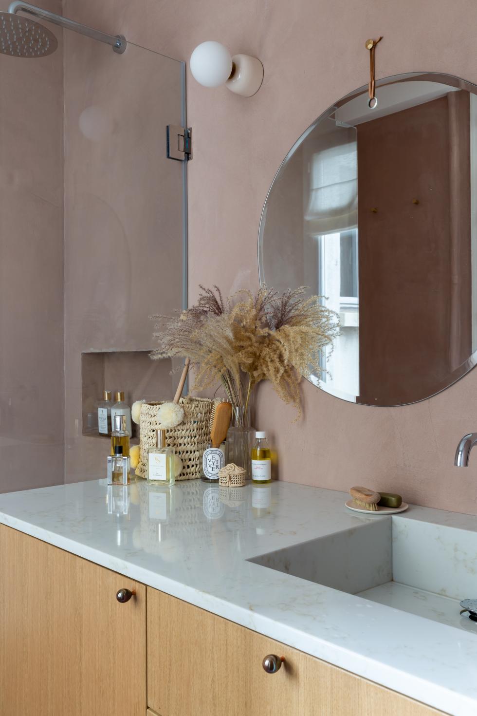
Practical and poetic
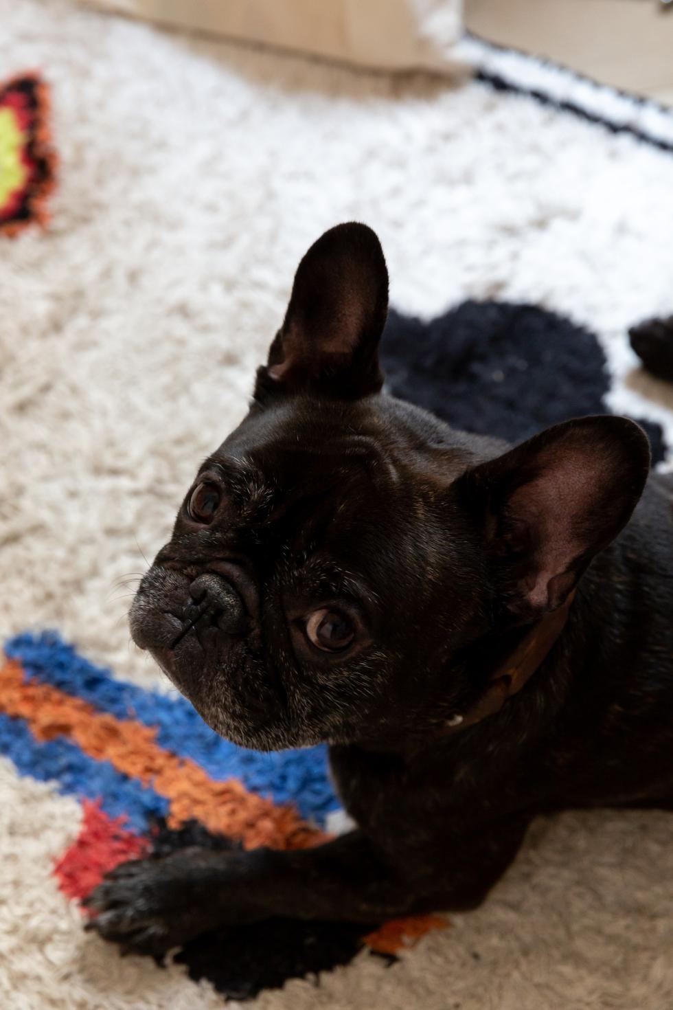
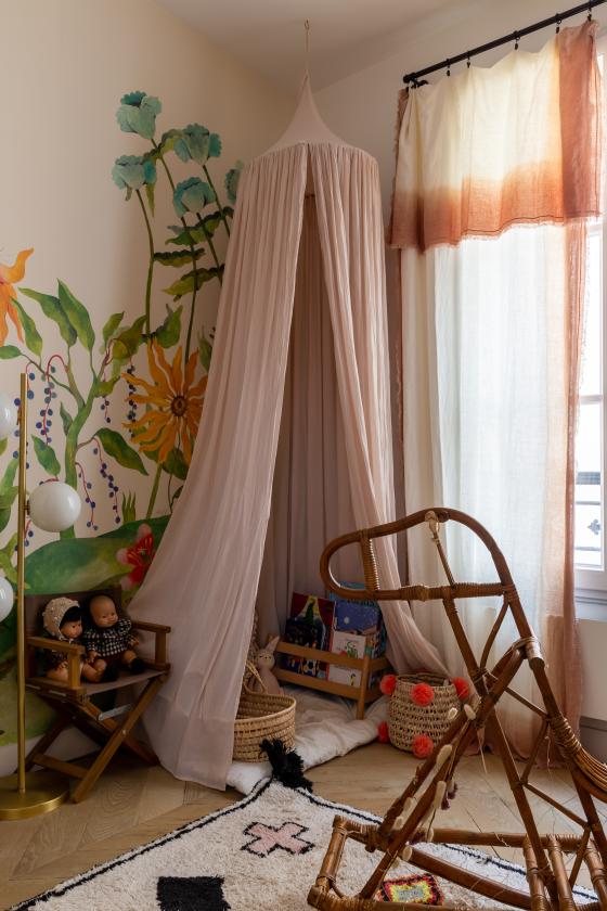
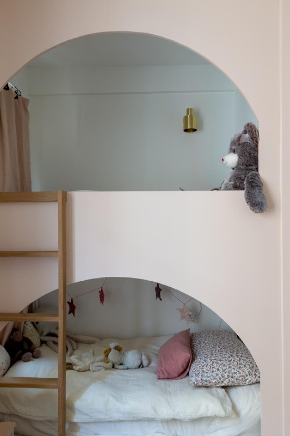
As the visit progressed, we had long forgotten the flat was only 52 m2. The highlight of this incredible lesson in optimisation was the kids' bedroom, which can comfortably accommodate another sibling. Good news for Izia the bulldog, who doesn't feel like moving out anytime soon...
Out of sight, out of mind
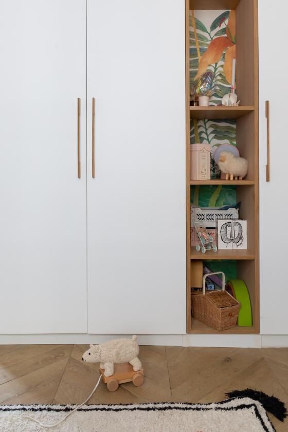
The Bien Fait wallpaper spreads its poetic flowers along the walls, right up to the alcove that separates the two custom-made wardrobes, accentuating the impression of space. Here, Margaux has hidden two Ikea bunk beds behind a plywood panel cut in an arch. A poetic and inspiring DIY!

Ideas that inspire us
- The Mercadier polished concrete that adds the finishing touch to the bathroom.
- The aged parquet floor full of charm.
- The kid's bed that we can't wait to recreate at home!
- The optimisation of each room in this flat.
