A green kitchen or nothing
Until then, your vision was as tidy as your Pinterest board. Your future kitchen would be green, no questions asked. All you have to do is pick the colour... easy, right? Green 02 - Sombre forest or Green 03 - Vert de gris? Green 01 - Amandier grisé? Two-tone? Take a breath, you're only at the colour! U-Shape or framed, Mini-Rond brass or Liseret chrome handles... The list of choices is getting longer by the day. The good news is that our customers been through this before. The perfect opportunity to be inspired by their creations, in green (and against all odds).
Undecided? Go for two-tone
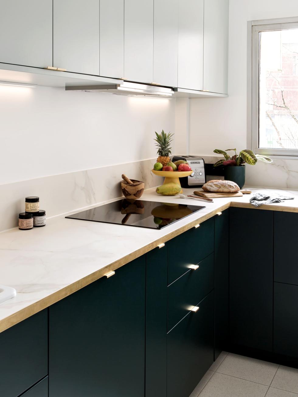
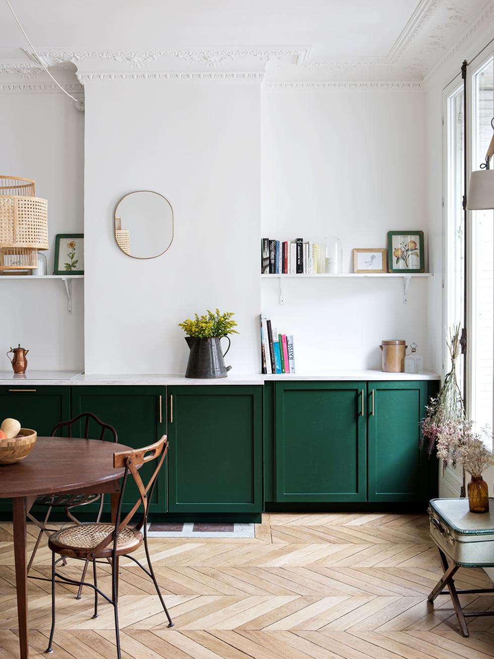
English green

Less is more
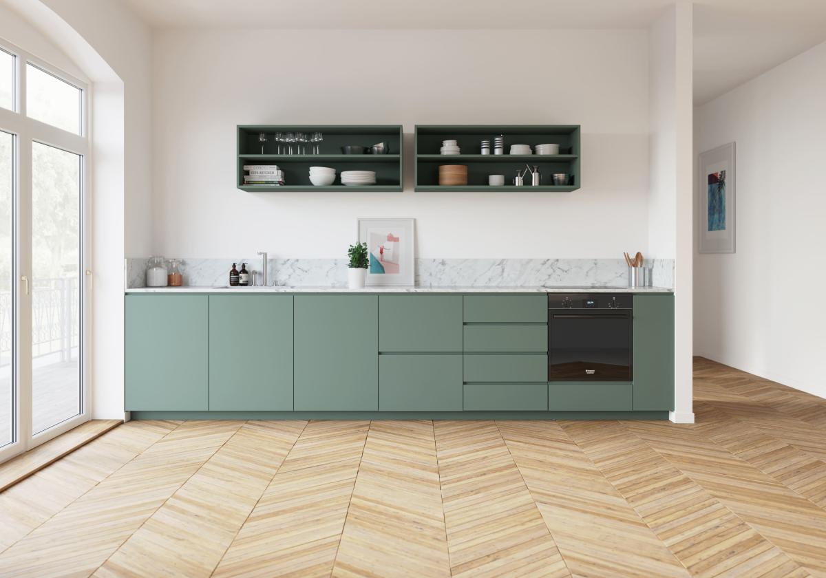
What columns? At Jules and Antoine's place, the kitchen has been designed like a beautiful piece of furniture that blends seamlessly into their living room. Here, the appliances are hidden cleverly under the countertop. Captivating yet simplistic, even in their choice of fronts. With their built-in handles, our U-Shape doors and drawers (here in Green 03 - Vert de gris matte lacquer) do not need handles. Goodbye high cabinets, hello open shelves. Made of medium and painted in the same shade, they break the codes of a traditional kitchen!
Celebration of lightness
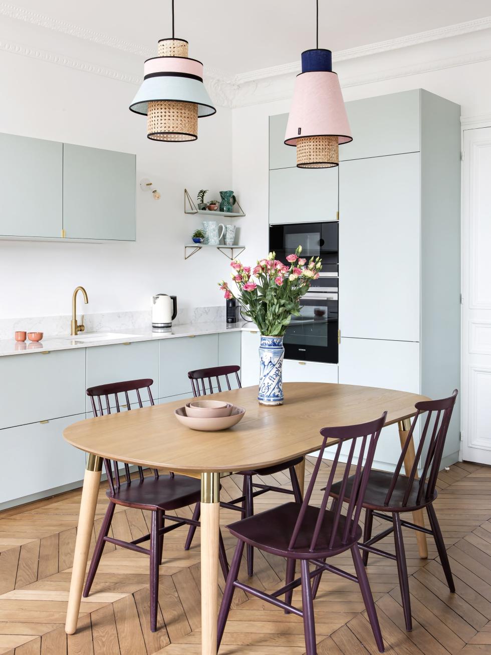
How to increase storage space in an open kitchen without overloading it? Hint: it's all in the colour. Interior designer Dominique de Joux chose our Green 01 - Amandier grisé, which gives the room personality while remaining subtle. Functional without being imposing, the Metod columns allow household appliances to be easily packed away. Special mention to the three cabinet frames that seem to float above the countertop, emphasising the impression of lightness.
Decorative piece
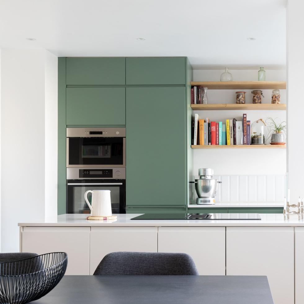
Endless storage space, built-in appliances, cleverly placed columns... This kitchen by Mon Plan d'Appart has been designed for everyday use. Our U-Shape fronts in Green 03 - Vert de gris matte lacquer give the room character, while the central island with its white doors visually separates the kitchen from the living room. The built-in handles give the kitchen a resolutely modern look, while the light wood shelves add a natural and warm touch!

Out of frame
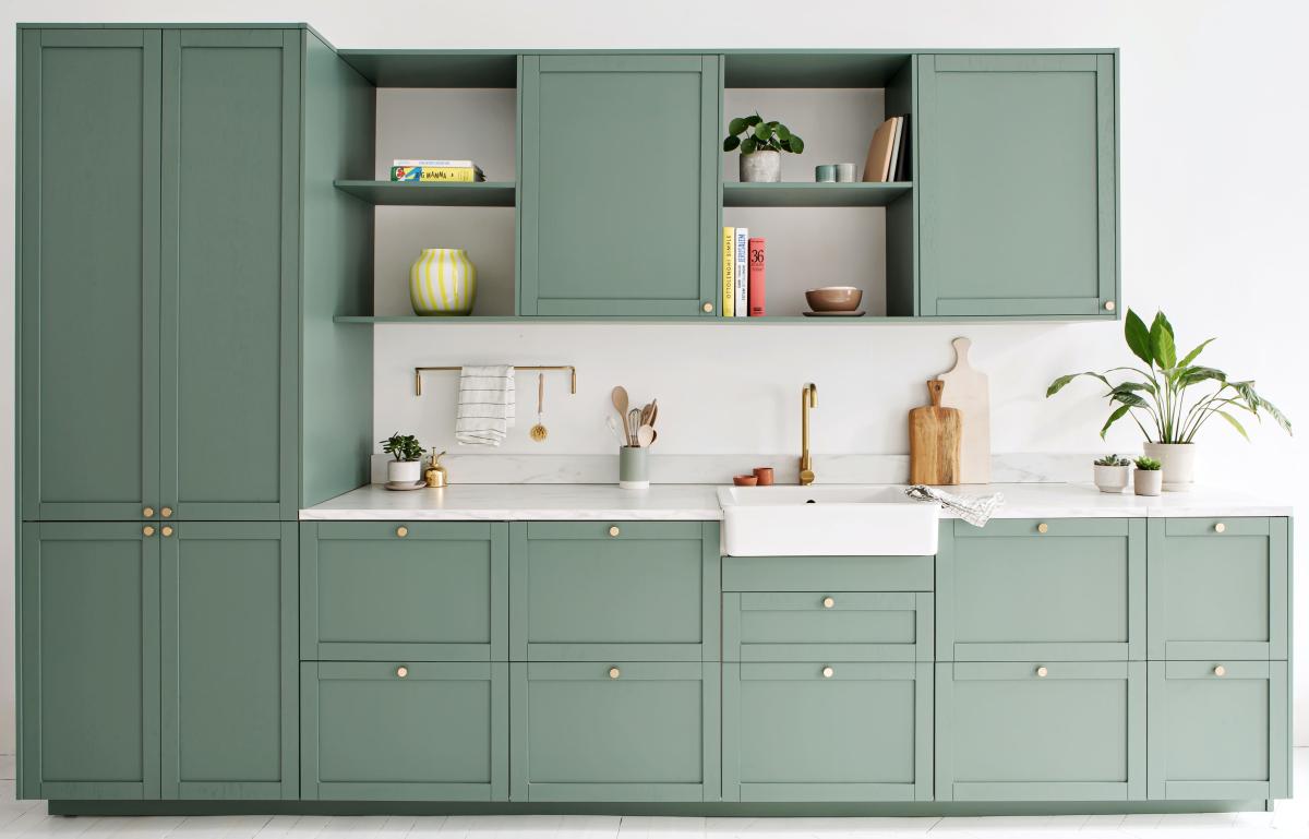
On one side, two Metod columns make up the pantry. On the other, open shelves made from cover panels. Inspired by Anglo-Saxon kitchens that handle the art of aesthetics like no-other, this layout created at Studio Plum Living is off the beaten track. Simply highlighted by our Mini-Rond brass handles, the Green 03 - Vert de gris framed fronts give it a little relief, while the shelves open up the overhead units. We are already picturing the decorative books and dishes we can place there!
Surprise, surprise
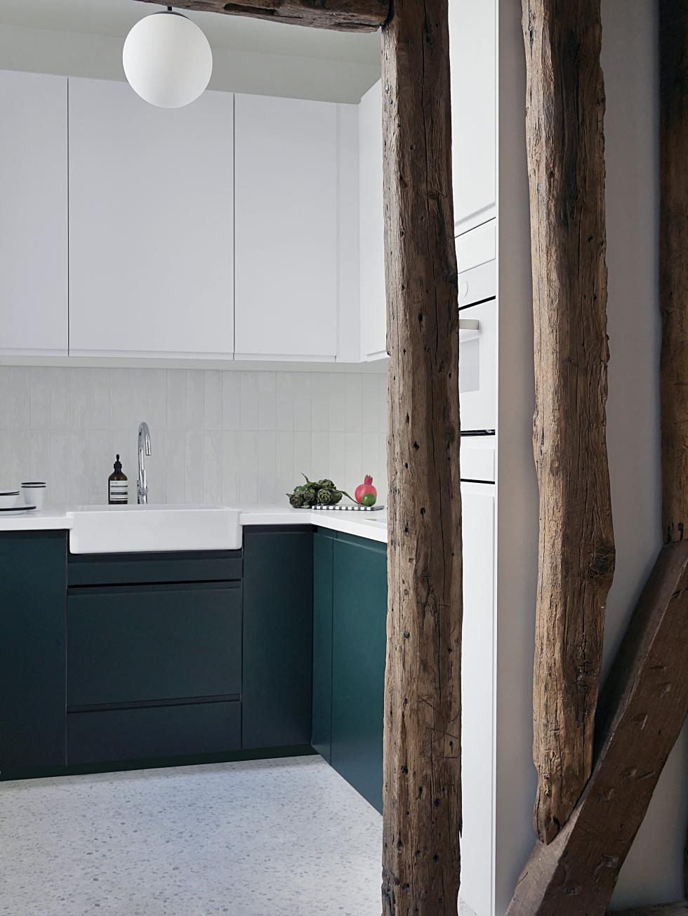
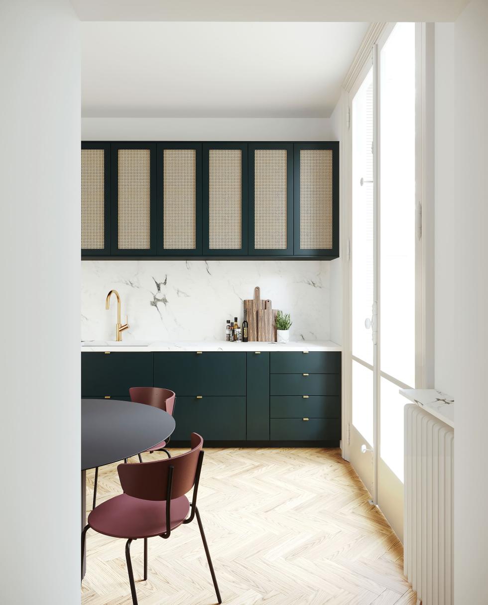
Greener on the other side

Graphic cocoon
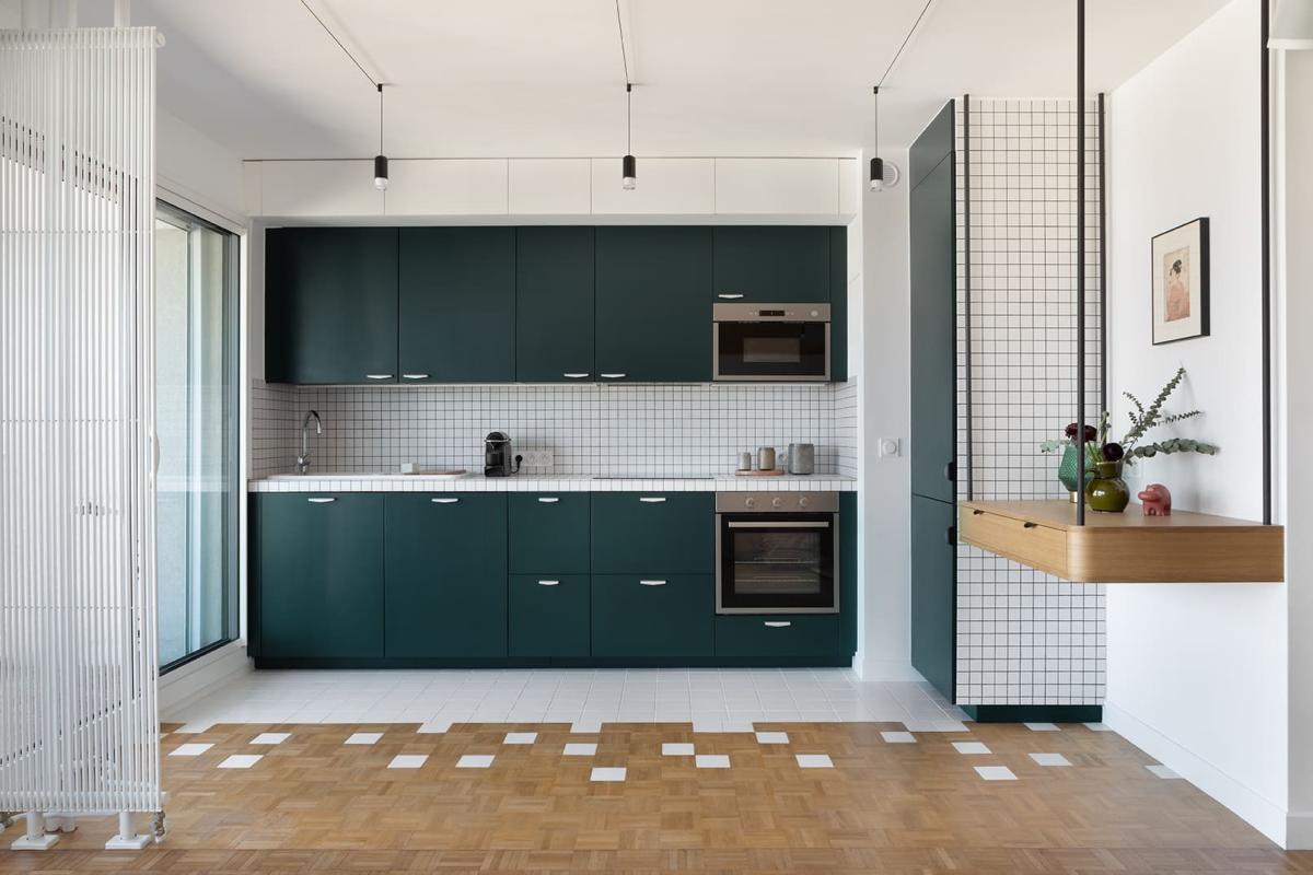
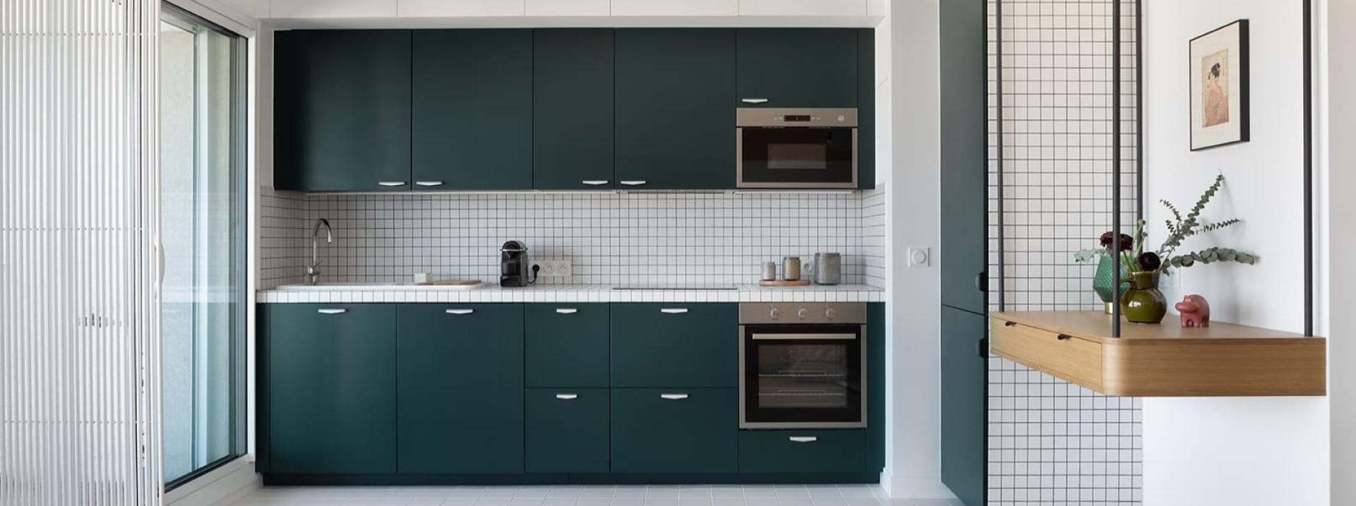
We had to look beyond dated decor and partition walls... say goodbye to the limitations of 70s architecture and hello to the most charming aspects of the era. Déborah Bettan nailed the brief with flying colours! The interior designer completely redesigned this Parisian flat to create a graphic cocoon. Open to the living room, the kitchen in our smooth Green 02 - Sombre forest matte lacquered fronts plays the geometry card, blending into the decor without going unnoticed. With their small white tiles and black joints, the splashback and countertop add the retro touch that completes this kitchen. Look closer: the same materials hide the column where the fridge lives, blending into the layout like a chameleon!
