A kitchen separated by a glass partition
It's a fact: in life, you always want what you don't have. The kitchen is no exception! On one side, there's the lucky owners of open kitchens, many of whom dream of being able to draw an invisible wall for a day - or just long enough to wash the dishes or cook the salmon without the whole flat smelling like it. On the other, those who would like to have a conversation with friends without burning the sauce that simmers at the end of the hall. At Plum Living, we believe in compromise, especially when it looks this good! The solution? Two words: glass partition. Whether metal or wood based, coloured or natural, they allow you to give a little intimacy to your open kitchen or open up a cramped one. Here's a look at some of our favourites.
Curves with character
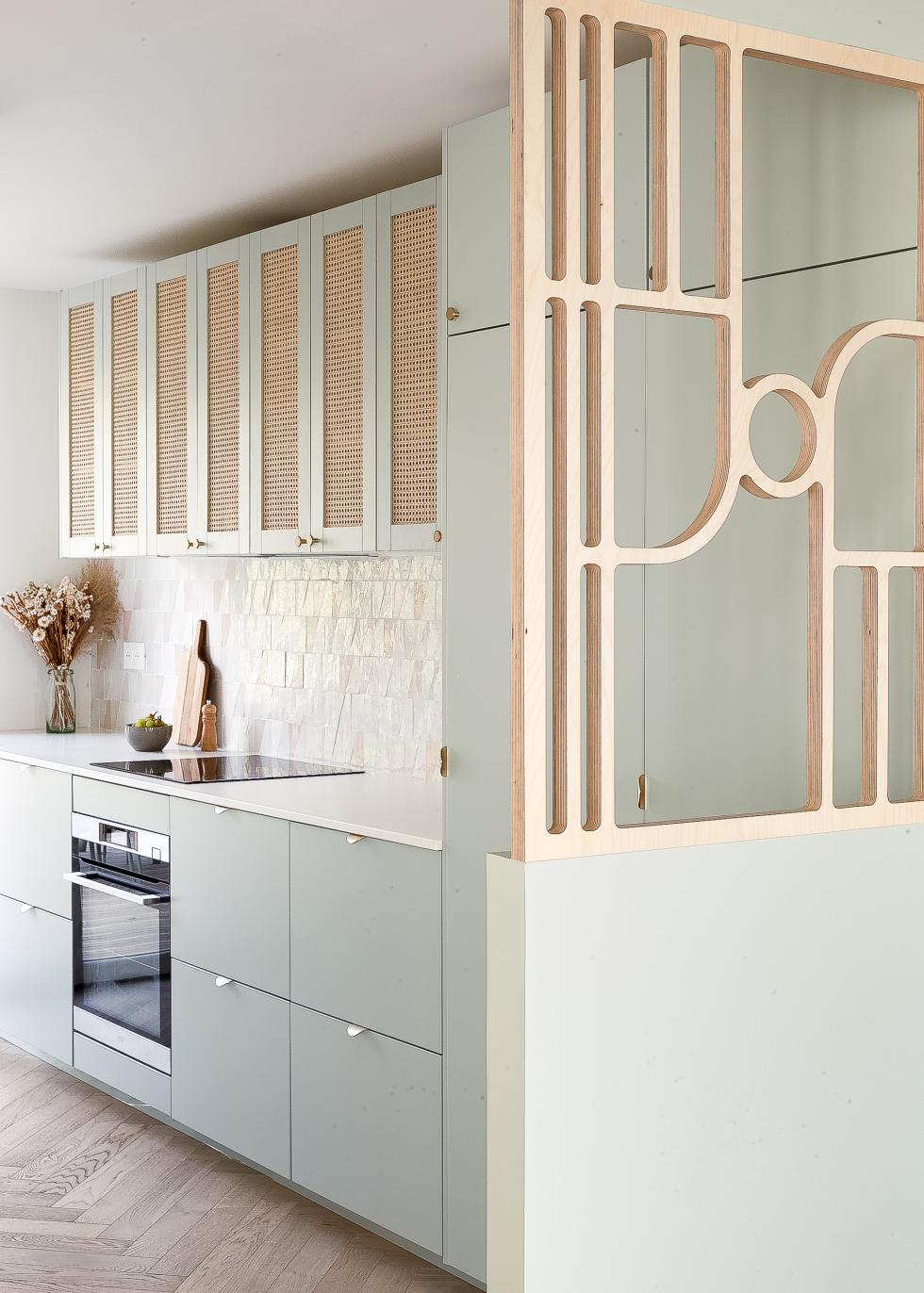
A cleverly cut wooden panel: that's all it took for interior designer Camille Bernard to give her dreamy Green 01 - Amandier grisé kitchen a new dimension. With its poetic curves, this wooden partition certainly makes an impression. Chosen in a light wood, it echoes the cane used for the overhead cabinet doors, and blends in perfectly with the zellige tiles and natural stone countertop. The wall below it is painted in the same shade as the kitchen to create unity.
Box effect
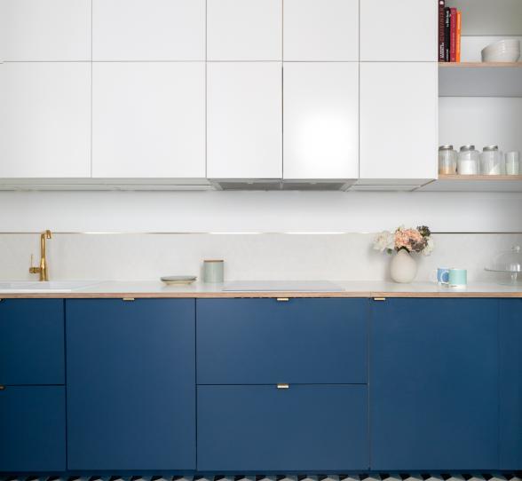
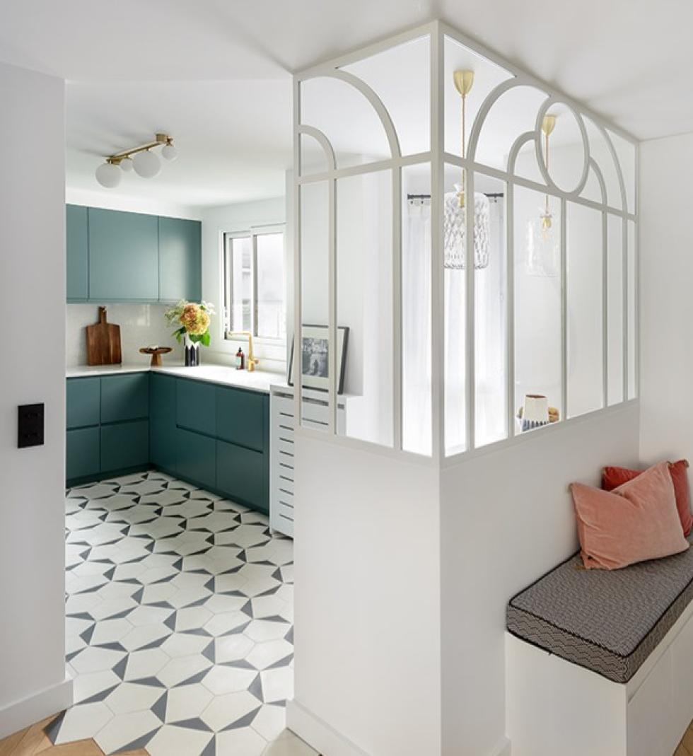
How to separate the kitchen while still letting the light and atmosphere of the living room flow in? You have two hours! Interior designer Caroline Debono opted for a glass partition with Art Deco style lines that creates a box effect at the entrance to her Blue 05 - Bleu paon kitchen. Designed in an L shape, it creates a link with the dining room without completely separating it, while also serving as a backrest for the custom-made bench. Clever!

Ultimate duo for a semi-open kitchen
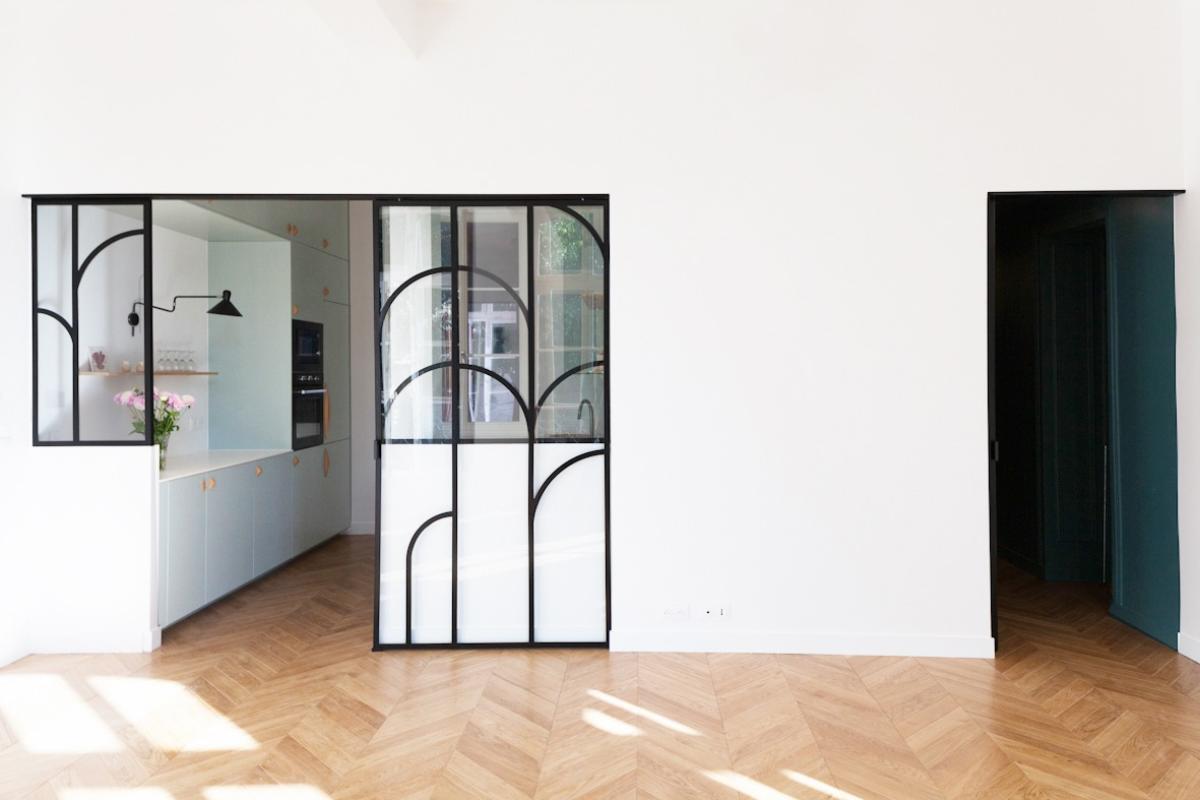
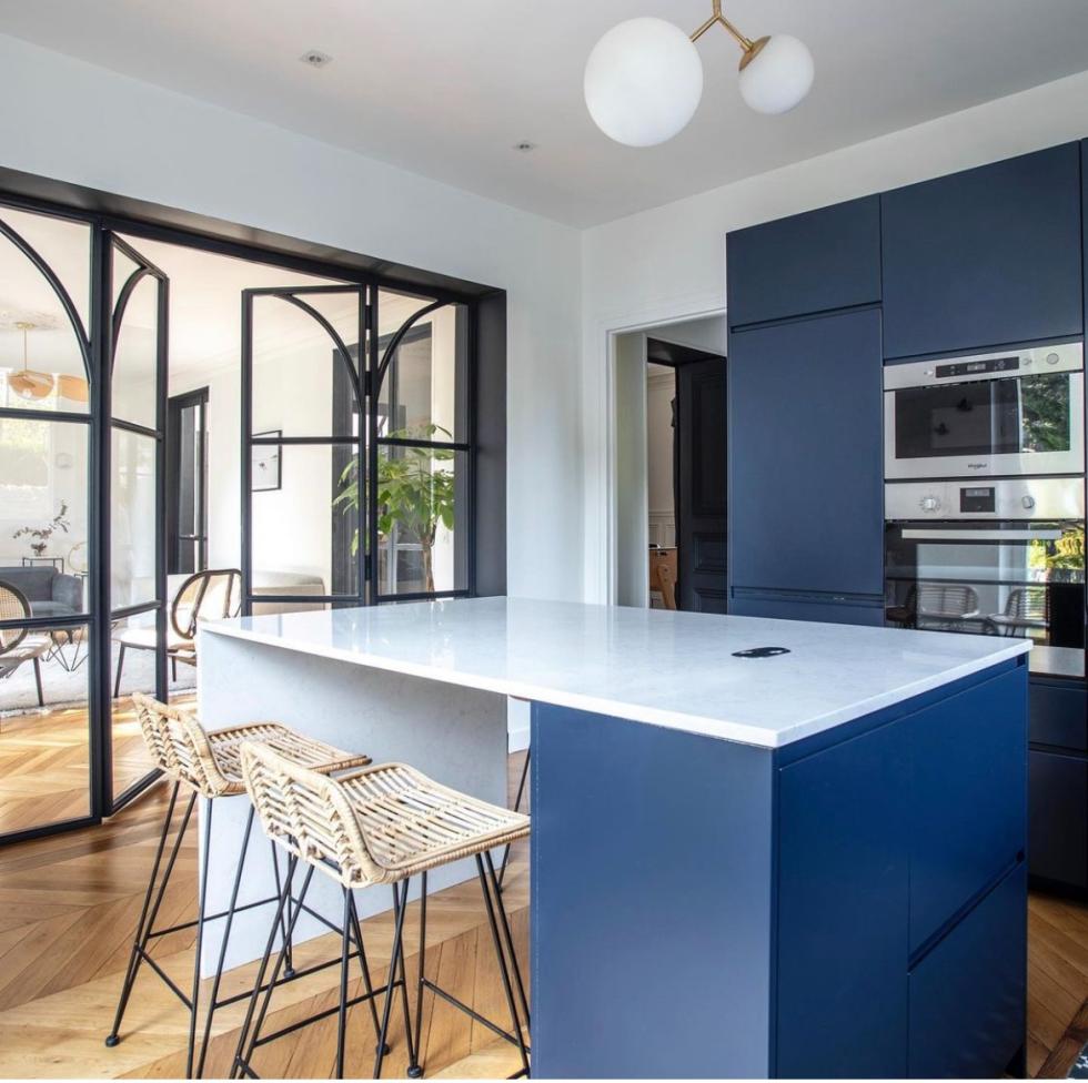
When she first pushed open the door to this Parisian flat, architect Lucille Bourdon discovered a kitchen separated from the living room. Not to worry! Rather than moving it, she chose to play with a sliding glass partition to let light in and gain precious square metres. Now semi-open to the living room, the two-tone kitchen in Green 01 - Amandier grisé and Blue 05 - Bleu paon can be seen behind the art deco curves of the black metal structure.
Front row seats
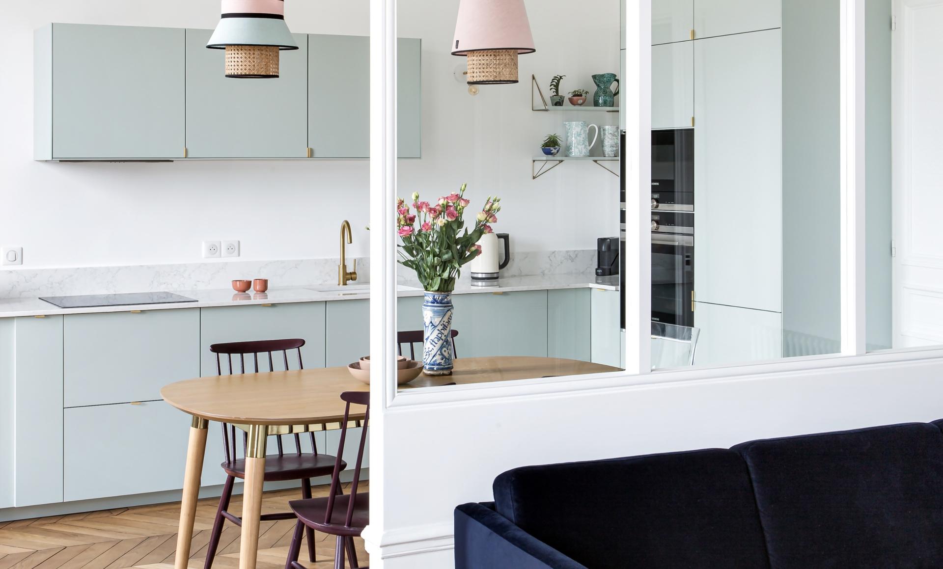
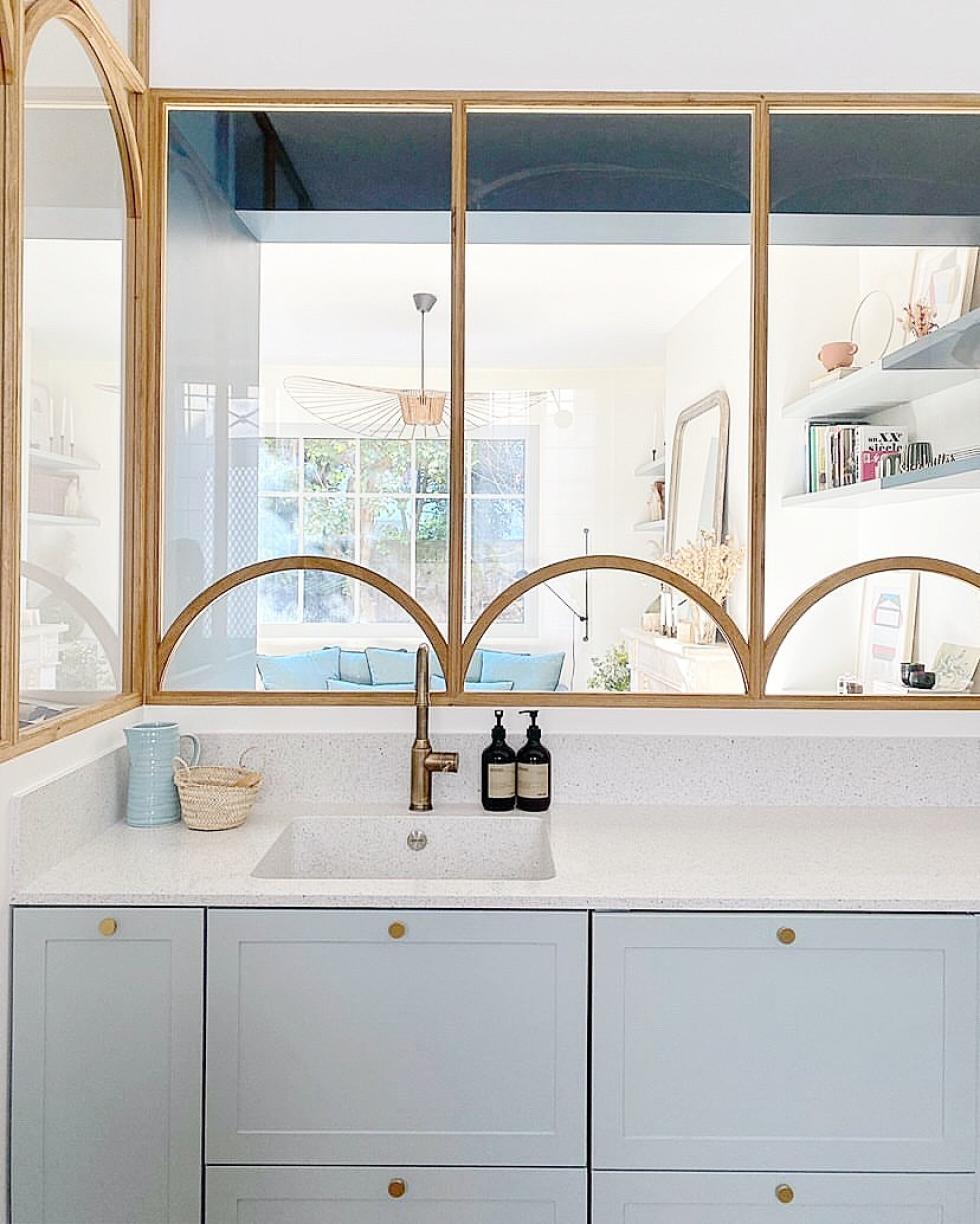
Nestled at the crossroads between the entrance, living room and staircase, interior designer Camille de Rafélis' kitchen was originally a separate room accessible via a dark corridor. Aware of its potential, the co-founder of the Bienvenues agency replaced the upper half of the walls with a glass partition, making it the centrepiece of her home. Made from wood, it echoes the colour of the parquet flooring and perfectly matches the shaker style of this grey Green 01 - Amandier grisé kitchen.
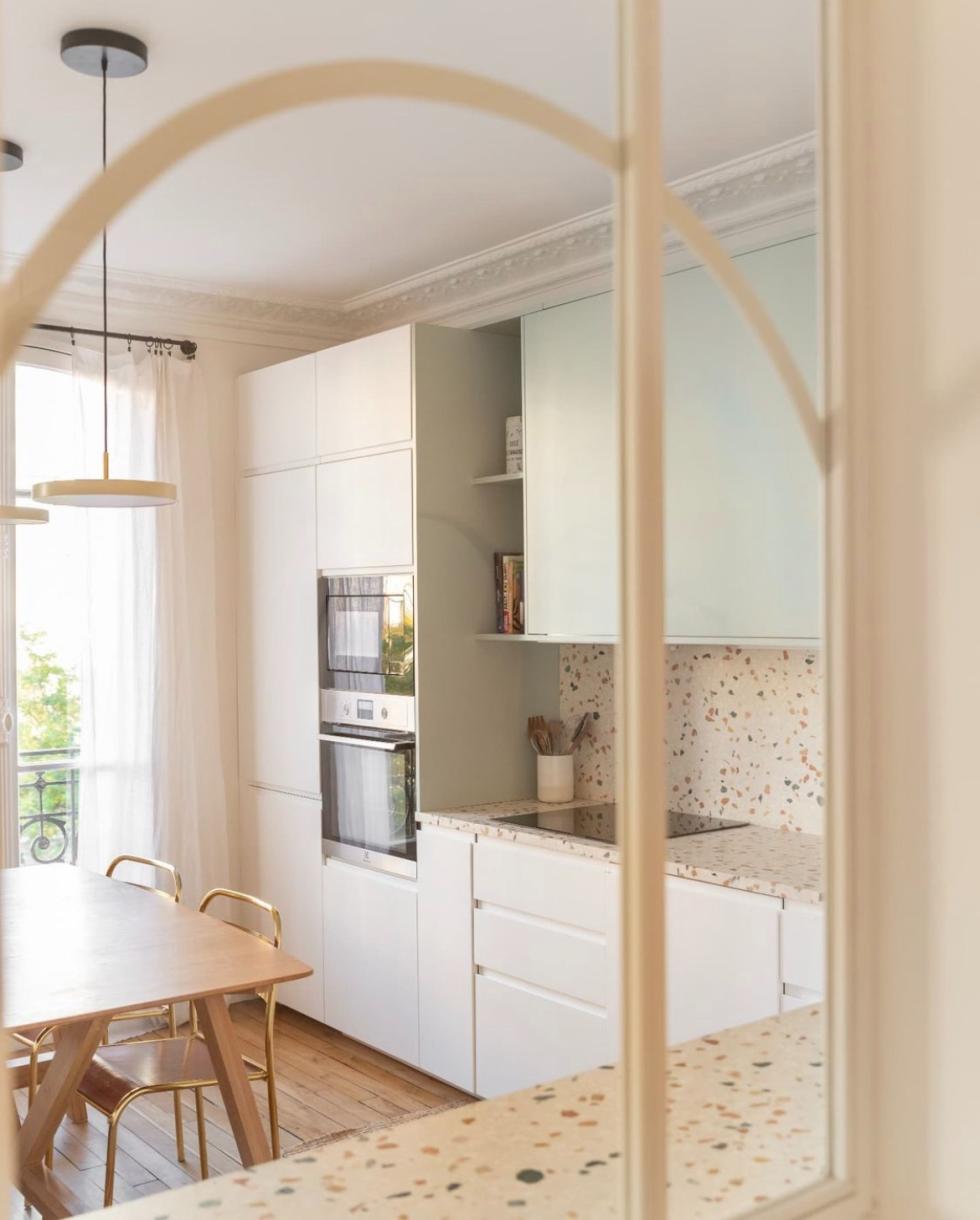
The art of optimisation
How to open up your kitchen? Close it off. Yep, you heard that right. This kitchen was originally open to the hallway through a door, but the interior designers at Mon Plan d'Appart decided to close it off to gain space and extend the countertop. However, having a dark kitchen was out of the question: designed as a window, the white metal glass partition links the two spaces and allows you to gaze upon the terrazzo charm from the moment you walk through the front door.

Courtyard windows
Who said they had to be custom-made? Interior designer Quitterie de Pascal found this old gem in the cellar of her new home and instantly fell in love. With its patina finish and old-fashioned charm, it has found its home in this Grey 01 - Gris nuage kitchen, separating it from the entrance while still letting light fill the space. An original and inexpensive solution which only adds to the charm of this layout. Keep your eyes peeled at the flea market!
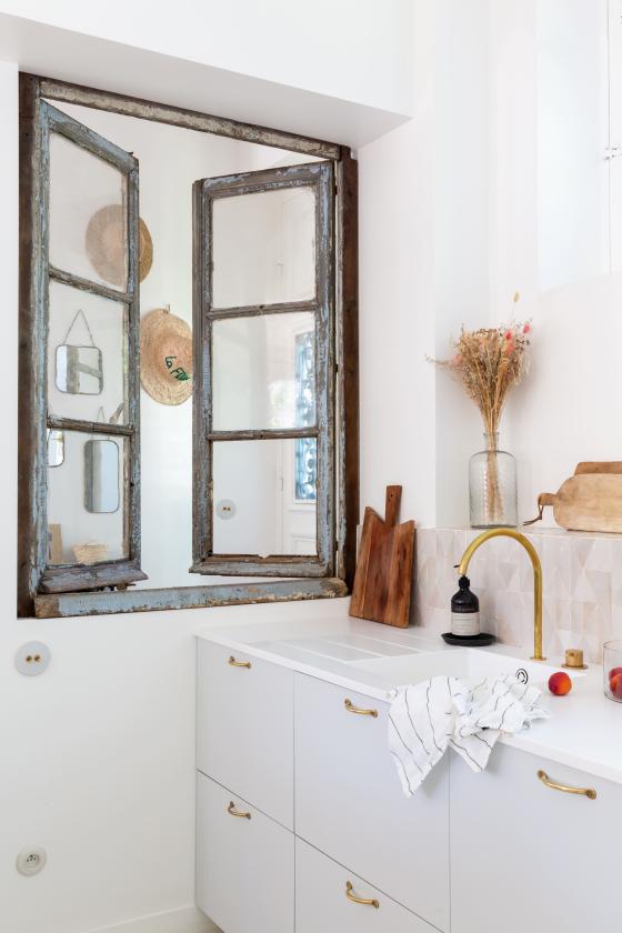
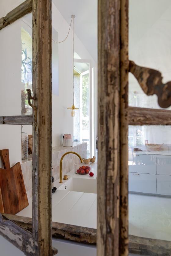
Clean and efficient
When she redesigned this Haussmannian flat located at the gates of Paris, interior designer Dominique de Joux set out to redefine spaces. The white metal glass partition used here is both simplistic yet assertive, separating the kitchen from the living room without compromising its ambiance. A centrepiece of the room, it made furnishing even easier, in particular by serving as an obvious spot for the sofa by NV Gallery.
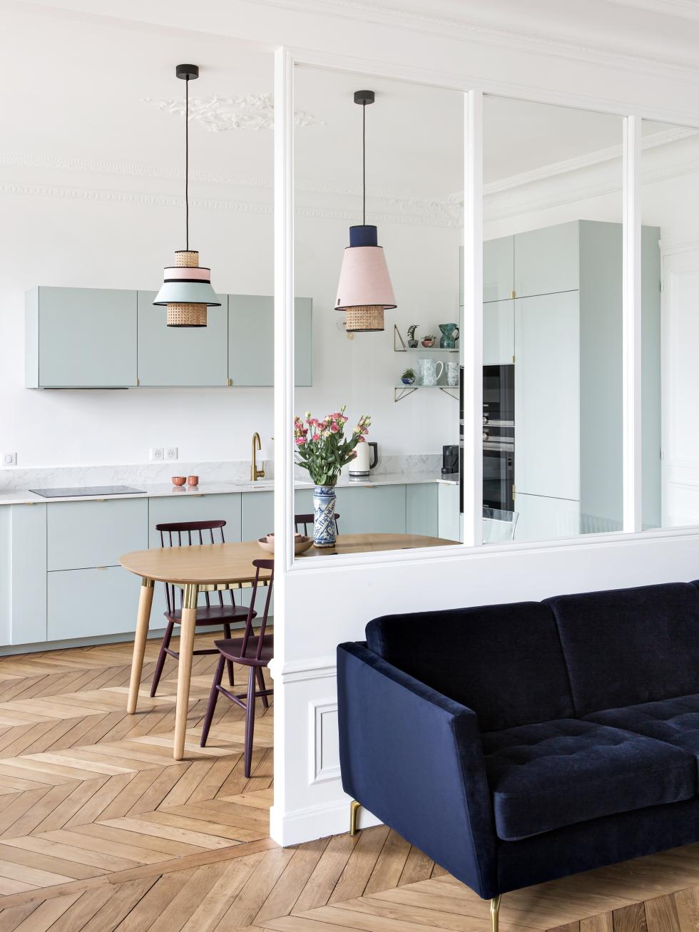

Glass half full
All it takes one push of this glass partition designed as a bay window to change the configuration of the space. Open, the kitchen is a natural extension of the living room. Closed, it becomes a bright and contemporary cocoon, protecting the living room from noise and odours (recall: the salmon!). Designed by architect Niloufar Izadi, the imposing black metal structure is the highlight of this Blue 02 - Bleu nuit kitchen. Take a closer look: the inside of the wall where it's nestled has been repainted in black to give it even more allure.
