Add some colour to your ceilings
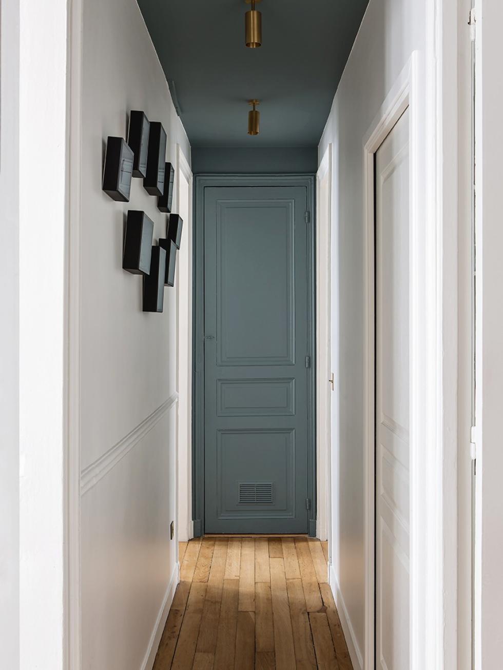
Usually ceilings are white. And when renovating, we usually never even get to start a conversation about ceilings, but hear us out… Painting your ceiling can wake up an otherwise empty room, or - at the very least - add some personality to the space. It may feel like an unusual choice to make, but a painted ceiling can lend itself to any room - from the hallway, to the bedroom.
Let’s show you how!
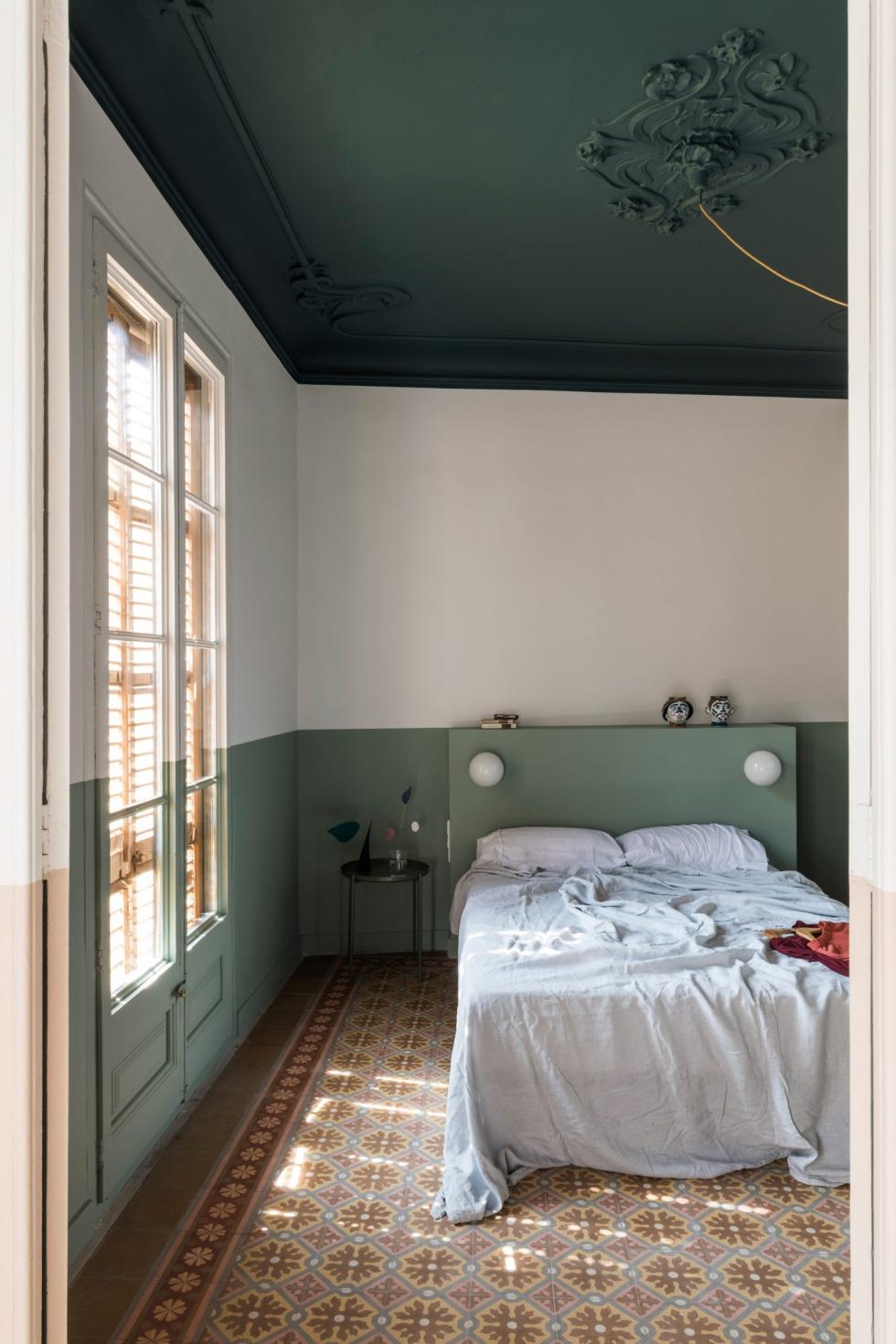
Go green

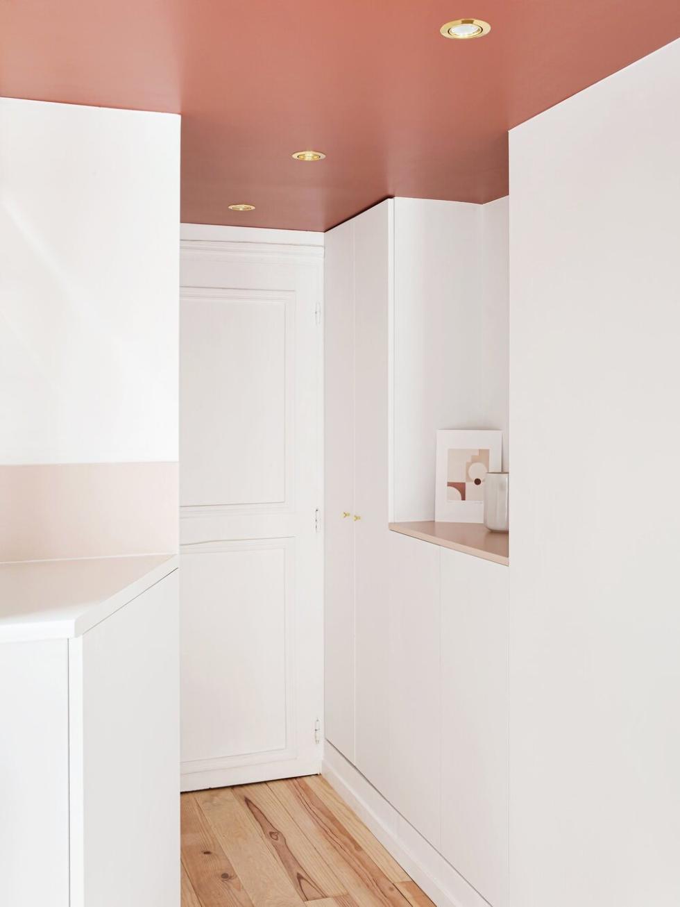
White + terracotta: the latest decor duo
“The most important thing is not how much space you have, it’s what you do with it.” As you can imagine, we are completely on the same page as Space Factory with this mantra. Edouard Roullé-Mafféis and Ophélie Doria push the boundaries of this room by challenging the classic rules of renovation, in a bid to draw attention away from its limitations. Here, the ceiling is painted in a shade of terracotta that makes you instantly forget how low it is - instead emphasising the volume of the white furnishings, which then seem even larger. Simply stunning!
A floating bubble
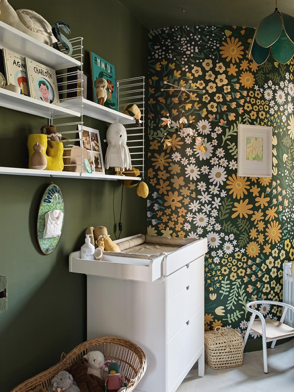
We all know the headache that comes with rooms with no natural light. Should we make them all-white, even when, without any ‘real’ light, they can tend to look grey? Or should we go the other way, and add a super-bold colour instead? Lisa Gachet went for the latter, by adding an Olive wall to her little girl’s room. Stretching from floor to ceiling, this colour echoes the wallpaper by Papermint and creates an enveloping effect, designed to be cocoon-like. It’s a really bold choice, which works all the better in small spaces.

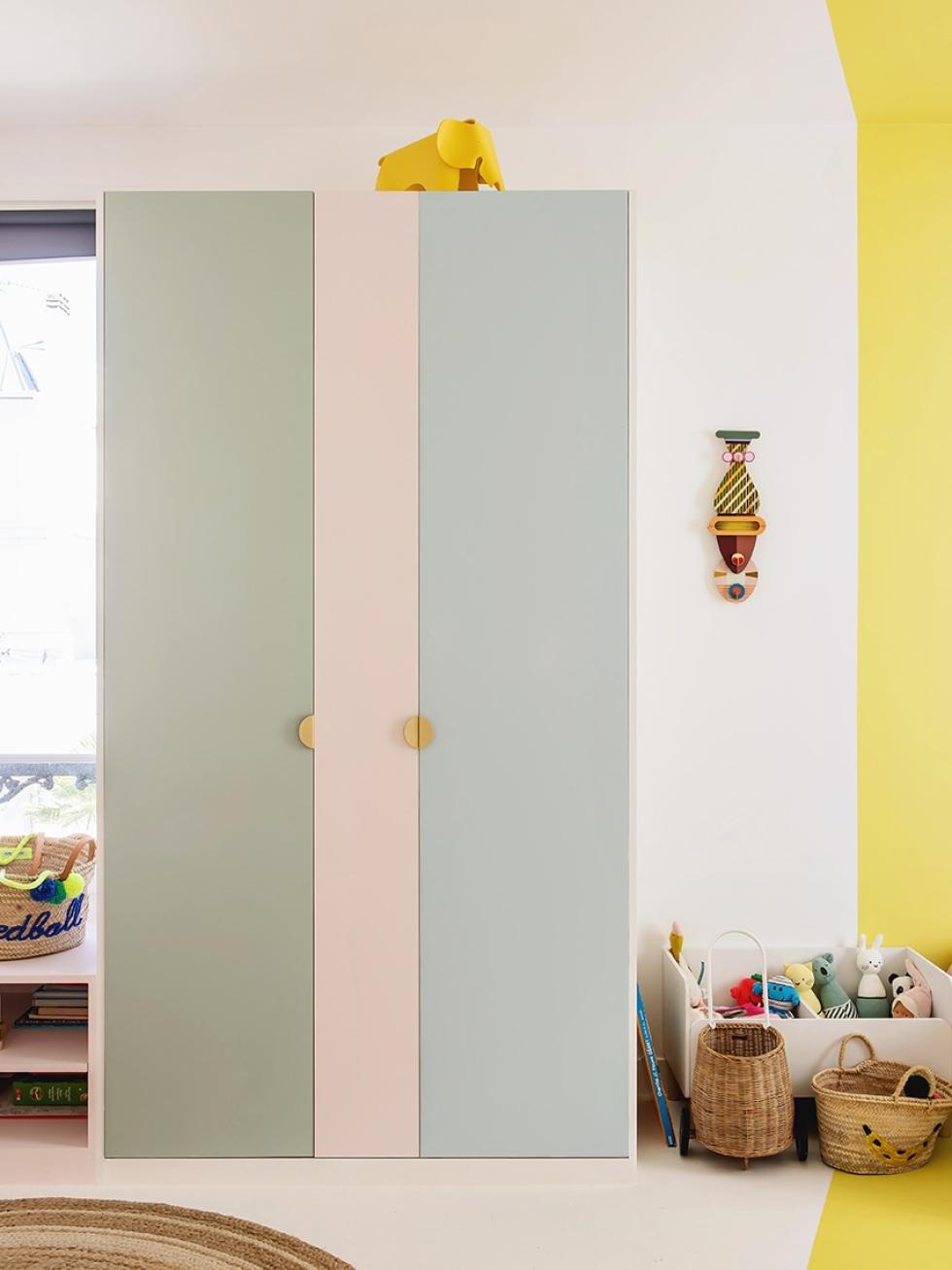
Yellow for two sisters
A line of thought

Gourmet scenes

La vie en rose
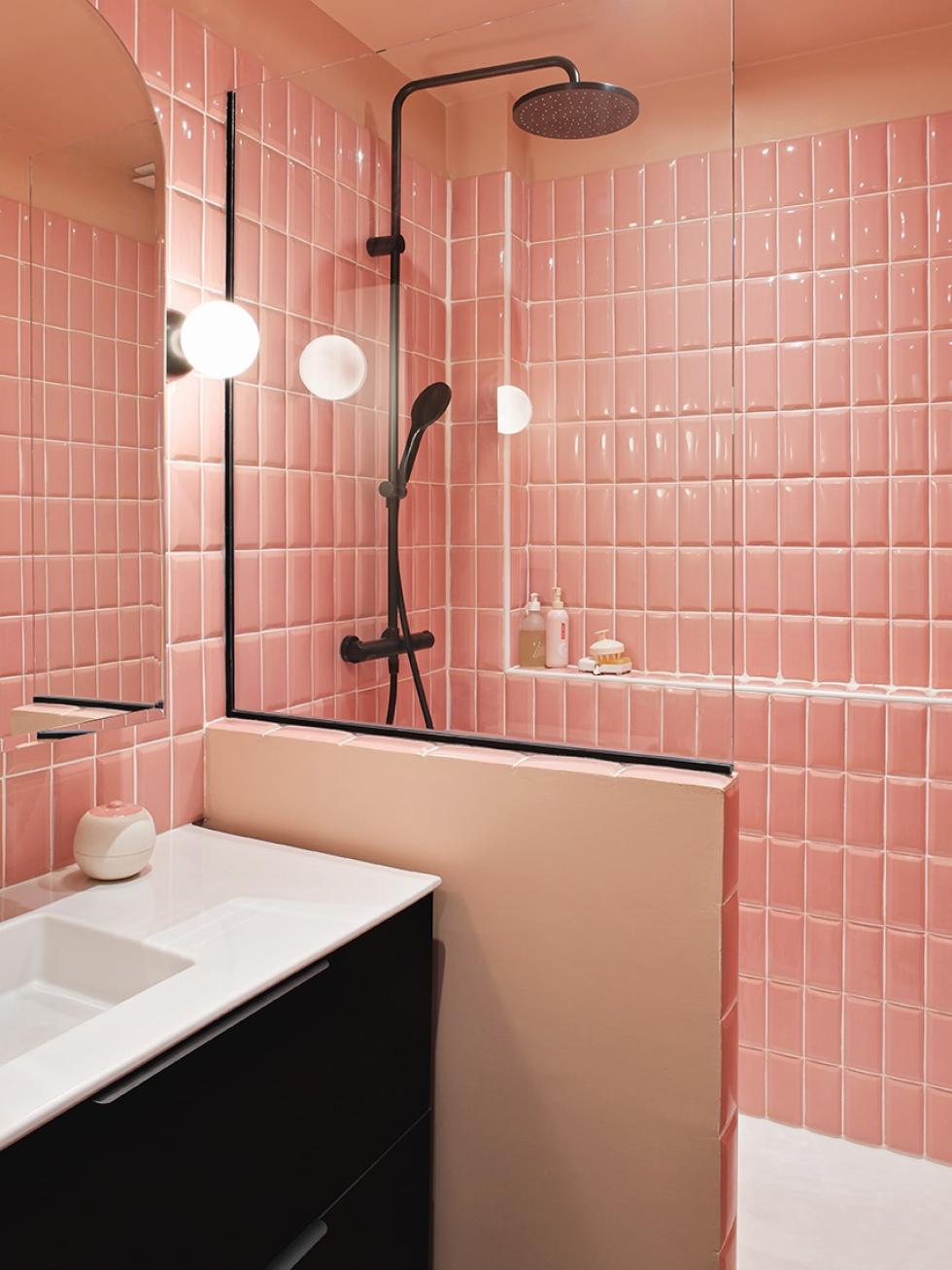
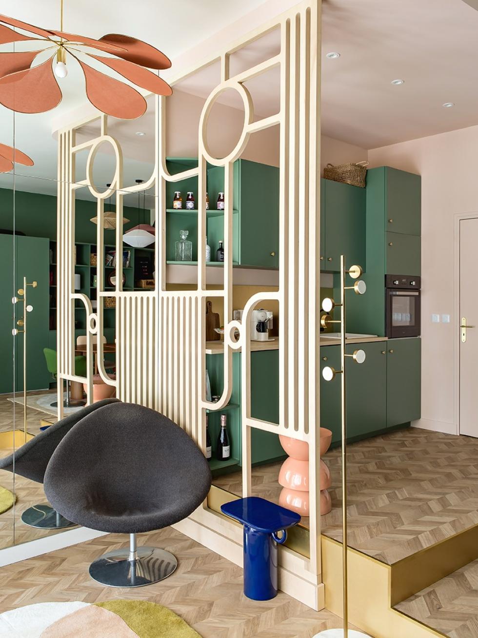
Panic not: a dark, seemingly cramped bathroom doesn’t have to crush your renovation dreams! Instead of opting for white (which, trust us, would have looked dull anyway), Lisa Gachet decided to paint her bathroom pink from floor to ceiling, giving it a totally retro feel. The tiles add texture to the space, while the black tiles offer some contrast. This look paid off!
