6 ideas on how to transform your attic space
Authentic, warm, a little unconventional… attic spaces have a lot to offer. Except for when it comes to getting all your furniture in there. But we’re here to reassure you: it’s not all about height. No matter how much space you have, every inch can be used to your advantage, even with slanted ceilings. Still not convinced? From the bedroom, to the living room, to the bathroom, we take you through a selection of very tempting attic space projects. Shall we?
Take note
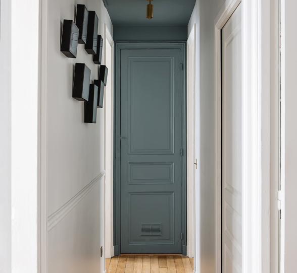
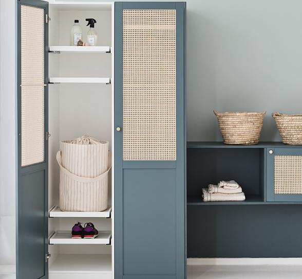
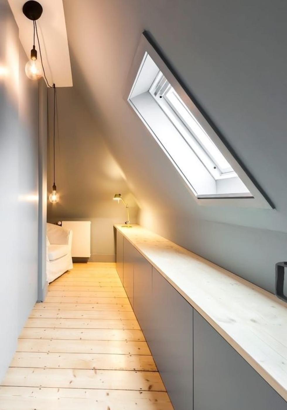
Corridors and basements have the same problem in common: you can look at them for hours without knowing what to do. An even bigger problem: the two combined. But what if we took this opportunity to have a long line of storage units? Like here in this layout, where all available space has been used thanks to some low cabinet frames. Two tips from us: keep some space between the cupboards and wall edges to place books or lamps, and keep the colours consistent to bring harmony to the room. In Plum Living language, this means using matte lacquered fronts and our Green 01 - Amandier grisé or Blue 04 - Ciel voilé paint.

Little and large
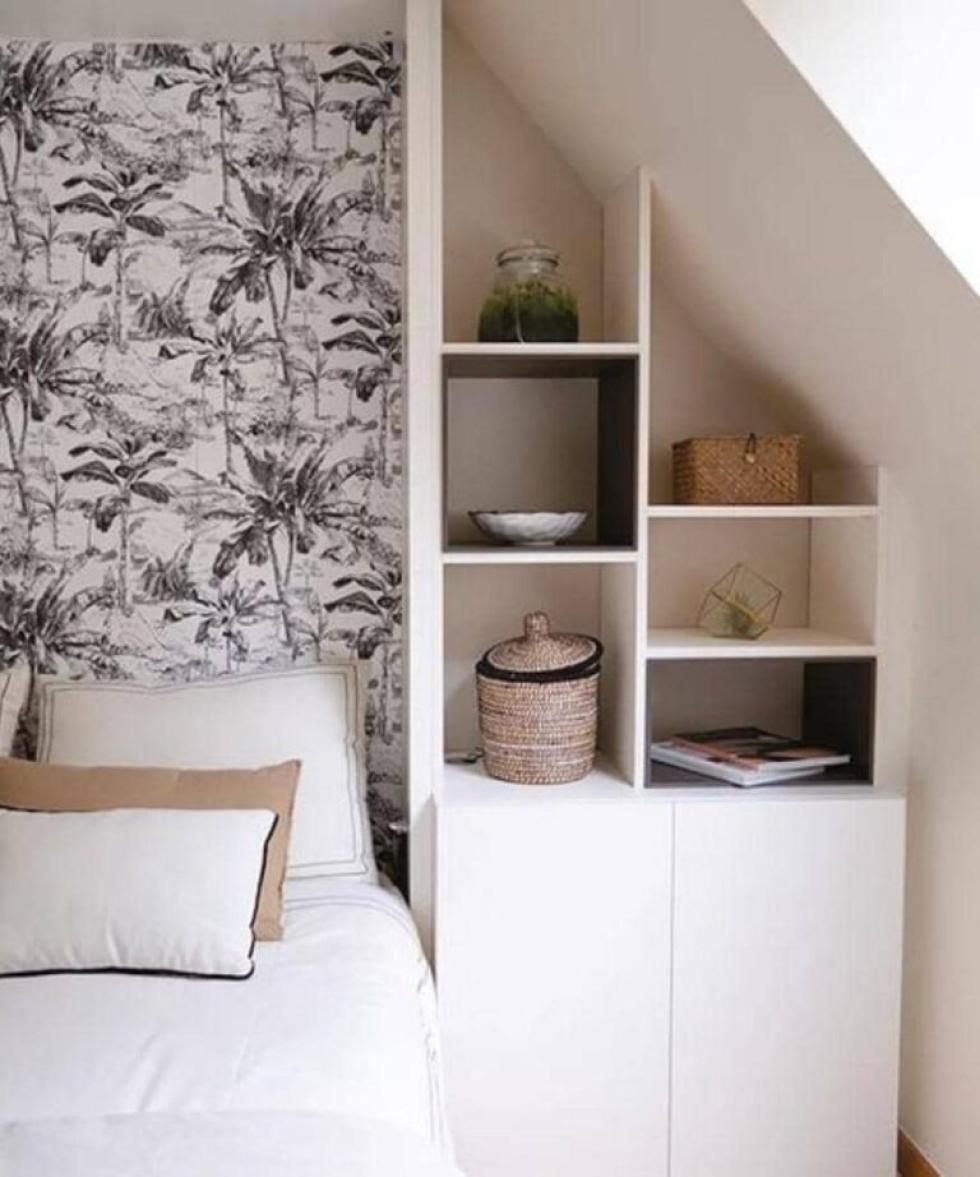
The sky’s the limit

Optimise, optimise, optimise…
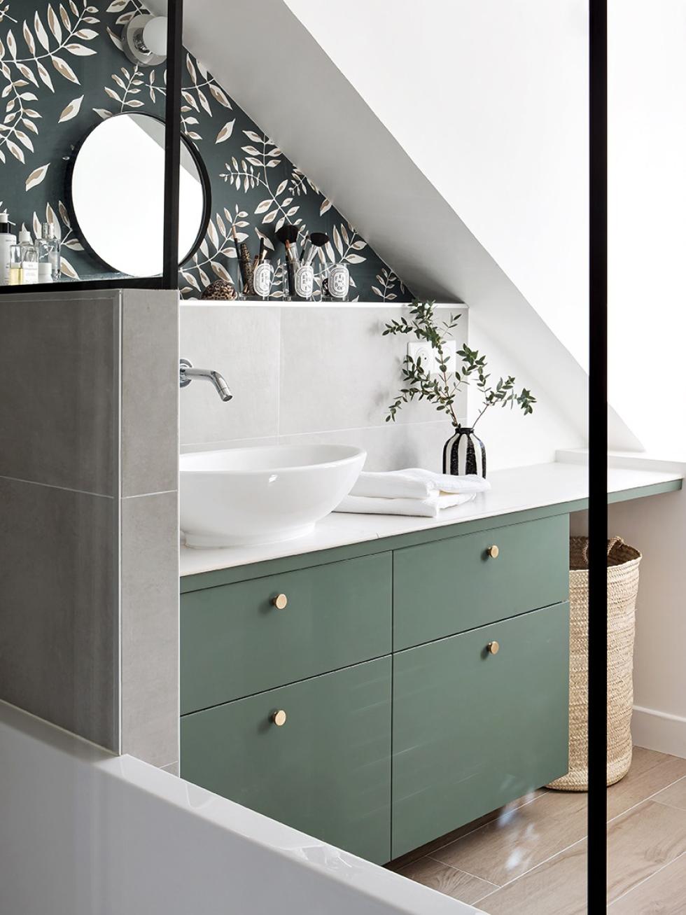
Feel like you’re missing some space from your bathroom? Get out your measuring tape and calculator, because every inch counts. Here’s a great example in the flat belonging to Plum Living’s very own Alexandra. Step one: put in a bathroom vanity from IKEA modules, then dress it up with fronts in the colour of your choice (here our Green 03 - Vert de Gris). Step two: cover this with a tiled worktop that stretches right up to the wall. Et voilà, no space is lost, and every inch is optimised
Wall to wall
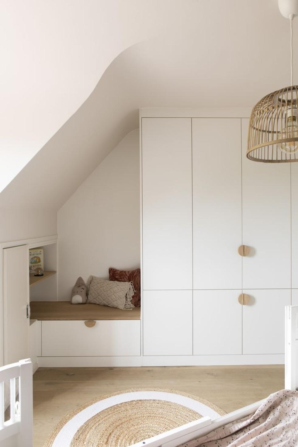
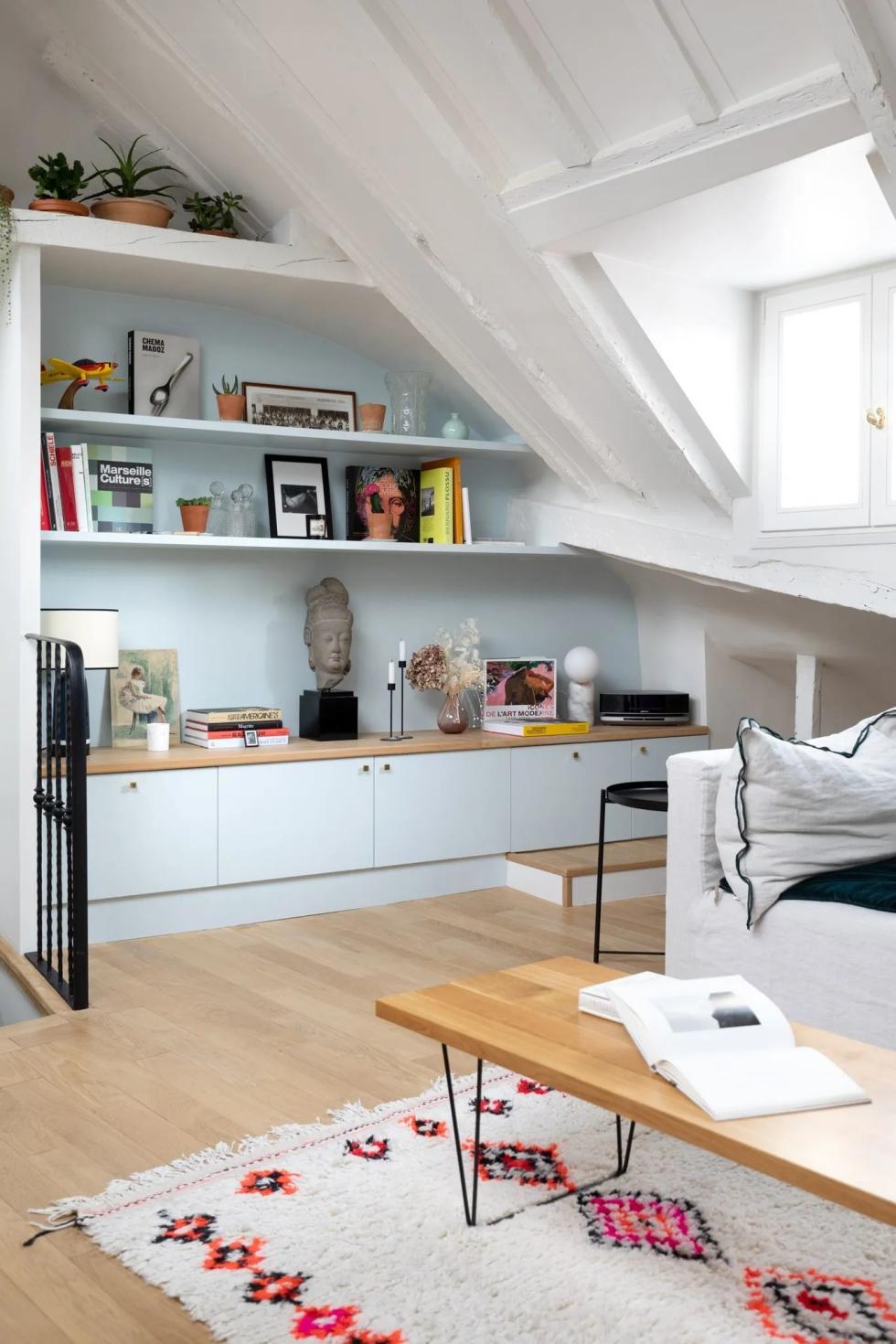
From exposed beams to out-of-the-ordinary dimensions, it’s hard to resist the charm of attic flats. But does working with these spaces have to be a challenge? Not always, as you can see in this renovation by Charlotte Féquet. By choosing low cabinet frames topped with shelves which fit into the slanted ceiling, this interior architect has designed a library corner where its dimensions follow the wall contour. Wondering what the trick is here? Paint it all in the same colour to highlight the visual effect. Beautiful AND practical, we really can have it all!

Head to toe
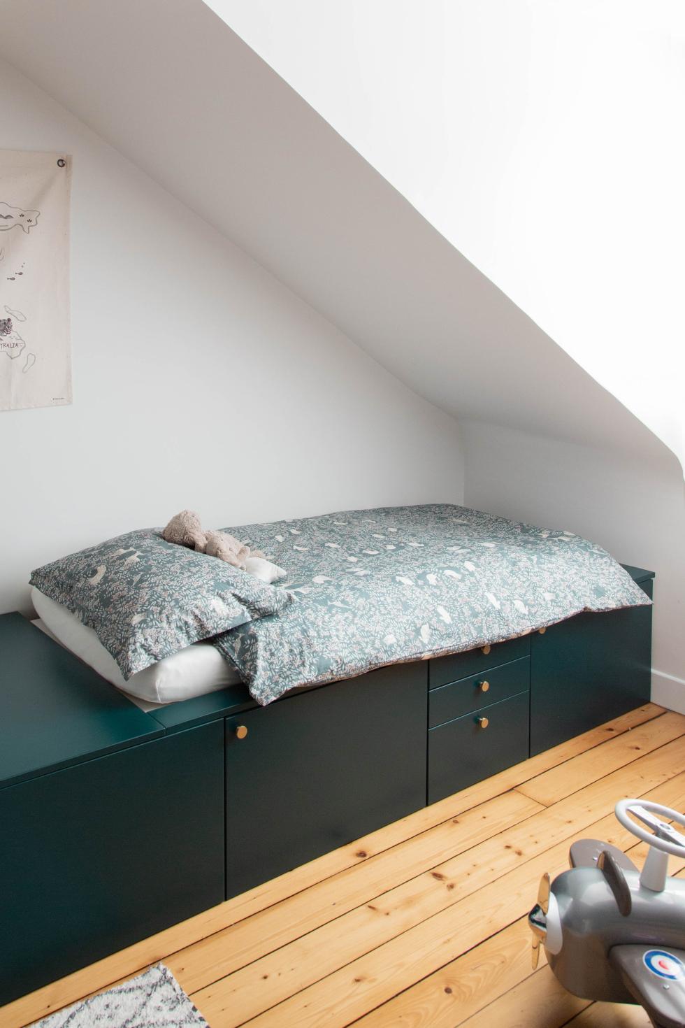
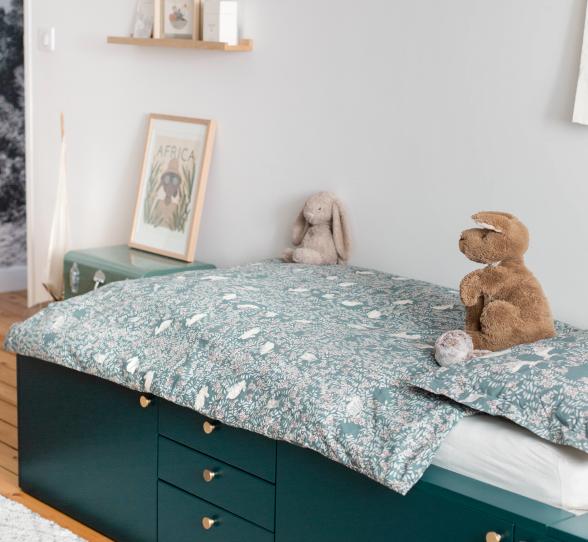
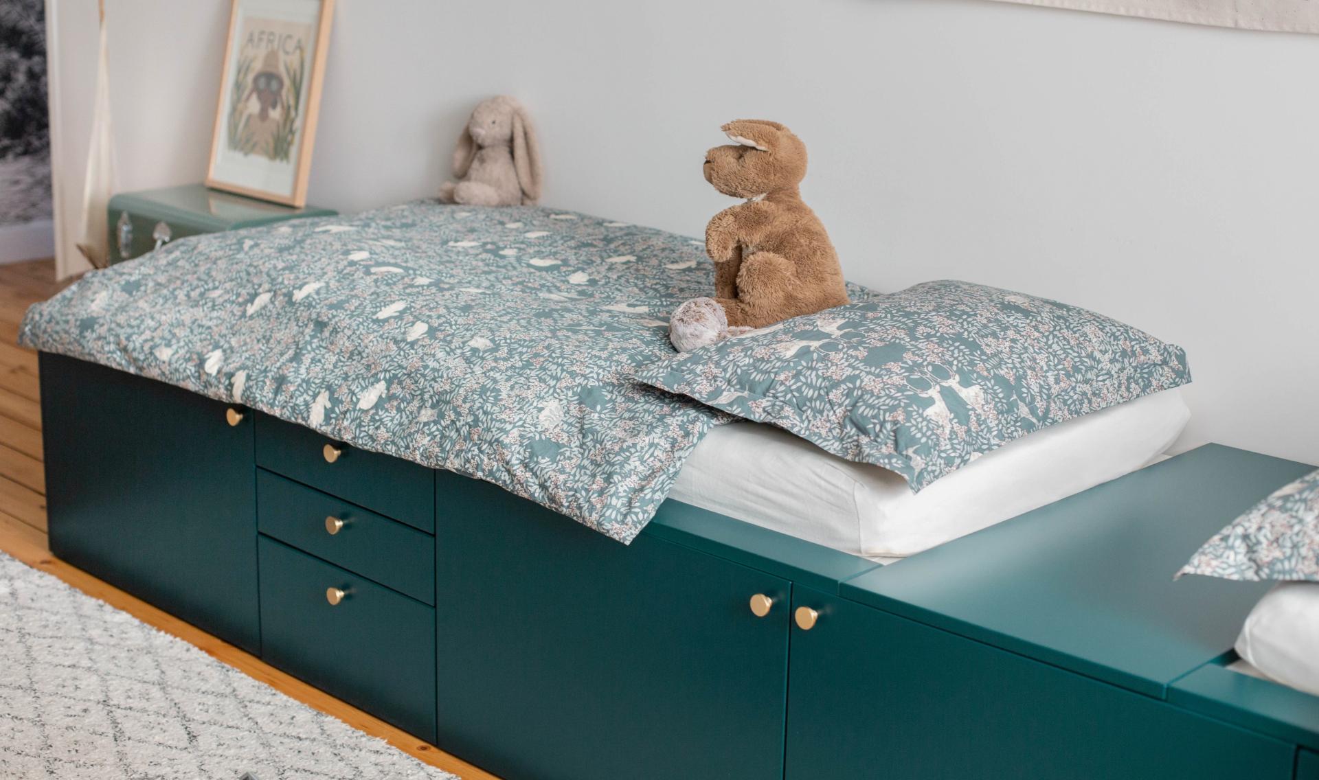
One bedroom, two children, three armies of Playmobil, four marble circuits, a double wardrobe… all in one room with a sloped ceiling. On paper, it sounds like a nightmare. But in reality, for Alexandra - our content producer - this is the best example to use Metod cabinet frames to create a 380 cm podium bed. Under the pair of mattresses, the drawers and cupboard create the maximum amount of storage space possible, which means you use up the floor space and say goodbye to clutter. Genius.
