An Ikea hack bookcase
The question pops up in almost every interview: "How did you come up with the idea to offer coverings for Ikea cabinets?" Our concept originally sprung from kitchens, after we realised that more and more architects were building their amazing projects using Metod cabinet frames. As they were so versatile and useful, we devised a concept around these cabinets: dressing them up with custom-made fronts and panels. With each project, the concept grew to incorporate ideas for every room in the home. An example? These wall-mounted bookcases, which bring together both open and closed storage. Inexpensive and extra-strong, Ikea cabinet frames make up the basic structure of this project, whilst shelves can be added to provide a designer look. Take a look at our favourite inspirations:
Every nook and cranny
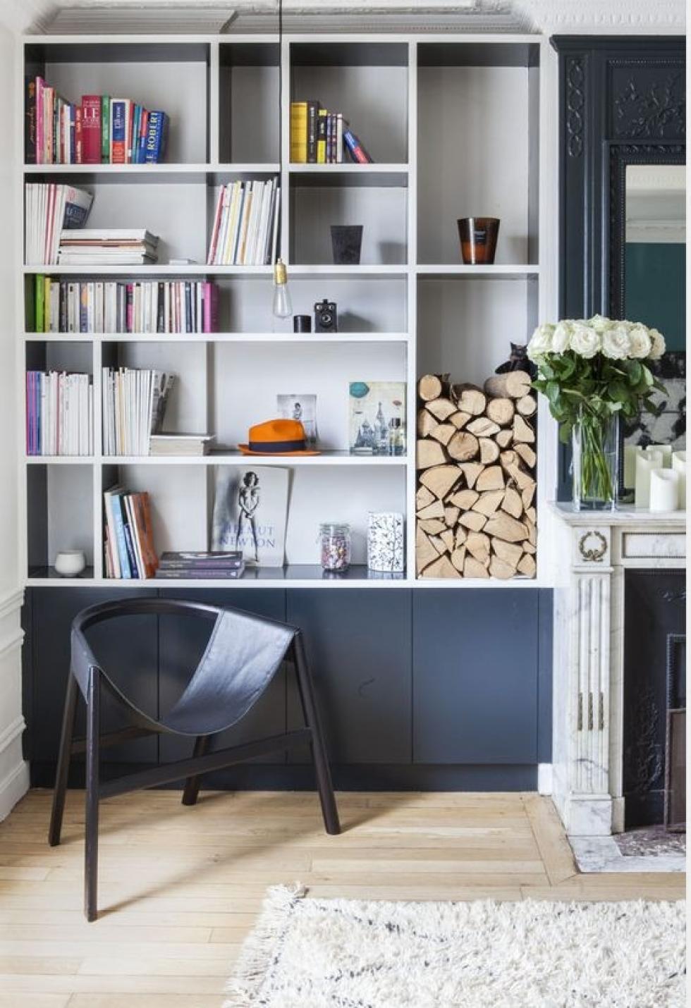
It’s as true in the world of interior design as it is in life: everything is a question of perspective. For some people, an unforeseen issue is a thorn in their side, for others it’s an opportunity to be creative! A niche? Let’s think outside the box! It’s the perfect spot to squeeze in an integrated bookcase. Here, architects Dorothée Delaye and Daphné Desjeux opted for a two-tone effect to bring some character to the fireplace surround. The navy blue cabinet frames are topped with custom-made shelving, resplendent in white for a graphic look. Look closer: the top section stops just short of the ceiling in order to allow the original Haussmann mouldings to take centre stage!
Clean lines, impressive effect
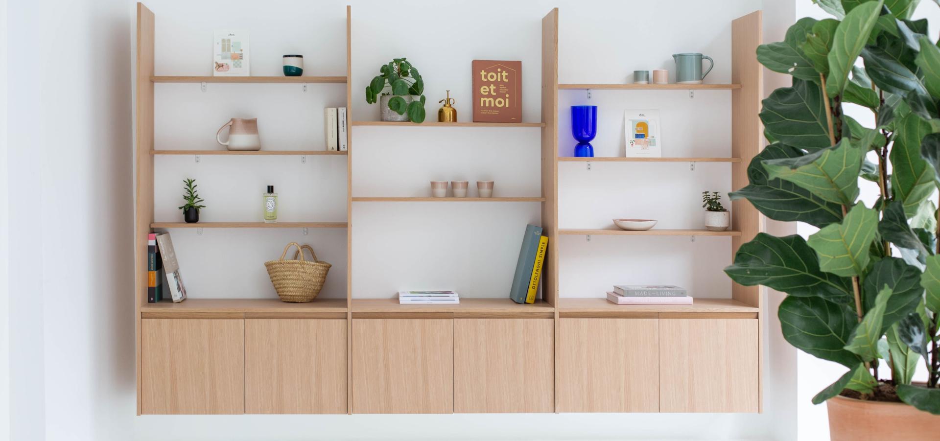
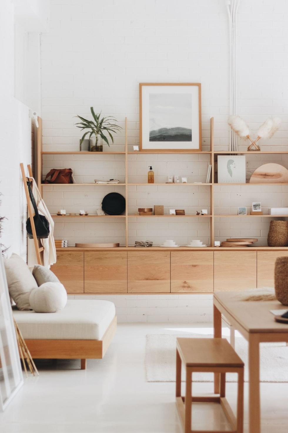
With natural oak panels serving as minimalist shelves, this bookshelf in Byron Bay, Australia, is supported by a row of cabinets incorporating built-in handles (just like our U-shape design). Both practical and pretty, the doors hide any mess, whilst the shelves provide a platform for books and favourite decorative objects. Light and airy, the top part of this bookcase can be recreated using 39cm wide cover panels. You will need to attach them to the wall and to the lower cabinets before screwing on the shelves, which can be created from 15cm wide fillers.

White is all-right
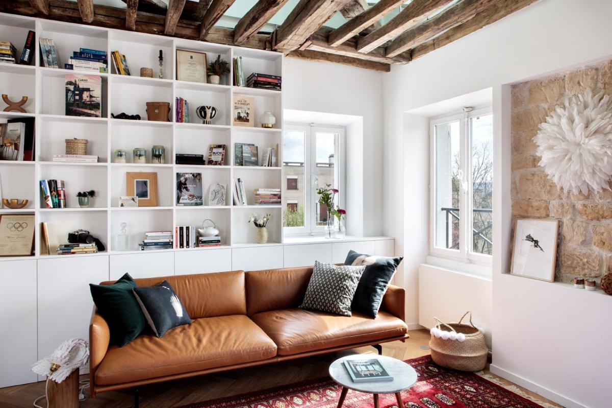
The star of this duplex apartment, this bookcase designed by Space Factory adopts a brilliant white colour in order to highlight the objects it houses. Simple but effective, the custom-made item was created by a carpenter and features clean lines running floor to ceiling. Extra design tip? Note that the bottom row of cabinets has been extended beyond the shelves, optimising storage and giving a new lease on life to the area under the window.
Blue velvet
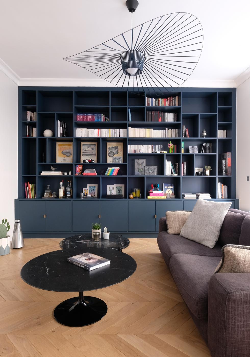
Midnight blue, slate blue, dark grey…as seductive as they are, we know dark colours can be scary when is comes to taking the plunge. Go for it! Intense and deep, they totally change the allure of a room, often without compromising on light. The proof can be seen in this velvety blue bookcase brought to life by Décor Intérieur, who have opted for a deep shade from head to toe. Super elegant, this bookcase also serves as a kind of cabinet of curiosities for books and trinkets. Brass handles help to highlight the lower cupboards which hide any mess.

Two-tone look
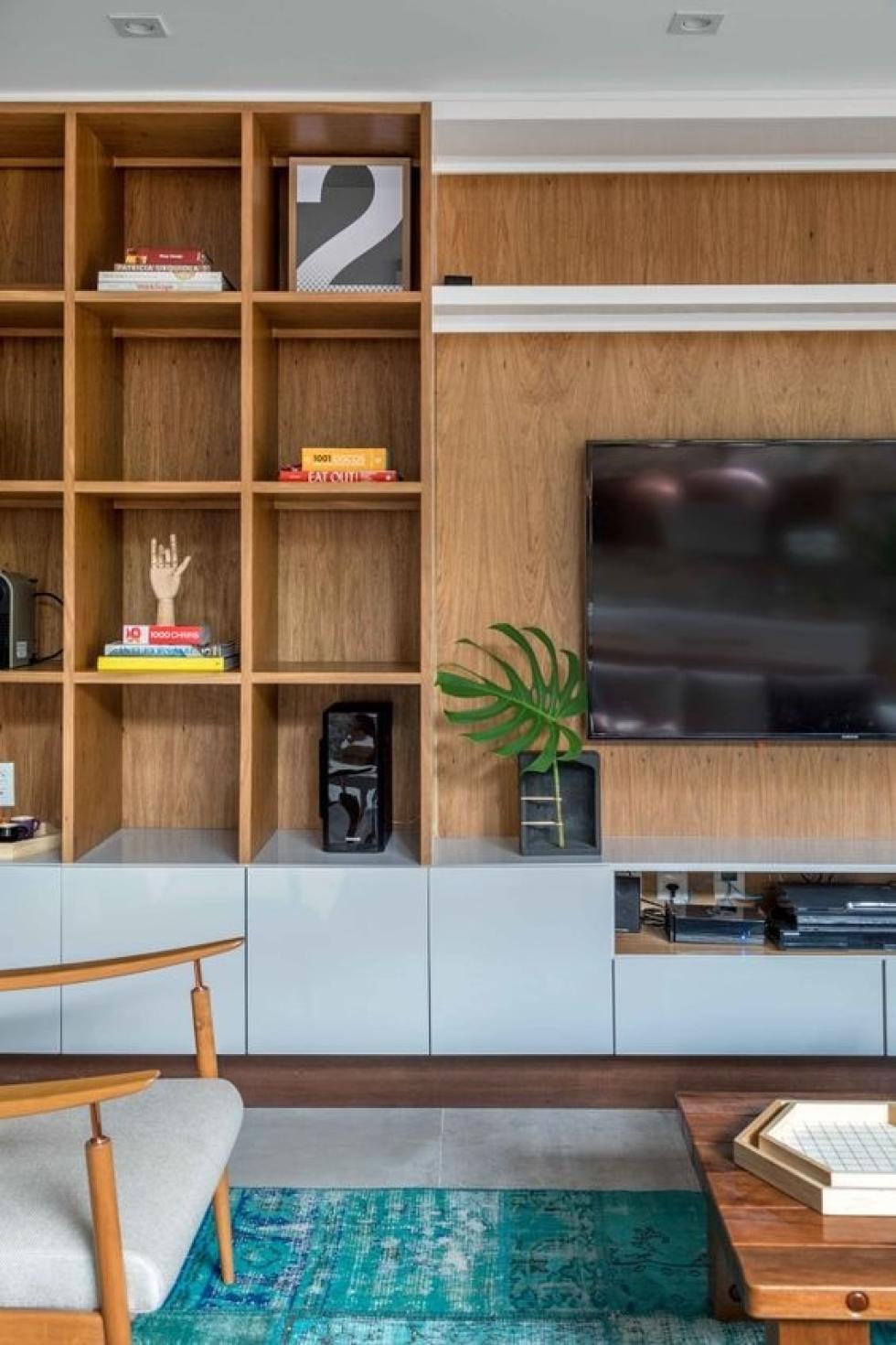
Bookcase, television stand, console table, shelves…having too many items of furniture can quickly drown a room and eat up that precious space. The interior designers who have created this renovation decided to blend multiple items in order to fluidify movement in the room. Installed right the way across a wall, this unit is built upon a row of 40 x 40cm cabinet frames, adorned with lacquered fronts. On the left, a natural wood bookcase continues in the same vein, whilst electronics are cleverly hidden in a specially-designed niche. A television is added to an attractive oak cover panel, which nicely ties together the two-tone theme.
