Picture perfect kitchen
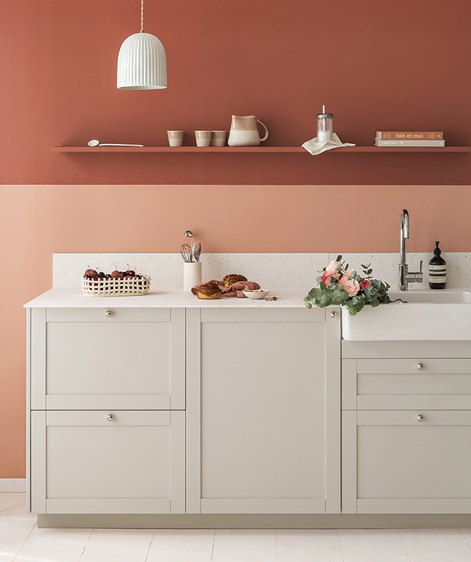
In the kitchen lottery, you've hit jackpot. No obstructing windows, no tricky alcoves. Not even a tiny corner forcing you to play Tetris with your kitchen cabinets... No, your room is well-balanced and perfectly accommodates a row of cabinets to hide your appliances, dishes and utensils. It’s a clear advantage, especially if the space opens onto your living room too. Don't hide your kitchen away, put it on display! It's about time your cabinets took centre stage. However, that’s not to say you have to dig out all your watercolour paints, creating a unique layout will suffice. Shall we show you how?
The rise of cubism
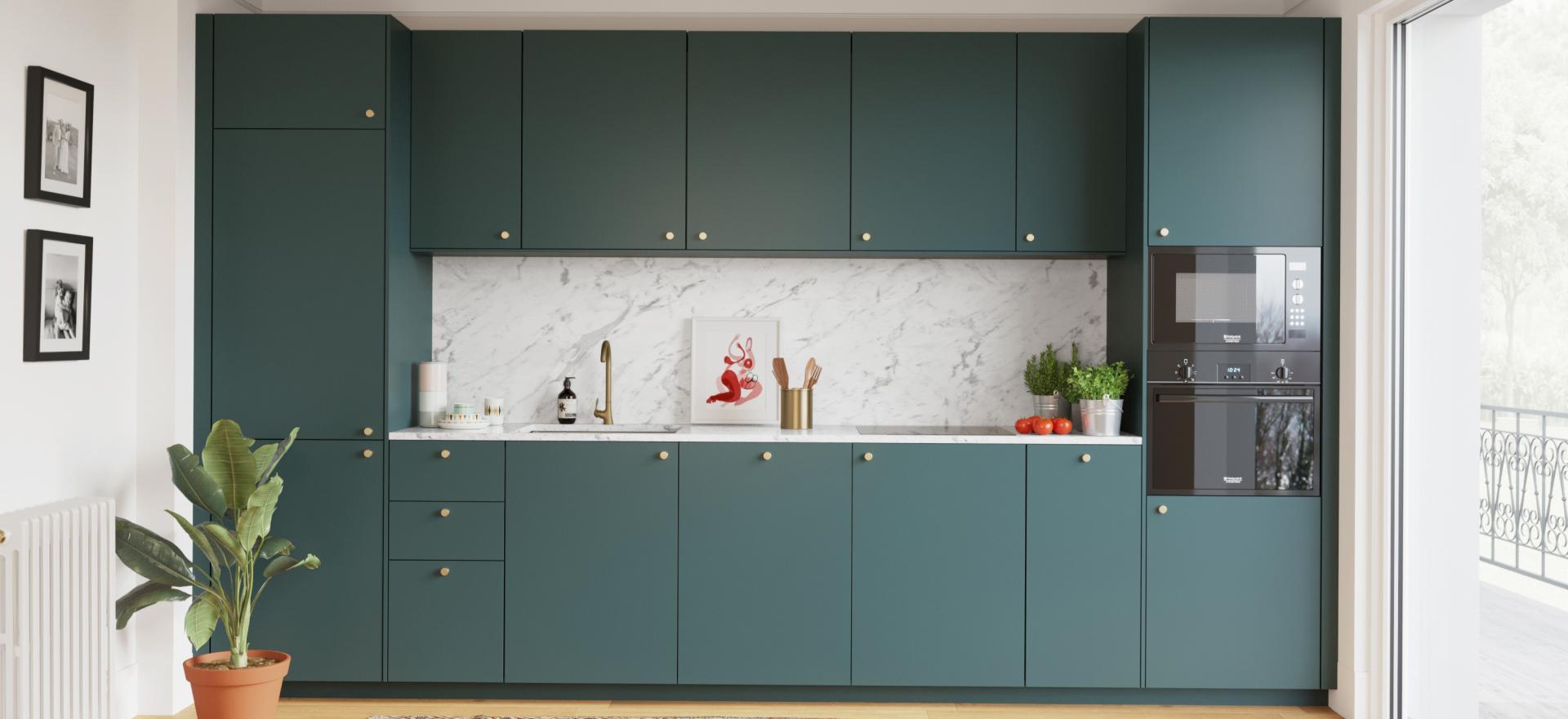
Hide your fridge where no one would ever think to look... Want a clue? Placing two columns at either side of your single-line kitchen is the perfect way to elegantly tuck away your electrical appliances. Once added to your Ikea Planner, you can then select lower cabinets to join the columns together, installing a sink, doors and drawers as well. To achieve symmetry, finish it off by adding a row of overhead cabinets. Don't have the space for two columns in your kitchen? Don't worry! A column on one side works just as well.
The art of perspective
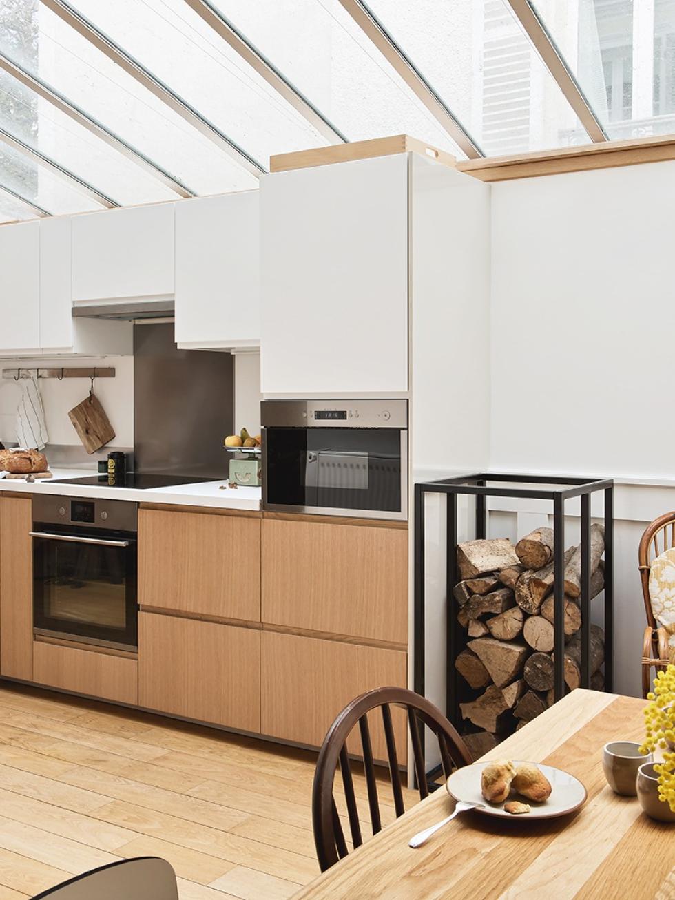
Is the single-line kitchen a little too straight for your liking? Just wait until perspective kicks in! Don't second-guess when it comes to replacing your 80cm high cabinet frames with two rows of 40cm high Metod cabinets. To create an eye-catching illusion of depth, the first row (60cm deep) should be installed at the same level as the columns, with the second row (37cm deep) placed just below. Still too simple? Go for mix and match! Select contrasting wood or cane fronts to add the perfect finishing touch and enhance this effect. Depth can also be achieved by adding two rows of 60x60x60cm cabinet frames with mismatching fronts, or one row of 60x60x60cm upper cabinet frames and one row of 60x40x37cm lower cabinet frames.
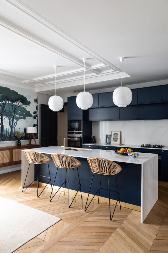
Attention to detail...
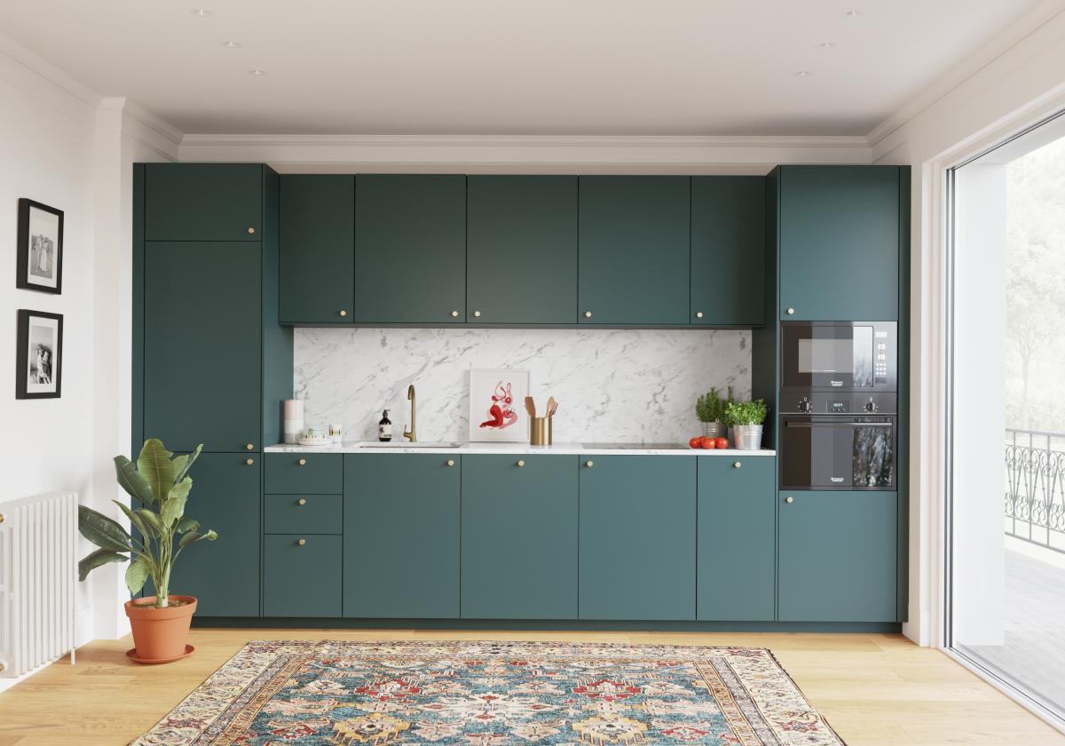
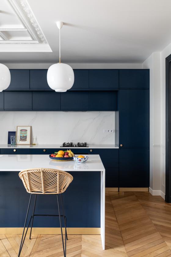
Remember, it's all in the details. If it’s true that cabinets are the framework of a kitchen, then it's the cover panels that truly elevate your space! Don't skim over your choice of countertop or cabinet undersides. Hidden by side panels coordinated with your chosen fronts, these special touches help create the illusion of a painting on the wall. Unless, of course, you choose a sharp contrast colour for your countertop and splashback. In a single-line layout, the cabinet frames form a square, attracting attention directly towards the heart of your kitchen. This daring choice can be further enhanced with the right selection of accessories
