Two-tone and two-material wardrobes, it's a yes from us
Rooms without personality... they're just not your thing. So it's no coincidence that your décor features mostly antique and designer pieces, knick-knacks from your grandma's attic and souvenirs from your travels. It goes without saying that you're not jumping for joy at the idea of having the same Pax wardrobe as everyone else. The good news: just because they're from Ikea doesn't mean you can't make them your own. A cover panel here or cleverly placed front there, and you'll totally change the look of your wardrobe. The proof is in the pudding with these projects combining two-tone doors and two-material finishes for a design as unique as you.
Strip of colour for graphic effect
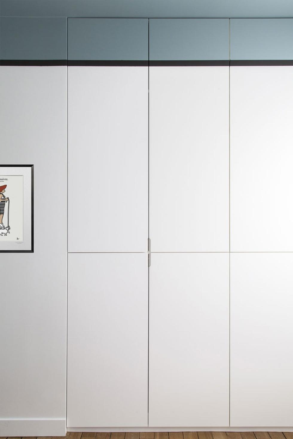
Get out the scotch tape! Far from common, this project by interior designer Agathe Convert gives a new dimension to this classic white wardrobe. The top, adjoining wall and ceiling are coloured in an ice blue, visually blending the module into the room. The black strip separates the two colours to better highlight them. This, along with the artwork also framed in black, creates a bold graphic look setting this bedroom apart. All you have to do is practice painting in a straight line!
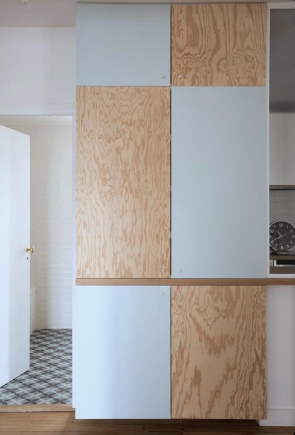
A two-material checkerboard for extra character
We promised something unique: well, here you have it! The mix of lacquer and natural wood adds a new dimension to this project by Atelier Premier Etage, which combines light oak and lacquered fronts in a shade similar to our Blue 04 - Ciel voilé
for an unexpected checkerboard look. A bold choice, reinforced by the wooden strip that extends along the adjoining wall. A layout that can be adapted to all your tastes, or if you're not quite ready to take on the fully look, replace the lacquer with stained oak for a more discreet result.

Black for a touch of relief
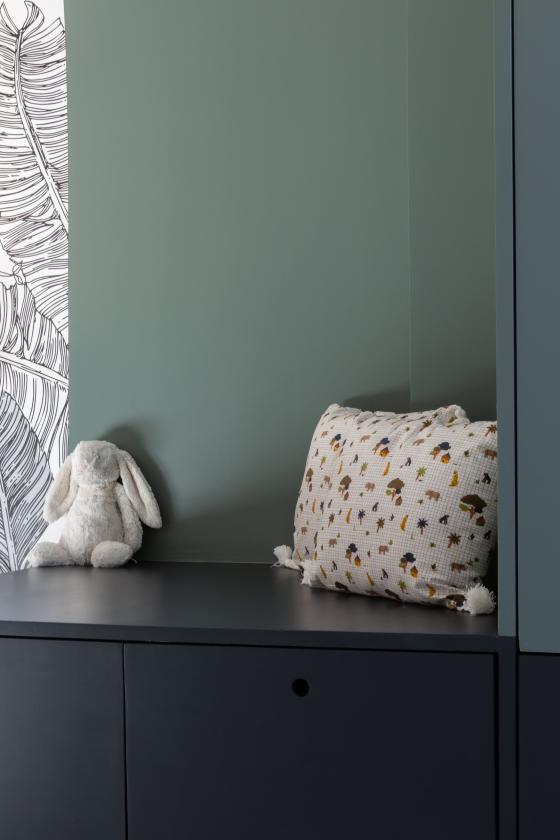
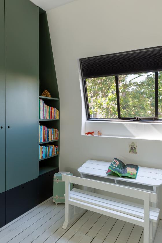
It's rarely the favourite for kid's bedrooms, but black can add a graphic dimension if used wisely. Interior designer Quitterie de Pascal proves it here with this two-tone wardrobe. The black at the bottom emphasises the Green 03 - Vert de gris while adding a little depth, and the contrast helps the little ones to find their way around the room. You can keep these cabinets accessible for them, while putting clothes away in the upper section of the wardrobe. A clever layout, which can also be used in the master bedroom as storage for your boots and trainers.
A wardrobe as a base
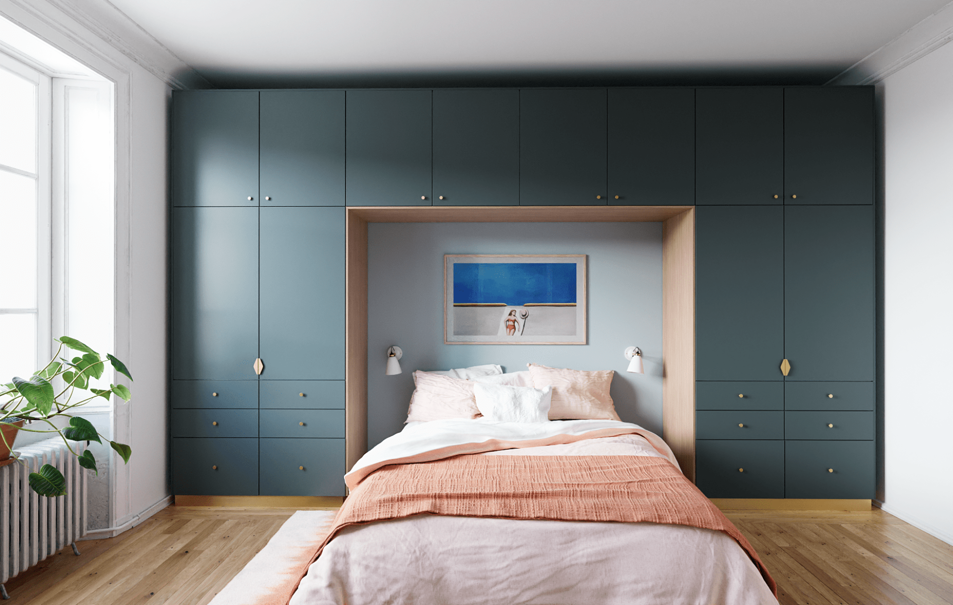
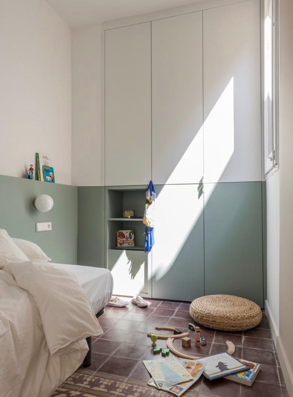
Say goodbye to bedside tables. In both parents' and kid's bedrooms alike, built-in headboards are having their moment. With electrical cables no where to be seen, and conveniently fitted with sockets and wall lights, we can see why! Painted in a contrasting colour, it adds volume to the room and leaves space for books and decorative pieces to be arranged. Is your wardrobe on the adjoining wall? Don't hesitate to extend the effect by choosing the same colour for the lower fronts as seen here — creating a modern take on a feature wall.

Contrasting colours to refocus space
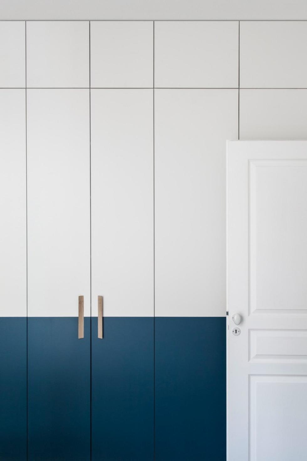
The pros and cons of a high-ceiling flat: while there is no shortage of space, they can sometimes lack cosy-ness and warmth. To create a cocoon-like feel, Beau Intérieur opted for an intense "petrol blue" that adds depth to the white and breaks up the vertical lines that tend to emphasise a room's height. Applied to the lower fronts, it almost makes you forget the row of cupboards are there at all. This two-tone wardrobe is highlighted with long brass handles that link the two colours together.
