A wardrobe as a headboard
Designed as a cocoon, the wardrobe shapes the bed while also creating storage space. Some see it as an opportunity to exploit every square inch of a tight space. For others, to give strong personality to a room that has long been confined to the triptych bed-wardrobe-bedside table layout. At Plum Living, we can picture the infinite combinations offered by this architect’s playground which is rarely considered, but that can nevertheless change the look of a room. A win-win combination! Take a guided tour.
Three shelves for a bookcase feel
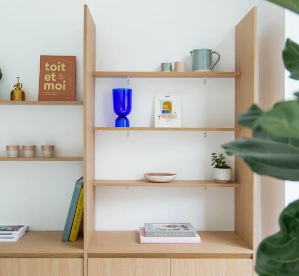
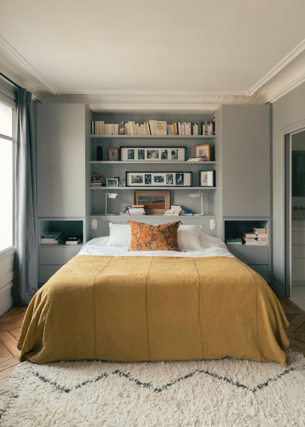
Sometimes all it takes is two carefully placed Pax columns to give a classic bedroom a new dimension. Painted in the same grey tones as the walls, they frame the bed on either side. Two alcoves are deliberately left empty, creating built-in bedside tables. Linking the columns are floating shelves in the same colour. A simple yet original way to design a bookcase, and distract from the wardrobe's primary purpose.
Tone on tone
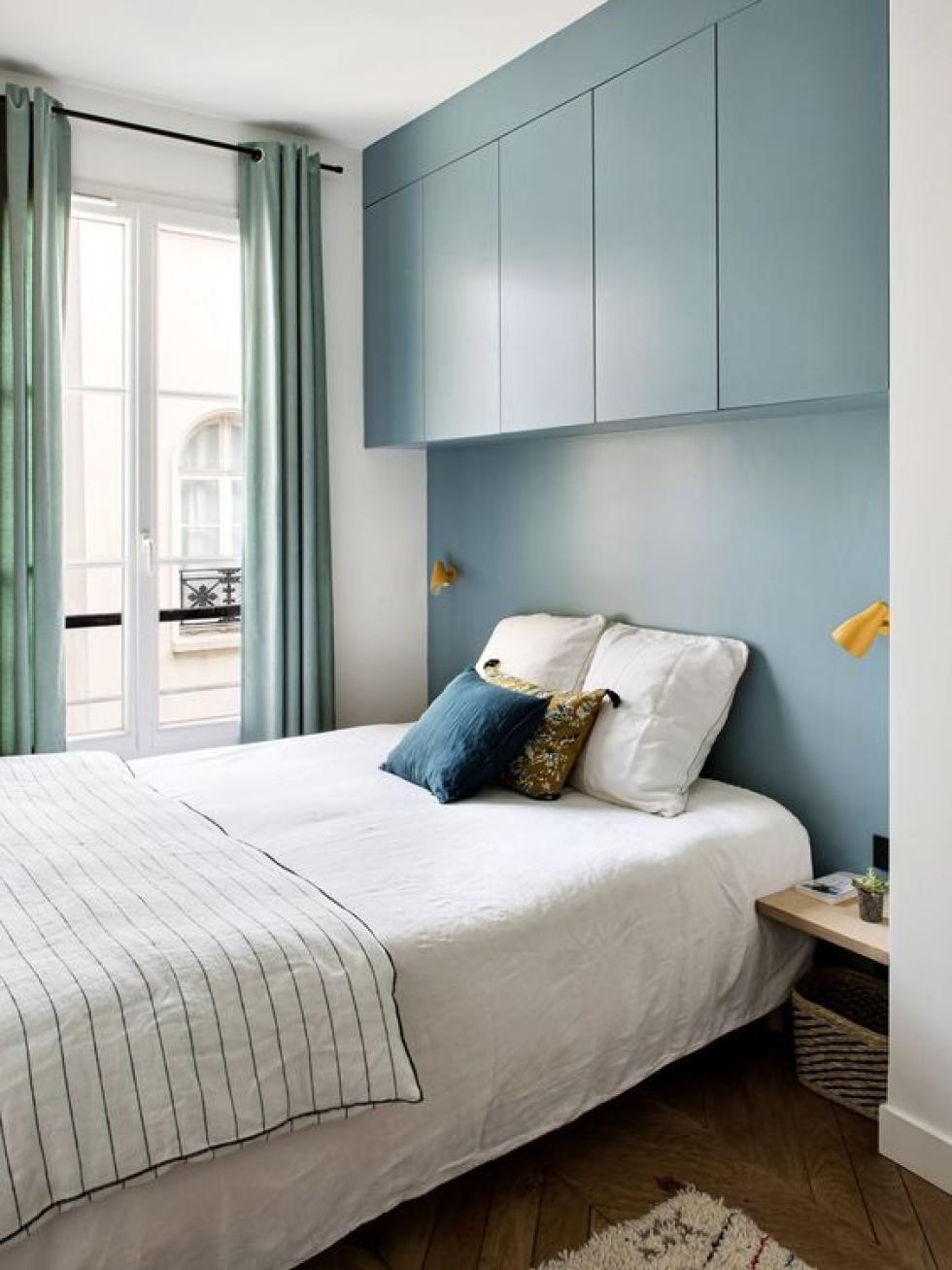
Create storage space and optimise your bedroom? Sure! But you don't want to feel like you're sleeping in your wardrobe either. The interior architects at BR Design Intérieur have the answer, creating a floating module above the bed. The custom-made panel fills the space between the ceiling and the cabinets, while the matching blue wall allows the wardrobe to blend in seamlessly. A simple yet stunning layout that saves precious square metres!

Two-tone wardrobe for a cosy alcove
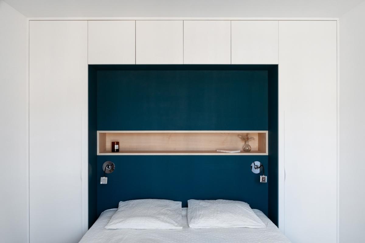
A pop of colour in a sea of white, this headboard makes you forget about all the cupboards that surround it, attracting the eye almost magnetically. The power of deep blue combined with light wood is undeniable! Simply dressed in white fronts, the wardrobe composed of two columns and a row of overhead cabinets blends in with the room, letting the colour take centre stage. A simple and inexpensive option that can be recreated with all your favourite shades.
Head in the clouds
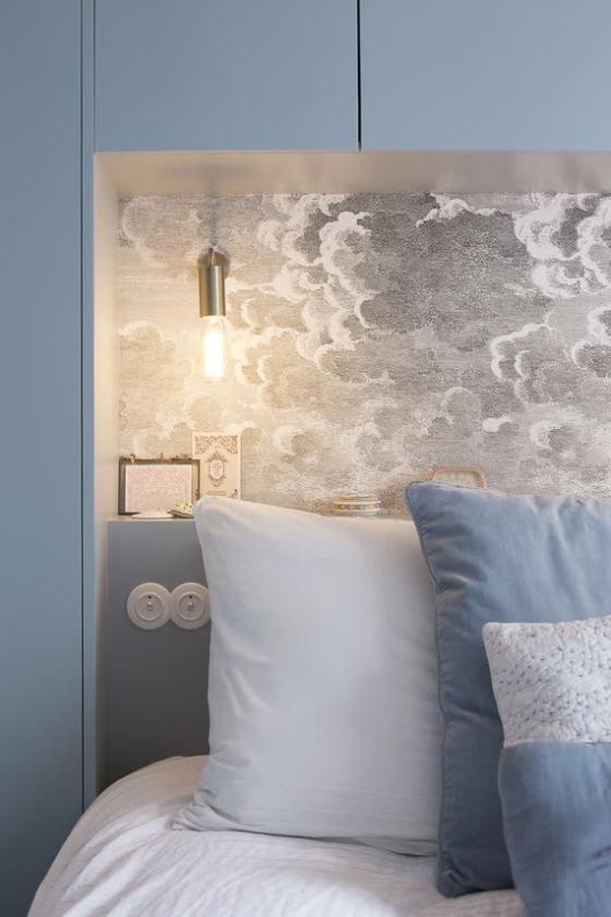
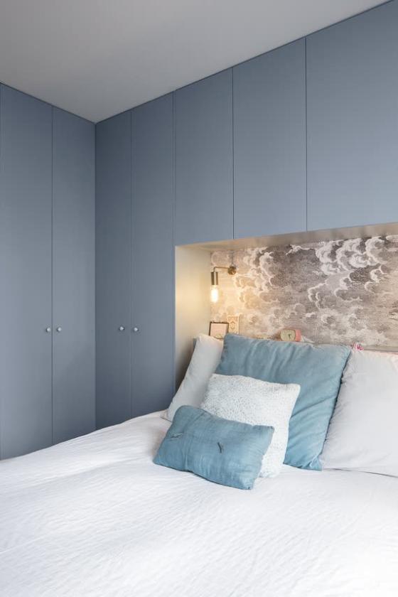
Soft sheets, a soothing blue-grey and a boxed effect… Designed by Beau Intérieur architect studio, this bedroom is our next excuse for a lazy Sunday. Installed at the back of the alcove, which was simply created with side columns and overhead cabinets, the Nuvolette wallpaper by Cole & Son catches the eye and steals the show from this sizeable wardrobe. A poetic yet functional layout, and we think we're ready for bedtime!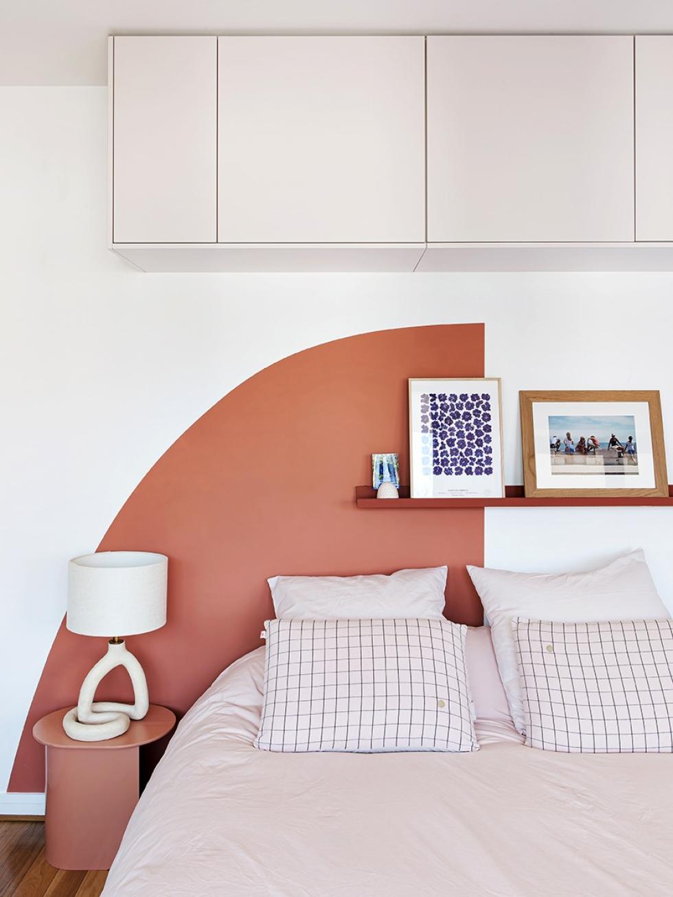
Floating cabinets in a poetic arch
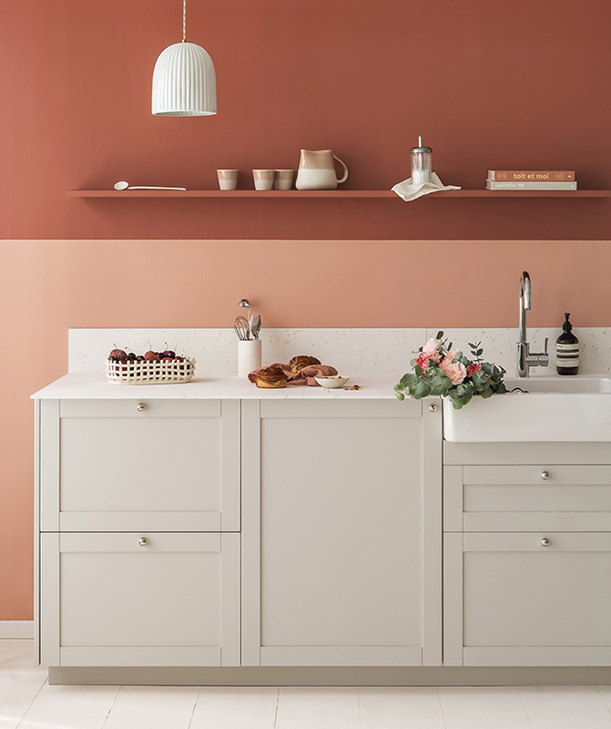
With the price per square metre being what it is in the big cities... keeping your entire wardrobe within reach is often a fantasy. Think outside the box! A cabinet on each wall to optimise every last spot, just take a look at this layout created by Amandine. The co-founder of Plum Living has turned Metod modules into overhead cabinets using our smooth fronts in Beige 01 - Beige rosé. An original idea, which provides extra storage while adding volume to the room. The Red 01 - Terra arch adds the finishing touch!

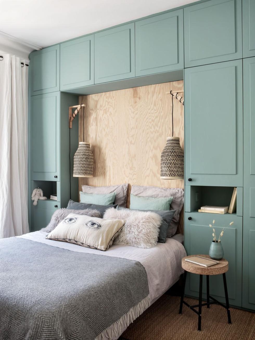
Wood and Green 03 - Vert de gris, cocoon effect guaranteed
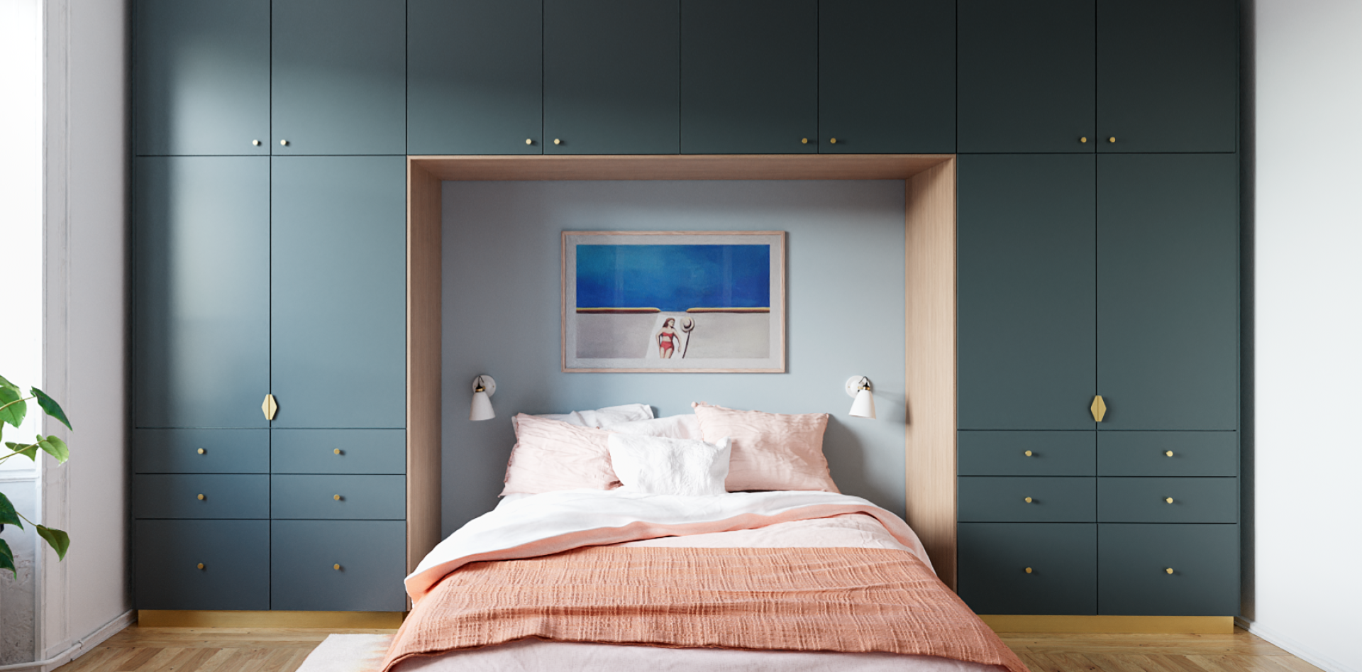
Throwing yourself into a wardrobe x headboard? We dare you! The inspiration that has you dreaming is all the products of an interior designers' imagination, like this bedroom redesigned by Constance Oulès. Got you thinking? All that's needed here are two columns and three high modules. The fronts and cover panels in a similar shade to our Green 03 - Vert de gris give a linked and finished look to the ensemble. We'll leave the decor up to you!
