To prepare your quote, we will need your plan from the Ikea Kitchen Planner, including fronts.
We only provide quotes for Metod kitchens and fittings.
Already have a Plum Living account? Log in before you start.
10 x bodysuits in size 0-3 months (and their 6, 12, and 18 month twins!), nappies delivered by the dozen and toys that seem to multiply at an unprecedented rate... Ah, remember when you thought a small chest of drawers and a few baskets would do the trick?! So, you've come to terms with the fact: the words "kid's bedroom" must be synonymous with storage space. Say goodbye to bright plastic boxes and monthly trips to the attic. Graphic or colourful, cosy or optimised, the new and improved kids wardrobe is making its debut! Create a version uniquely them while making clutter disappear. Over to you!
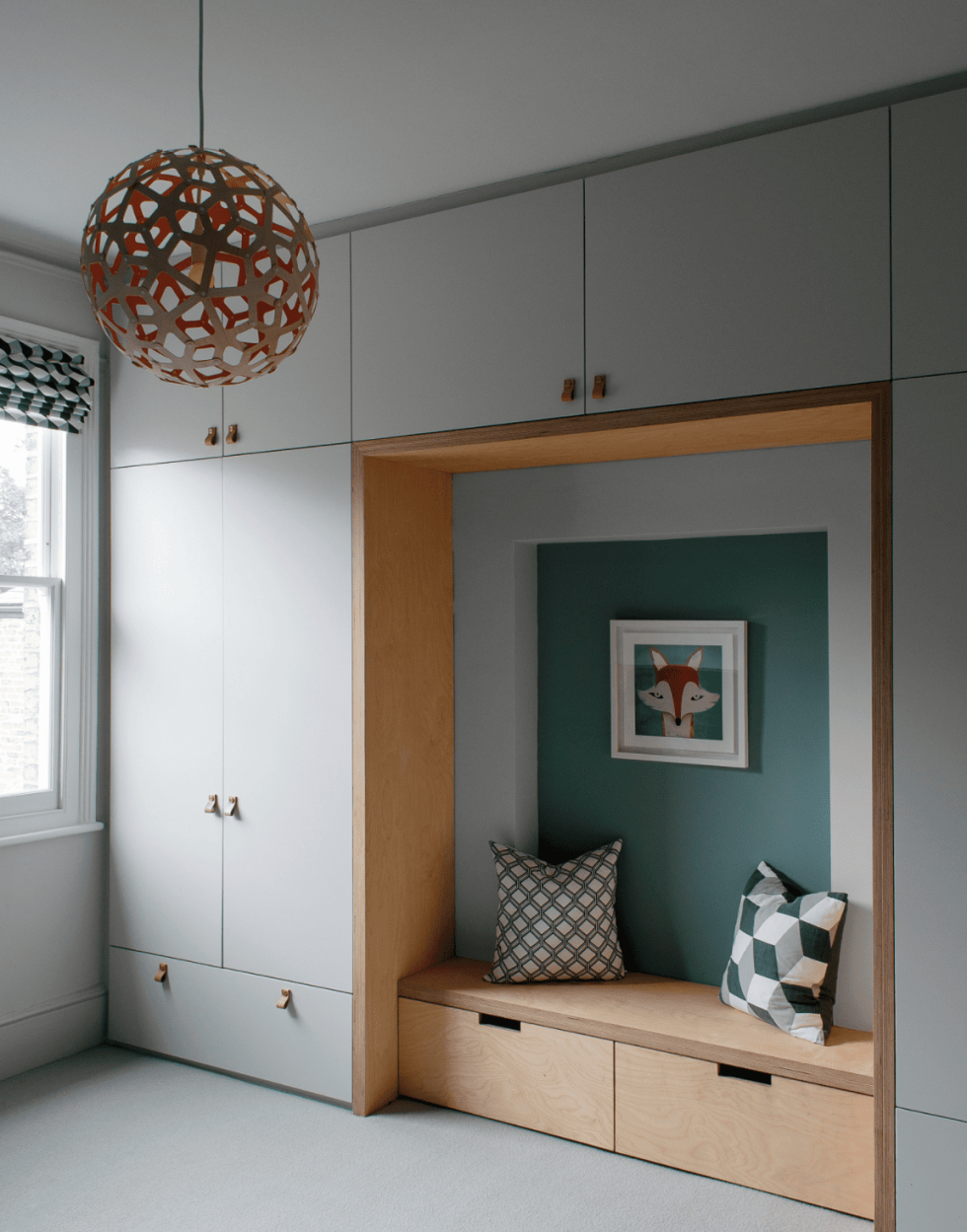
Created as an arch, this children's wardrobe features a light oak bench for a contrasting effect. The architects behind the project played on the depth of the cabinets to establish a "cocoon" feel, while defining the space with cover panels that are a perfect pair for the natural leather door handles. Add a few cushions and a pop of colour to the wall, and what could have been a simple row of closets becomes a cosy and creative arrangement.
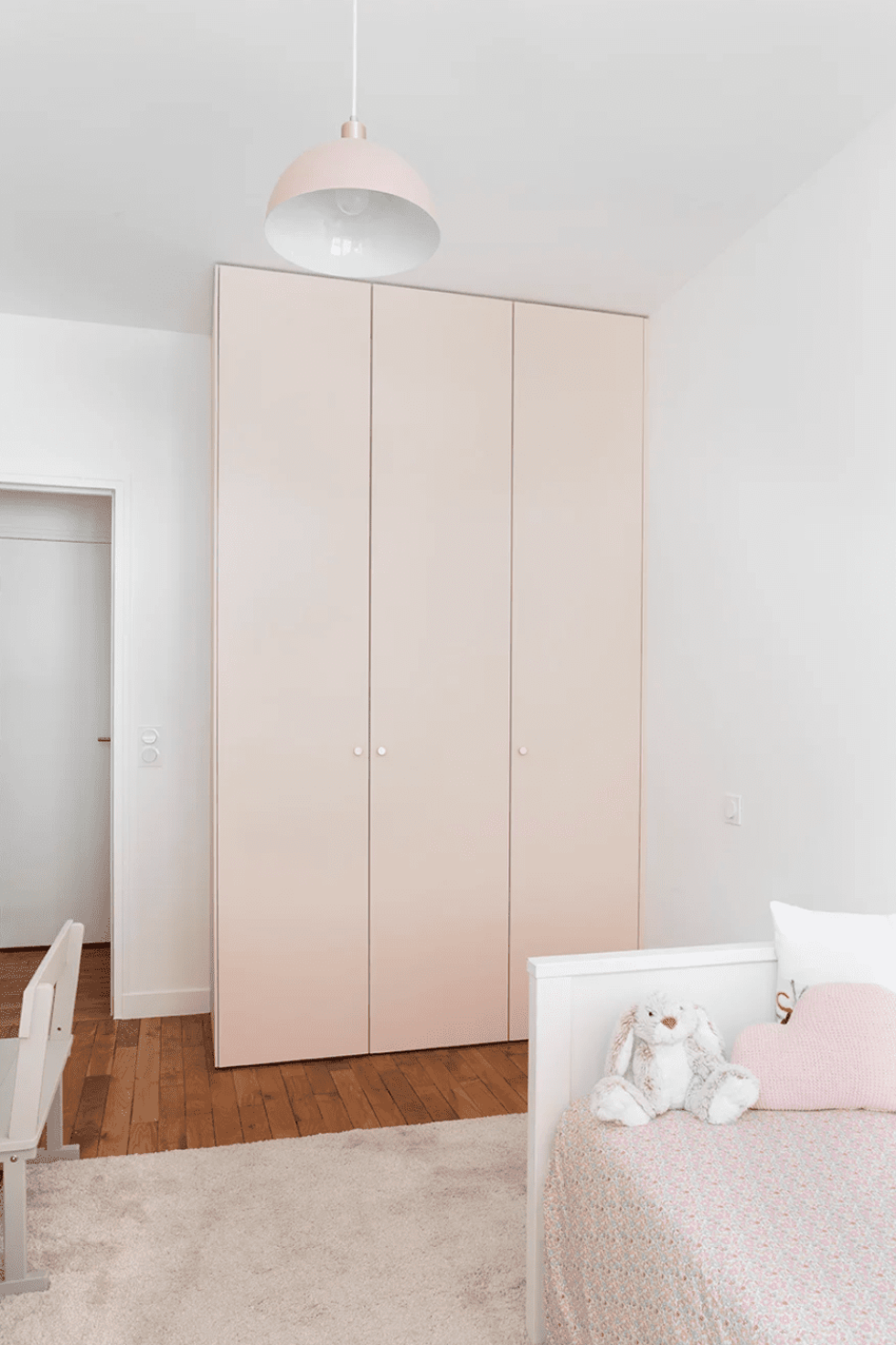
Less is more. Simple, elegant and functional, this powder-pink wardrobe blends perfectly into this little girl's room. The design is simple: just pair your PAX cabinets with our Beige 01 - Beige rosé lacquer doors for the same result. A cover panel is added to the left exposed side, while the brass door knobs add a refined touch to this semi-customised storage unit.
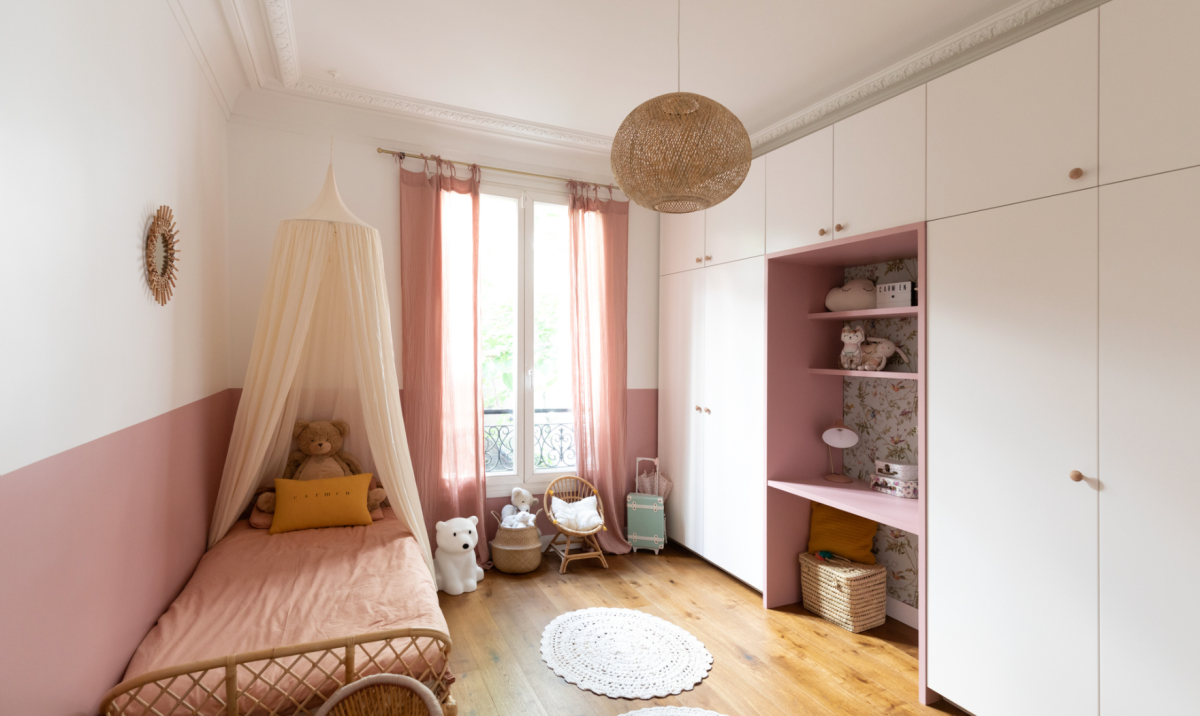
The secret behind this wardrobe designed for a studious little girl is in two words: cover panels. Chosen in a contrasting colour, they create a desk space between the cabinet frames. Here, they deliberately protrude a few centimetres so as to stand out from the furniture and steal the show from the dressing room. The off-cuts have been cut to make shelves set back from the main shelf. The wallpaper strip underlines the whole and adds to the charm of the installation.
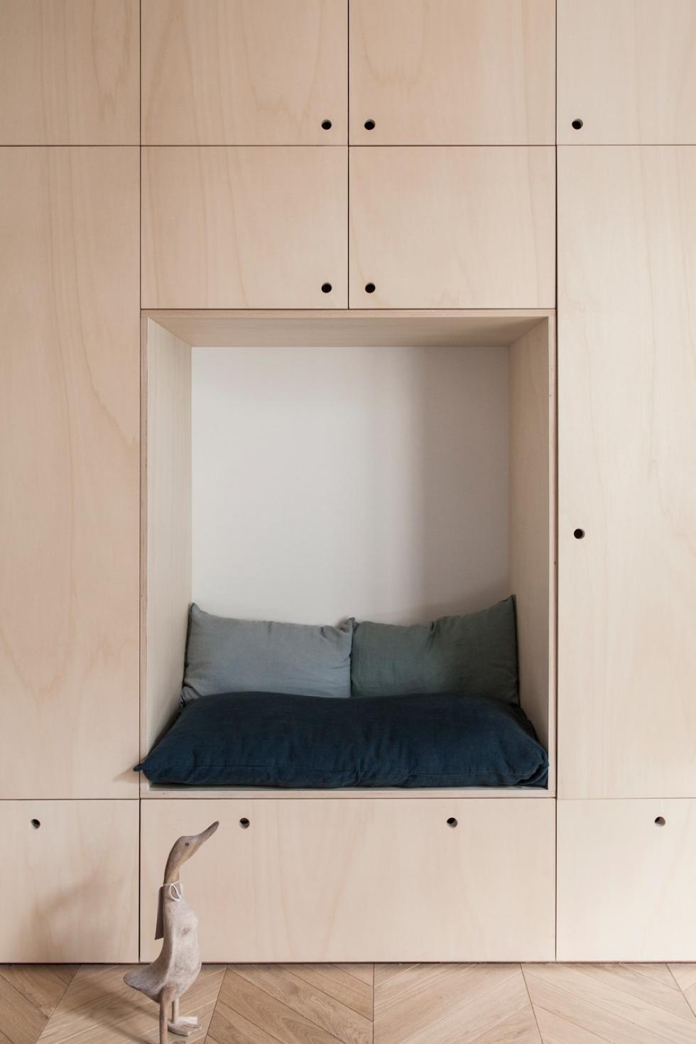
Kids' rooms doesn't have to mean "childishly" designed. A few details is all that's needed to transform a classic wardrobe into their playground (without distorting the style of the room too much!). This is the case with these plywood fronts, which remind us of wooden building blocks. Arranged as an alcove with comfy cushions, they create a unique look and a life-size hut where the kids will dream of hiding.
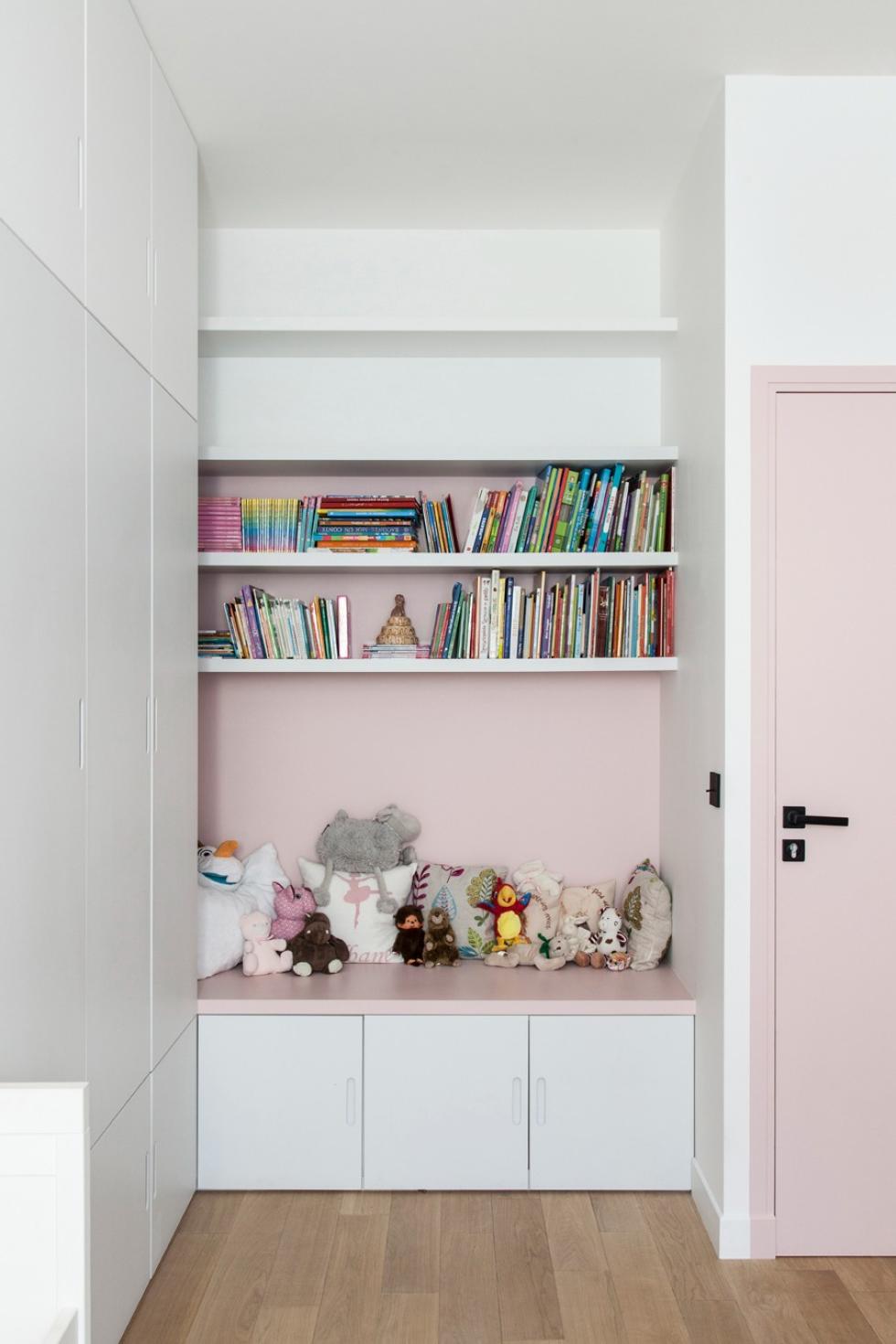
Lego pieces scattered across the floor, pianos, maracas, and other instruments that are particularly melodious in the hands of a two-year-old... AKA: toys that don't do much these days besides gathering dust. Although there's no shortage of toys that you're in a hurry to make disappear, books don't have to be one of them. Playing the leading role, they sit decoratively in this bookcase nestled between two cabinets, to create a cosy atmosphere for a child's room. Add soft cushions, and both young and old alike will be ready and waiting for evening story time!