Where to put your wardrobe?
In your wildest dreams, your wardrobe would be a dozen square metres. Your shoes would be arranged in height order, your clothes by colour. Snap back to reality: once your two kids, their toys and your furniture have been squeezed into your three-room apartment, sadly there's no space left for fantasies. Walk-in wardrobe, maybe not this time, but storage space is still a necessity. So why not make the most of every nook and cranny to put your dressing room in? From the hallway to the headboard to the door frame, every square inch can be used. We'll show you how.
Along the bed
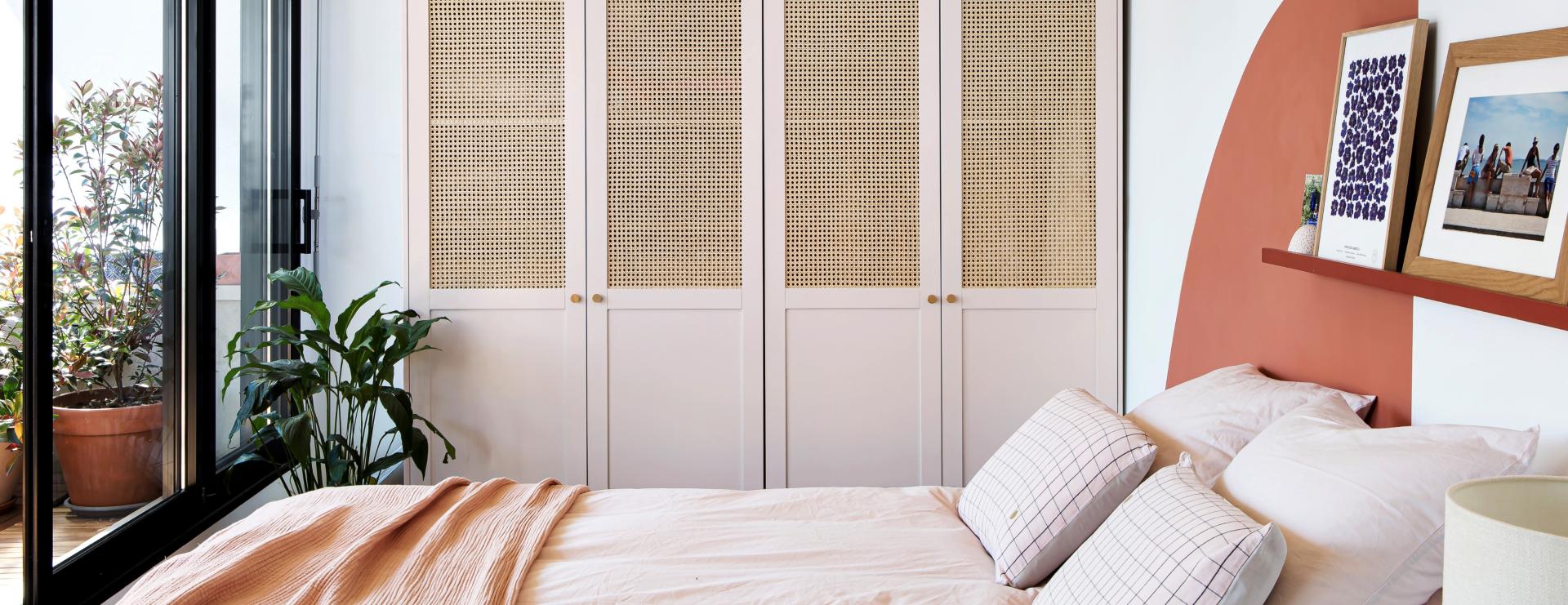
Say goodbye to solitary wardrobes and hello to wardrobe-walls! Don't hesitate to utilise multiple Pax modules to cover the whole length of the wall besides your bed, making your wardrobe decor in its own right. Our Plum Living paint range has been designed in the same colour as our fronts so you can play on the camouflage-effect.
Headboard
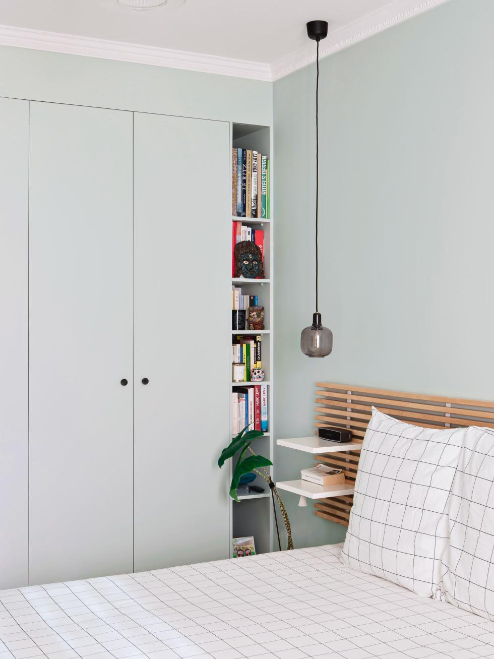
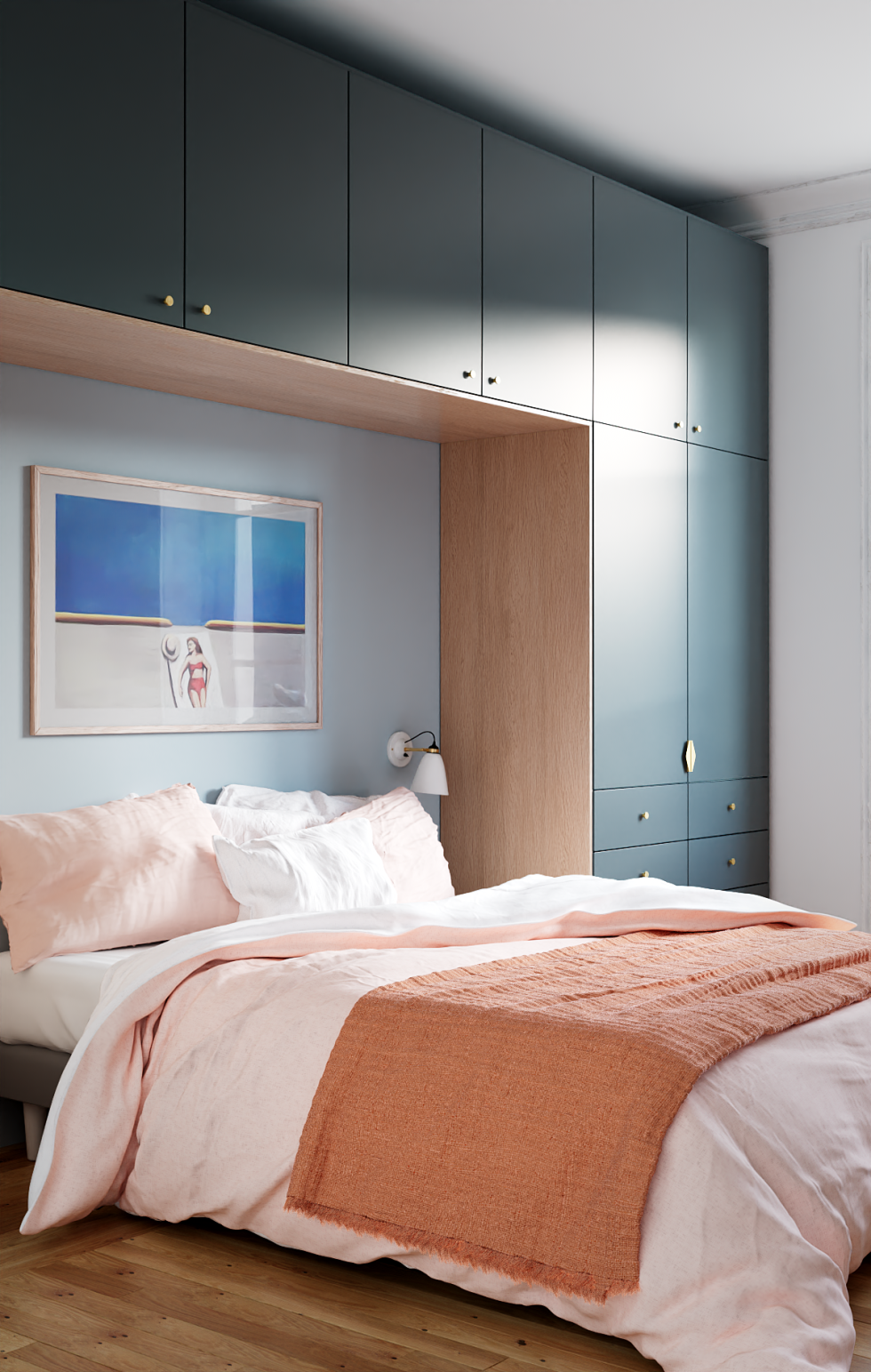
Creating storage in a tight space requires a little bit of creativity and a whole lot of optimisation. This is certainly the case with this wardrobe x headboard design. The 37 cm deep Metod wall cabinets connect the two 60 cm deep Metod columns, creating an ultra-practical alcove where the bed, lamps and decorative pieces can hide.

As a door frame
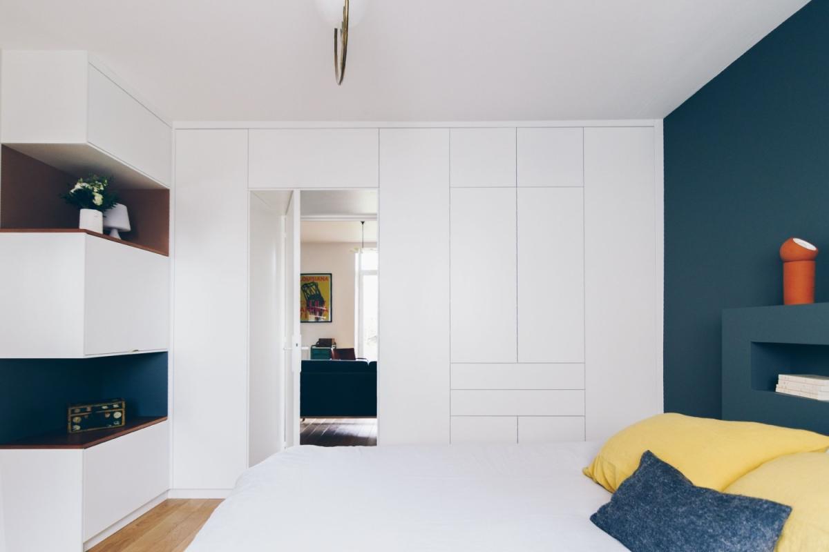
Too restrictive, too technical... Wrong! We take Metod modules out of the kitchen and mix them with Pax to frame your openings with a few twists of the drill. We particularly like the "box effect" which adds to the cocoon-feel of a room.
In the hallway
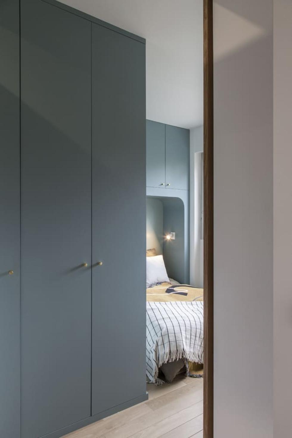
Mirrors? Family photos? Hooks? It's not easy to decorate the walls of your hallways. If their width allows it, why not install your wardrobe there? Ikea's Pax cabinets are available in 35 and 58 cm depths to suit the space you have to work with. The doors can either be discreet, simply highlighted with graphic handles, or for a more decorative look dress them up with cane or framed doors.

Behind a half-height partition
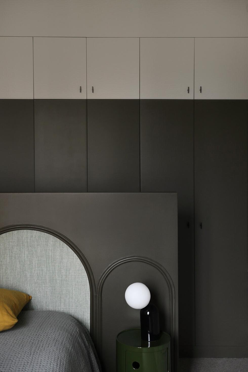
Who said your wardrobe had to be uniform? Here, the overhead doors play the graphic card with a grey shade that blends in behind the half-height partition where the bed rests. An original way to visually delimit your storage space while keeping within the same colour code.
Side by side, framing the window
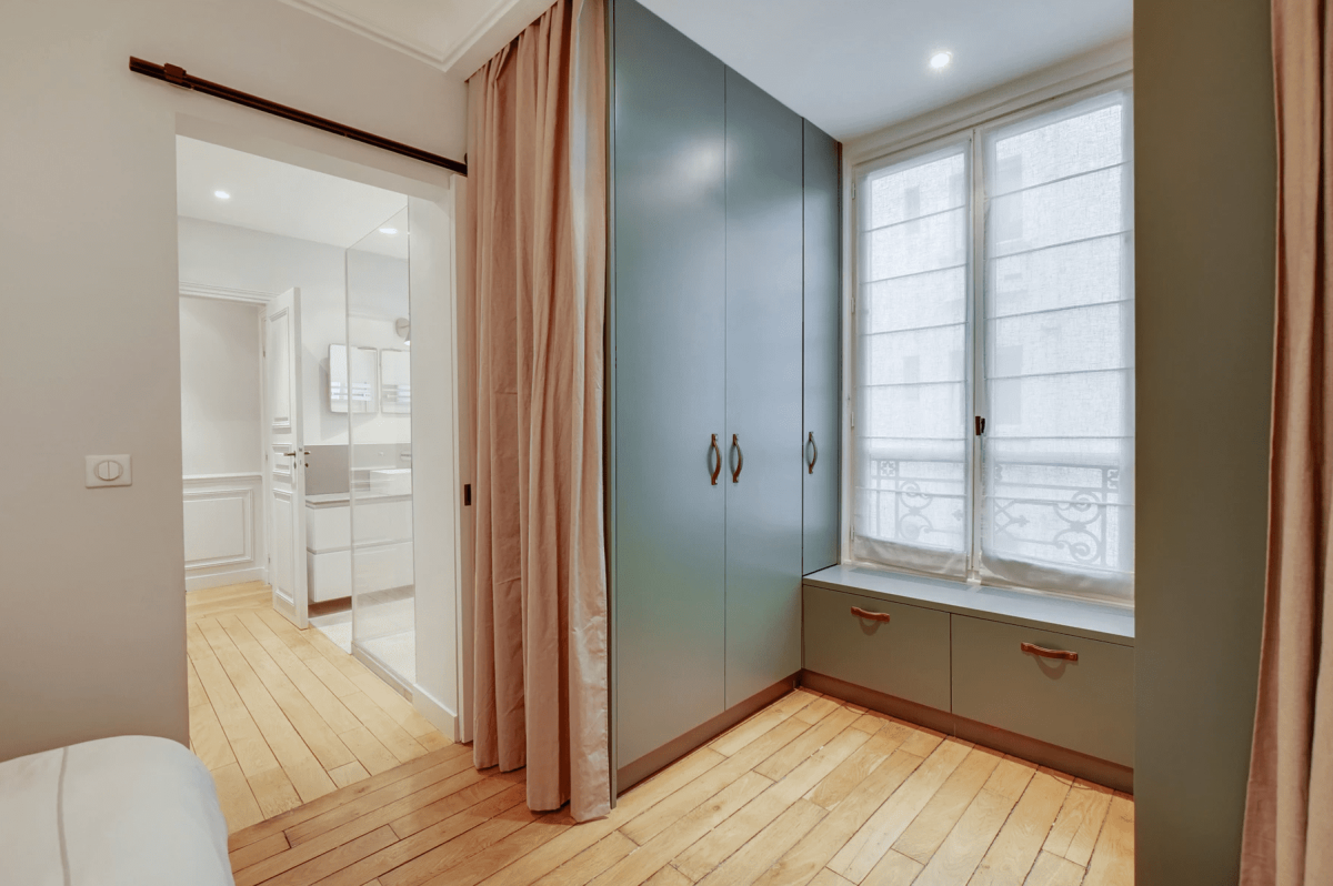
Forget curtains! We love this design where two wardrobes frame the window. Installed under it, the cabinet links the two columns while creating a handy bench seat and extra storage. Having a wardrobe besides the window also allows you to take advantage of natural light. Win win!
In a corner
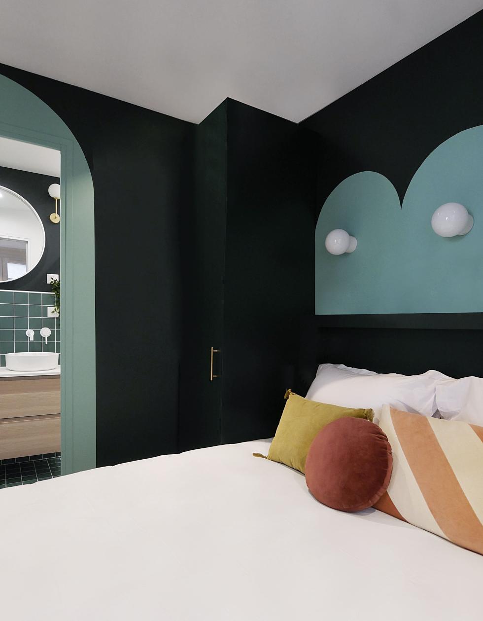
Designed like a hotel room, this bedroom is optimised in every corner. The wardobe is no exception! Minimal yet functional, it is simply composed of a single column installed in the corner. A door and cover panel to match the wall were all that's needed to blend it in with the decor. Our tip? Consider using push buttons for the door to reinforce the tone-on-tone effect.

To delimit space
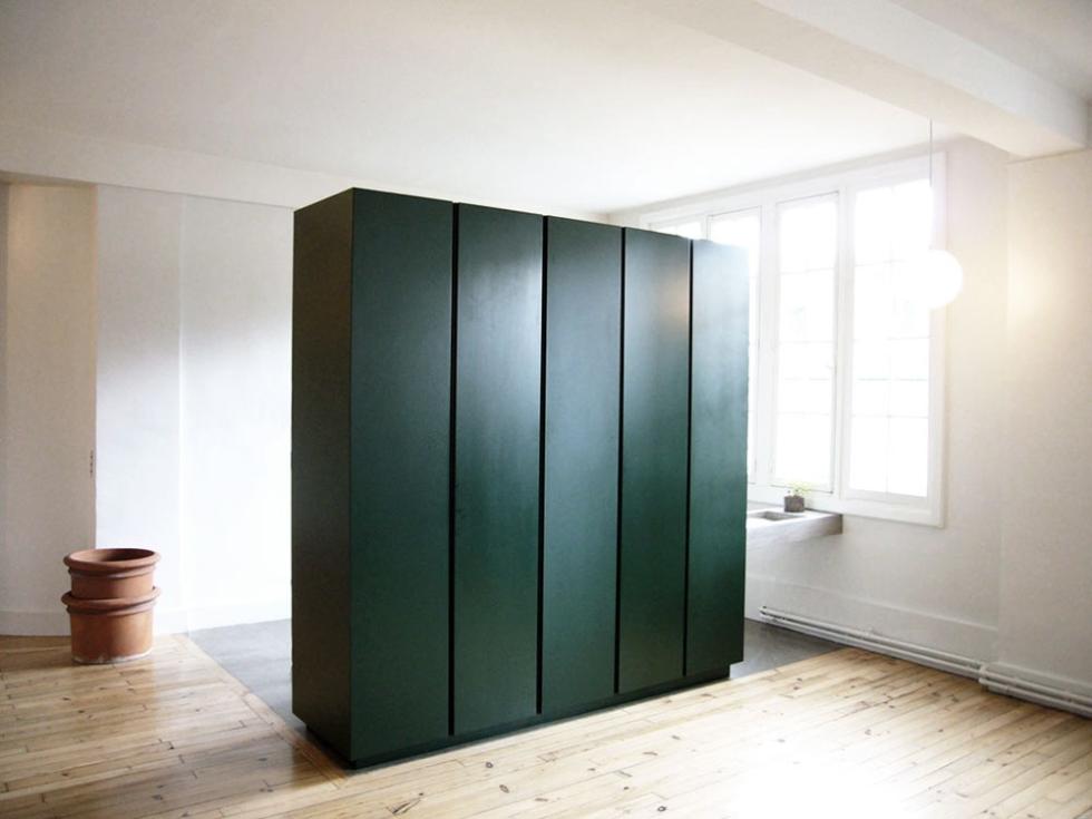
A wardrobe as a partition. Installed in the centre of the room, a wardrobe can be used to delimit space, particularly when creating a makeshift bedroom. Don't try to extend it to the ceiling - the day lets in precious natural light. Be careful, ensure the wardrobe is securely fixed to the floor to avoid any risk of falling.
