A colourful renovation by Lucie Socrate
Previously, Plum Living visited Lucie's own home for a home tour, full of colour and tips. Today Lucie Socrate welcomes us in to her latest project. Nothing was off limits regarding archiecture and decoration, and the city of Rio provided the inspiration for a fun, jewel-toned palette. In just 4 months, the designer totally renovated this 61m2 apartment, creating a magical and fun space. A sunny home, just outside Paris; perfect for stimulating your creativity and imagination! Here, contrasting colours are played with, redefining spaces and punctuated with vintage gems and modern items. Daring and bold, each room is more unique than the last. Shall we take a look?
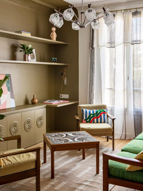
Welcome to Rio de Janeiro
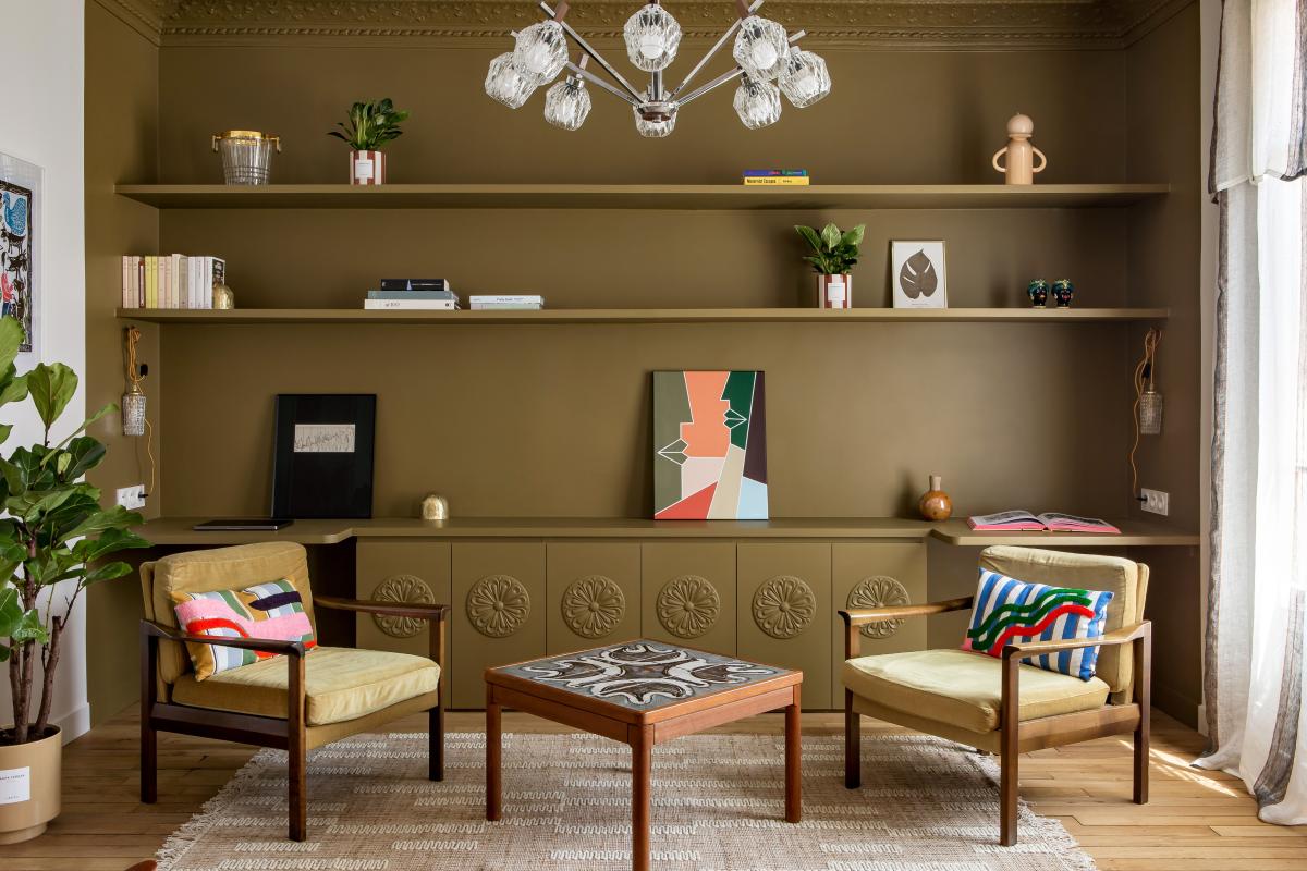
One less diving wall here, a little more storage there: as soon as you step in to the living room, it's clear Lucie has reconsidered the dimensions of the room, as well as giving it a punchy new colour. To give depth to the room and a focal point to the bookshelves, Lucie added a khaki green all over the cupboards, shelves and even a sliver of the ceiling! A few vintage lights and pieces of retro furniture, warm natural wood and vintage paint shades; the atmosphere of this bold project is clear as soon as you enter the chic living room. One for antique lovers then! .
Rehomed & reloved
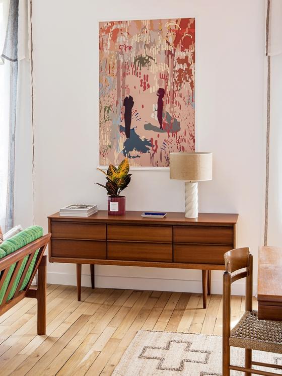
How to find the pefect item for your home that blends style, authenticity, quality and respect for the environment? Sourcing second-hand of course! Selency, obscure websites, jaunts to Belgium... Lucie loves a treasure hunt, but don't overlook her hard-earned tips! "To avoid falling in to any traps, clearly define your global budget before identifying how much you can spend on each item. And check any light fittings are correctly wired!" Worried about ending up with the total-grandma look? Consider mixing antique pieces with modern colours and designs, like this wallpaper which has been framed with wooden mouldings to create a piece of art.
Details details
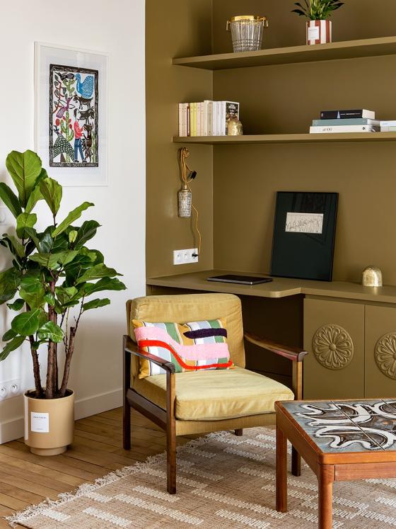
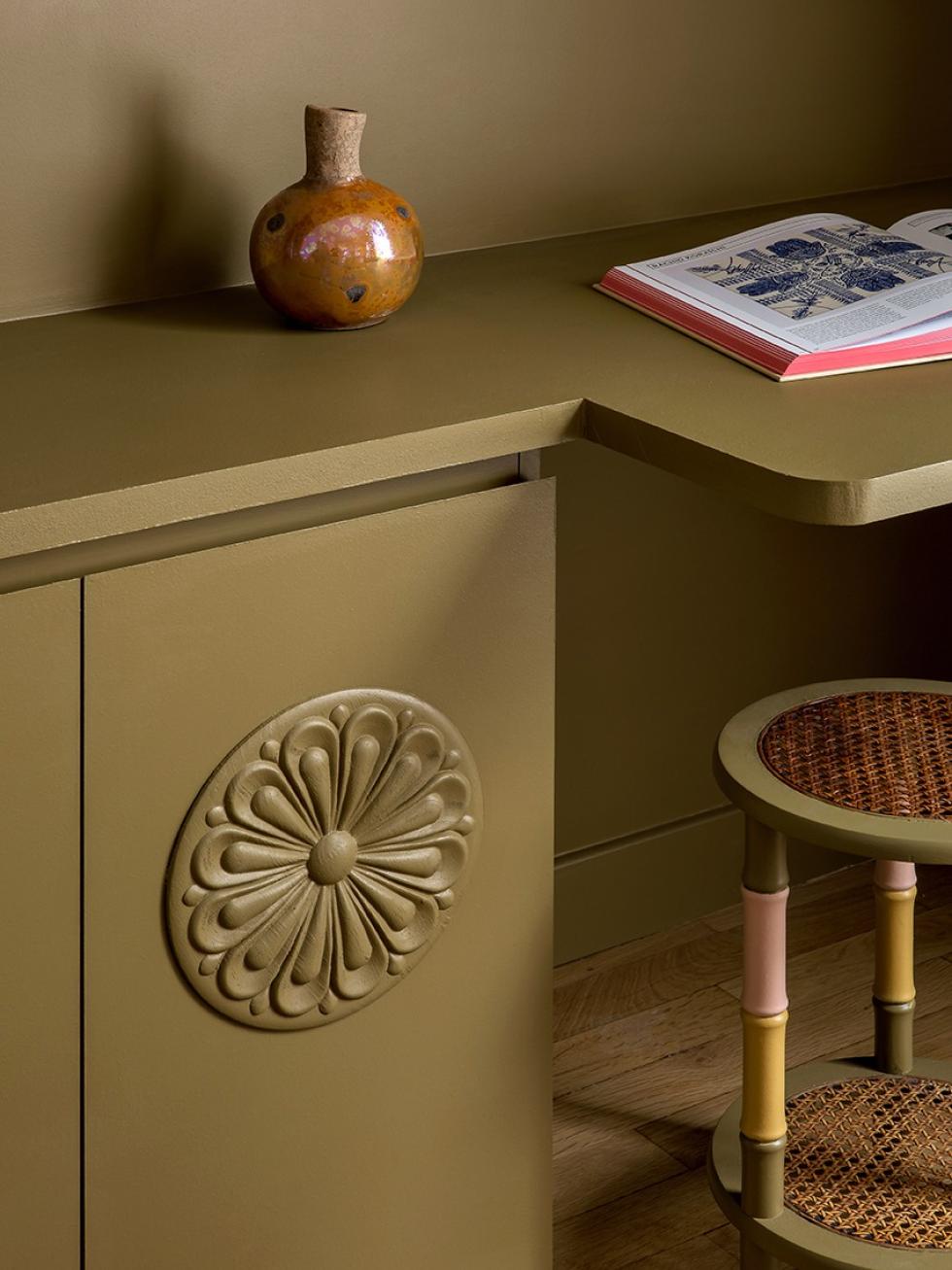
Lucie has designed a full size bookshelf and desk across the width of the room, perfect for displaying books, decoration, a TV and a workstation. "Integrated to the lower storage cabinets, we created a niche to include 2 small desks for the couple who will live here". The elegant detail that changes everything? The pretty mouldings made from wood, glued to the façades and painted in the same shade.

Cosy colours
Multicoloured haven

All or nothing
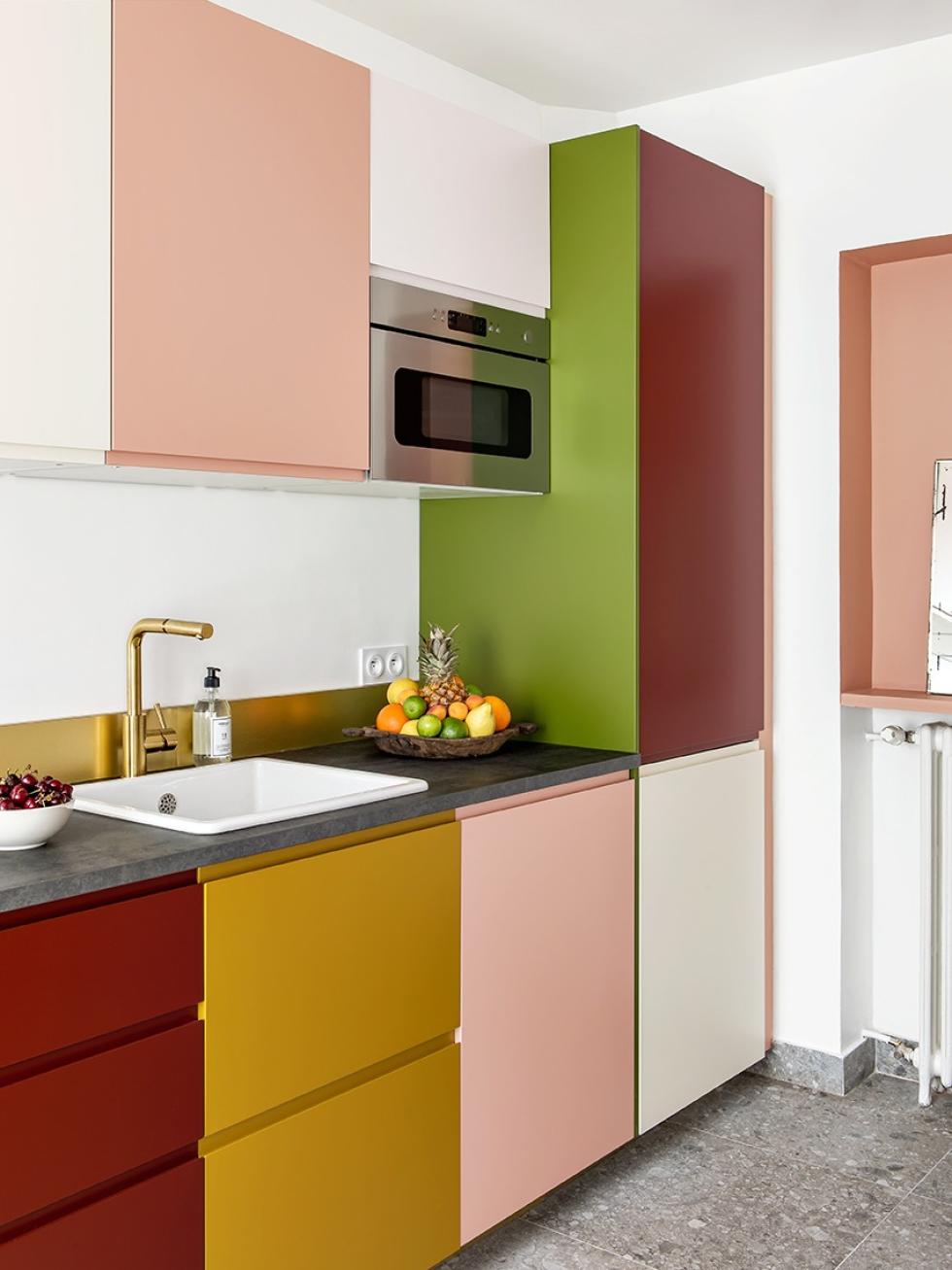
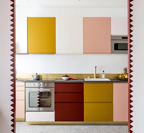
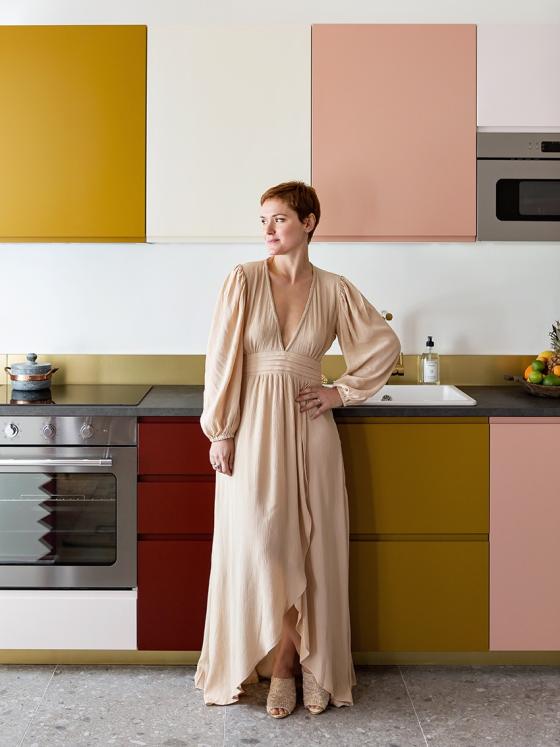
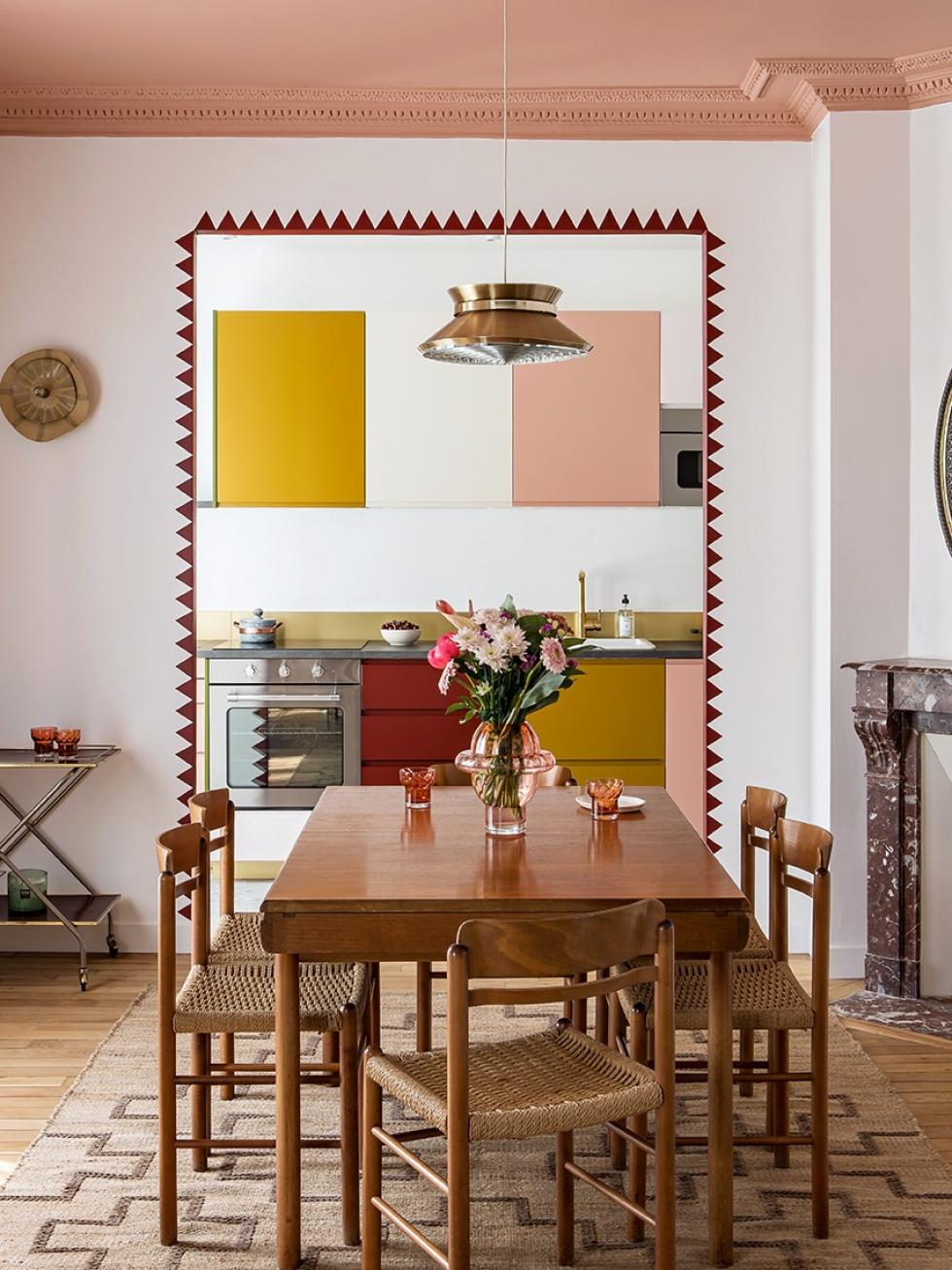
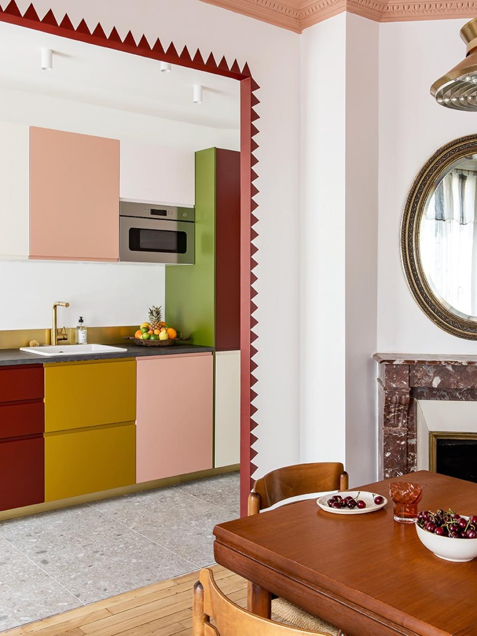
Not only are the colours of this kitchen daring, but so is the story of its creation: this used to be a bathroom! "On the floor plan, this room is small; however opening it onto the dining space allowed me to play with perspectives. The upper row of cabinets really optimise this back wall". All the potential of a 'big' kitchen, which Lucie managed to make the most of. She stretched the storage all the way in to the angle in the far corner, using a shallower lower cabinet..
Bright ideas
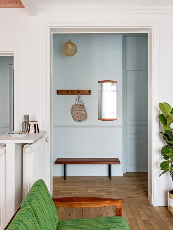
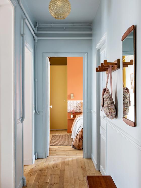
Allow for free flowing movement by optimising partition walls? Yes! Destroying everything and starting over? No thanks. It was important to Lucie to minimise the environmental impact of this renovation, opting to restore the original parquet flooring, and keep the original position of the radiators, adding a simple tablette on top so that these could also be used as storage. For the colour, a light blue added a breath of fresh air to the hallway and offsets the rich shades in the rest of the apartment. She even opted to add some colour to the exposed pipework, shown off proudly.
Mission: optimisation

Night and day
Box of surprises
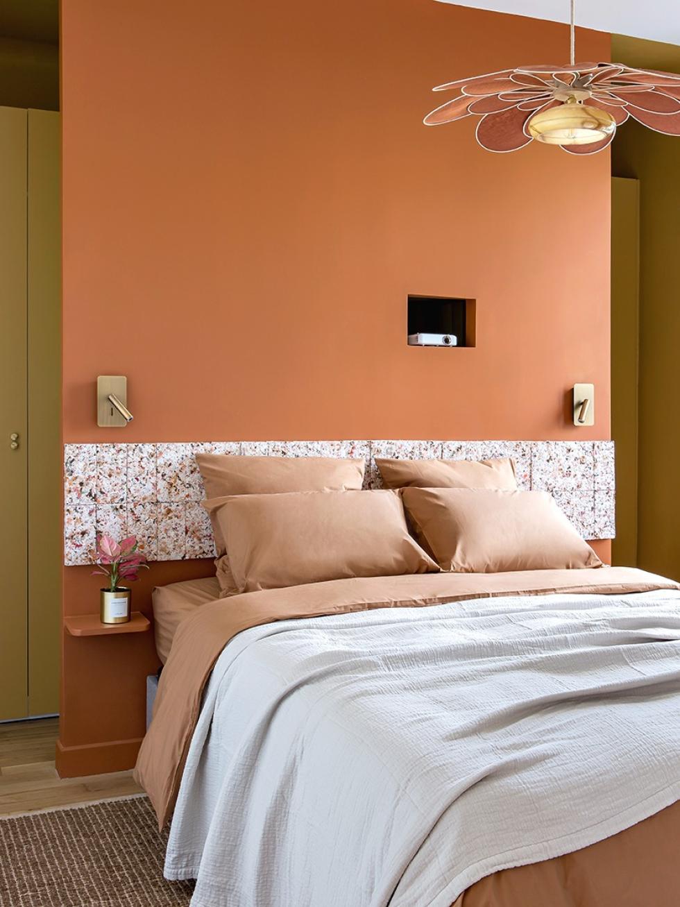
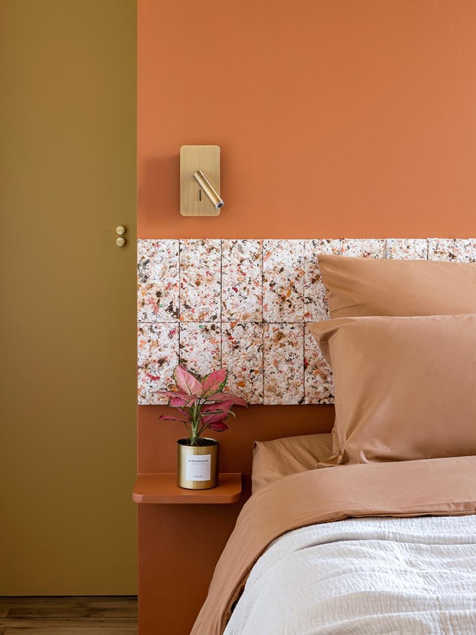
In perfect harmony with the rest of the apartment, the bedroom showcases Lucie's taste for pretty details and mixes of textures. On the wardrobe doors, little handles in brass pop like gems. To give some rhythm to the room and continue her eco-friendly approach, the designer chose tiles made from recycled clothing.

Inspirational ideas
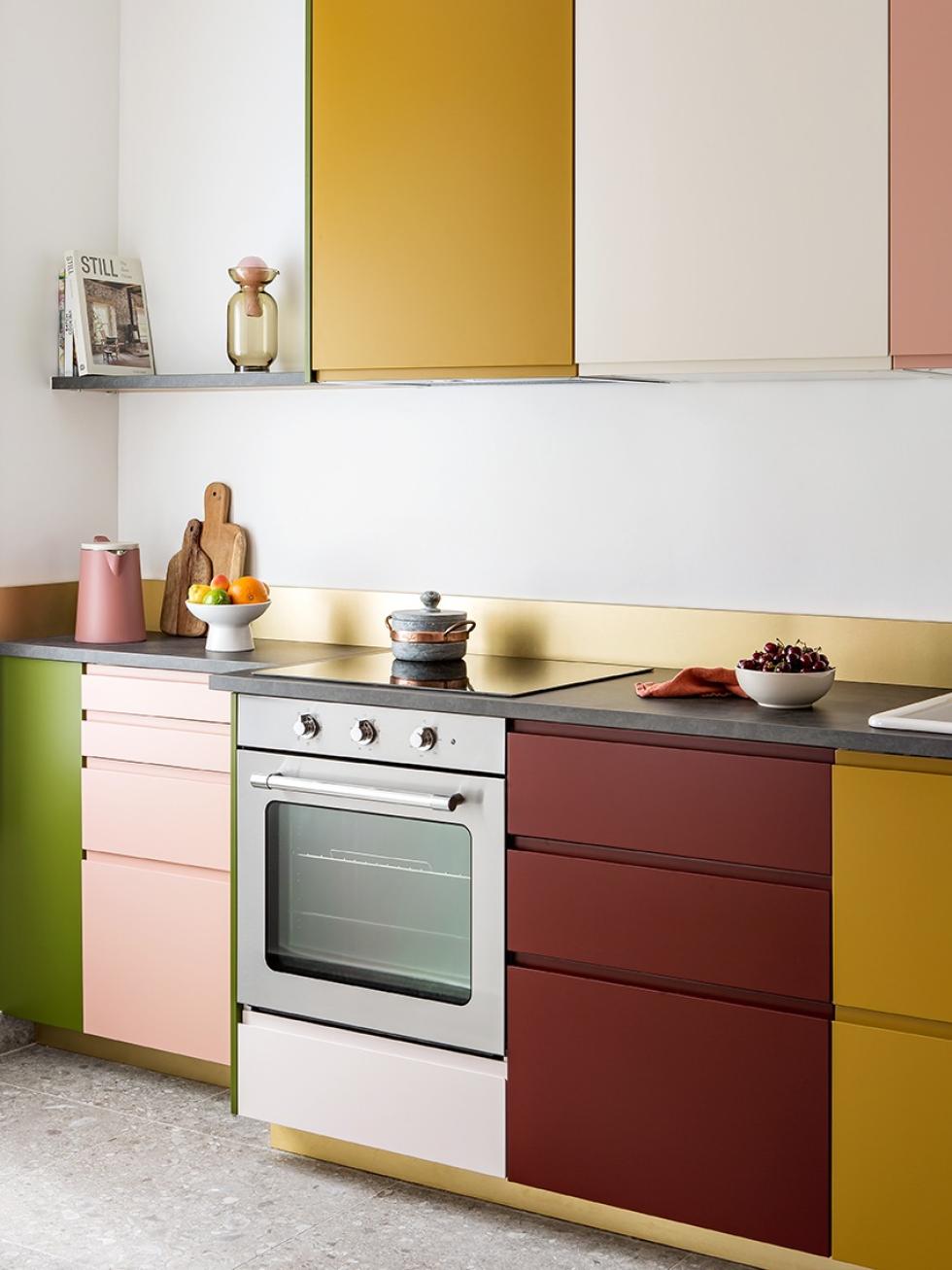
- Use your kitchen like a piece of art, in multiple colours. Add a modern edge using U shape fronts..
- Use colour in a graphic style to define spaces and bring some dynamism to ceilings and door frames.
- Mix vintage furniture and sustainable materials to reduce the environmental impact of your renovation
- Consider adding wooden decals or double handles to jazz up a simple storage unit
