Chez Eduoard & Jennifer
Don’t let yourself be fooled by the typical Parisian staircase and herringbone parquet floor that you see on entering this apartment. There’s nothing ‘classic’ about Eduoard and Jennifer’s home. Scenes of Sicily blend with 70s looks, warm walnut tones, a real disco influence and true passion for vintage, all themes united by a love for craftsmanship. Every inch of this space has been meticulously planned by this couple, who both played active roles as project managers to see the transformation through. It’s truly an adventure to behold, told through carefully-chosen details. Shall we show you around?
A fresh start
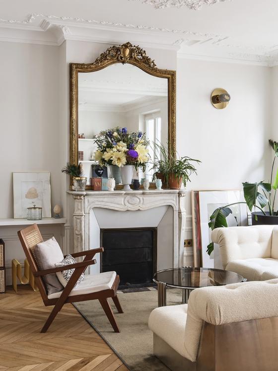
Imagine a space that had once been home to an old jeweller’s shop, long since replaced by a run-down flat. Its original charm never really faded away, along with many unique features too! Wall mouldings, parquet floors and fireplaces remain intact. Jen and Edouard decided to really start from scratch with the rest of the space. “We decided against hiring an architect and played the role of project manager ourselves. It all felt a bit rock and roll, but we learnt so much. We love this kind of work!” Which is definitely a good thing, when the originally-planned 4 months of construction turned swiftly into 9. The couple really did it all: daily visits to the site, hours spent working on floor plans and trawling the internet for material and furnishings… to create a place they could start to call home.
An exercise in style
A blank page doesn’t necessarily mean a totally ‘clean slate’. Passionate about handcrafted objects, Jen has a real gift for storytelling and weaving the threads between different eras. She explores this throughVenetico Marina,her line of ceramics and candles. In her home, the trio of parquet flooring, wall mouldings, and fireplaces creates the décor framework.
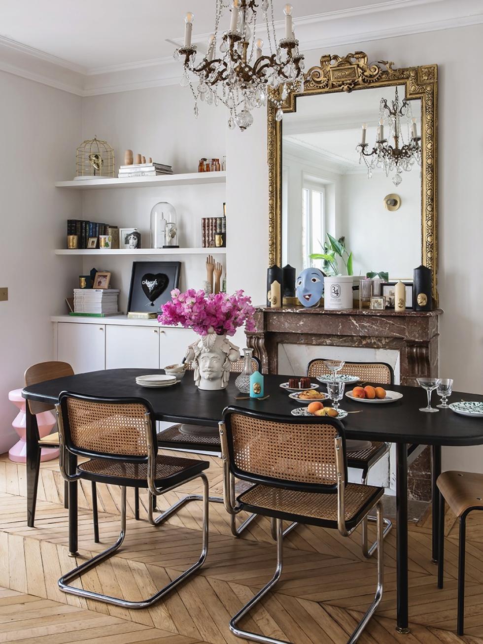

The original doors marked with ‘shop’ bring the soul of the place to life, and the 70s influence echo Jen’s childhood memories, lit up by Sicilian sunshine. It’s truly a delightful mix of styles, unified by a few key elements that can be found in all rooms: walnut, retro, and warm, touches of brass used here and there, and an overarching sense of attention to detail.

Signature style
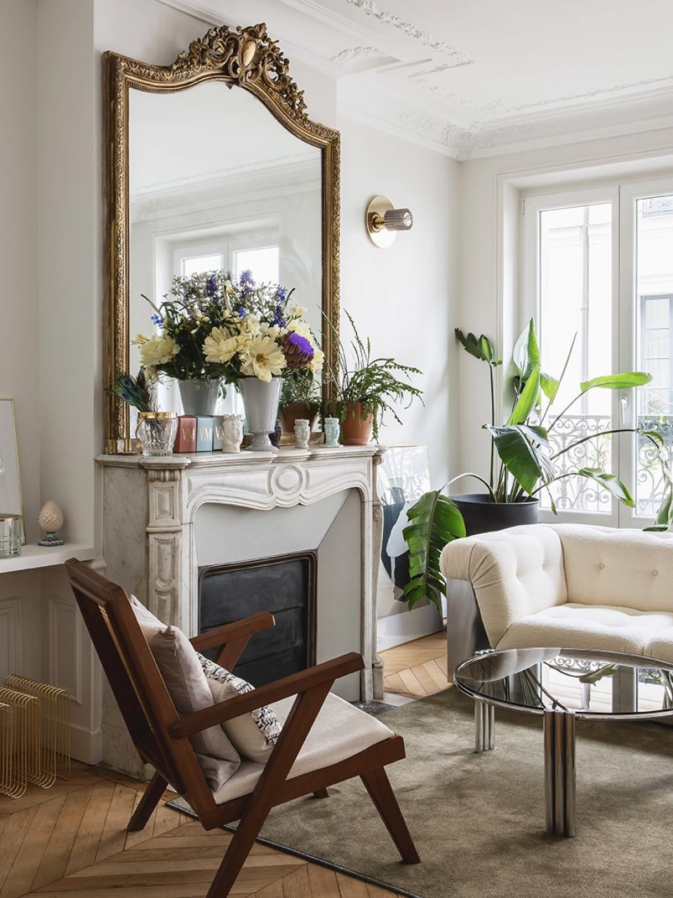
Big fans of both the 70s and second-hand finds, Jen and Edouard don’t have any qualms with combining vintage pieces with modern mass-market staples. It’s an unconventional approach which only adds to the flat’s charm. Forget impulsive shopping - Jen prefers the treasure hunt of spending 6 months to find the piece of her dreams. “I don’t care about what’s ‘in’! It just needs to fit my state of mind.” This modular sofa in the living room is really a sight to behold. This half-metal, half-fabric collector’s item was inherited from Eduoard’s grandparents, then reupholstered by Eduoard and Jen.
The perfect plan for your dream kitchen
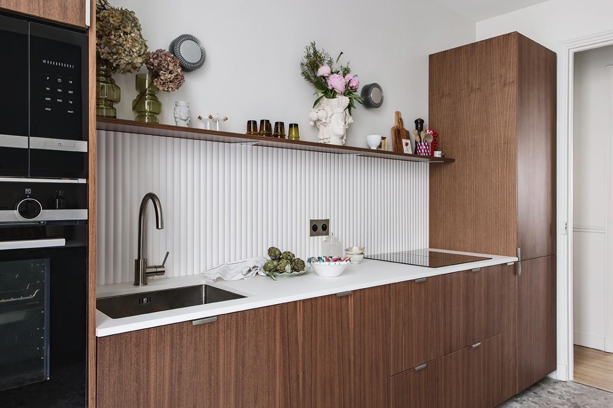
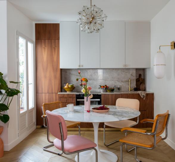
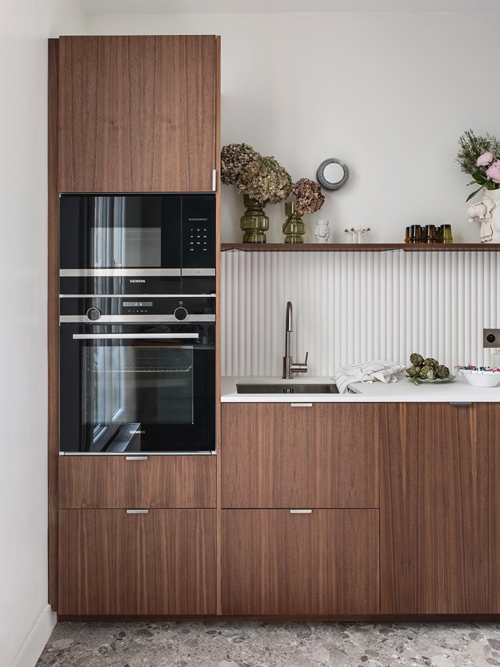
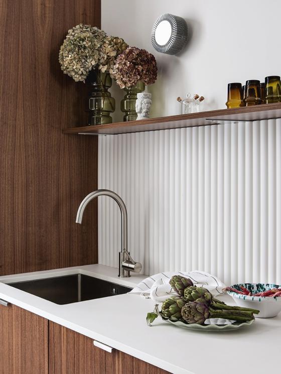
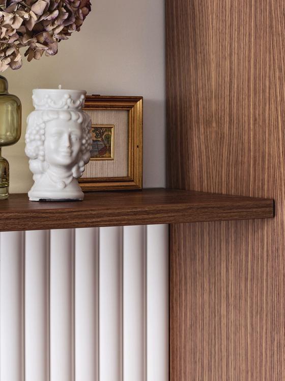
As the daughter of two restaurateurs who shares their passion for cooking, Jen warned us that when it comes to the kitchen, there must be no compromises. Functional, but aesthetic, compact, but not feeling like a corridor, with a seventies, yet timeless spirit… this room had to tick all the boxes. They took the time to brainstorm to find solutions to this seemingly impossible mission - friends, family, everyone got involved to create the perfect layout, finished by a floating shelf and our smooth Natural Walnut fronts.
It’s all in the details
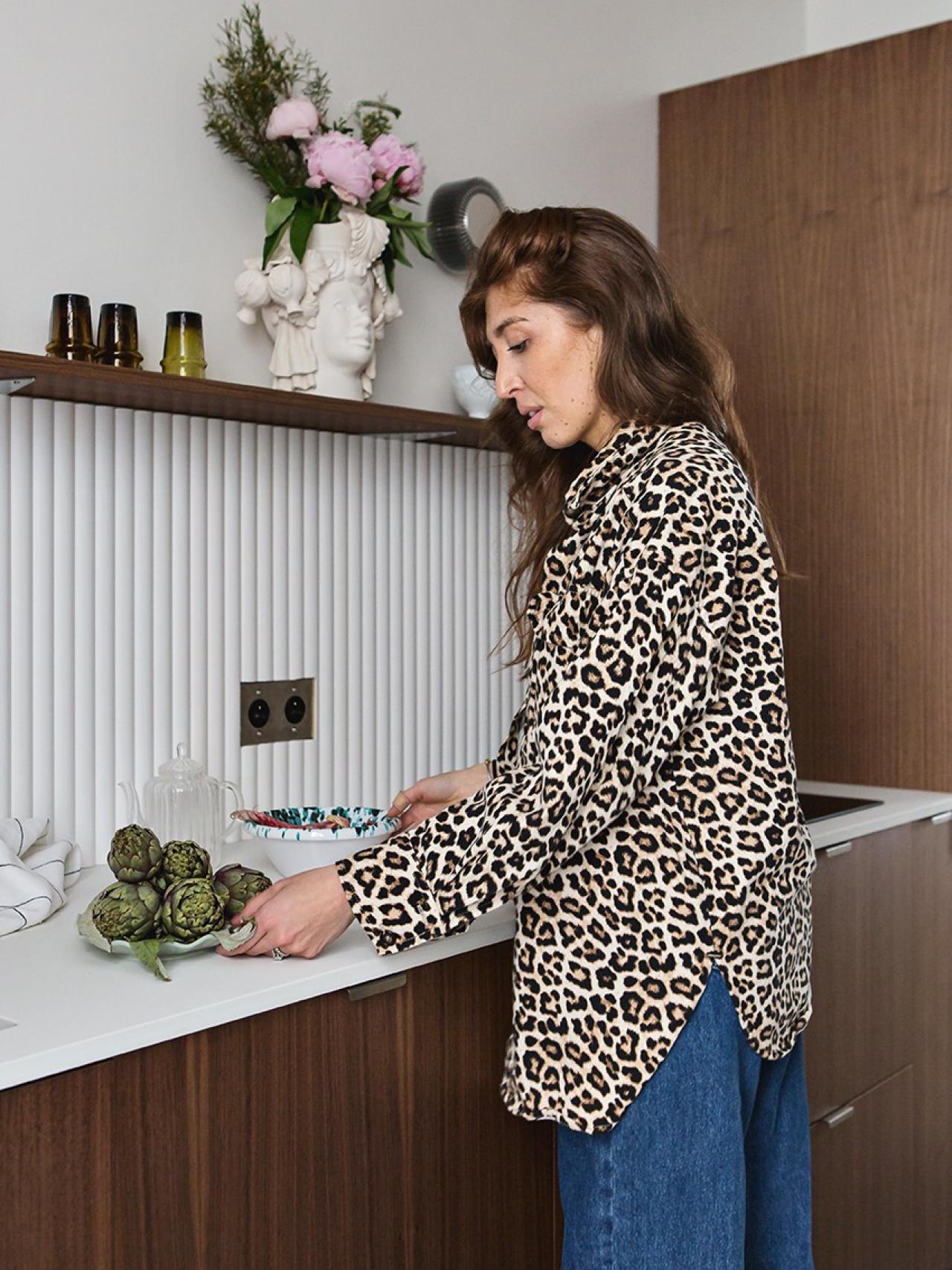
We all know the problem: how do you combine chic & affordable when your budget’s running out by the day and there’s still so much to think about? For Jen, the solution is simple: the internet. From specific keywords, international sites, to ten Google search tabs open at any given time… This designer really searches every corner of the web to find hidden treasures without sacrificing her savings. When it came to the splashback, Jen put her desire for ceramic to one side, swapping it for a wall panel found at Orac Decor. Stylish, easy to install and maintain, ready to paint, waterproof… A true miracle that didn’t have to break the bank. This Dekton worktop is resistant to quite literally everything - especially stains - and whilst it arrives white, it really stays white. Priceless.

A lesson in optimisation
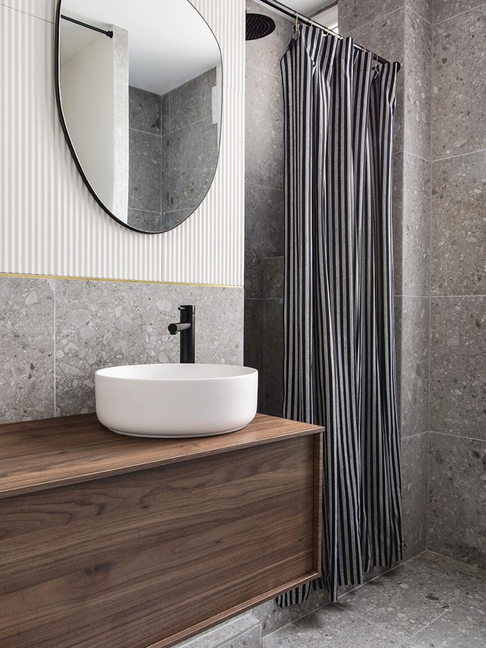
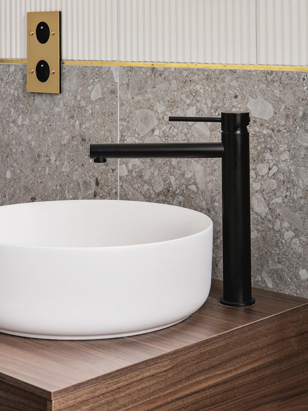
It was the same challenge for kitchen and bathroom: maximising opportunities without changing the wall layout. “We spent a lot of time on the floor plan here too. The room may feel cramped, but with a two and a half year old, I categorically wanted a bathtub.” After hours of thought and consideration, both brought their solutions to the table which involved moving the toilet and a raised shower. The result: an ultra-practical family bathroom with a bathtub and shower cubicle, perfect for everyday use. Ever keen to keep costs low, Jen combined Terrazzo from Leroy Merlin with Surface tiles to keep the room unique, yet affordable. Look closely: the brass trim allows the transition between the two types of tiles, while adding some brightness to the overall look!
Introducing… the electricity fairy

The floating machine
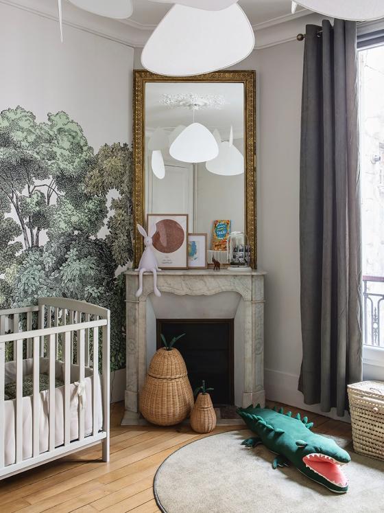
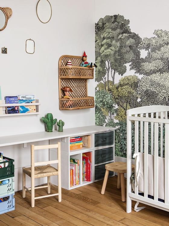
The couple’s attention to detail extends far beyond the odd decorative touch. Whether antique or modern, light fixtures always have a special place in their home. The Market Set hanging lamp in their little son’s bedroom is the best example for this. With its dreamy style, it served as the perfect starting point for imagining a childlike universe, while staying in perfect harmony with the rest of the flat. Here, the light switches also match the leafy wallpaper. The colour-matched bed also blends into the wall, and the desk built with Ikea cabinet frames and topped with a wooden board doubles as a storage unit. A total dream for playing, tidying up - and for being messy!
From yesterday to today
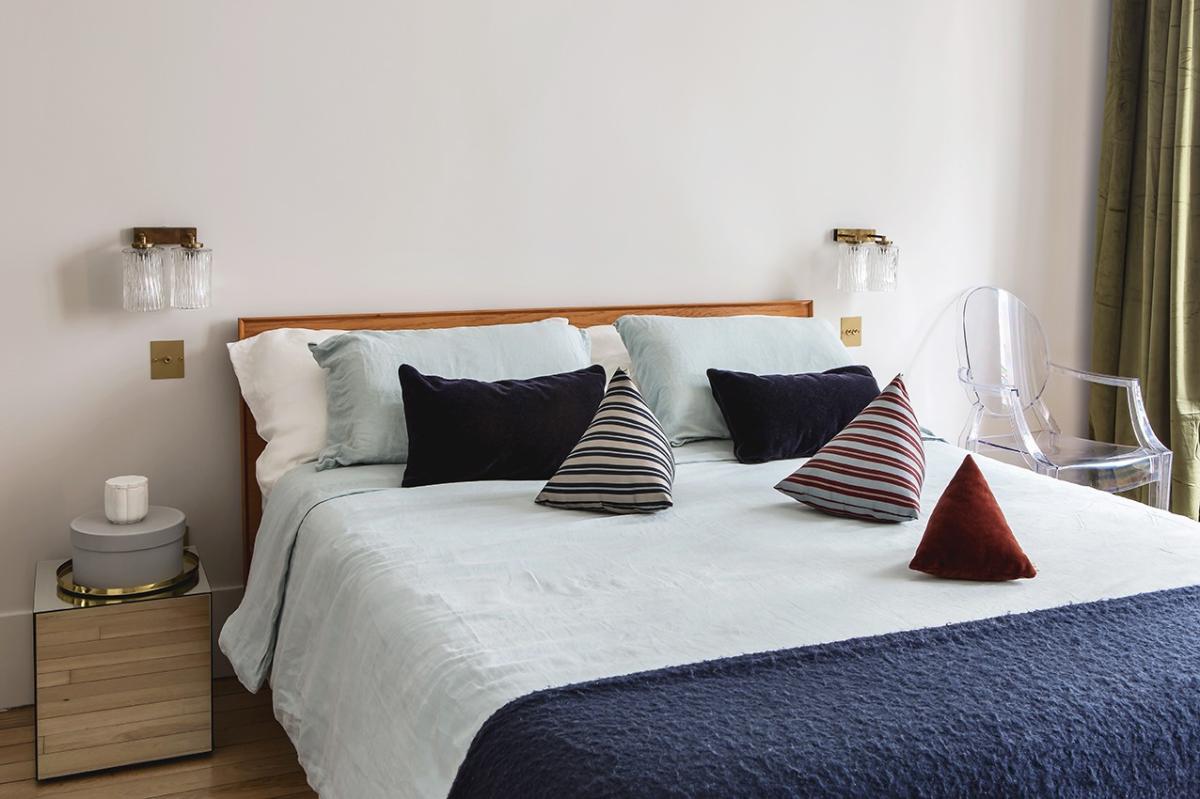
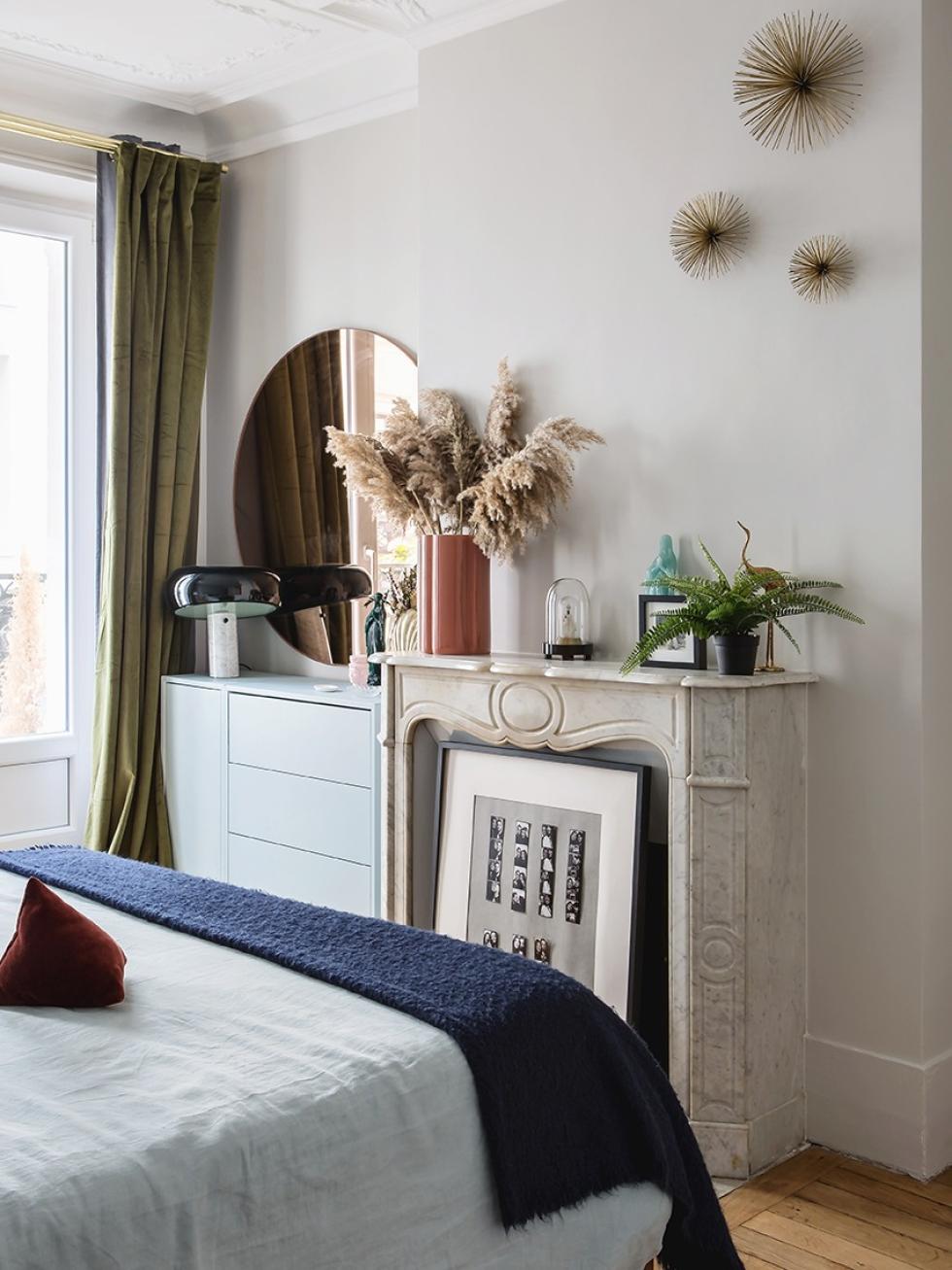
A Proustian dream, mellow and warm: the master bedroom was the first room planned by Jen, inspired by her childhood memories under the Sicilian sun. The double velvet curtains feel like transalpine chic. Then, the bed linen offers a gorgeous Mediterranean blue, paired with the Ikea chest of drawers (found by Jen) which offer some softness to the space. Finally, the vintage lamps are combined with neo-retro mirror cubes (found on La Redoute), which continues our journey between eras.

We’re inspired by...
- Walnut in every room. A real nod to the 70s. A
- mix between vintage pieces and modern, retro finds. The perfect way to add some character to your home.A kitchen splashback that echoes the bathroom’s serrated tiles. Two strong elements that add texture to the space.
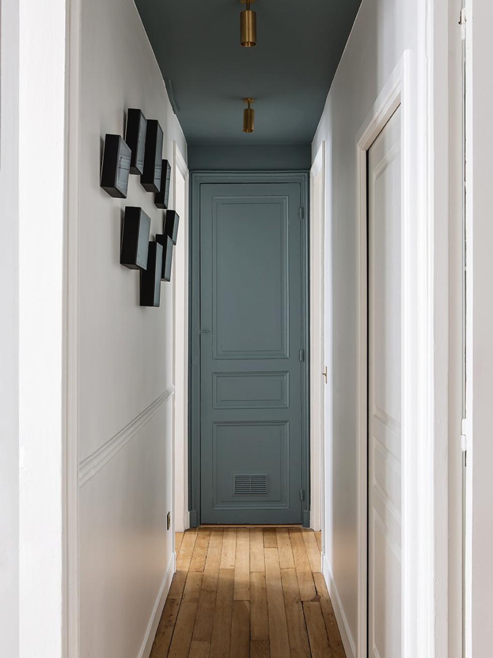
- Creating a ‘room’ from the corridor by emphasising it with contrasting colour, in this example: a deep, luminous blue.
