At Mélanie Diligeart's, in Rennes
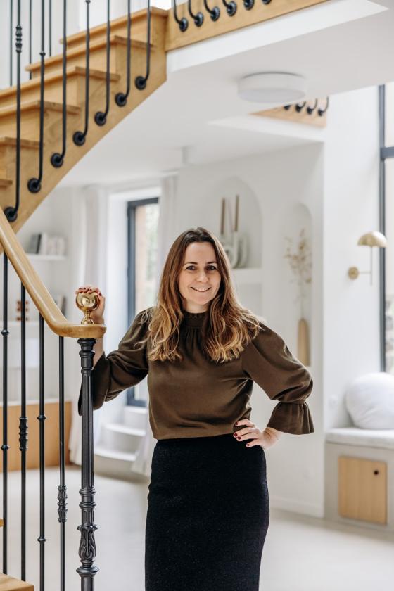
There are those who just want to unpack their boxes, without even having to lift a paintbrush. Those who would happily put up some wallpaper, unless they decide to freshen up the kitchen. And finally, those who only see renovation as a blank page, through which they can let their creativity run free. Interior designer Mélanie Diligeart has chosen her camp. "I really wanted to bring my touch, to work on the volumes, the circulation, the materials... In short, to rethink the place from A to Z". It must be said, this home was crying out for it. After a year and a half of work, the old farm with its dark stable has given way to a light-filled house in which every element has been carefully considered. Check it out, this tour is full of inspiration!
Inside Outside
Preserving the soul of a place while infusing it with a touch of modernity... that's quite a challenge! There was no question of giving up the old stones and beams weathered by time. Mélanie worked with the structural elements of the house to imagine openings to the outside that allow the Breton character of the building to play a major role, like a painting that evolves season after season. A happy accident, the large glass roof of the living room was originally supposed to be much smaller. "It illuminates the whole house, its monumental aspect has set the tone in the living room".
Concrete appeal
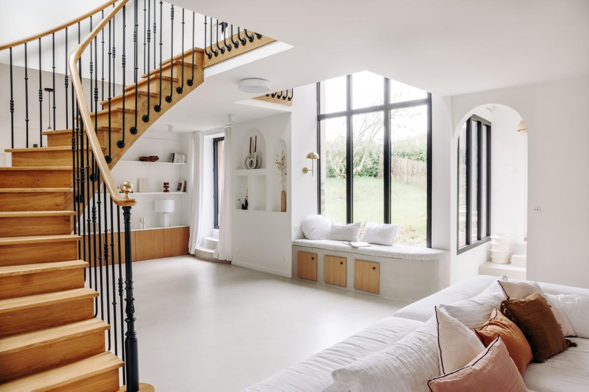
Inspired by Japanese and Scandinavian influences, the founder of MD Studio chose soft and organic materials that contrast with the black metal frames. Poured over an underfloor heating system, the waxed concrete brings unity to the ground floor. "I wanted something soft and very pleasant to live in. Contrary to popular belief, it's very easy to maintain but you have to be realistic, it's a material that lives." The challenge is mastering the installation. "Don't hesitate to ask a specialist to do it, and respect the waiting time between each layer."
Hide and seek
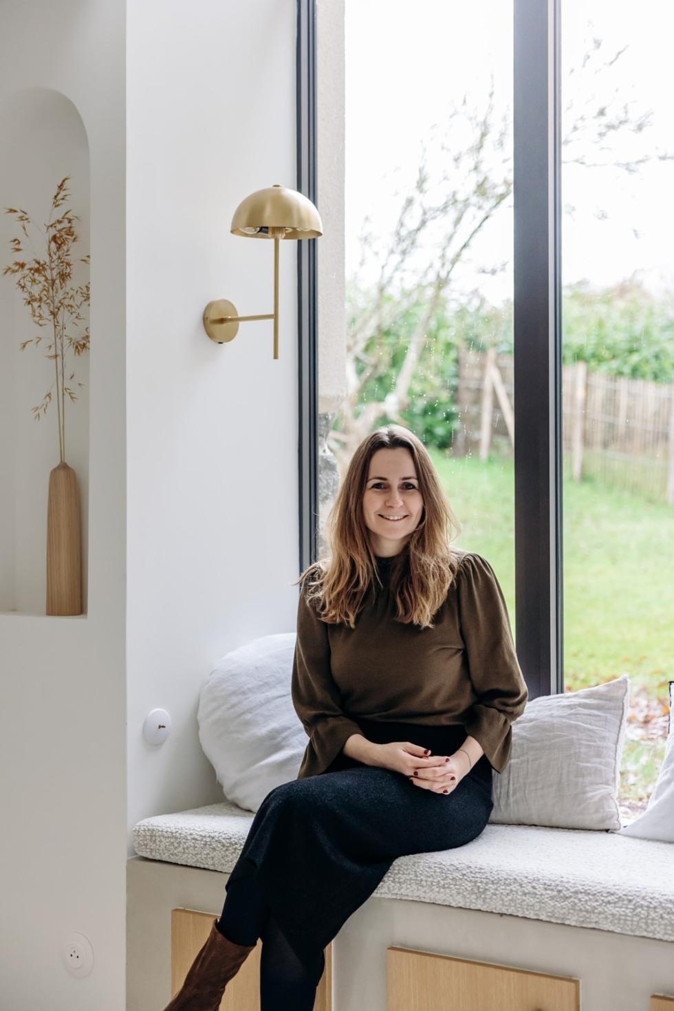
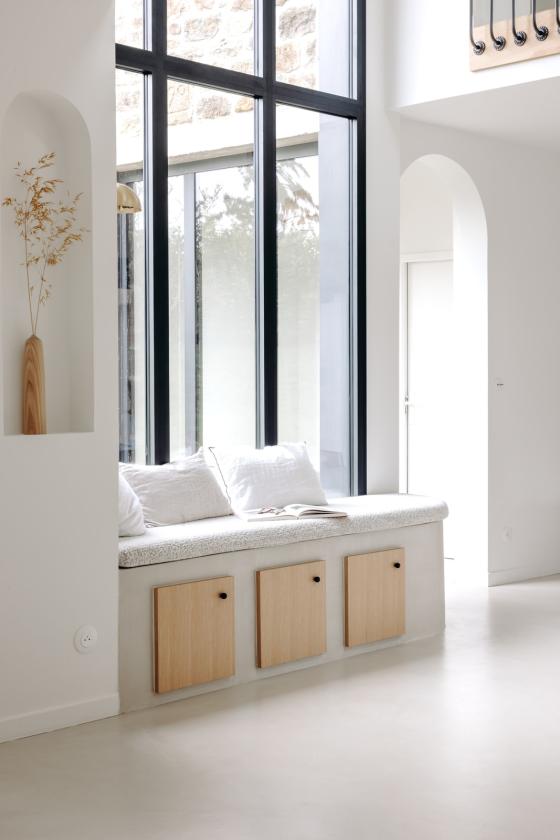
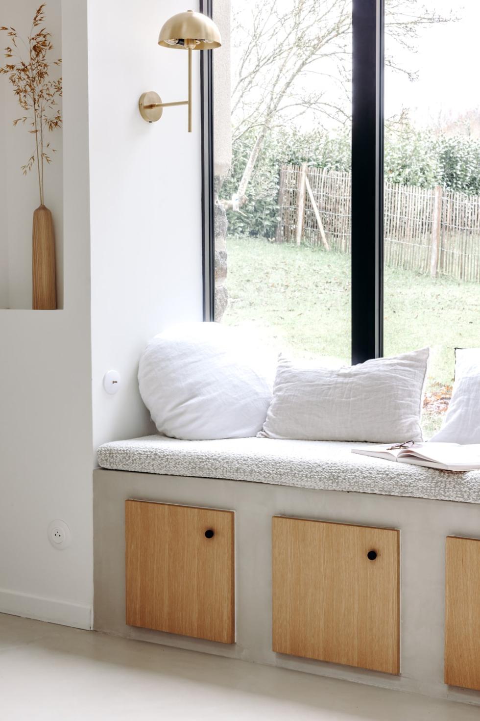
Nestled under the large glass roof, the minimalist bench hides three Metod cabinets in which making puzzles and lego disappear becomes child's play. Mélanie chose to extend the waxed concrete on the structure to blend it into the decor and create unity. "It applies just as well horizontally as vertically." The natural oak Plum Living doors bring a warm touch, while the matte black Bulles handles echo the structure of the bay windows. Add a bouclé bench seat, and all that's left is to snuggle up with a good book and a cup of tea!
Deliberate minimalism
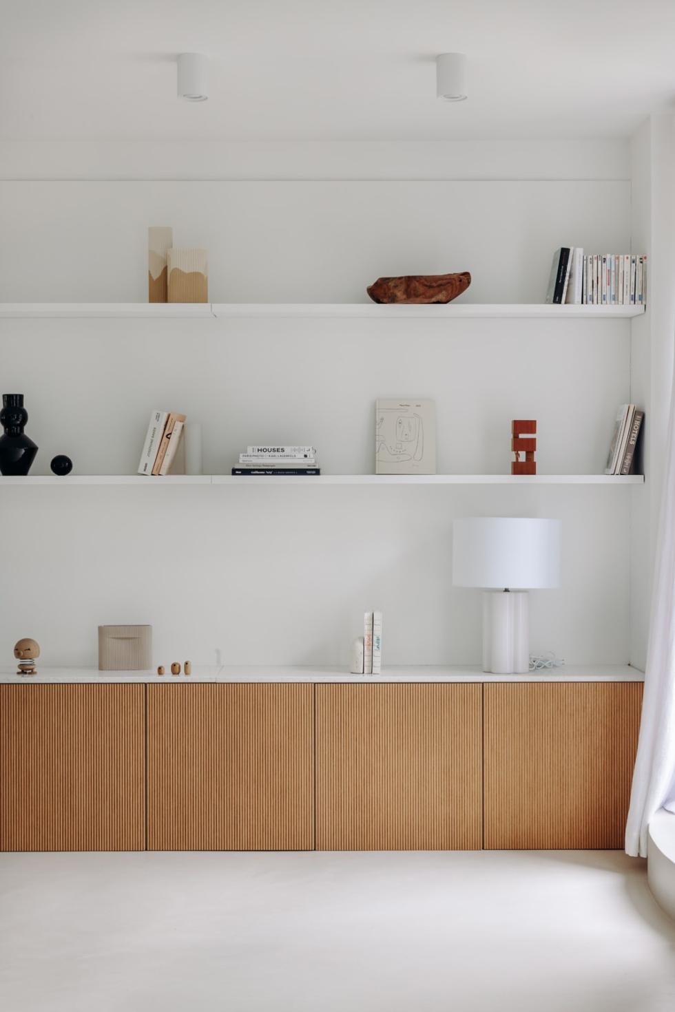
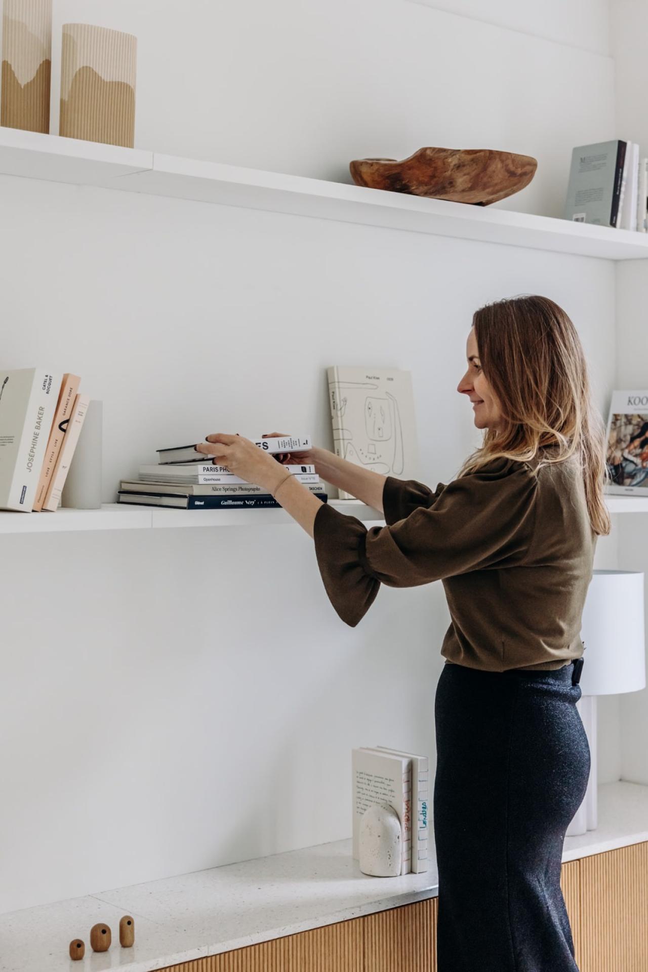
Like the bench, the sideboard is directly integrated into the wall to enhance the minimalist aspect of the living room. Made up of Metod cabinets simply finished with wooden doors, its a stickler for details. The worktop created from scallop shells, a nod to the region, enhances the layout with a subtle touch of colour, while the tone-on-tone floating shelves allow to highlight the family's favourite objects.

Island dreams
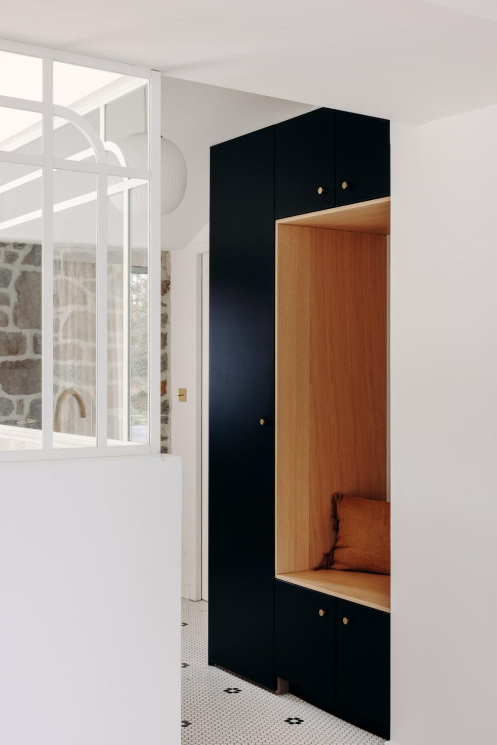
A few metres away, the entrance stands out like a mosaic island on the grey floor. "This is the only place where we have put tiles. The waxed concrete evolves, patinas like real wood and only becomes more beautiful, except when it comes into contact with small pebbles that can damage it." Designed as a buffer between the interior and exterior, it houses an arch made of Ikea cabinets. "The entrance remains a utility room, in which you need to be able to store coats, umbrellas and shoes. I wanted hidden storage in a built-in piece of furniture."

Shake, shake, shake
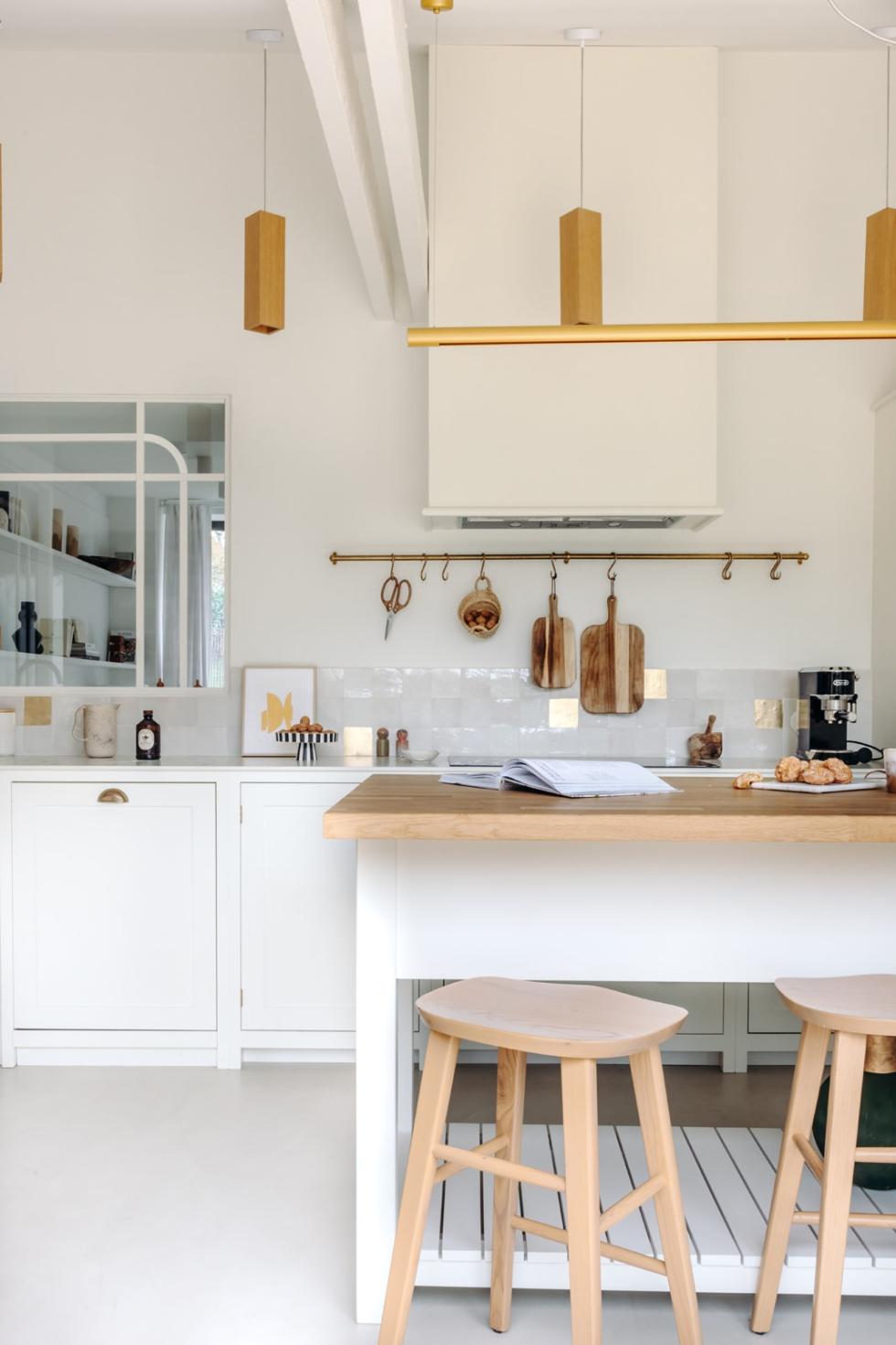
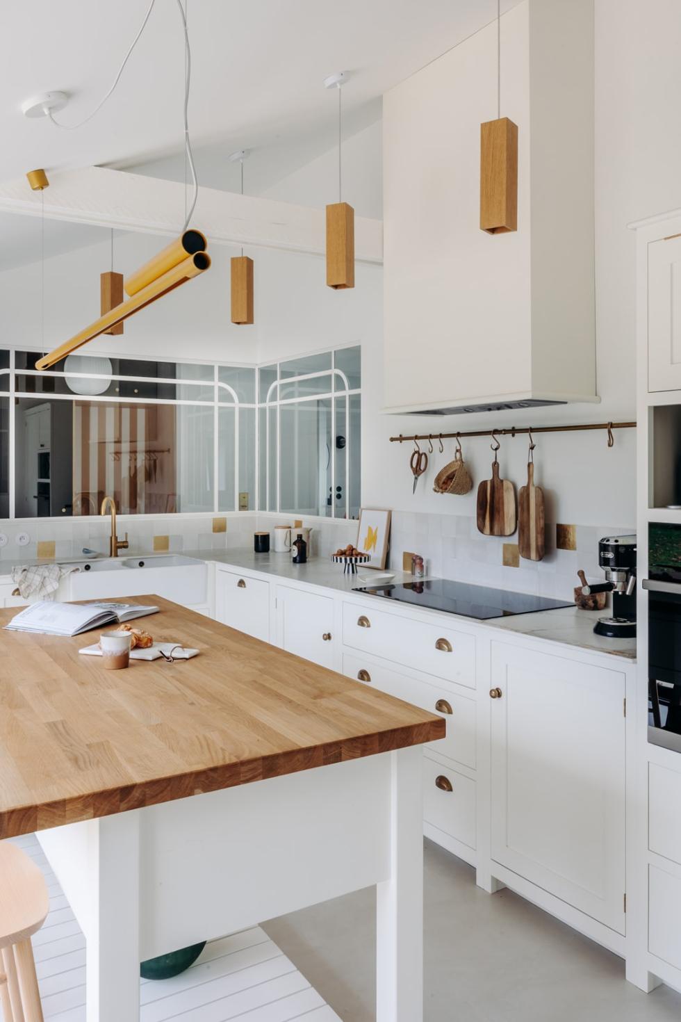
Simply separated from the entrance and the dining room by half-glass partitions, the kitchen ticks all the boxes of the shaker style. No wonder when you know it's signed by DeVol! With its ivory frame facades, shell handles and stone worktop, it recalls the history of the building. Look closer: the brass details help to attract light, starting with the golden zelliges scattered here and there. The pendant lights and the pale wood island, on the other hand, echo the carpentry elements found throughout the rest of the house.
Practice makes perfect
Two columns and a majority of low cabinets: Mélanie played with the structure of the elements to create a kitchen that is both aesthetic and functional. "I often advise my clients to note everything they do in their kitchen for a few days, and to identify what they like and what they don't like." Here, the total surface area of the ground floor allowed for the creation of a pantry in which to hide washing machines and other bulky appliances.

Linking piece
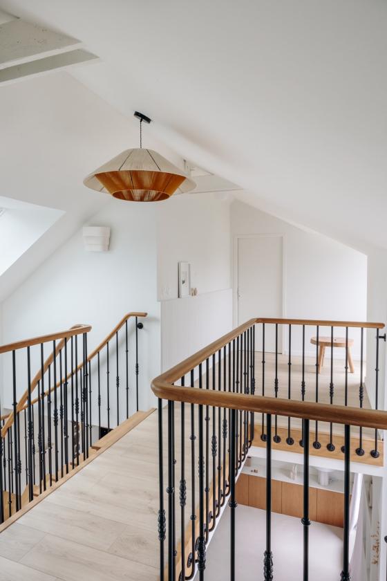
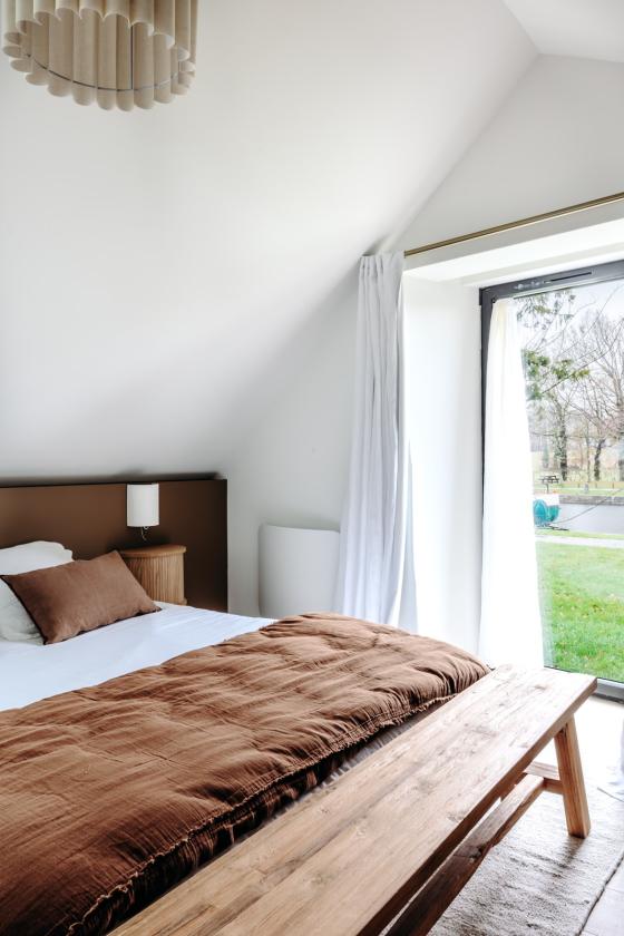
The centerpiece of the living room, the staircase plays with the codes of the house by mixing light wood and black metal. A hyphen between the reception rooms and the night area, it draws the eye towards the ceiling and highlights the volume of the room. Upstairs, the master bedroom follows the thread of the natural hues that can be spotted through the window to create a cocoon effect.
Constraint or opportunity?
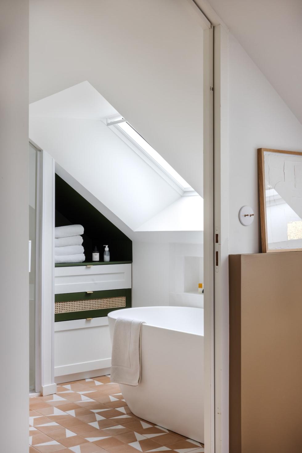
Nestled under the sloping roof, the bathroom combines shower and bathtub in a compact space. Mélanie took advantage of every available centimeter by playing with an Ikea cabinet tucked under the beams and dressed in Pure White and Olive fronts. Stretched on the adjoining wall, the colour creates a box effect that gives the illusion of a custom-made unit. On the bathtub side, the interior architect played with the partition to install the brass fittings into the wall on the bedroom side. As a result, zero space is sacrificed in the bathroom, and a base that adds relief to the back. Clever!
Birds of a feather flock together
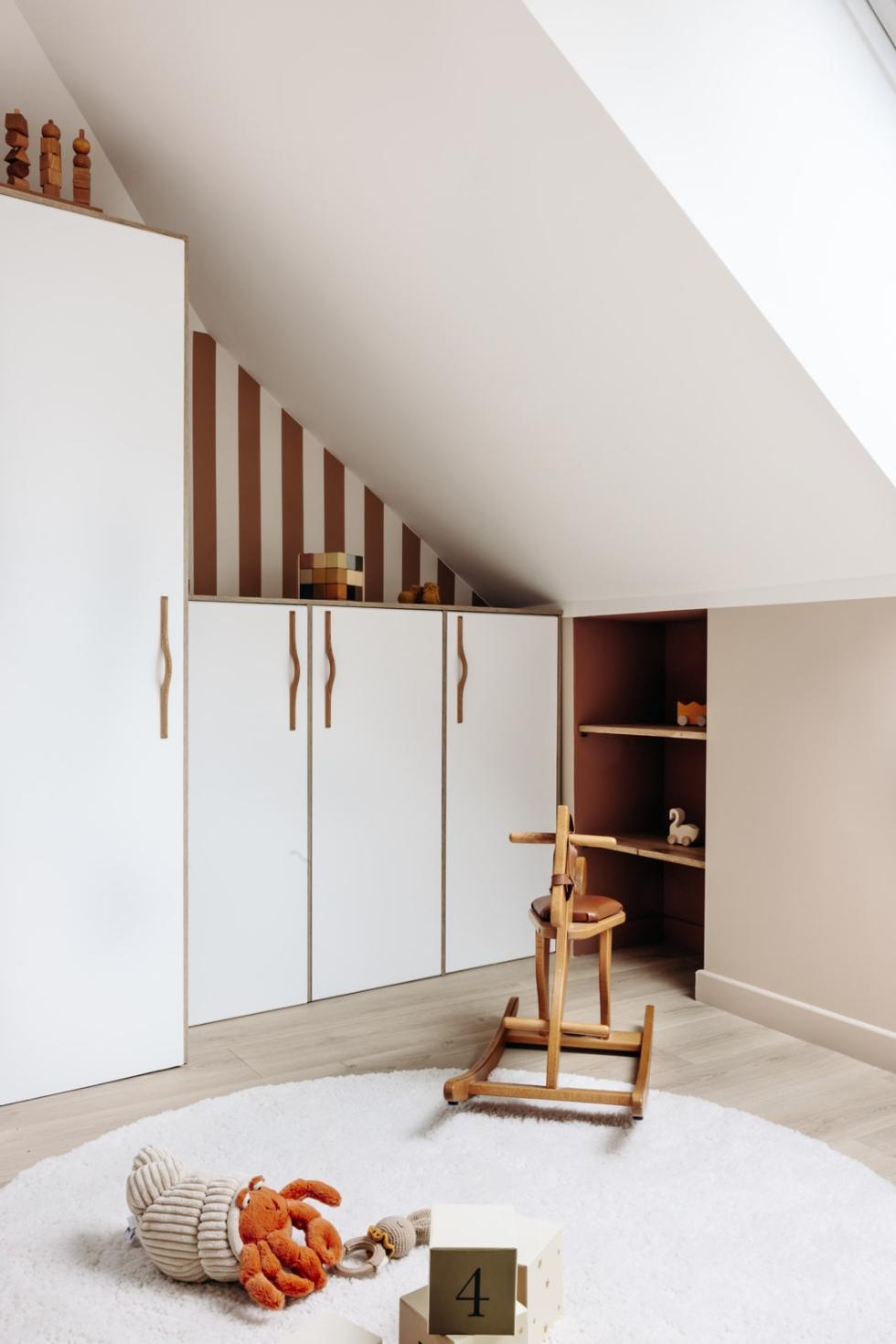
Don't change a winning formula! In her youngest's room, Mélanie has once again composed with cabinets to make use of the space. Installed in the extension of a column, they allow the creation of storage at a child's height. Here again, colour helps to give coherence to the whole: the bronze stripes of the wallpaper recall the colour of the niche, while the wooden handles echo the matching handles.

Withstanding the test of time
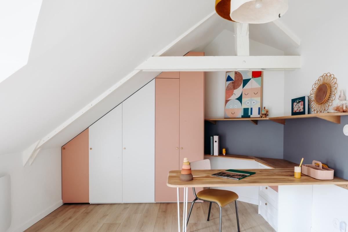
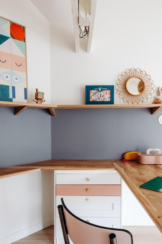
Double bed, adult-sized desk, and wardrobe that mixes Pax and Metod units... but here's the twist: Melanie's youngest child is only 5 years old! "When you stop using a cot, I always advise switching to a double bed: it's super practical on a daily basis, it comes in handy when we have guests, and we don't need to change it again in a few years!" This philosophy also applies to the desk. With its standard height top and two-tone storage, it serves as a creative space until homework time.
Tandem
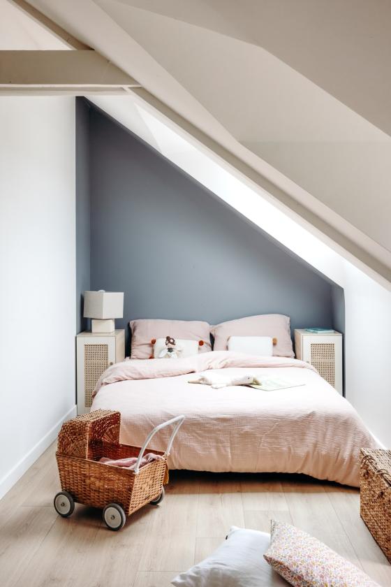
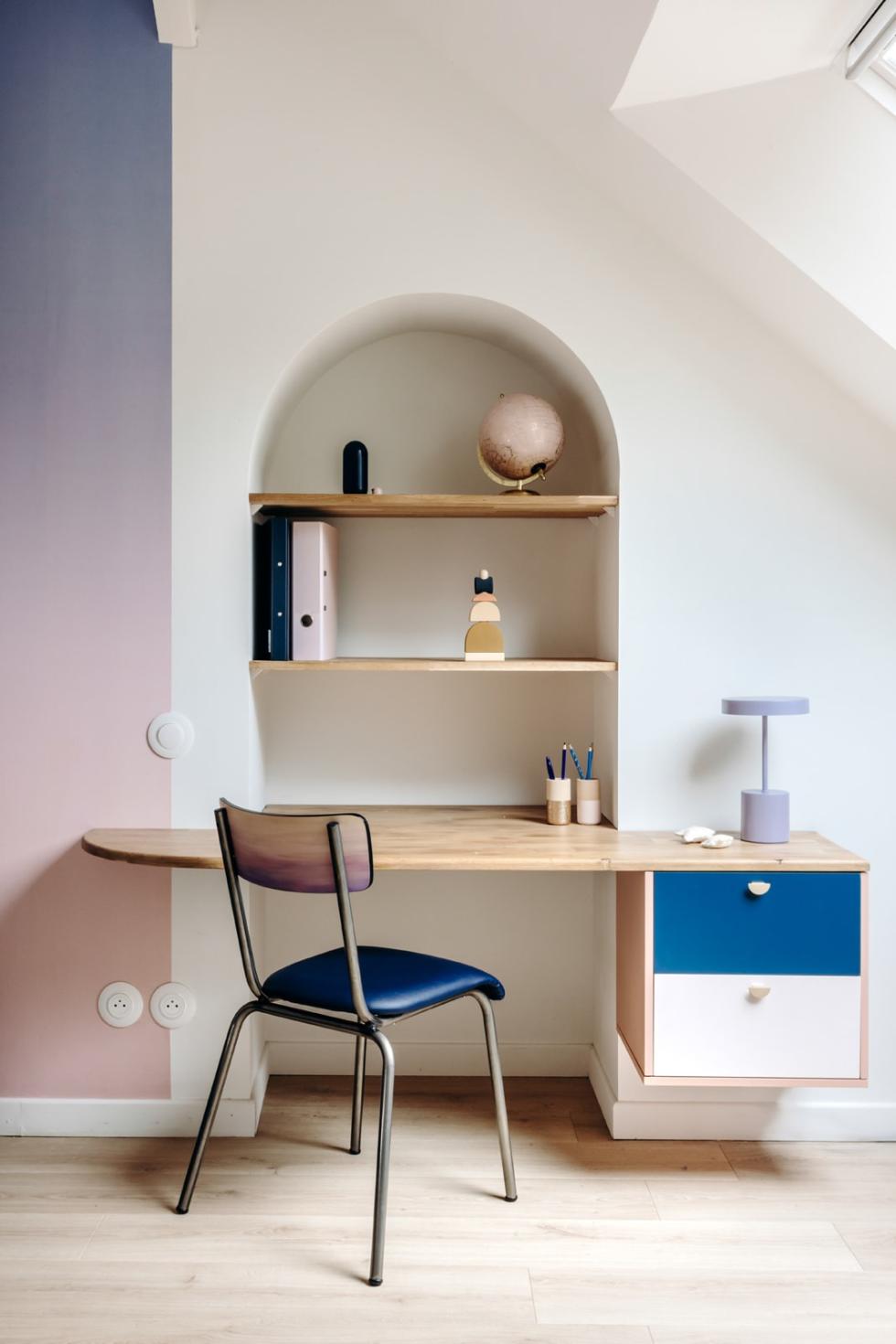
7 years, the age of reason! With her eldest, Mélanie had to deal with desires other than her own. "It was important to me that everyone feels good in their space". The starting point of the room, the tie dye wallpaper inspired a small two-tone desk created from a Metod cabinet. The door that led to another part of the farmhouse was sealed off, to make a poetic arch in which floating shelves nestle, a nod to the architectural elements of the ground floor.

Ideas that inspire us
- The Metod cabinets embedded in the waxed concrete bench
- The entrance arch that allows shoes and coats to disappear discreetly
- The furniture created from cabinets for a minimalist ambiance
- The floating shelves that give an airy look to the arrangements
