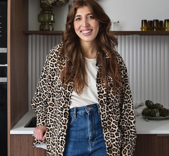
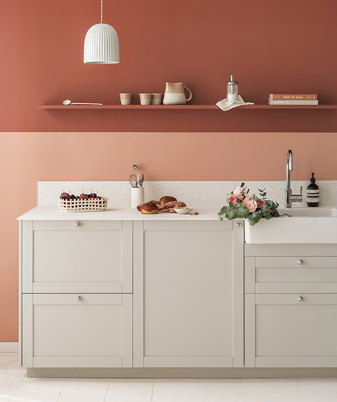
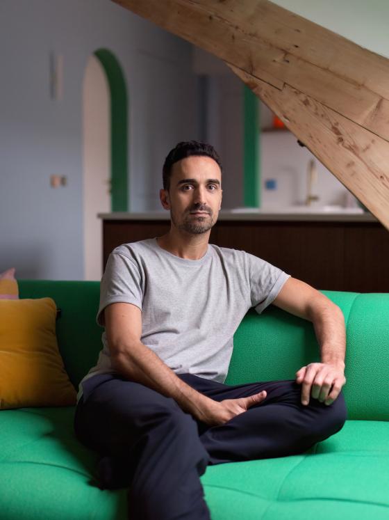
Chez Nicolas Payet, founder of architectural agency Marn
Here's the deal: a top floor with an attic, 78 m² of floor space (48 in ‘real’ terms) and a family living space to be created. If interior architect Nicolas Payet likes to say yes to challenges, the renovation of his new flat was certainly one to tick that box. Six months of work later, the result is quite something. Between storage units that make the most of all available ceiling height, and an exercise in bold and colourful style, the founder of Marn Agency has both challenged and made use of the space in the most wonderful way we could have imagined. Here is a guided tour of the details we are inspired by. Let’s show you around!
A truly colourful project
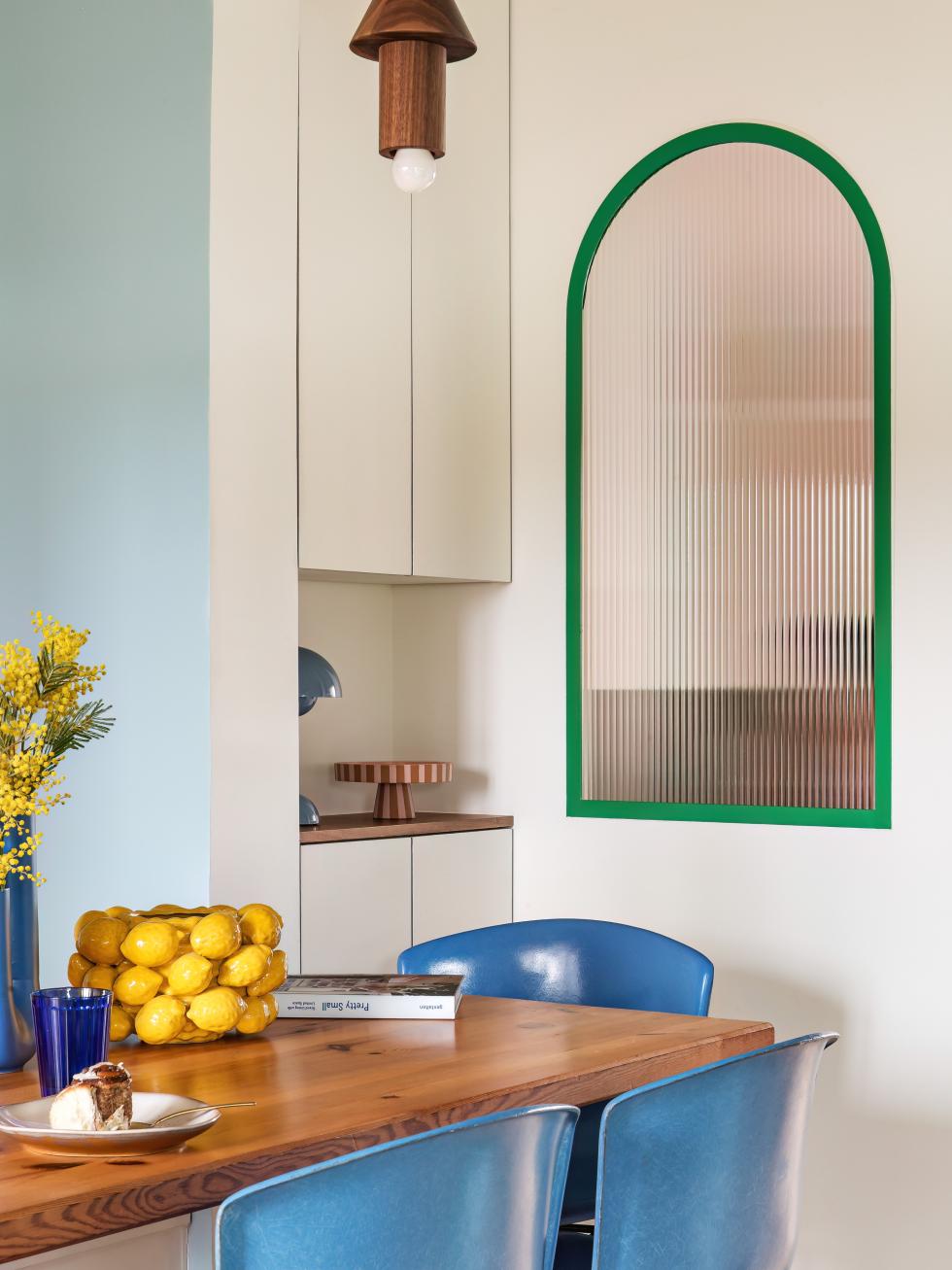
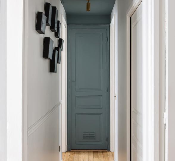
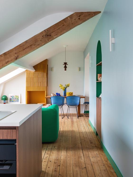
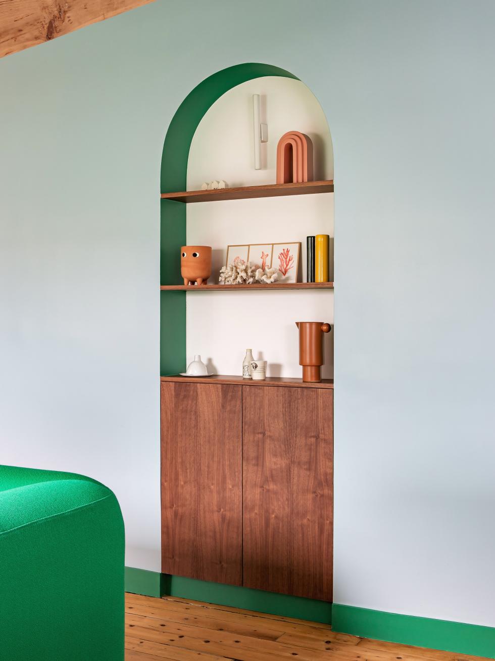
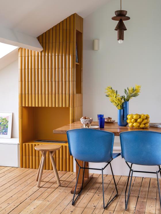
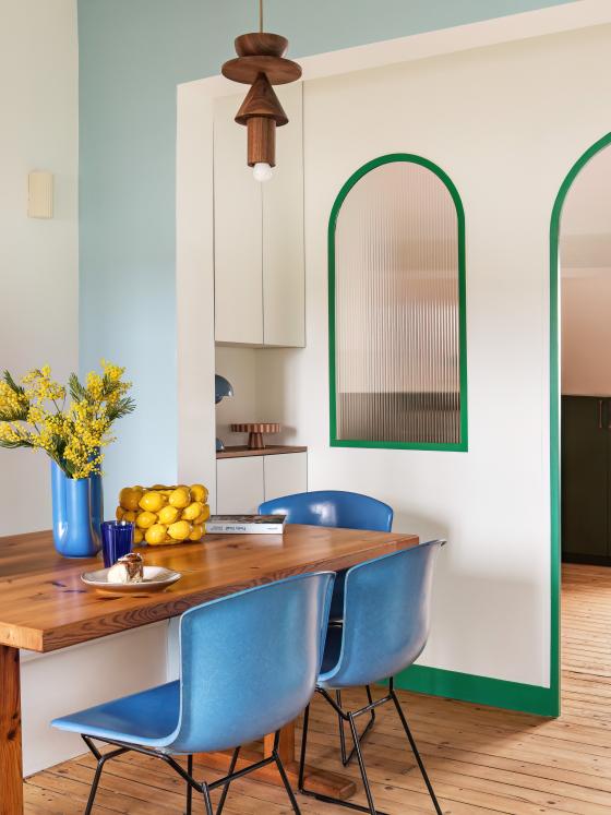
As soon as you step inside, you're in the thick of it: colour. Often ignored, rarely taken full advantage of, the corridor takes centre stage here, inviting you to step inside and discover the architect's world. "Whilst colours are always present in the projects my agency produces, here I wanted to encourage the use of contrasting shades". Fresh and luminous, a sky blue stretches throughout the space, which really opens it up. Our Green 09 - Leaf is the main element that adds depth, highlighting the plinths and the rounded edges of the arches. In the distance, the ochre chimney really stands out against the rest of the space.
Optimising - horizontally

Retro colour scheme
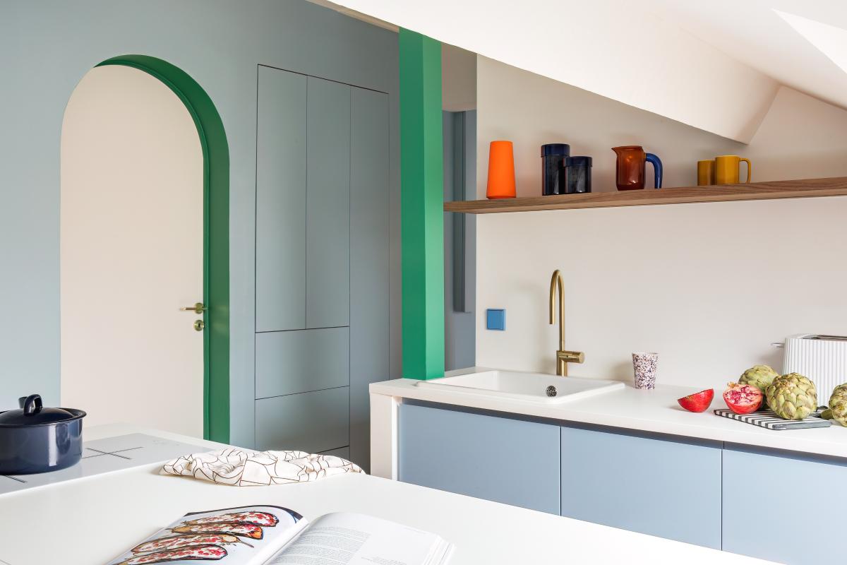
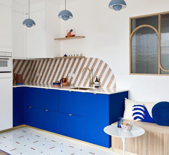
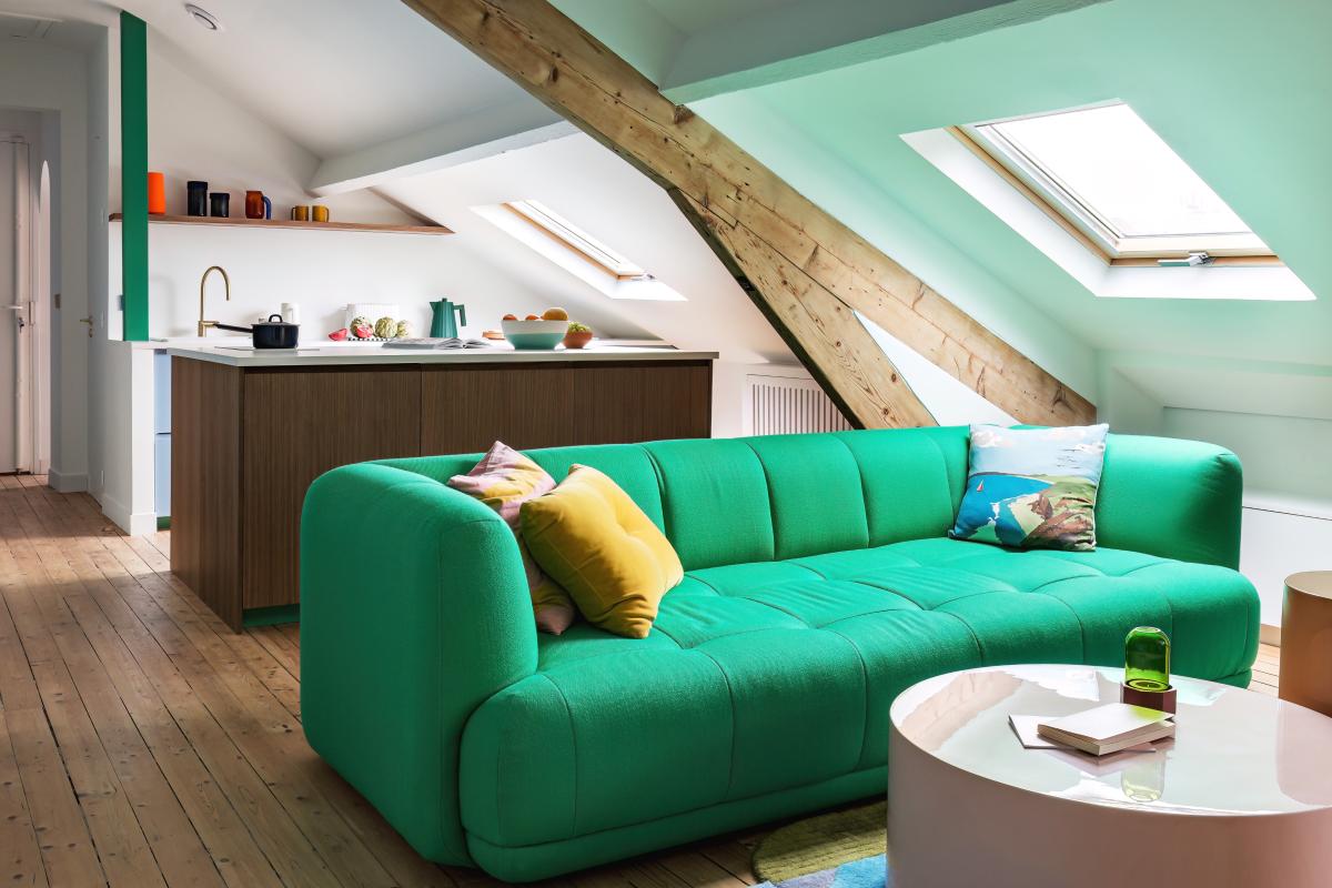
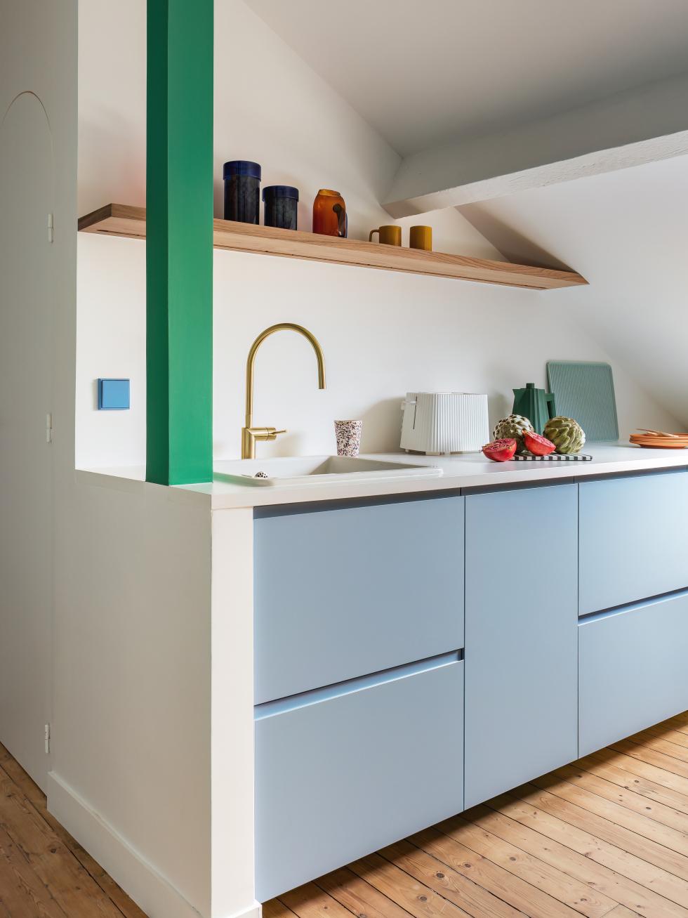
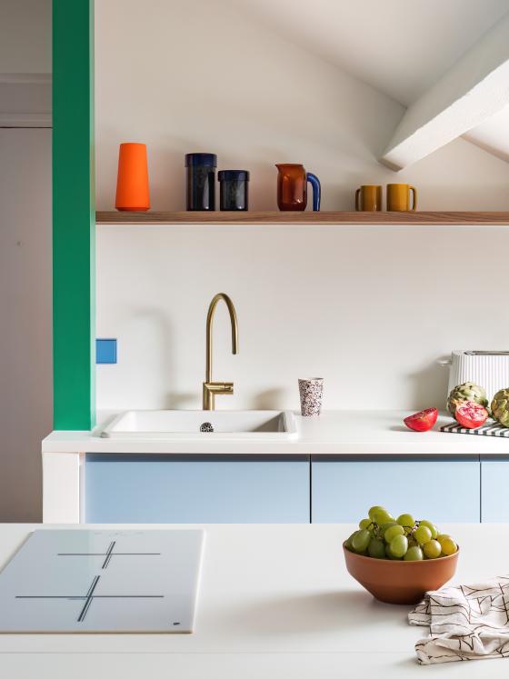
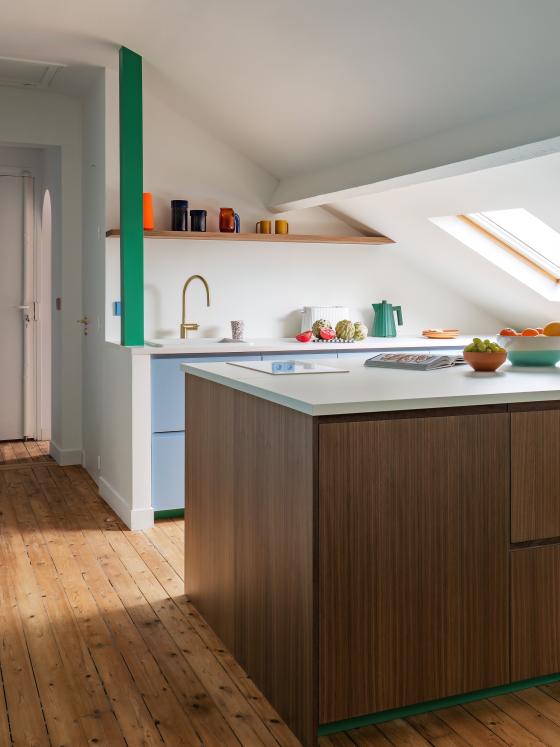
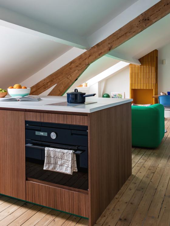
What really makes an impression on us is the daring use of colours, which oscillate between vintage influences and a modern spirit. Nicolas has explored this approach thanks to a two-tone colour scheme. "Similar to the blue we see in the corridor, I chose this pastel blue for its "formica" look. As for the Plum Living fronts in natural walnut that adorn the central island, nothing rivals them for adding that 60-70s touch.” As for the finishing elements, the architect likes to transform these into visual assets: painted in Leaf green, the island's skirting boards and the beam become bold statements. Painted in blue, the light switch really stands out. Bold, and brilliant!
Clean lines
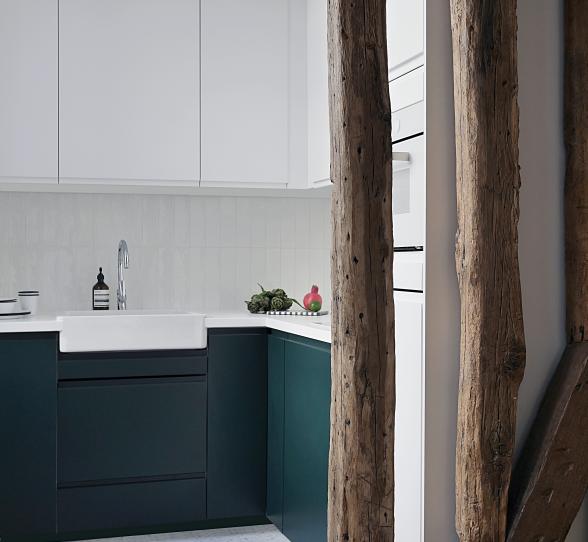
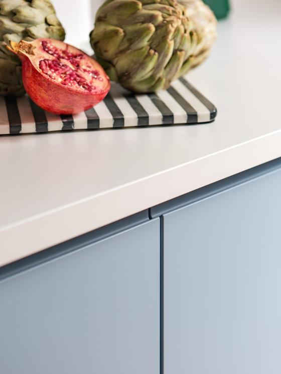
Although Nicolas has succeeded in combining a low ceiling with a perfectly planned kitchen, this room goes above and beyond its practical purpose - to us, it’s a beautiful piece of design. The secret lies in a few carefully chosen details, including the use of our U-Shape fronts. With no visible handles, they instantly create minimalist designs, whilst creating flow in the space. A simple floating shelf in walnut, completed with a brass mixer tap.It’s totally the right balance
The art of recovery
Design dinners
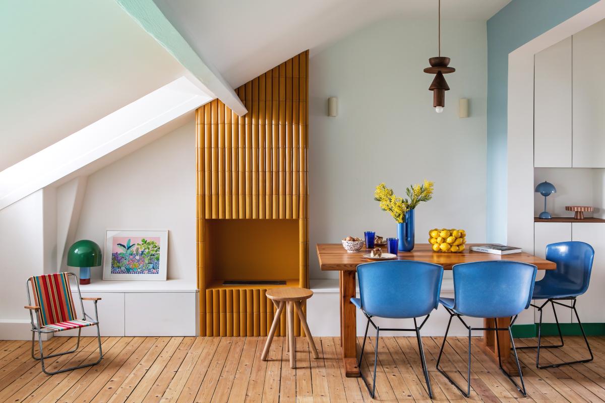
With its rustic wood, antique chairs and custom-made earthenware fireplace, the atmosphere of the dining room is reminiscent of Charlotte Perriand's aesthetic approach. "In each room, I like to create a surprise, to tell a new story.” Nestled between the end of the corridor and the entrance to the parents' bedroom, every inch of this space has been thought out: behind the table, a custom-made bench fits perfectly, and limits the space taken up by chairs. The glass roof, set into the wall, offers a beautiful opening for natural light. The key word here is always: optimise.
Bon voyage

An eye for detail
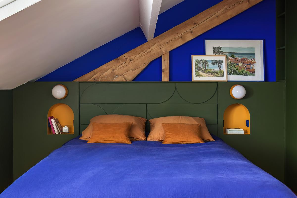
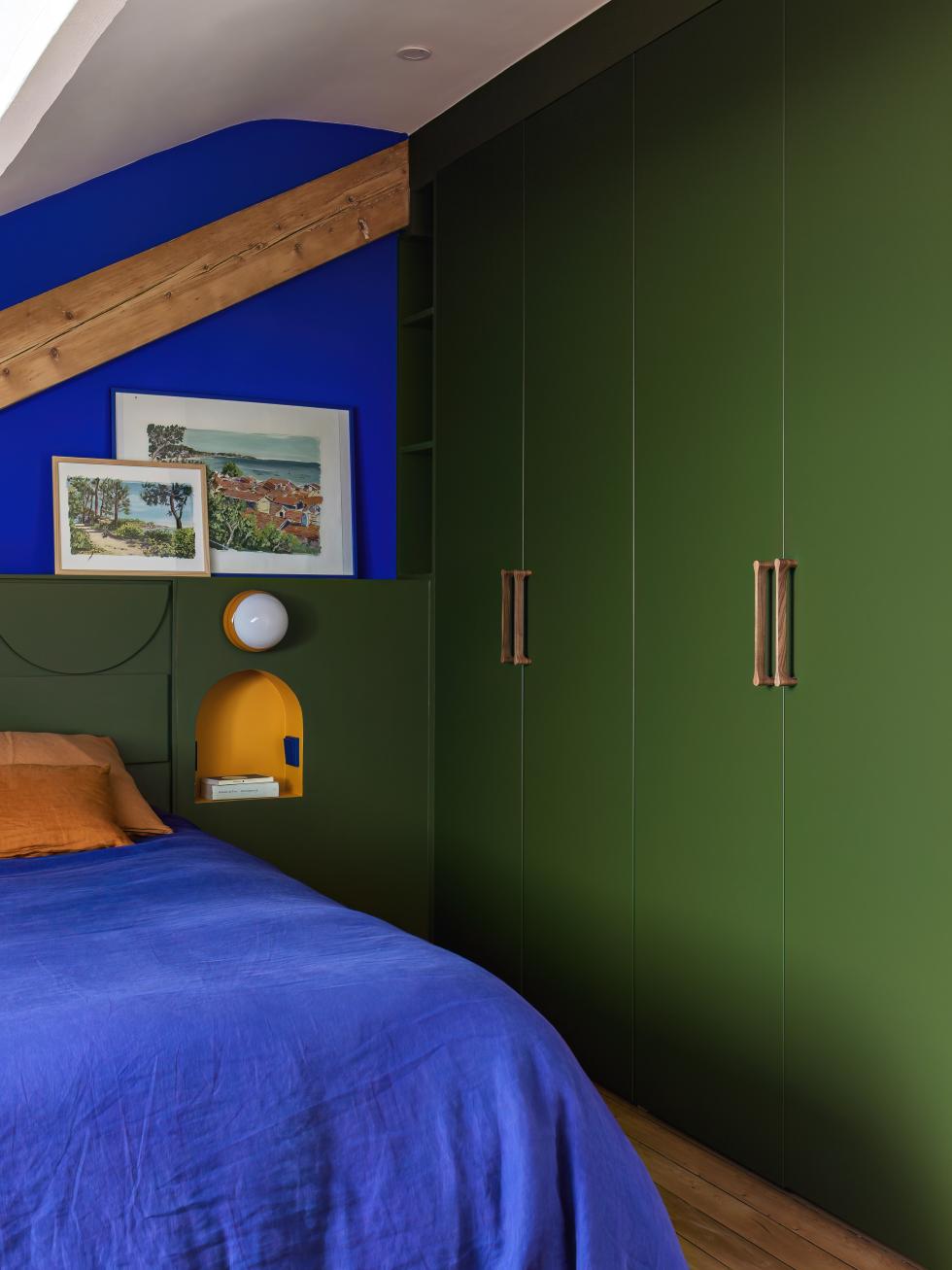
Olive green at night

1 room, 2 spaces
This is the headache of most shared children's rooms: how to combine a common space, whilst creating distinct areas. For Nicolas, the solution, also stated by his two daughters, can be summed up in one word: colour! In sunny yellow and bold coral, the two custom-made headboards define Mila and Liv's respective spaces. What if they get bored? One quick brushstroke, and it's all changed!
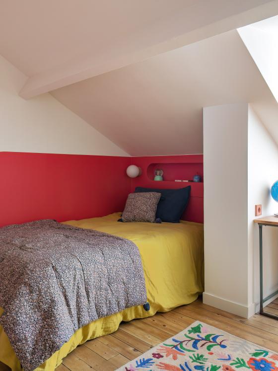
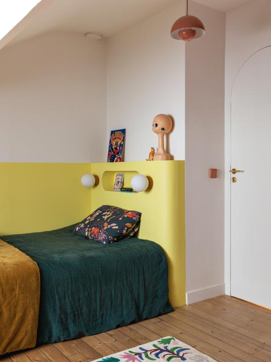
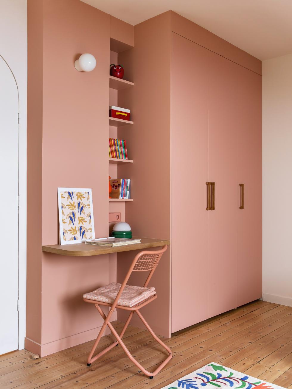
Blush, and that's it!

We’re inspired by…
- Optimising the sloped ceiling in the kitchen with an XXL-sized central island
- Using green as a way to highlight the skirting boards and emphasise all rounded alcoves
- Using leftover natural walnut finishing panels to create a customised storage unit
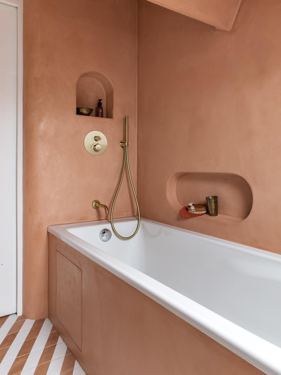
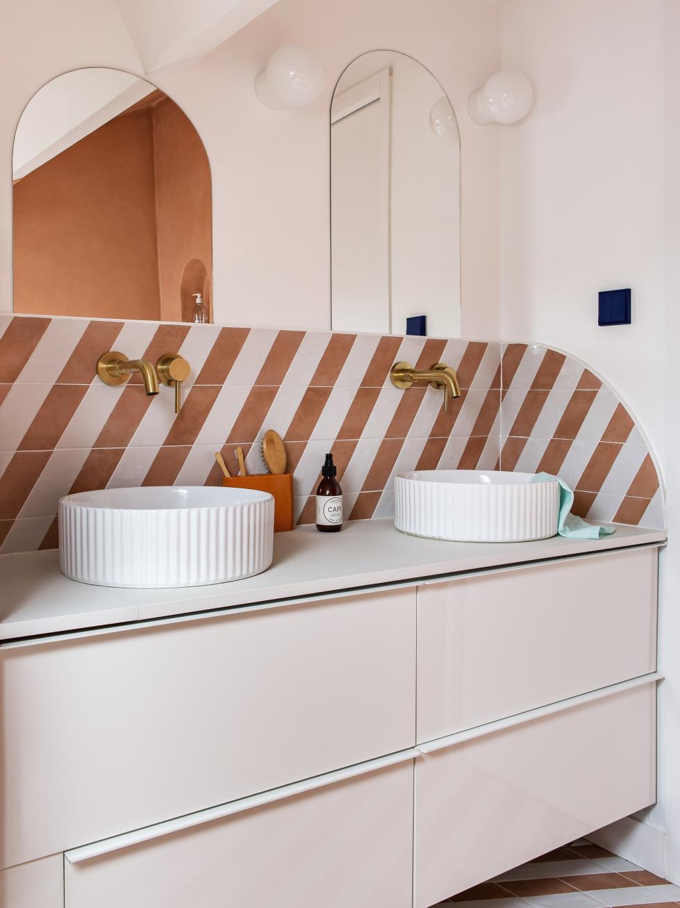
- The bold contrast between wax-coated tiles and Electric blue, which gives the bathroom a real holiday feel
