At Fanny Petit’s, in Paris
All it takes is to step through the door to Fanny Petit’s home to travel back in time. Nestled in the heart of Paris’s 11th arrondissement, her flat embraces all the hallmarks of 1970s apartment buildings, from the chequerboard parquet to the refuse chute from another era. Far from wanting to wipe the slate clean of the past, Fanny has chosen to play with these architectural codes to create a distinctive and bold cocoon, where her love of colour speaks to her passion for vintage. Take the tour.

At Fanny Petit’s, in Paris
All you have to do is push open the door to Fanny Petit's home to take a journey back in time. Nestled in the heart of Paris's 11th arrondissement, her flat embodies all the hallmarks of 1970s buildings, from the chequerboard parquet flooring to the rubbish chute from another era. Far from wiping the slate clean of the past, Fanny has chosen to play with these architectural features to create a singular and bold cocoon, in which her love of colour converses with her passion for vintage. Guided tour.


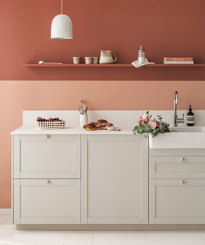
Daytime box
“Everyone asks me how my husband is taking it, but he loves it!” For the past few weeks, Fanny, Charles, Marcel (6 years old), Michel (2 years old), and Raoul, the dog, have been getting a dose of pink right from breakfast. Designed like a box that stretches to the ceiling, the Sorbet kitchen in their 60-square-meter apartment is certainly eye-catching. Fanny had initially played it safe. “When we moved in seven years ago, we first opted for a white kitchen, for fear of getting tired of it… and in the end, it was the white that ended up tiring me out.”


La vie en rose
So the couple got out the paintbrushes and the drill, and replaced the soulless fronts with colourful tall doors, without touching the structure. Both soft and bold, the pale pink is simply punctuated with white technical elements, from the worktop to the appliances. The chrome details, meanwhile, add a contemporary touch to the whole.
Hide-and-seek
While it may seem like an obvious choice, the pink is no accident. 'Originally, there was a rubbish chute column in the kitchen. Rather than hide it, we preferred to turn it into an asset by tiling it to make it a strong architectural feature'. The result is a bronze, pink and white triptych that catches the eye and sets the tone. Look more closely: Fanny opted for a simple groutless installation to let the colours take centre stage, whilst a row of matt white tiles was slipped in amongst the glossy earthenware to add rhythm. Subtle and devilishly effective.


To keep a low profile
Here a handle that echoes a wall, there a light fitting that awakens a harmony… Like a common thread, colours visually structure Fanny and Charles's flat. In their bedroom, it was the wallpaper by Mathilde Cabanas that served as the starting point for the palette. Fanny picked up on the veiled yellow, which she adopted on the walls, but also on the dividers and handles that give an unexpected twist to her Espresso dressing room.


A sense of rhythm
While Fanny was drawn in by the colour, the interplay of lines is no accident. Also inspired by the wallpaper, to which she gives a decidedly more grown-up dimension, the dressing area is rooted in the 70s influences dear to the creative. Gone is the dated wardrobe with sliding doors. Fanny worked with the constraints to devise a composition of black Metod units simply separated by visible finishing panels. A design that slotted in to the millimetre between the two existing walls, making the most of the available space without embarking on major structural work.
It’s a small world
Same constraints… different layout! In her sons' bedroom, Fanny prioritised functionality: here, the use of the base units initially designed for the kitchen primarily meets the need for drawers in the lower section, so that Marcel and Michel can pick out their toys independently. A guiding principle that also influenced the choice of handles from our collaboration with Pauline Borgia. "They provide a visual reference point for the children and have a very playful quality."


The circle is complete
Look up: used as an accent, pink is making a comeback in bedrooms to energise the colour schemes. In children’s rooms, the pendant light gives a boost to the pairing of Bronze and Cement. In the bathroom, it brightens up dark wood and once again makes it possible to add a graphic, slightly old-fashioned touch to the room. An explosive cocktail whose recipe Fanny knows like the back of her hand!
The ideas that inspire us
- The rubbish chute column that becomes an architectural element thanks to seamless tiles
- The kitchen designed as a box, ceiling included
- The Metod units repurposed as wardrobes to adapt to constraints
- The coloured finishing panels used as dividers to create rhythm
- The monumental handles that add spice to a smooth wardrobe and suit small hands
- The handles repurposed as coat hooks in the children's bedroom