Florian & Jérémie's place
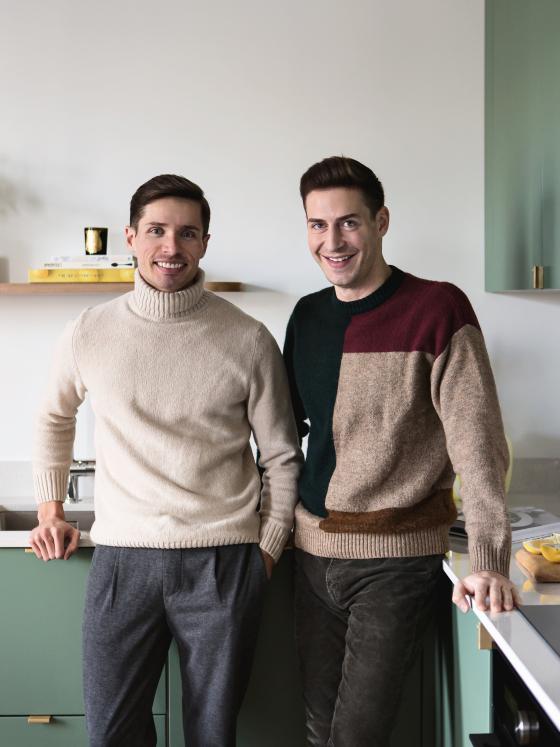
They dreamt about it for months: putting pen to paper, and playing around with plans to swap the kitchen and bathroom. They spent hours searching for the perfect materials and refining their inspiration to a tee. However, Florian and Jérémie are the first to admit that when they set out to renovate their 50m2 home on the outskirts of Paris, they had "the jitters". "It was our first home. We had to make the right choices to be sure that we would still like it in three years." Rather than work with the existing, which was still in good condition (but not quite to their taste), they decided to start with a blank canvas, with one principal: to bring character back to their nest.
The Haussmannian charm
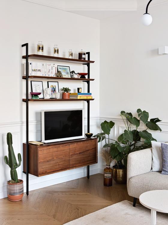
With its parquet floors, wall mouldings and period fireplace, Florian and Jérémie's flat ticks all the boxes of Haussmannian style. But when they first moved in, the floor was dull and in need of a little (or big) makeover, and the marble fireplace non-existent. "There were only the cornices, wall mouldings, and honey-coloured chevron floors which served as our starting point..." Everything else was added by the couple, including the fireplace that looks as though it's always lived there. "We found it on Leboncoin, and it naturally found its place besides the kitchen."
Goodbye cramped kitchen, hello open-plan layout
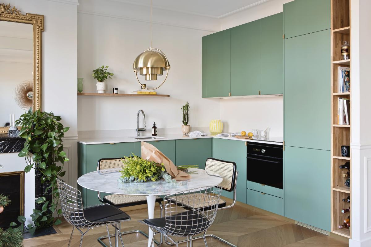
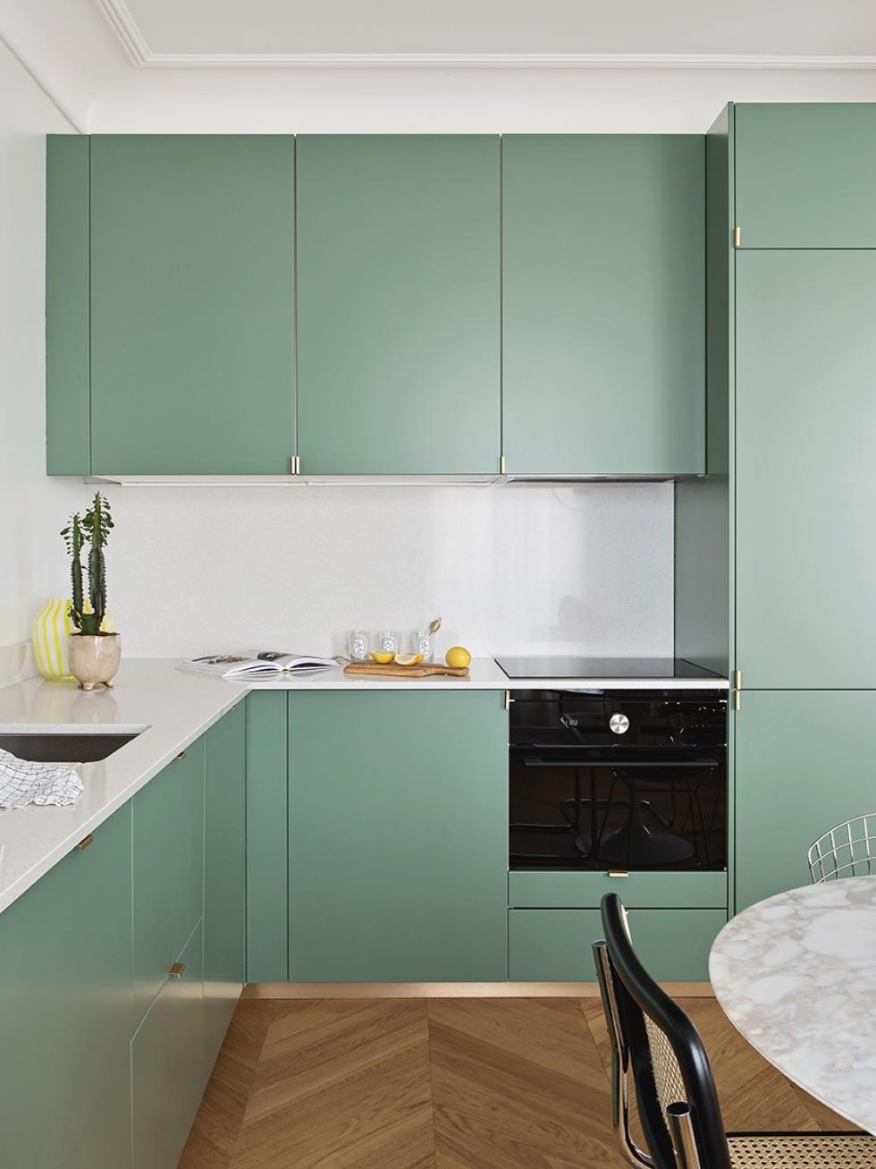
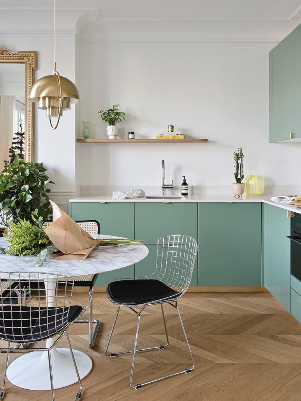
The kitchen, previously nestled in 4.5 square metres, is now transformed into the bathroom. "For us, it was essential to have a friendly kitchen for when we have friends over and entertain." But firstly, they had to tackle the load-bearing walls to be able to move the kitchen into the living room. Next task was to play around with the volumes of the cabinets, to leave room for the essentials without overloading the space. "We knew we didn't want full-length wall units".
Weightlessness
A little pizazz
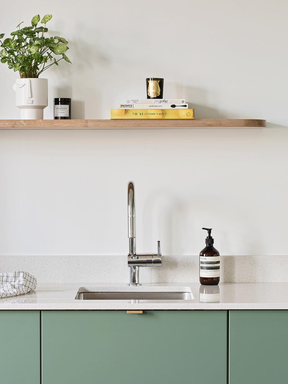
Chosen to add a little flair to the room, our smooth fronts in Green 03 - Vert de gris matte lacquer are highlighted by a terrazzo-style quartz countertop. The brass plinth echoes the colour of the parquet floor and gives the kitchen a "floating" illusion.

In good company
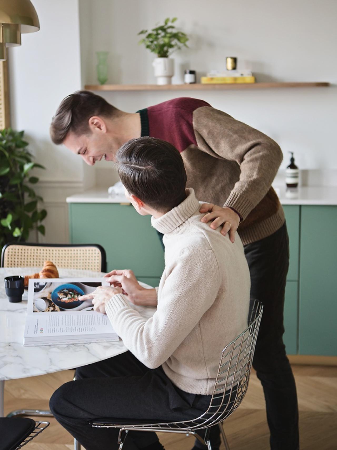
After three months, the couple finally got to grips with the reality of the work. "I didn't know how to use a screwdriver," jokes Florian. "We called in professionals to guide us and lead the project." From Pinterest to Instagram, Florian and Jérémie had compiled an ultra-precise criteria to help them turn their dream into reality, and to avoid any nasty surprises along the way. "It made communication super easy. That's what made the project so successful."

Custom-made look
Most of the renovation work took place in the bedroom. "The space was badly arranged, it felt cramped, and there was a serious lack of storage space." The old bathroom was replaced by a large wardrobe (that we would have guessed was custom-made!). "These are Pax cupboards!" laughs Florian. The couple blended them into the wall with doors in Green 01 - Amandier grisé matte lacquer. A matching filler panel was used to fill the empty space between the wardrobe and the ceiling, reinforcing its built-in look.
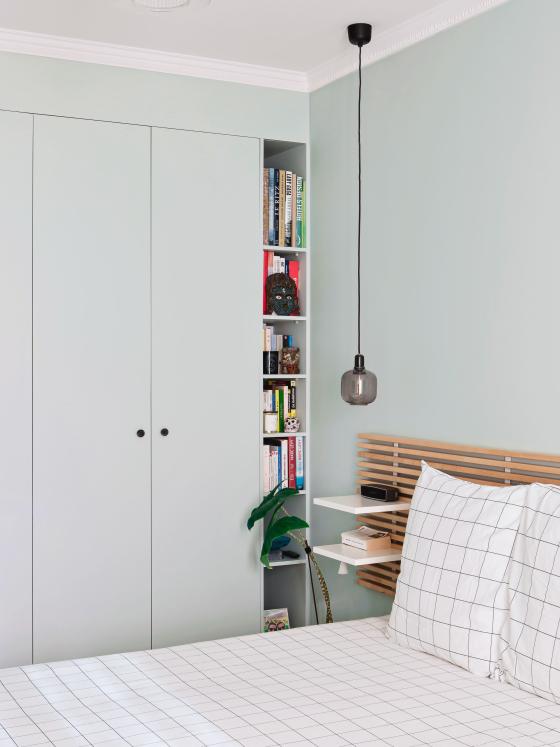
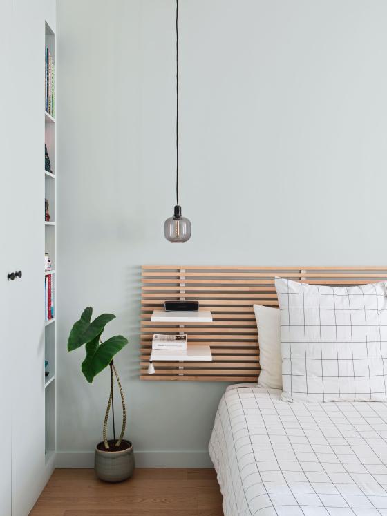
Light wood + Green 01 - Amandier grisé, perfect match
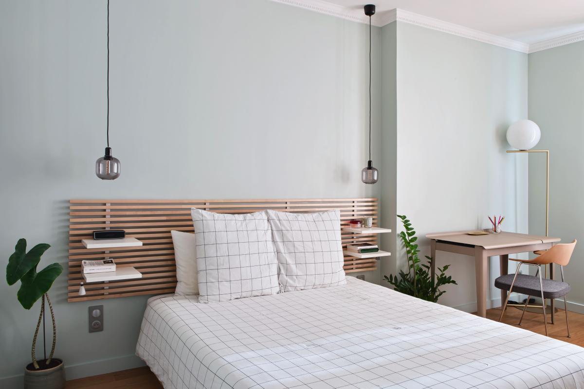
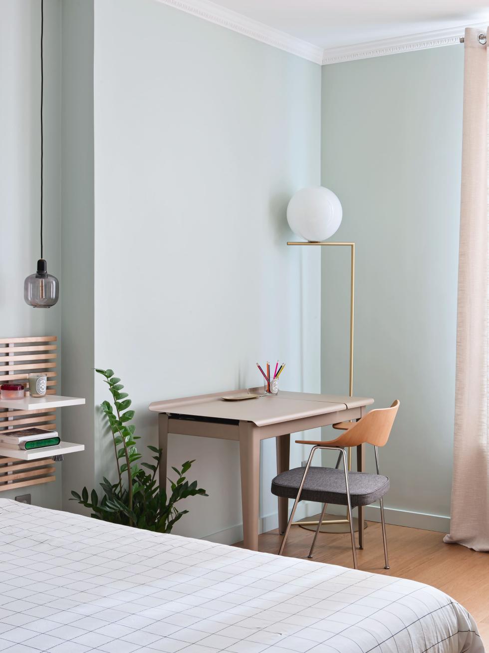
No detail spared, not even the wardrobe, which is adorned by a moulding to keep it consistent. "We simply had it glued to the filler panel!" The walls are painted in the same shade as our fronts, blending in seamlessly with the decor. Bathed in light, the room is highlighted with an original light wood headboard from Ikea, "people always ask us if we made it ourselves!"
Roles reversed
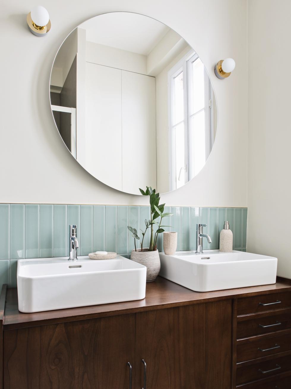
Here, the shower replaced the sink and the washing machine replaced the oven. Once a small & cramped kitchen, the room at the end of the hallway is now the bathroom, voila! Visible from the entrance, the vintage-looking walnut apothecary cabinet catches the eye and makes a connection with the living room decor. Just as we were wondering how the Plum Livingber managed to customise the antique piece to allow room for the basins, Florian laughs. "It's a recent piece of furniture, which was actually designed just for it!" The tiles take up all the colours of the kitchen, right down to the brass outline that defines them.

Ideas that inspire us
- The floating shelf that visually lightens the kitchen
- The bedroom walls painted in the same shade as the wardrobe for a built-in look
- The cornices and wall mouldings that give the flat its character. You'd swear they've always been there!
