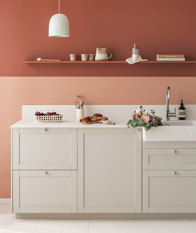
In the heart of nature, welcome to Sabine Mérillon's place
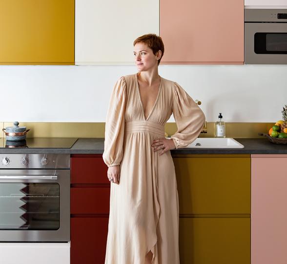
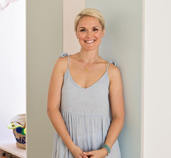
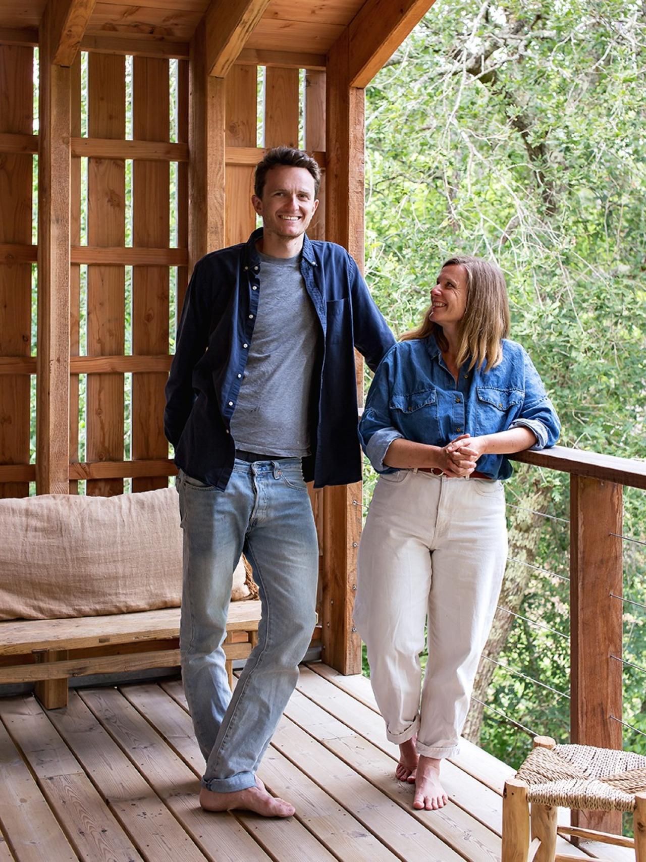
Sabine Mérillon AKA Miss Etc… you might not know her name, but she's the creative force between so many of the projects we built and share at studio Plum Living! Today, the content creator takes us behind the door of her new home, in the Landes region of France, between Bordeaux and Biarritz.
The project? A wood and concrete structure, nestled in the heart of the countryside, terraces aplenty, a natural and dynamic interior, all with a splash of colour.
Both a family home and a workspace for Sabine and her partner Maxime, this calming bubble often welcomes Sabine's grown-up daughters: let's take a look!
Eternal vacation
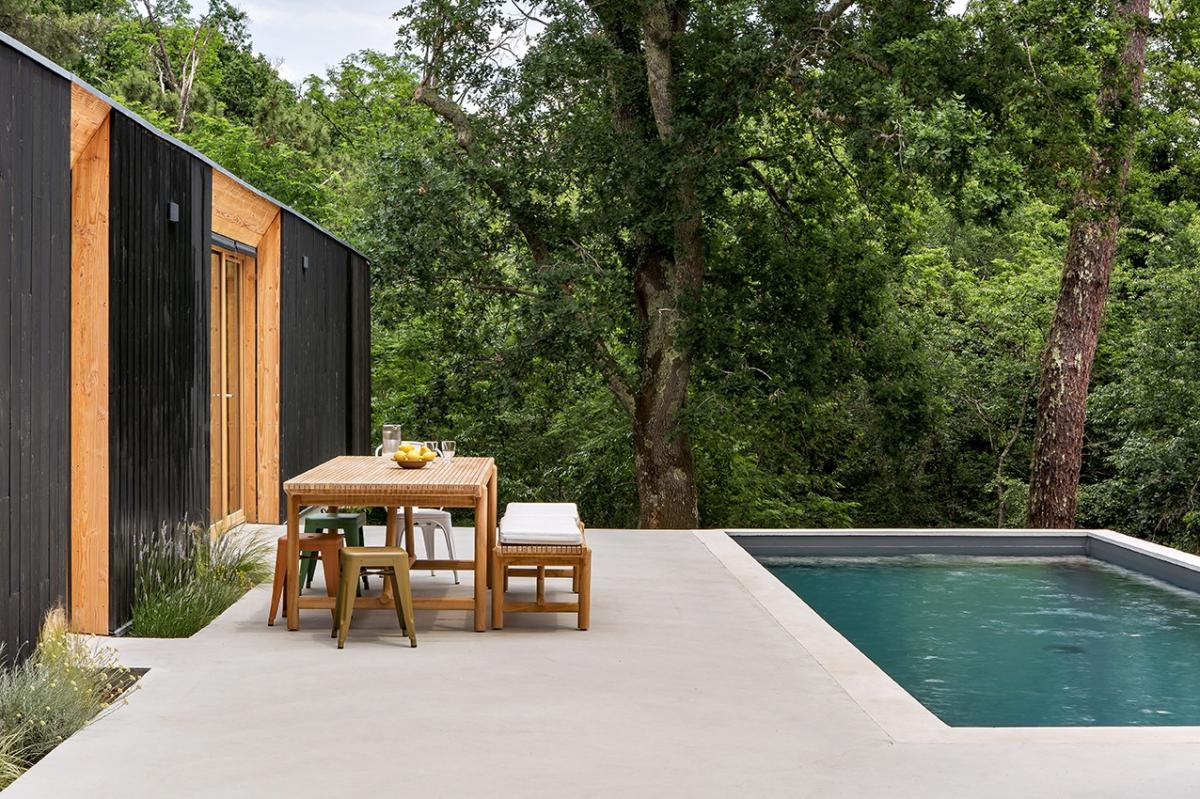
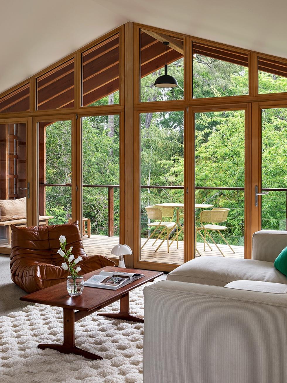
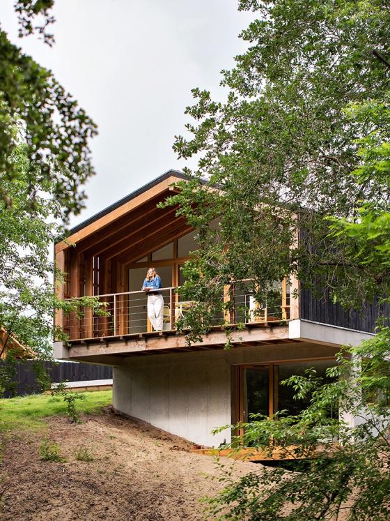
One year: that's how long Sabine had to transform this house from an concrete and pinewood shell, built on an empty sloping plot in the forest. "I still have trouble realising that this is truly our home, it's exactly what we dreamed of: that feeling of being on holiday all the time!" Both modern, sustainable and in sync with the region's style, Sabine and Maxime's home blends seamlessly with its surroundings. Outside, the swimming pool seems to float suspended above the trees. The same sensation can be felt on the ground floor and lower garden, where each window opens onto a forest vista, almost like works of art.

Raw nature and neutral materials
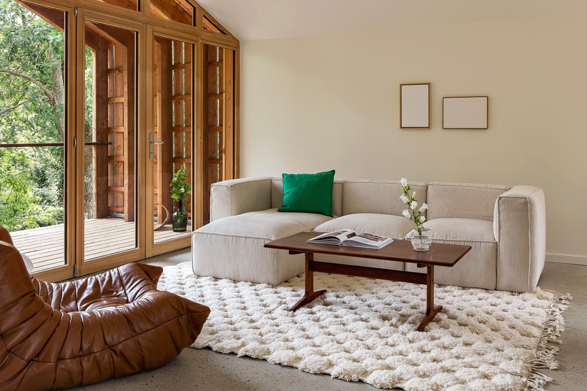
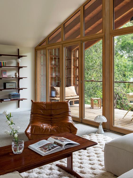
Just a quick look out of the large windows of the living room or a glance from the suspended patio, and you realise just how important a sense of nature is to Sabine's home. Nestled amongst the trees, this back to basics soul has naturally infused the decoration. "I wanted the focus to remain on the exterior, so I had to think paired-back for the interior design choices. We opted for raw, rustic materials, wood and cement, and for a simple colour scheme" . The only element that's attached to the wall, a bookshelf that Sabine fell in love with. For the rest, everything can be moved and adjusted: the furniture is, for the most part, vintage mid-century pieces which can be shifted closer to the fire for a cosy evening, or pushed to the window to catch some morning rays.
Arty recipe
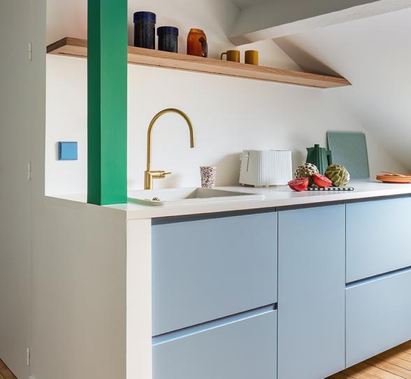
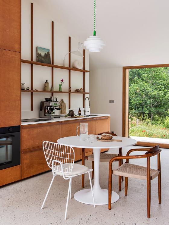
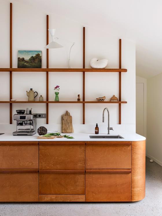
Some curved lines to soften the architecture, wood to warm things up: in the heart of the house, the kitchen is revealed. But for something so unique, didn't it explode the budget? Not necessarily! "I had a clear idea of what I wanted, I drew up the plans myself. I chose coloured and varnished plywood to keep costs down, and an easy to clean worktop. A professional installed everything.".
Framing it
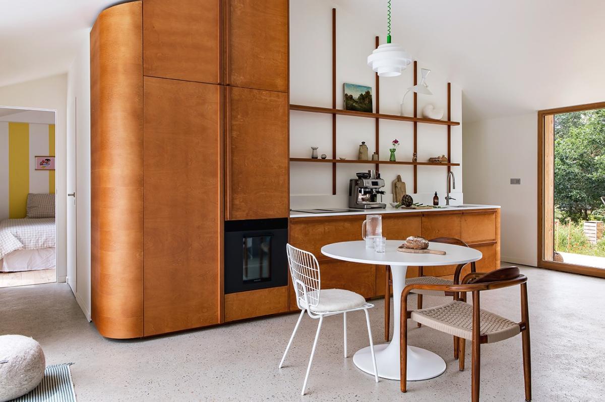
To complete this elegant and retro style, where only one appliance is visible, slim shelves dress up the walls. Pretty objects and everyday items decorate them. Using the generous volumes of the room, this DIY structure highlights the sloped ceiling and brings some lightness to the ensemble.
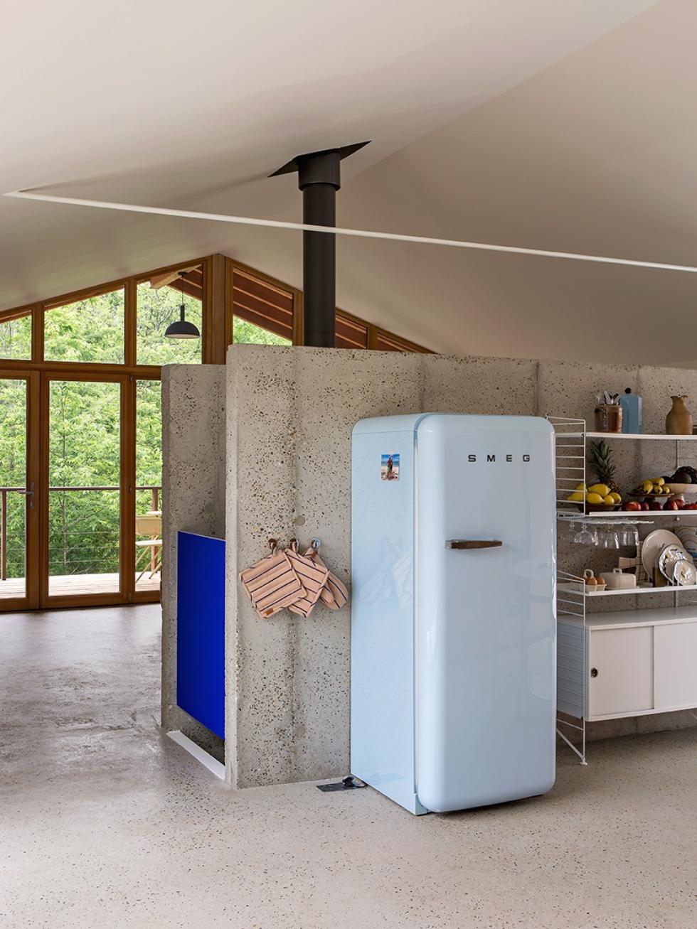
Raw cement is a theme

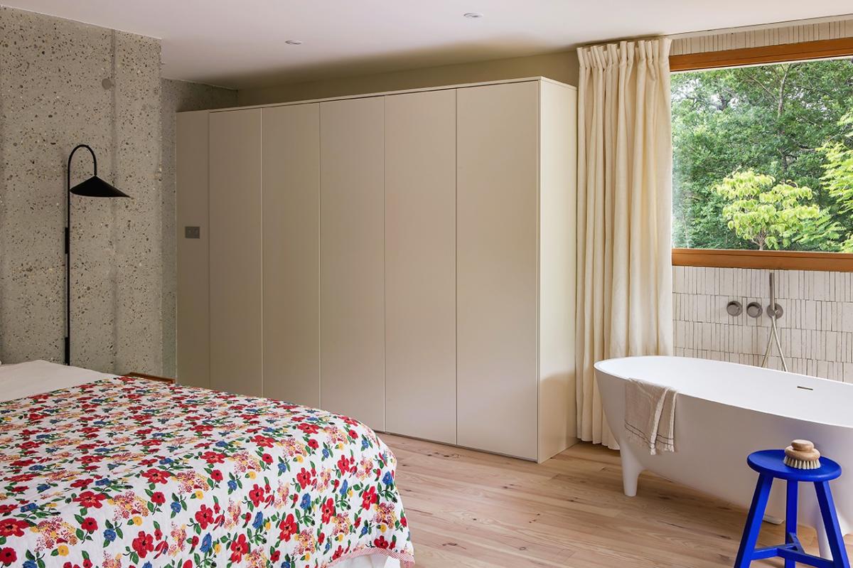
Beige flag
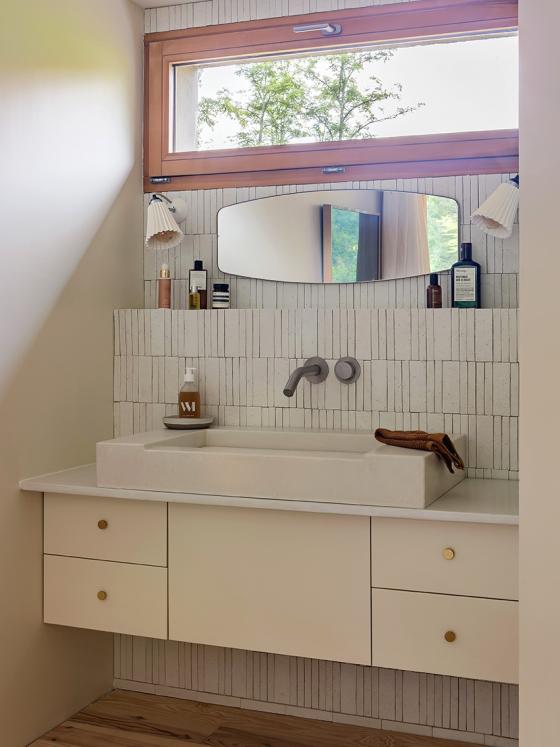
A vista of nature and plenty of beige, the master bedroom can be found on the lower ground floor
"On the walls, the wardrobe and the vanity unit, Ivoire is the dominant colour. I love this colour today, but if I ever fancy a change, I could easily add a lick of paint and switch out the Plum Living doors".
A bathroom fancing the expansive window, cement tiles without grouting (to add to the industrial look), the warmth of natural wood. Thanks to these timeless elements, the master bedroom feels like an elegant hotel suite in a far-flung location.
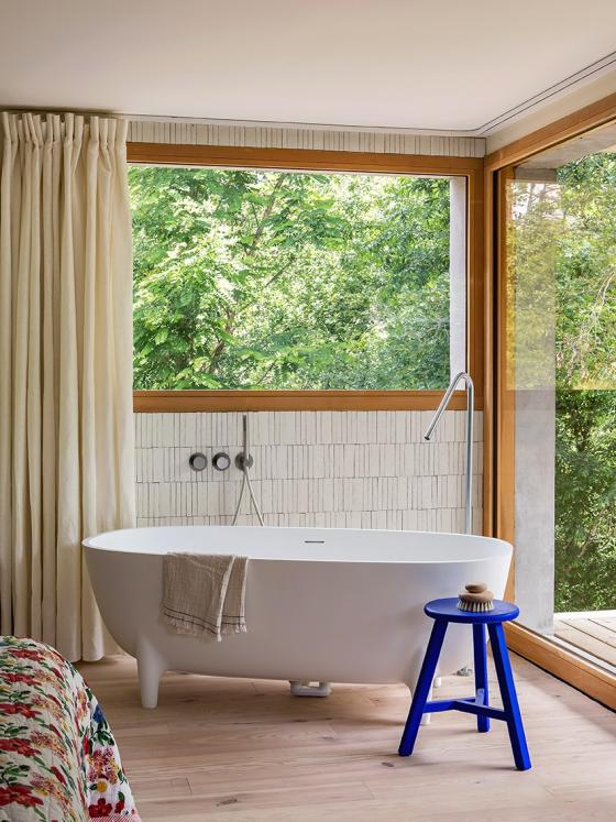
Double cocoon
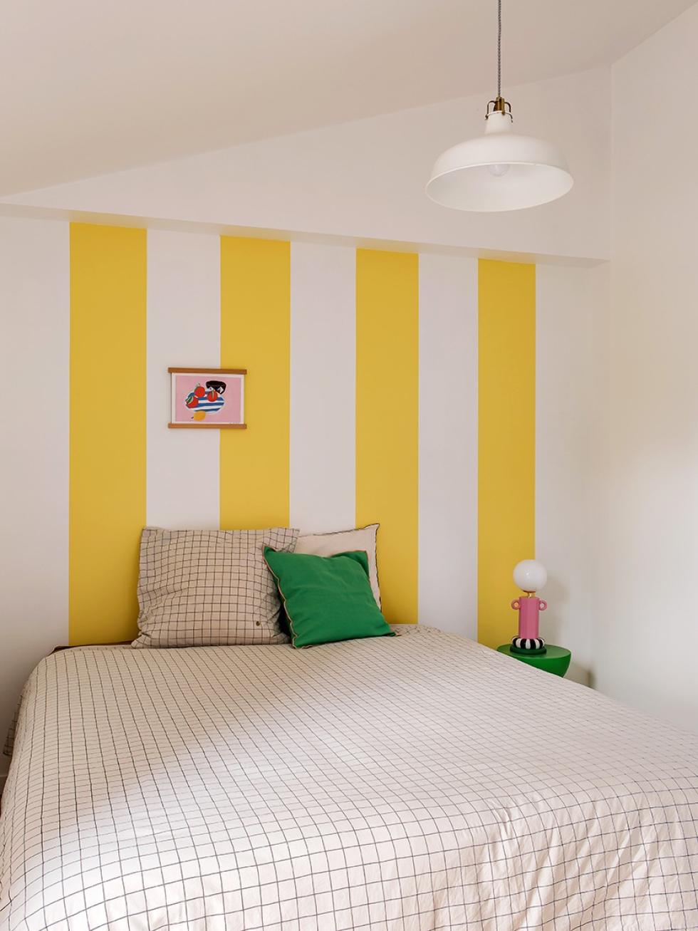
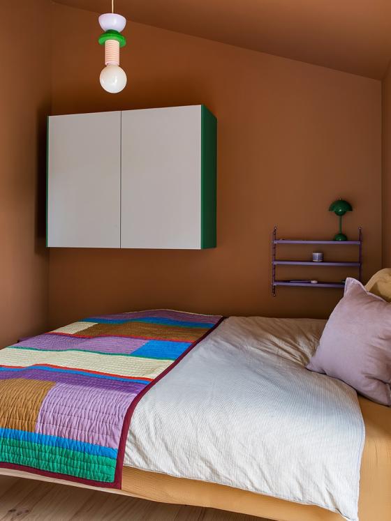
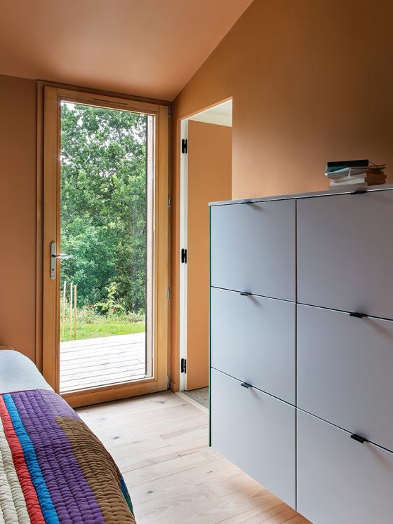
Let's keep going: on the other side of the kitchen, Sabine's daughters' rooms. "One large shared room, or two smaller rooms measuring less than 9m2? We actually went for the second option. Between them, a bathroom links the two and makes the space look bigger when the doors are opened". When it comes to colours, Sabine went bold. Yellow stripes bring fun and warmth to Jade's room, which was already very bright. A little darker, Noa's room is washed in a cosy terracotta tint, for a cosy nest effect. When it comes to storage: Sabine brought along the cabinets from her previous apartment, hanging them on the wall to free up floor space and adding Plum Living Ciel voilé fronts and Leaf cover panels for some personality!

Colour is king
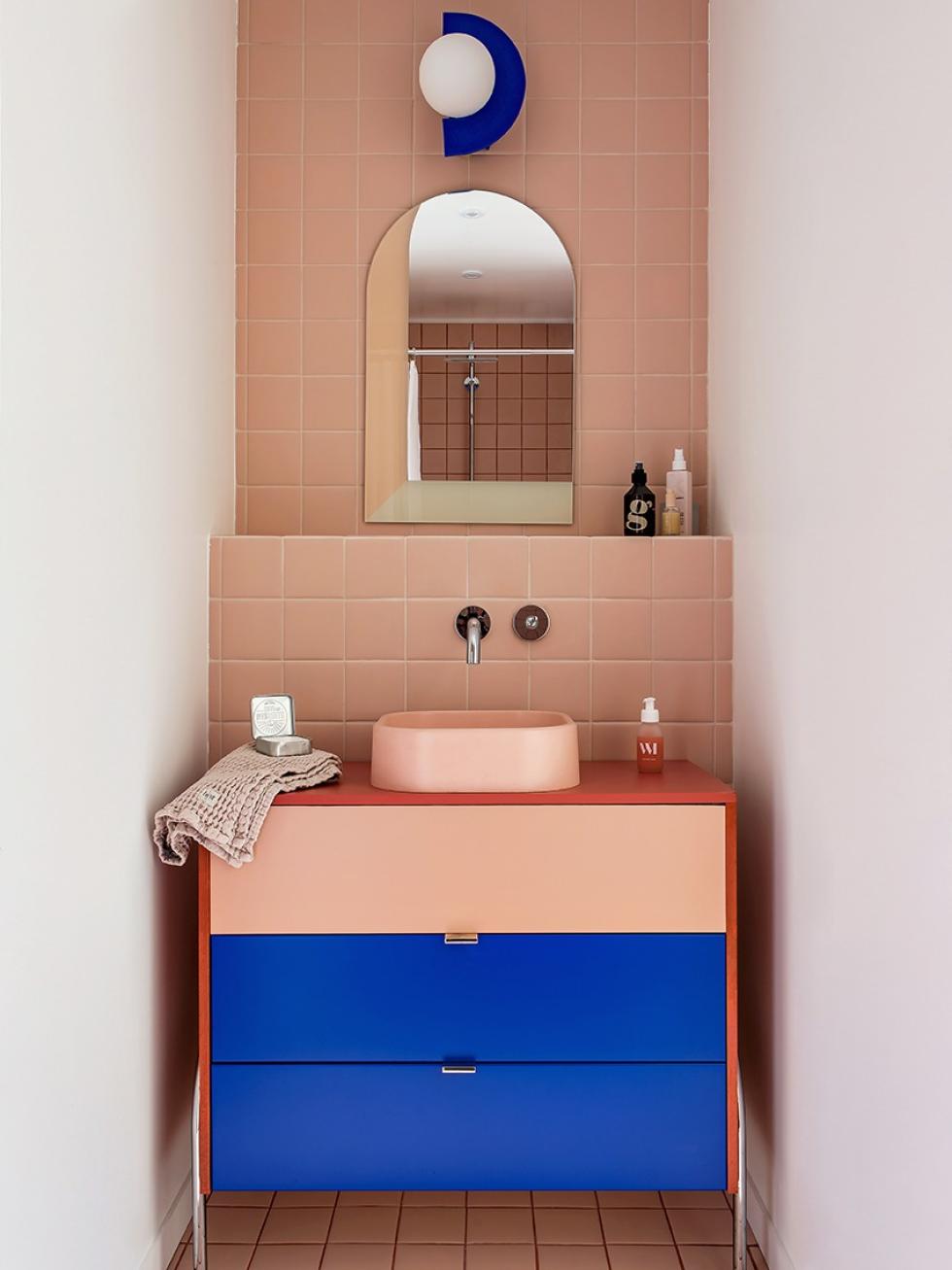
2 young ladies, a vanity unit, a shower and all in only 3.5m2. A big challenge to make this bathroom practical and beautiful! Sabine succeeded, thanks to a carefully calculated layout and chic colour scheme. Blush, Electric and Terra, this unit dares to combine three of our favourite Plum Living shades and transforms itself from utilitarian block to design object. To keep things coherent, Sabine chose a sink in a similar shade. On the floor and in the shower, a dark grouting pops: a simple tip to bring visual interest to a small surface area.
Creative bubble
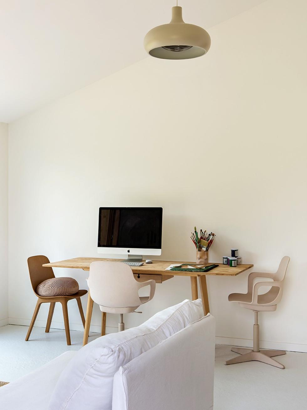
Working from home often makes it difficult to disconnect. To protect her work-life balance, Sabine decided to totally separate her studio space from her home. This 30m2 home office is at the heart of the house, yet can only be accessed by going outside.
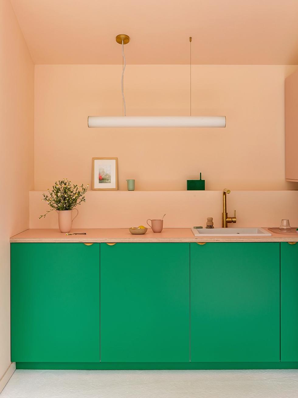
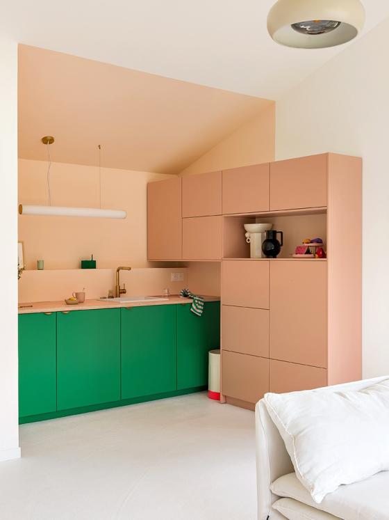
"Maxime works here too sometimes, but it really is my creative bubble. I created a pristine white box to shoot anything and everything for my clients, but I wanted a splash of colour for the kitchen. In my previous office I chose a pink, and I wanted the same for this one: it never gets old.

Mission: optimisation
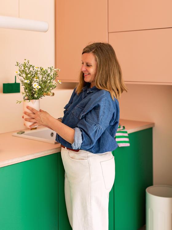
Blush pink and Leaf green, Sabine's studio doesn't shy away from peppy colours but it also incorporates ingenious storage. "To optimise the sloped roof without overloading the walls, I fitted a number of 40cm deep cabinets where I can store all my materials". A dynamic layout which remains quite airy and full of personality, thanks to a cute decorative niche and brass detailing. The final touch?
Pink paint, in a similar vein to Plum Living's Blush, used to define spaces and add depth.

4 ideas that inspire us
- Polish the raw cement to give it a terrazzo effect.
- Attach narrow shelves to struts, to create DIY frames on which you can styel your favourite objects.
- Use paint to highlight the light in a room, or to lean in to a cosy atmosphere.
- Create upbeat layouts using Plum Living's Blush fronts with Electric or Leaf. And if you change your mind, you can easily change the fronts!
