Office Tour: the office of Marn Deco
Neuilly-Plaisance, and we have reached our destination. Interior designer Nicolas Payet has opened the doors to his offices located at the gates of Paris. A colourful place, serving as a showroom in itself.
Invitation to travel
Maybe it's the light that bathes the place, or the masonry shelves that remind us of Mediterranean fincas. Then there's the Klein blue that looks like it came straight out of the Greek islands. One thing is for sure: from the moment you walk in the door, the Marn Deco offices invite you to travel. Starting as an impersonal showroom, Nicolas Payet redesigned this three-room flat like no other. The bathroom is next to the bedroom, while the kitchen opens up to a living room where the team works on projects and meets with clients. A life-sized business card!The sky's the limit
While low units are instant eye-catchers, overhead units are more discreet. Not to say that they should be neglected! Nicolas took care of the details right down to the filler panels, which he had cut out of the U-Shape drawer fronts to give the illusion of a full-height column. "They are installed like cover panels above each cabinet and on the ceiling, to give the kitchen a custom-made look".
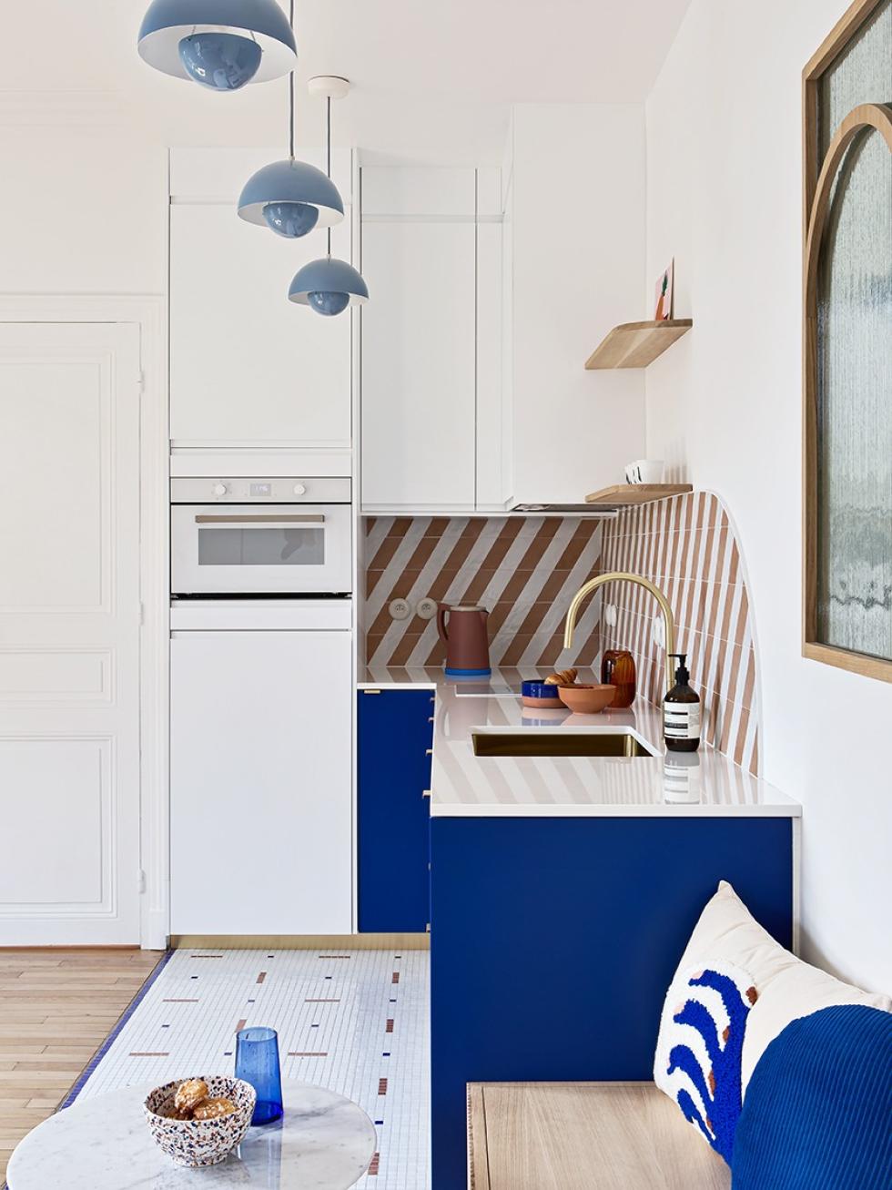
Graphic, period!
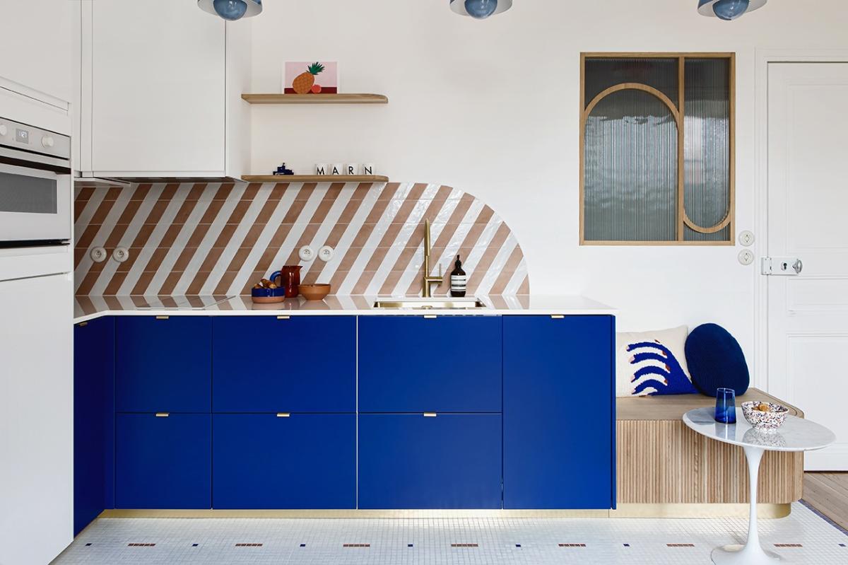
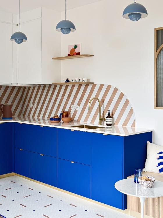
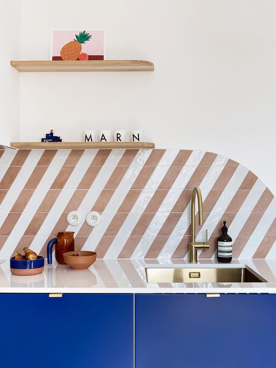
It's the agency's signature: there isn't a Marn Deco project that goes by without an unexpected graphic composition. Their offices are no exception, on the contrary in fact. Here, Nicolas used different materials to create a unique atmosphere. The two-tone splashback has a delightful "berlingot" look, tying in with the curved lines of the glass window and light wood bench. The mosaic floor, "which gave the fitter a cold sweat", also takes up the colours of the flat. The bench seat is covered with rounded slats, glued together to give the room an new dimension. Available in three different colours, the FlowerPot pendant lights by Verner Panton highlight the high ceiling and create a common theme from the entrance to the office space and kitchen.
The masonry charm
Being a showroom, the agency needed a bookcase where they could display their favourite materials. Inspired by houses found in the Mediterranean, it found its place between the two windows. Take a closer look: the details are so meticulous that you'd swear they were always there. The custom-made masonry structure blends in perfectly with the decor, highlighting the colours and materials of the samples. At the bottom, the plinth links the bookcase to the floor, while the Art Deco mouldings added at the top leaves it to blend in seamlessly with the rest of the room.
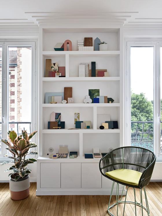
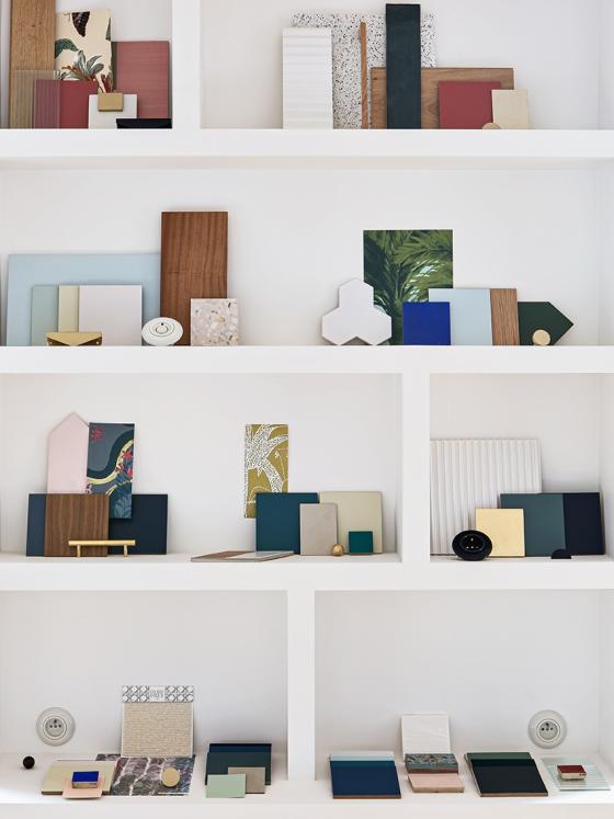
Finca spirit
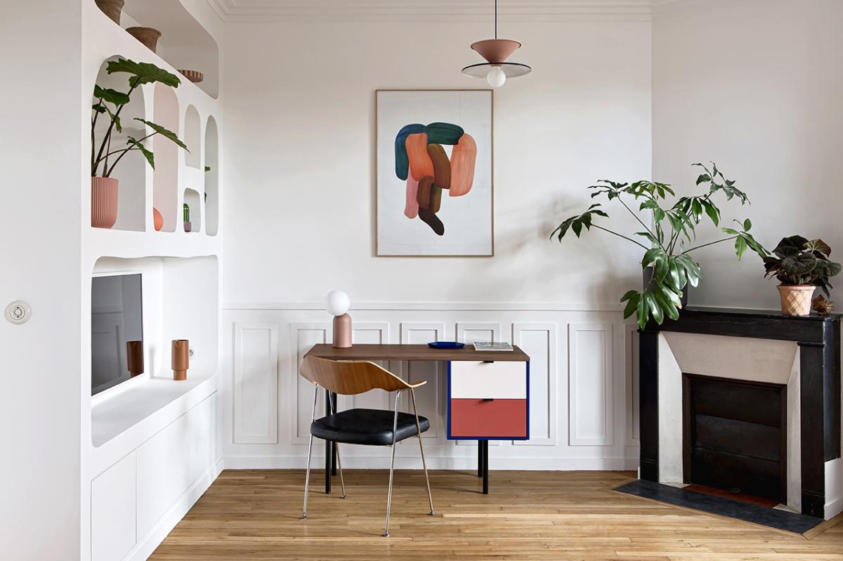
On the opposite wall, the masonry alcoves are home to a screen that displays the agency's work to its clients. "We had to have them redone one by one", says Nicolas. The masons had cut them in a very straight line (similar to the bookcase) but we wanted to accentuate the imperfections that make the fincas so charming. The back wall was covered with geometric mouldings that emphasise Ronan Bouroullec's reproduction. Bright blue, deep green, terracotta, pink... All the colours dear to Nicolas are mixed in the painting. It's no coincidence that they are featured on the small desk just below!
Pierre Paulin, is that you?
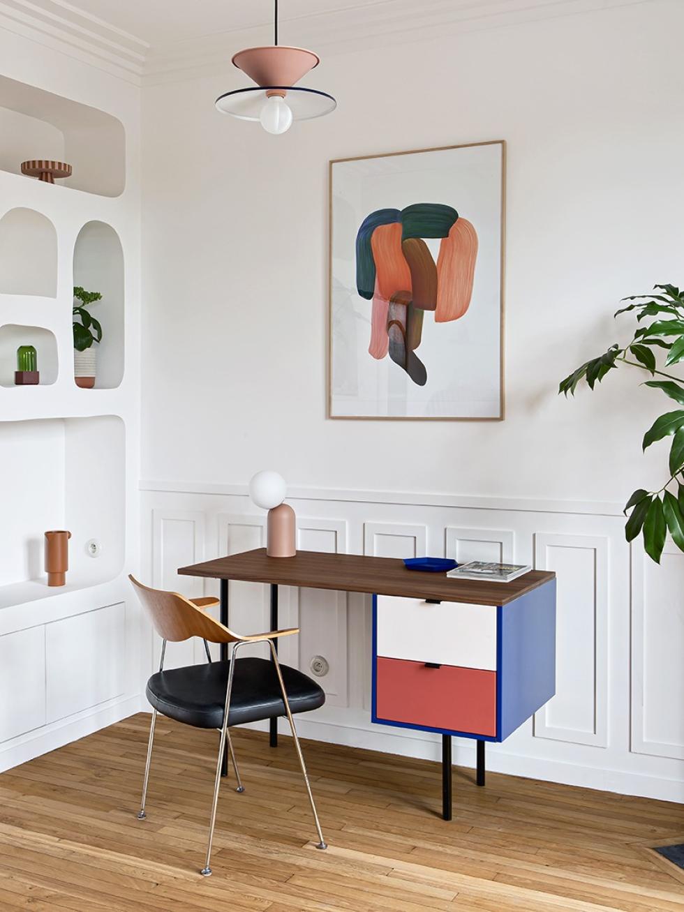
"This project started with an urgent need for a desk for me to work at! says Nicolas. In the beginning I searched for a desk in the shops, quickly realising that all the elements of '50s inspired desks that I wanted were at Plum Living. So I started with the iconic designer Pierre Paulin's office to create this structure". The interior designer started with a 40x40 cm Metod cabinet frame 37 cm deep, which he covered with a Klein Blue cover panel before dressing it up with matte lacquer fronts and matte black Liseret handles. He then simply re-cut black metal rounded legs bought in a DIY shop and installed them under the cabinet. A 40x120 cm door serves as the desk work top!
Time travel
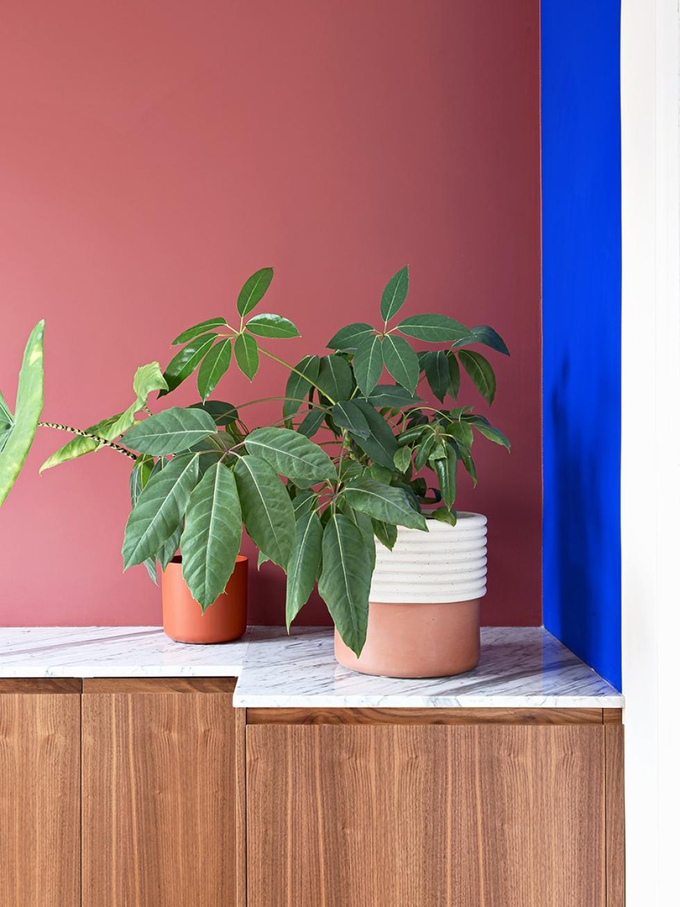
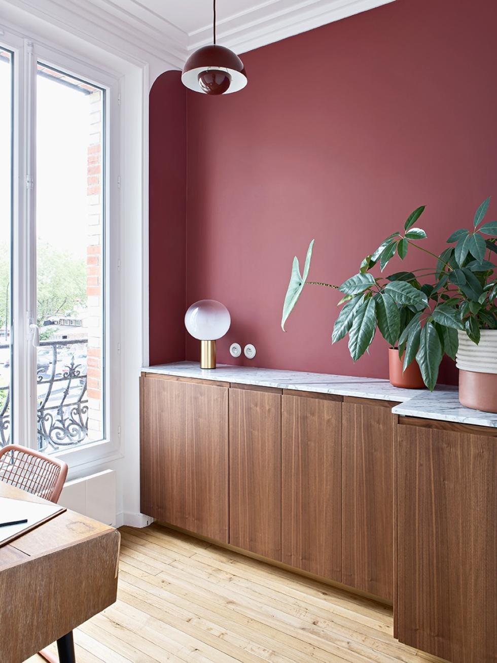
Nestled in an extension of the kitchen, the second bedroom acts as a "bubble" from the rest of the office — you know, that necessary spot for making phone calls in peace. "It's a 4 m2 room with a depth constraint because of the door on the right and the window on the left", he explains. The interior designer played with 80 cm high Metod cabinets in two different depths (37 and 60 cm), to create a customised piece of furniture. "What was originally a technical constraint, ended up allowing us to create relief and a graphic composition". Our U-Shape fronts in natural walnut keep the vintage spirit of the small office alive. On the walls, Klein Blue brings a unique touch. It's in the details: the small arch on the wall adjacent to the window emphasises the FlowerPot suspension.

Ideas that inspire us
- The suspended oak-clad cabinets give the illusion of a vintage sideboard
- The bench seat installed as an extension of the kitchen to create a mini dining area
- Inspired by Pierre Paulin, the desk is made from a single Ikea cabinet
- The masonry bookcase gives a holiday-home feel to these Parisian offices
