5 Ideas to introduce vivid colours into your home
Electric, Leaf, Blush or Lemonade, our new colours have one thing in common: they are bright! Although we love their vibrancy and depth, it's not always easy to integrate them into your home. However, combined with wood, used in paint, or dispersed in accent touches, they will fit into all kinds of settings and will surprise you with their diversity. From the bedroom to the kitchen, throughout your home-office space, we give you 5 ideas to present touches of these colours into your home.
Balance is key
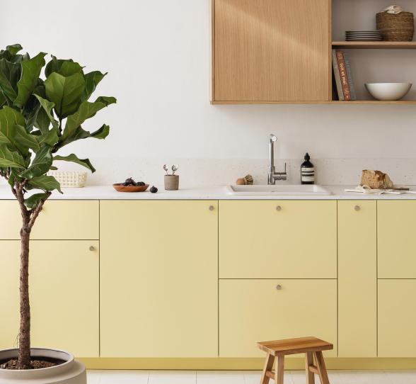
A splash of sunshine

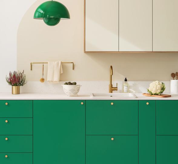
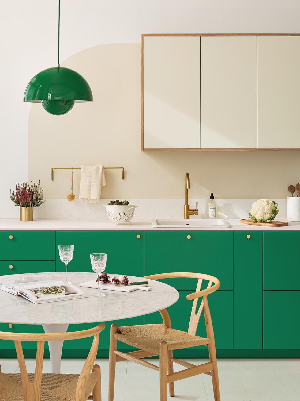
Green and wood is always a YES.
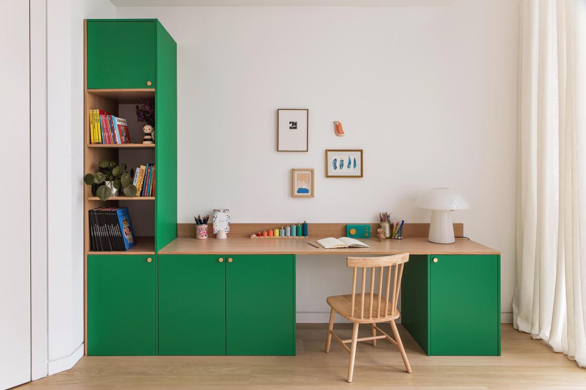
Storage, aesthetics, managed visual clutter and careful ergonomics: the office space presents its share of form versus function challenges. Do not worry though, we have the solution. When in doubt, ask mother nature! In this L-shaped design example, the four low cabinets make up the bases as well as storage units for the desk. Our own smooth Leaf lacquer fronts give the furniture a unique look, but it's our light oak panels that make the difference. On the practical side, they provide structure to the worktop and the niches. On the aesthetic side, they tone the colour scheme down. Try it in your own office space and let us know, we cannot wait to hear what you think.
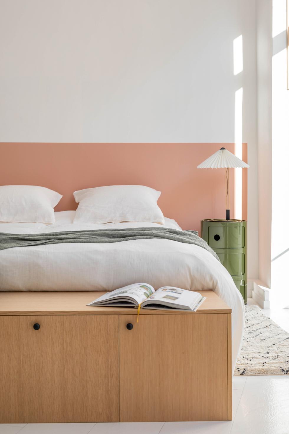
Rosy dreams
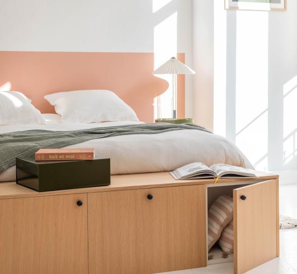
A total look where every square centimetre is painted tends to get too expensive. But working with cleverly placed colour accents will do the job of transforming your space without breaking the bank. A simple application of colourful paint can revitalise your space in a matter of hours. Used in this example as a bed frame, our rosy Blush paint wakes up this neat bedroom. To bring this project to life, take a look at our tutorial “How to create a graphic frame with paint” to paint clean lines without spilling over any paint.

Technicolor
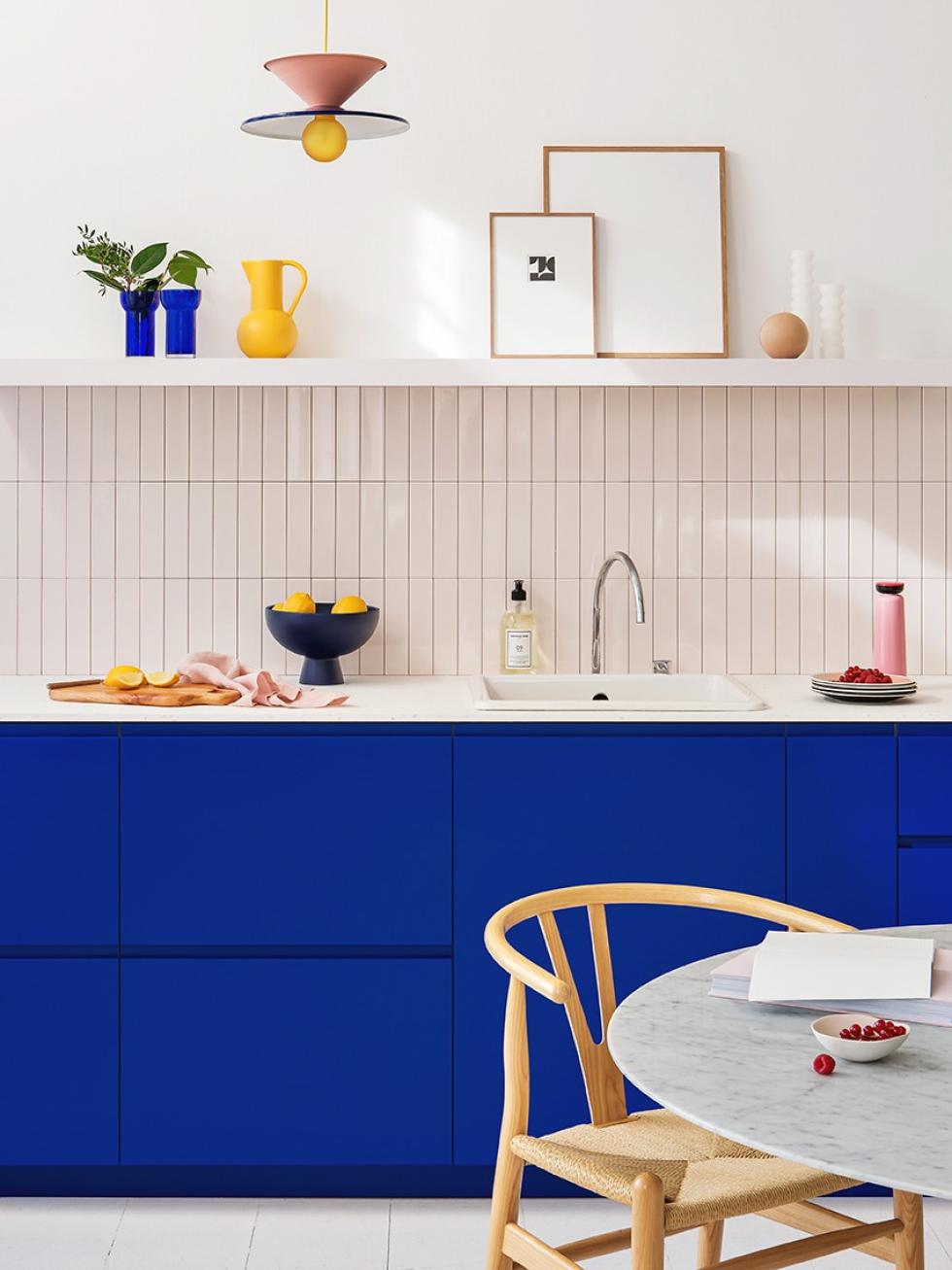
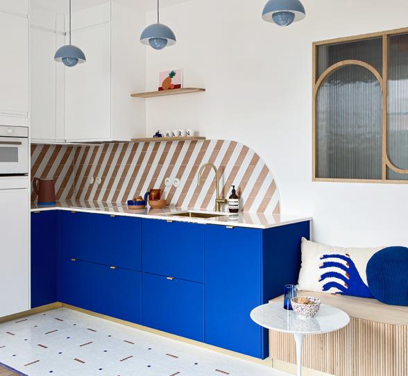
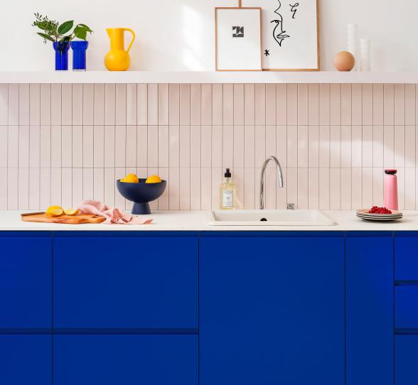
As we love to innovate and experiment here at Plum Living, our bright and modern Electric shade joins our azure palette to tickle your Klein blue cravings. In this art deco-inspired example, we have dressed up the low cabinets of the U shape fronts, whose design reinforces the graphic allure of this colour. Then we added a vivid base that we have combined with a pink-tiled credenza to introduce relief to the overall look. Highlighted by a shelf and a white worktop, live your Memphis’ L'air du temps fantasy within a few square feet of your space.
