6 ideas to use wood panelling
Create a box effect, delimit spaces, enhance a layout... There are countless ideas for personalising our interiors with colour. An alternative to colour is wood panelling. It's a very simple concept: enhancing a wall with a thin panel to give it another dimension. Walnut or oak, natural or stained, untreated or varnished, it doesn't matter what material you use as long as you get the effect! Take a look at our inspirations.
To highlight an opening
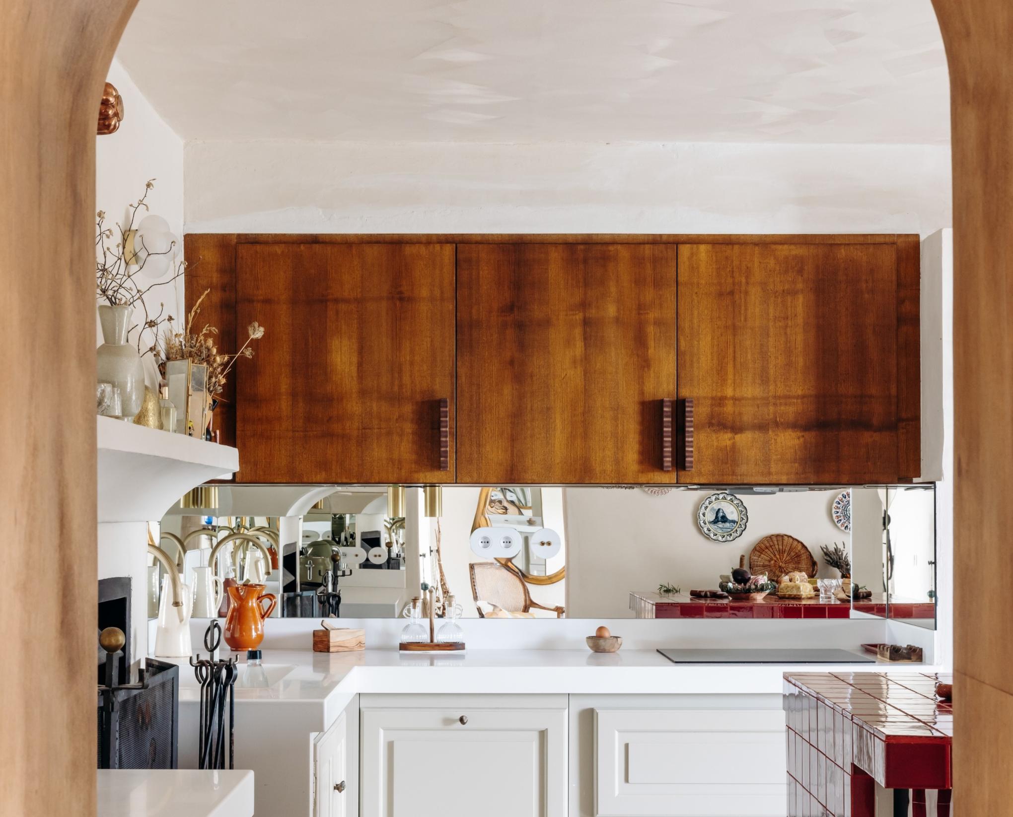
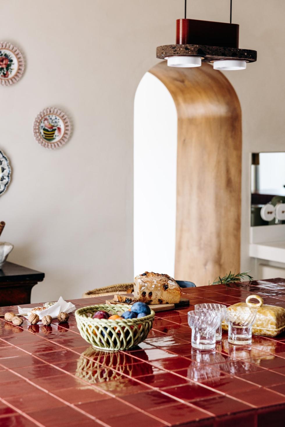
Far from being a simple passageway, openings are architectural elements and not to be neglected. Margaux Keller swapped the door and its hinges for a sheet of stained oak, which she had a fitter bend to fit the existing arch. The result is a graphic opening with an assertive character that instantly adds charm to the kitchen.
To give character to a living room
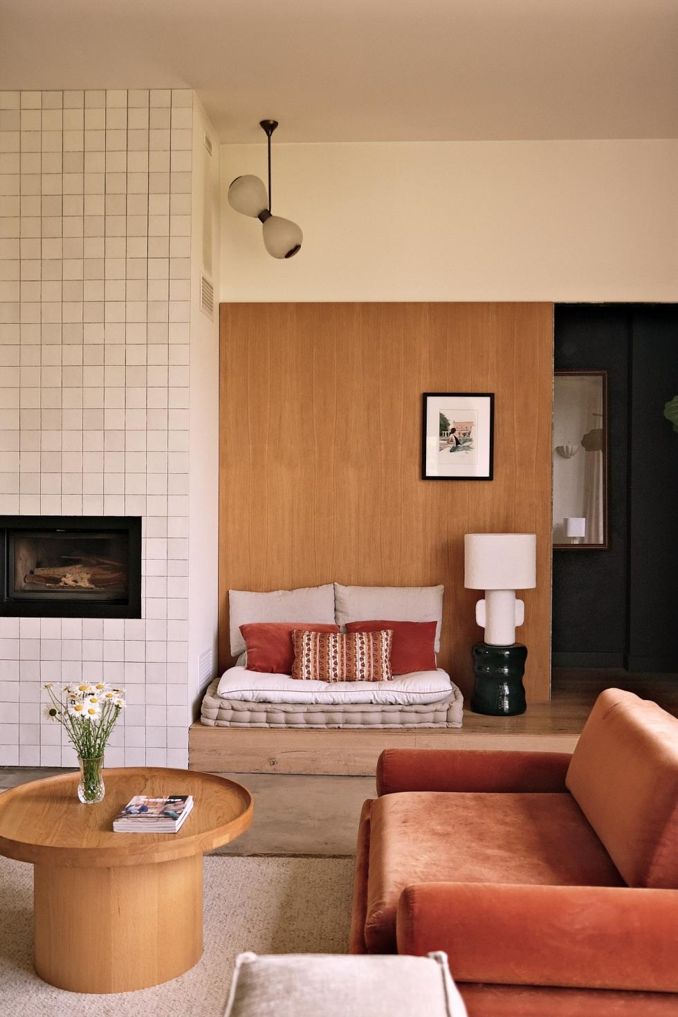
How do you carry out a renovation while giving the illusion that the structural elements have always been there? Marine Gabily and Lucas Madani have a secret weapon: wood. Simply screwed to the walls of the living room, the oak panels underline the soul of their home. Take a closer look: they stop at two-thirds of the total height, to give rhythm to the room and allow the door to blend into the décor. We are inspired!

To section off spaces
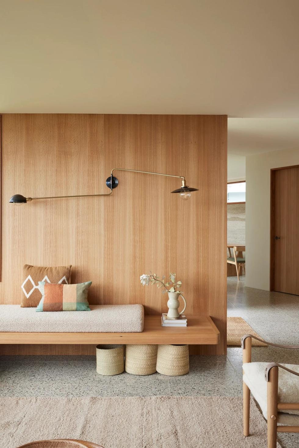
White, wood and raw materials: the mid-century look of this family home designed by Courtney Adamo is an ultra-simple... and ultra-effective mix. Here, wood panelling is used to delineate spaces, while colour is reserved for decorative elements. Right from the entrance, the honey oak veneered wall sets the tone. Add a graphic wall lamp and a bench seat in the same wood, and you've got it!
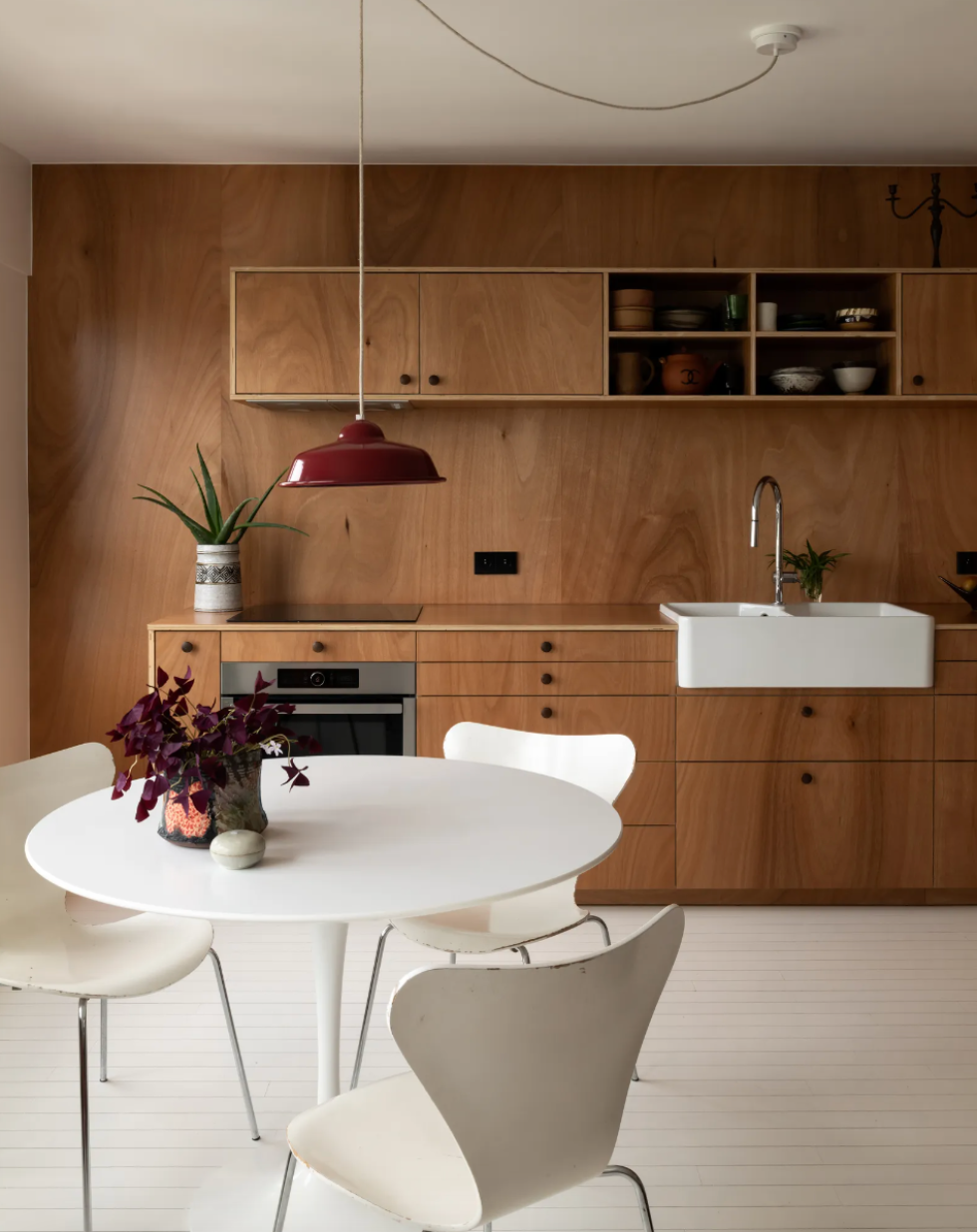
To give the kitchen a theatrical effect
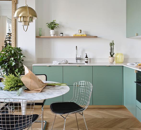
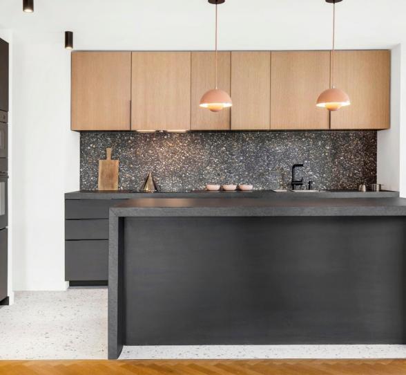
A kitchen in Amandier grisé on a tone-on-tone wall couldn't be more obvious. What about an okoumé kitchen on a veneered wall? Interior designer Alexandre Deshayes has given a classic wooden kitchen a twist by cladding the wall in the same wood. A few square metres of raw material changes everything, adding depth and character to the room. A winning bet!

To create a headboard
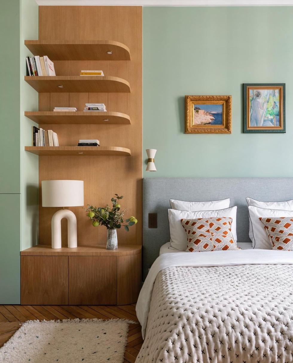
Shift the lines! Gone is the horizontal headboard: Vanessa Faivre has used wood panelling to stretch perspectives and emphasise the bedroom's high ceilings. Placed to the left of the bed, the wooden panel supports floating shelves that create a pattern. Colour on both sides, and you've got the best of both worlds. What could be better?

To create a box effect
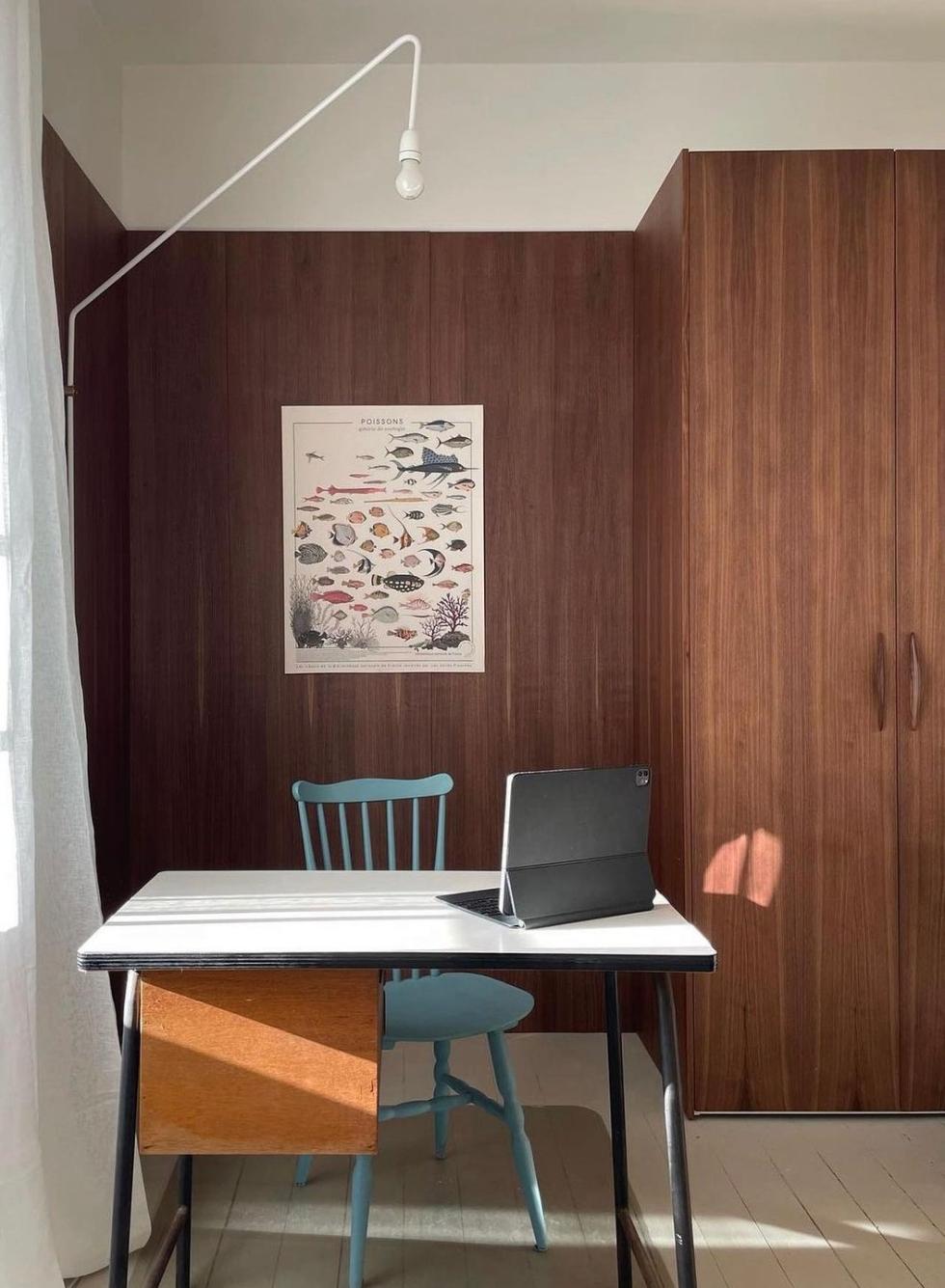
As regular readers of this blog will know, one of our great passions is to divert our products from their original purpose! A creativity shared by our customers, like interior designer Julie Steinhoff. She used our side panels as an extension to these Pax wardrobes in natural Walnut on the adjoining walls to create a box effect and a cosy office area. Enough to make us want to get out our pencils and tools right away.
