Create a "box effect" with paint
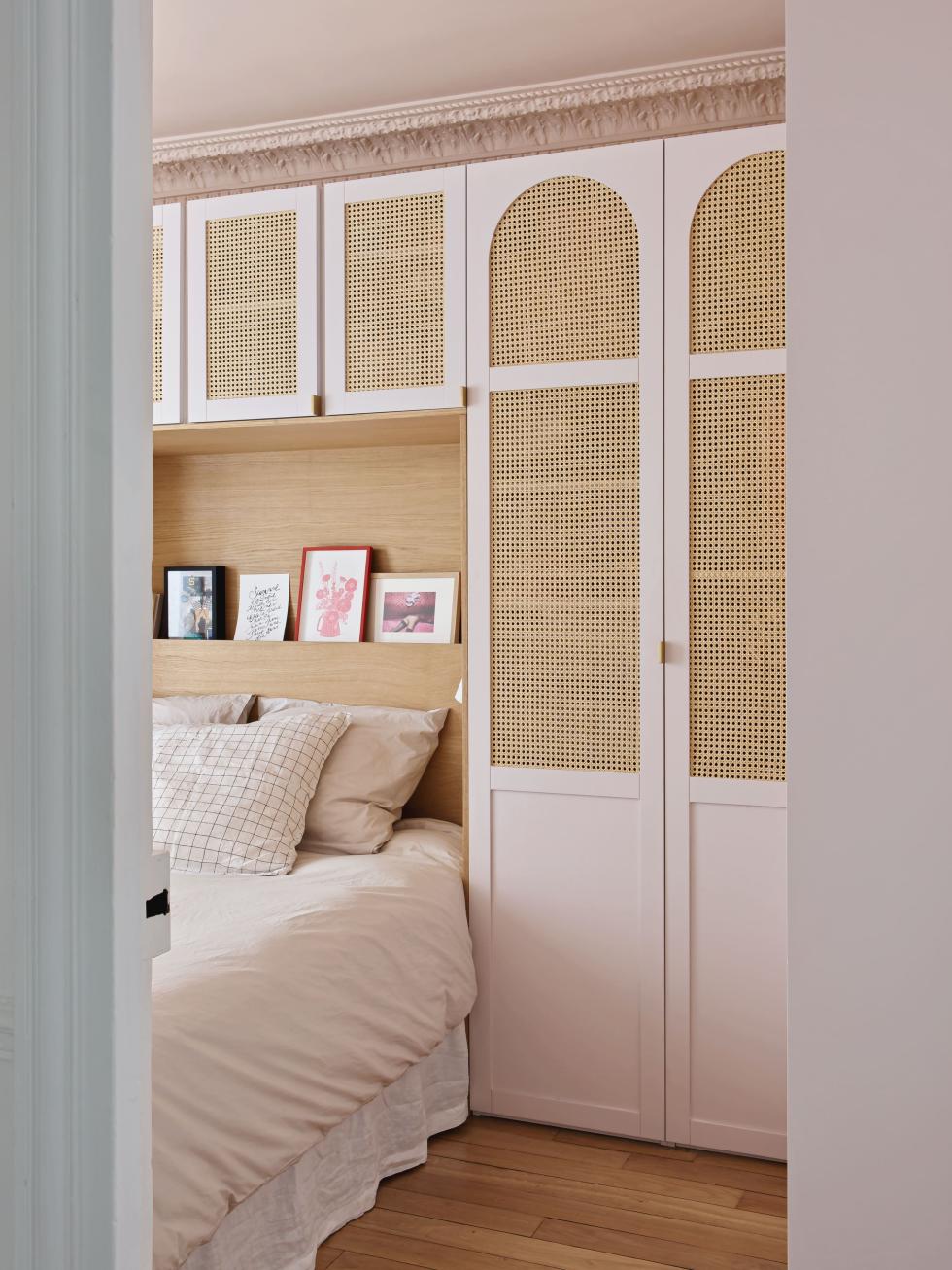
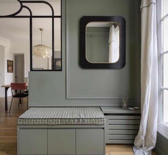
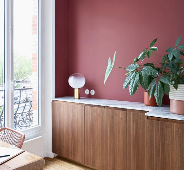
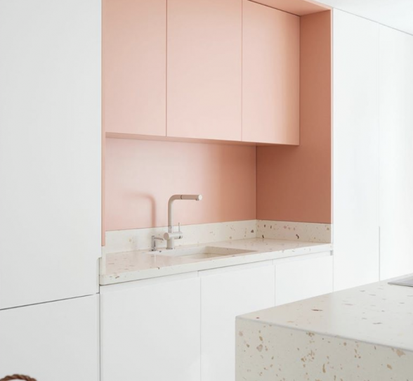
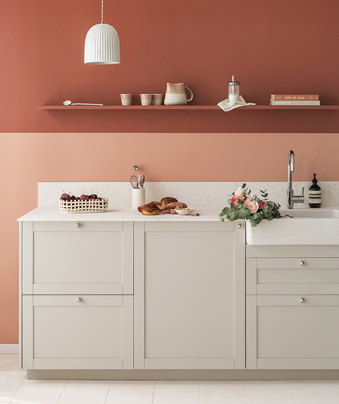
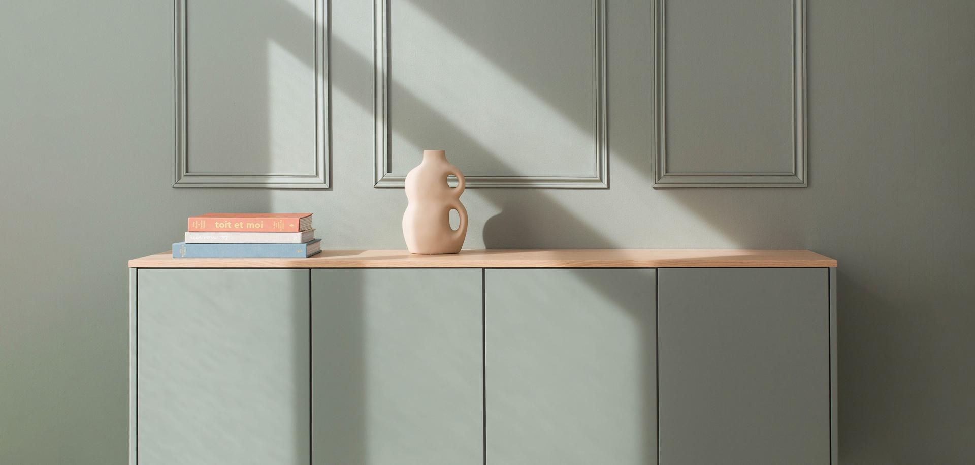
Looking to add a little zest to your rooms? Three walls in white and one in colour...right? Think again! A twist on the classic feature wall, a full-colour box effect (paint extended onto the ceiling and adjoining walls) can add personality and depth your layouts. When applied to a specific area = it visually delimits spaces; when adopted throughout the room = it redefines the atmosphere and the light. Here's a look at some inspiring projects to get you dreaming!
To create a bedroom full of character
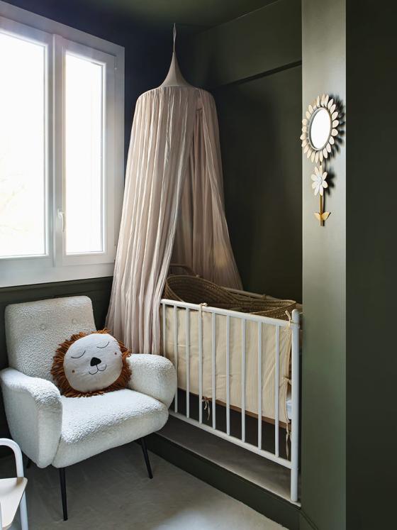
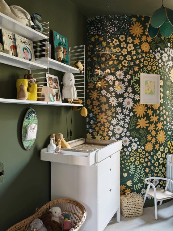
When Lisa Gachet first visited her flat, this small room was actually home to the kitchen, which was butter-coloured from top to bottom. Although the Make my Lemonade founder decided to totally transform it into a kid's bedroom, she kept the idea of having the ceiling painted in the same shade as the walls. Applied all-over, the khaki green - Pitchy Olive by Blime - is simply highlighted with a floral wallpaper in the same shades. Snug!
To dress up your entrance
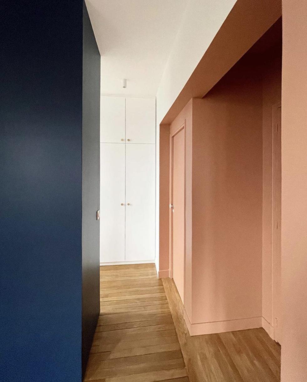
Let's face it: doors are rarely the priority in a renovation project. Yet all it takes is a splash of paint to give them a new dimesion. The proof is in the pudding with this project by Marina Tomić. Previously plain white, the entrance to this wardrobe was repainted in a deep pink to contrast with the white & Blue 03 - Bleu gris layout. The interior designer extended the colour across all the grooves and doors to emphasise the box effect. Inspiring!

To create a cosy cocoon
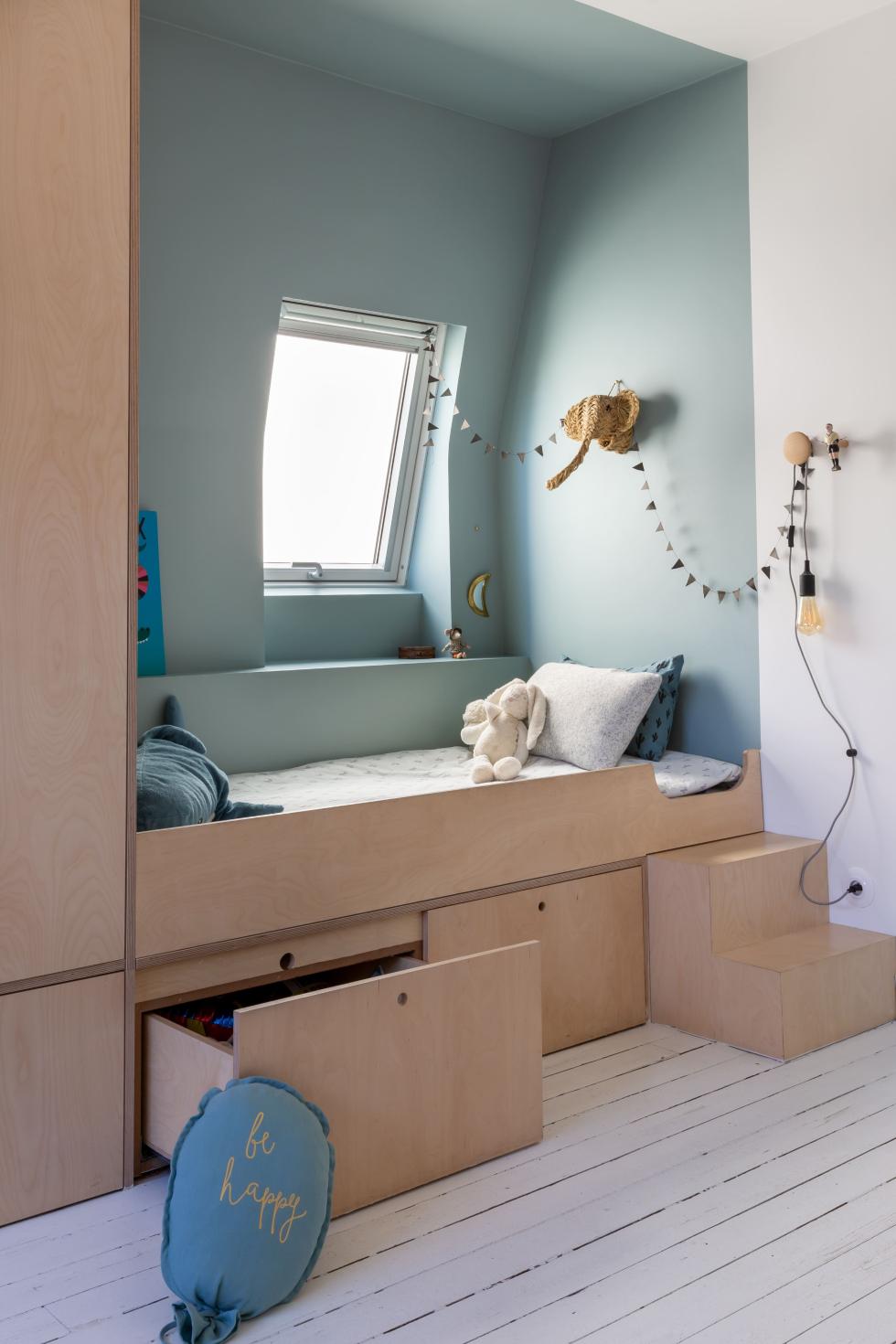
Storage space, eye-catching colour, and a layout they can only dream of: this is Quitterie de Pascal's recipe for a tidy kid's bedroom. At her place, the Mise en Scène Interior Designer has created a podium bed outlined with a plywood wardrobe. Nestled under the window, the bed is highlighted with a celadon blue that extends from the ceiling to the walls. The result is a poetic cabin that only requires a few strokes of the paint roller!
To delimit your kitchen
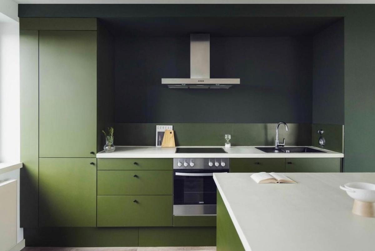
Call it the headache of designing an open kitchen: how to delimit spaces without visually overloading the room? In Berlin, the interior designers at Fantastic Frank used paint to create a box effect that defines the contours of the kitchen. Painted in a green slightly darker than the fronts, the walls and ceiling attract the eye and emphasise the depth of this layout. The matching splashback reinforces the monochrome effect of the creation.

To enhance mouldings
