Two-tone or two-material, the kitchens that have it all
Between Blue 03 - Bleu gris and Natural Oak, you're torn. But what if you didn't have to choose just one? At Plum Living, we like to create, recreate and break all the codes. As your orders come in and we get experimenting with them, we see new combinations come to life, resulting in two-tone or two-material kitchens that are uniquely you. Your turn!
Heads or tails
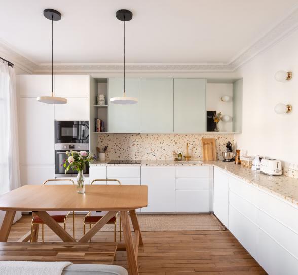
Compromise? Not your thing. It's not by chance that your daughter is named Louise-Apolline. The good news is that when it comes to decorating, indecisiveness can be a good thing! Even an asset when it comes to designing a kitchen that best reflects your personality. Option 1: opt for colours that compliment each other, such as Blue 05 - Bleu paon and Green 01 - Amandier grisé. The hint of grey in the two shades makes them perfect for combining to create a harmonious look. Here, the darker colour is used for the overhead cabinets, which are smaller than those below. As the Blue 05 - Bleu paon is bolder visually, it highlights them and draws the eye to this "floating" cabinet. The colours could also be reversed to emphasise the lower cabinets and give a little lightness to those above. The colour combinations are endless: Red 01 - Terra and Beige 01 - Beige rosé, Green 01 - Amandier grisé and Green 02 - Sombre forest, Blue 03 - Bleu gris and Blue 04 - Ciel voilé... The hardest part is choosing.
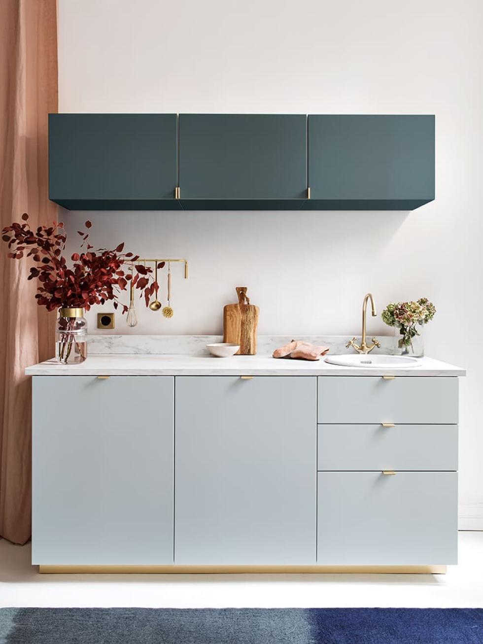
Question of contrast
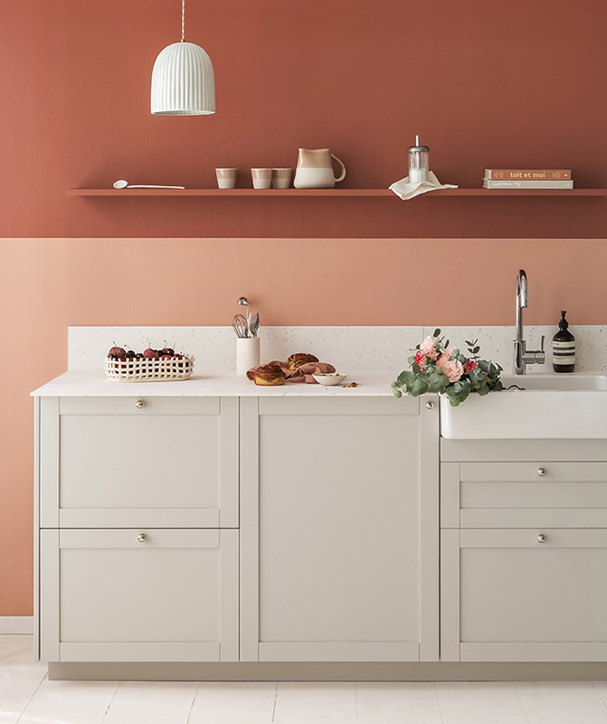
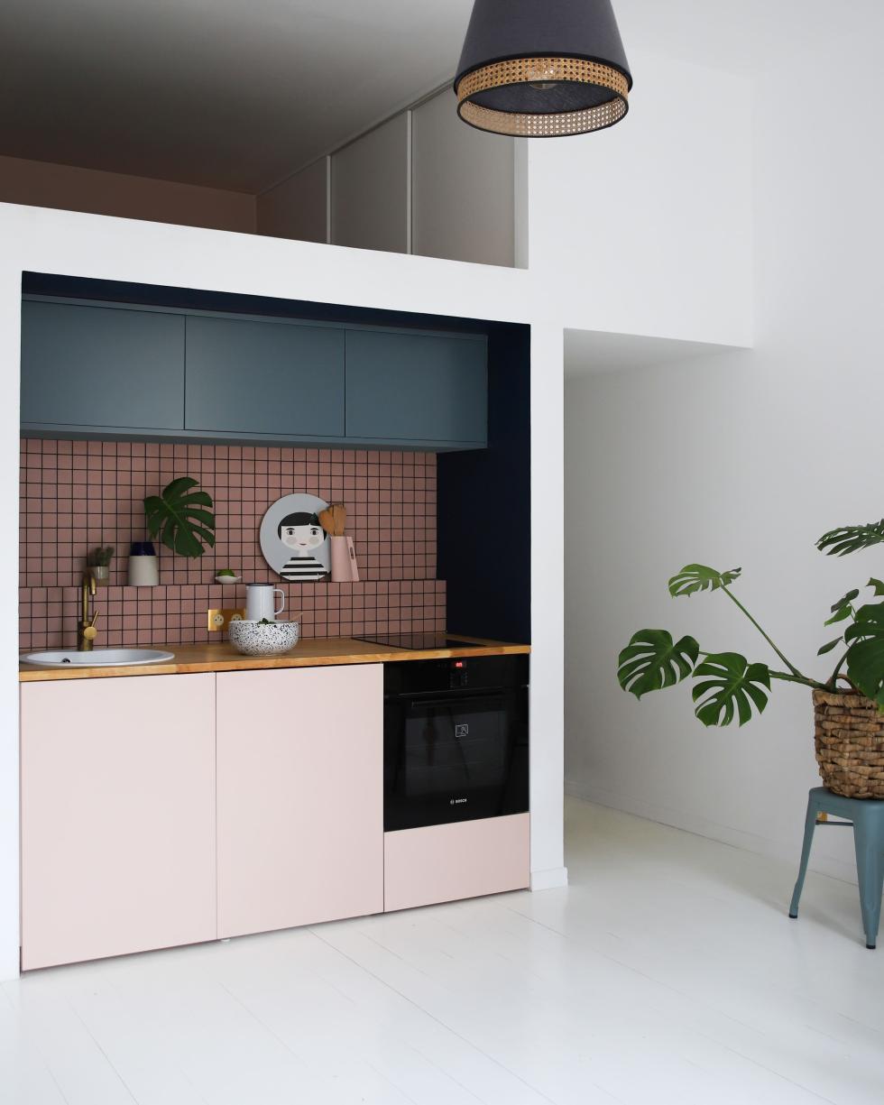
With its matte finish, lacquer also plays on contrasts. Proven here in this kitchen, which combines Blue 05 - Bleu paon and Beige 01 - Beige rosé. Here, the dusty-pink tiled splashback and its black joints link the two colours, resulting in a bold two-tone look. Dark and light, muted and vibrant, pastel and bold, all combinations are possible! We suddenly have the urge to change all our cabinets to Grey 03 - Asphalte mixed with Red 01 - Terra. Because, why not?

Out with the old
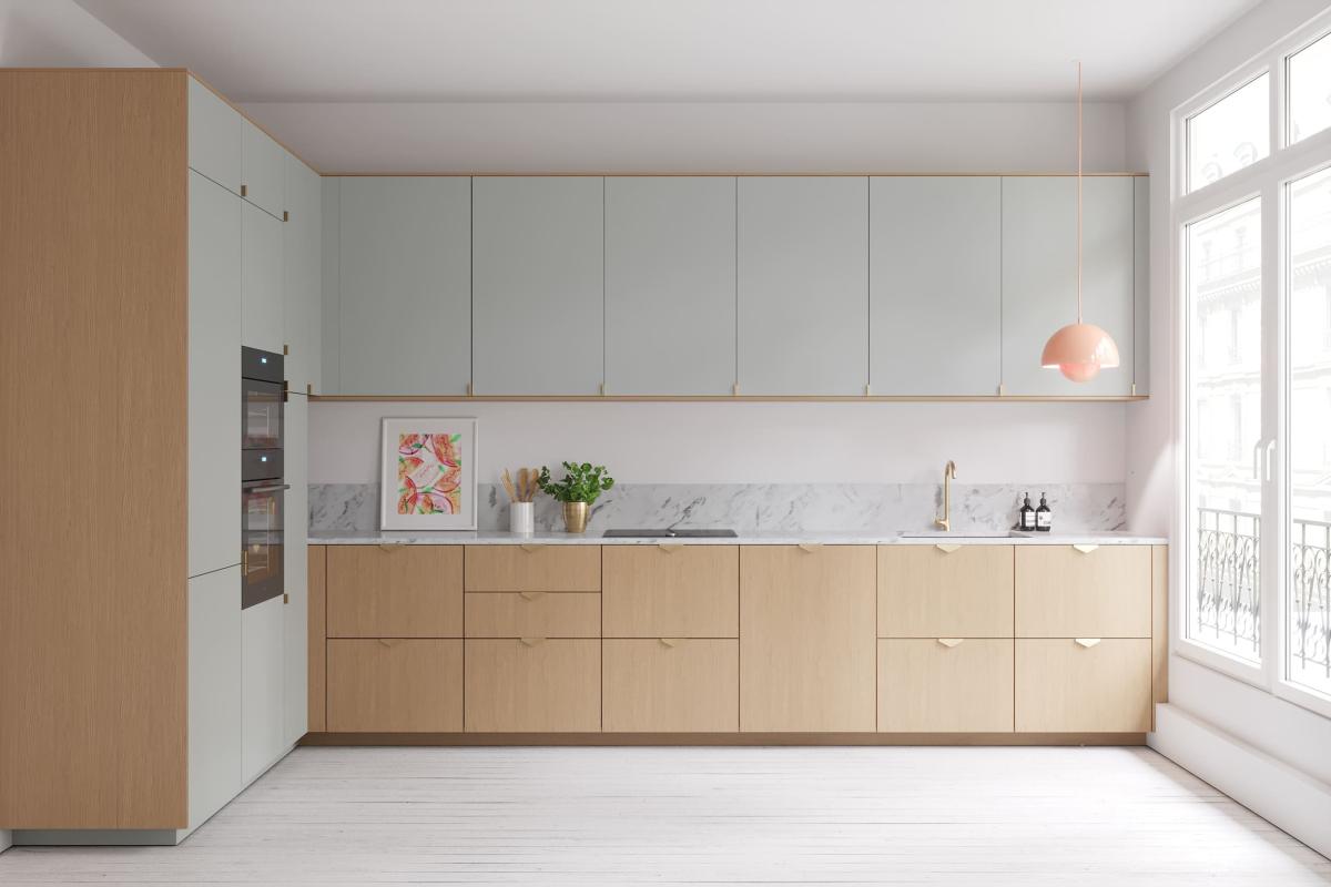
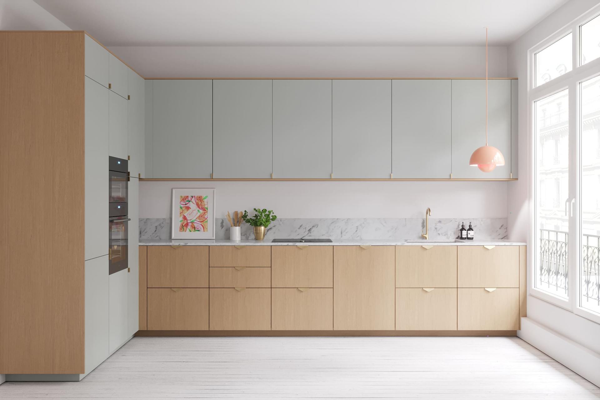
Does "rustic" and "authentic" come to mind when picturing wooden-kitchens? Too often left in the "old-fashioned" pile, it's time to dust off your oak, combining it with lacquer for a result that's right up with the times. Here, light oak is combined with Green 01 - Amandier grisé, creating a kitchen with soft and natural colours. Instead of the full-wood look, the light oak is used as a common theme for a coherent layout. Our tip? Use matching cover panels to highlight the Green 01 - Amandier grisé fronts. They echo the cabinets below and give the kitchen a little character. Our Delta and Liseret handles add the finishing touch.
An oak change
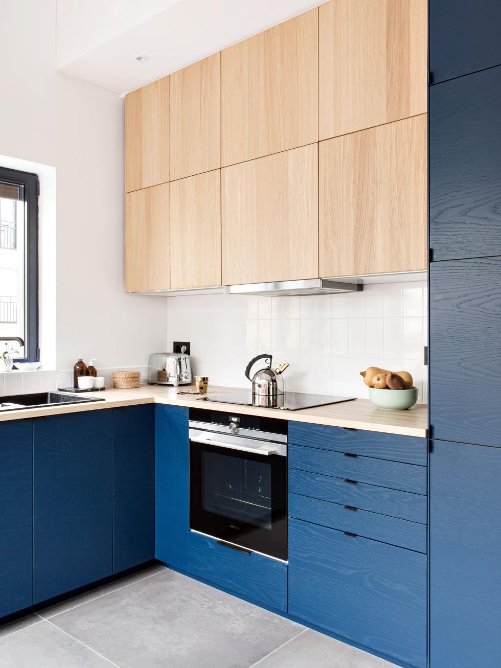
Whether home to your rangehood, pots & pans, or the smoothie maker that you take out once a year, overhead cabinets no longer need to prove their usefulness. The problem? They tend to weigh down the kitchen visually, especially when there's a few of them. Opt for trompe-l'oeil we say! By using a different finish for your overhead cabinets, you create a depth effect that lightens the layout. The wood grain, which is visible on both the light oak and the matte oak in Blue 02 - Bleu nuit, creates harmony between the fronts. Material and colour are certainly the stars of this aesthetically-pleasing kitchen.
