At Plum Living in Marseille
There is something a little intimidating about pushing open the door at 26 rue Grignan for the first time. The high ceilings have a lot to do with it. The mouldings, the Versailles parquet and the palazzo spirit drive the point home. A theatrical setting that had to be tamed in order to roll out a new expression of our vision of interiors. Here, colour softens the volumes and structures the space, making it easier to make the place your own. After two months of work, we can say it without batting an eyelid: our Marseille Apartment is finally ready to inspire you!


In the colours of Marseille
A single glance out of the window was all it took to sketch out the colour palette for our showroom. Gone were our desires for Bronze and India yellow. The surrounding tiled rooftops naturally imposed their rosy hues, simply enhanced by chalk-white walls. The green we had dreamed of took on a touch of grey, becoming a khaki reminiscent of olive tree leaves, whilst the azure of the sky was reinterpreted as a muted Almond grey. As a starting point, these shades — which shift with the light and their combinations — allowed us to draw a thread through the 180m² apartment, envisioning a singular yet cohesive space.


Daytime box
5 metres by 3, high ceilings and not a window in sight: the entrance could easily have become a real headache. That was without counting on our love of colourful boxes! Rather than trying – in vain – to make up for the lack of natural light, we took the opportunity to create a khaki cocoon from walls to ceiling (Le Soupir, Ressource), to set the tone from the moment you step through the door. The double doors leading to the living room and the kitchen were removed to gain depth and entice you to continue the tour.


A bit much
Nestled on either side of the entrance, the two corridors leading to the design room and the bedroom had no other purpose. Without a second thought, we fitted them with a coffee corner built from shallow Metod units. Inserted between each module to give a graphic quality to our natural oak fronts, the dividers created from 2.5 cm finishing panels echo the width of the Bar handles… A thickness that lends a sense of opulence, which didn't stop us from drilling through the left-hand column to thread the cables for the kettle and coffee machine so they could be plugged in inside. Out of sight, out of mind!


Made to measure… or almost!
On the opposite side, the open rounded honey oak unit introduces a linen raffia dressing area that stretches up to the ceiling. Created from Pax units simply cut down to fit between the first row of modules and the ceiling, it slots in to the millimetre and gives the illusion of a bespoke arrangement. We took the opportunity to intersperse a row of Metod units to add rhythm to the whole, whilst also creating a bench behind which a mirror will soon be placed.
It’s Palace
37. That’s the number of painted ceiling inspirations from Italian-style palazzos saved on our Pinterest account. It was too good an opportunity to miss! Chosen in the same shade as the entrance (Le Soupir, Ressource), the colour here visually lowers the ceiling while highlighting its mouldings. On the walls, the Craie paint (SL03, Ressource) enhances the layout and furniture without stealing the show from them.


Into the wood
How do you inject a good dose of modernity without spoiling the character of the place? The answer can be summed up in two words: wood panelling. Simply glued to the walls with Sika adhesive before serving as a backdrop to sleek sideboards, our Edge fronts in Honey Oak dress the space with a contemporary twist. Add Metod cabinets with Ivory fronts, a floating shelf in the same wood, and you have a bookcase enhanced by chrome wall lights.


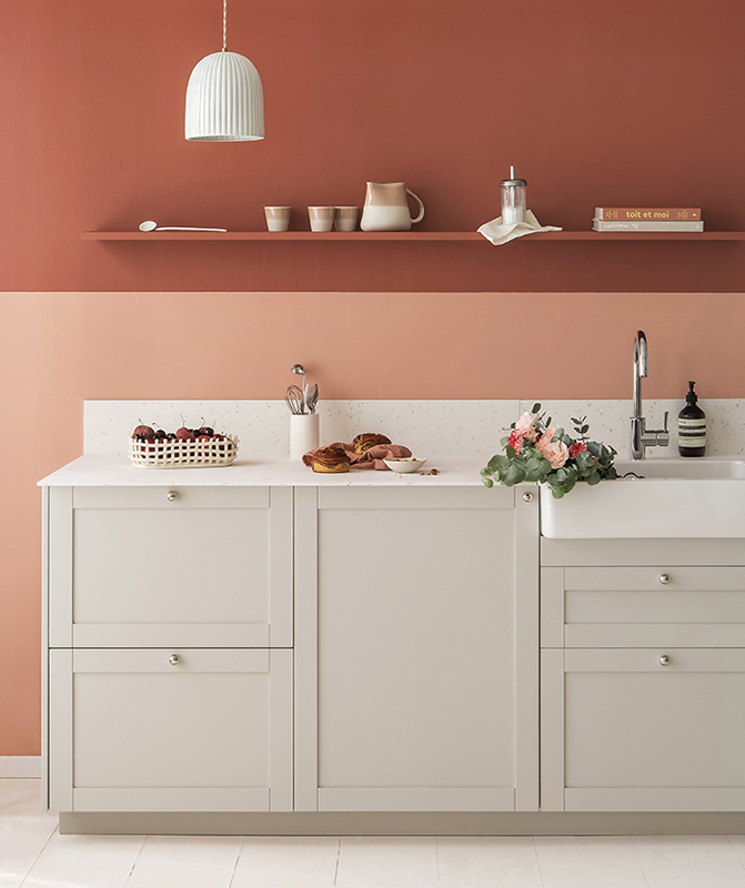
How is your banquette?
Open to the living room, the kitchen is set against what was, just a few months ago, a picture rail wall flanked by a fireplace. The fireplace was removed, whilst the mouldings were preserved by erecting a plasterboard partition that extends up to the ceiling — simplifying the installation of the wall units in the process. The opportunity was also taken to add a bench seat in the extension, creating an incredibly practical everyday dining area.


Seamlessly hidden
On the hidden side, a BA13 partition wall was installed to define the column block and keep it out of sight from the living room. It houses the fridge, the oven and the microwave, as well as an open Honey Oak unit that echoes the Fragment handles by Pauline Borgia. On the right, a filler panel was carefully cut to follow the contours of the picture rails. A bead of silicone, and it’s done.

The Possibility of an Island
Designed to let you bring your projects to life with our designers, the design room is organised around a central island. Created specially for the occasion using repurposed open units, it is framed by a compact worktop that extends right down to the floor thanks to an end panel. Facing it, the Grenat kitchen is topped with Honey Oak wall units to make full use of the ceiling height.


Roses are red
On one side, a deep Garnet. On the other, an Argile bookcase built in between the fireplace and the opposite walls. Their common denominator? Pink tones, highlighted by a pinkish beige that stretches across the walls (La Jouvencelle, Ressource) and allows them to converse, where a white would have been too stark. A principle that can be found throughout the entire Apartment, where Craie (SL03, Ressource) reigns supreme to better enhance the rest of the palette. bsp;


Savage Nights
In the bedroom, the Fauve wardrobe permeates the whole space, to the point of tinting the adjoining walls. The lacquered fronts are punctuated with handles designed by Pauline Borgia, which give them a graphic look and echo the honey oak headboard. Created using wall-mounted Metod cabinets fixed to the floor, it hides on one side U-Shape drawers in Fauve lacquer, while Edge fronts in natural wood, simply screwed on at the back, are displayed behind the bed.


Same player, play again
When we tell you that wood panelling has earned its place in the Pantheon of our obsessions! Here it’s used as a niche backdrop to define the dressing table tucked away at the end of the walk-in wardrobe, giving it some rhythm. It’s 135 cm wide, fitted with two 50 cm fronts and one 35 cm front, all in Honey Oak Edge to preserve the thin frame’s graphic look. Our desktop, meanwhile, has been cut down to the millimetre so it fits perfectly while keeping its curved lines. Take a closer look: the panel placed above the niche is in Fauve, visually extending the wardrobe.
From us to you
Like a thread running through the apartment, the bedroom follows the same language and, above all, the same hope: to inspire you and give you, in turn, the desire to create a distinctive, well‑designed interior. Good news: Mélanie and her team of designers welcome you there by appointment throughout the week.